

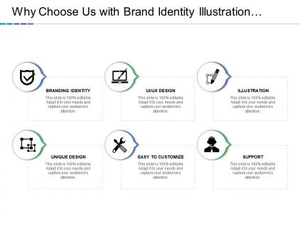
Why choose us with brand identity illustration unique design and easy to customer




Try Before you Buy Download Free Sample Product
 Impress Your
Audience
 100%
Editable
 Save Hours
of Time


Don't give up the ghost with our Why Choose Us With Brand Identity Illustration Unique Design And Easy To Customer. Continue the effort till you achieve.
People who downloaded this PowerPoint presentation also viewed the following :
Why choose us with brand identity illustration unique design and easy to customer with all 5 slides:
Appreciate intent to improve conditions with our Why Choose Us With Brand Identity Illustration Unique Design And Easy To Customer. Encourage inventive attitudes.


FAQs for Why choose us with brand identity illustration unique design and
Honestly, start with your logo and colors - those are gonna be everywhere. Typography matters way more than people think though, it's what makes everything look like it belongs together. Pick colors that actually match your vibe, not just what looks pretty. For imagery, whether you're doing photos or illustrations or whatever, keep it consistent. Oh and figure out how you want to sound when you talk to people - that voice thing is huge. But here's what I'd do first: nail down like 2-3 words that describe your brand, then use those to guide everything else you pick.
Colors hit people way before they process your actual messaging. Red makes everything feel urgent and exciting - just look at Coke. Blue screams trustworthy and reliable. Green gives off nature/growth vibes. It's actually crazy how hardwired these reactions are in our brains. Purple = luxury, orange = fun energy, black = high-end sophistication. You can't just pick whatever looks pretty to you though. Think about what emotions you want customers to feel, then work backwards from there. Your personal taste doesn't matter if it doesn't match what your audience expects.
Think of fonts as your brand's personality showing up visually. People get a vibe before they even start reading. Round, bubbly fonts? You seem friendly and chill. Sharp, clean ones feel more professional or high-end. Pick 2-3 fonts that actually match what you're going for and stick with them everywhere. Like, if you're a tech company, please don't use Comic Sans - I've seen that mistake too many times! The font literally sets expectations for how people should "hear" your voice. It's kinda crazy how much it matters, but it really does.
Your logo is basically a visual shortcut - people see it and instantly know it's you without reading anything. Look at Nike or Apple - you recognize them before you even spot the company name, right? That's what you want. Make yours distinctive so customers can pick you out in a crowded space. Honestly, I think too many businesses overthink this part. Keep it simple, use it everywhere consistently, and just make sure it actually fits what your brand is about. The repetition is what makes it stick in people's heads.
Honestly? Most people overthink the hell out of branding. Don't chase every design trend - you'll end up with some Frankenstein logo that looks like five different people designed it. Know your audience too. I've seen so many "cool" designs that totally missed who they were actually trying to reach. Oh, and test your logo tiny first - like business card tiny. If it turns into a blob at that size, start over. Simple beats complicated every time. Your brand should feel intentional, not like you threw everything at the wall to see what stuck.
Think of your visual identity like renovating a house - you'll update the paint and furniture, but keep the foundation solid. The key is figuring out what's sacred vs. what's flexible. Your logo proportions, main colors, and typography hierarchy? Those are your non-negotiables. But how you use them across different campaigns? That's where you can get creative. Document these rules clearly so your team knows exactly where they can experiment without totally breaking things. Honestly, most brands are way too rigid about this stuff. Give yourself room to breathe while staying recognizable.
So brand identity is basically how customers recognize you and feel connected to your company. When your colors, fonts, and messaging stay consistent everywhere, people trust you more - it's like recognizing a friend's handwriting, you know? People will actually pick you over competitors even when prices are the same because of that emotional bond. Honestly, I think most businesses underestimate how powerful this is. You should check if your brand feels cohesive across all the places customers see you. Strong identity = loyal customers who stick around.
Dude, you really gotta think about cultural stuff when designing for different markets. Red's lucky in China but screams danger here in the West. White can mean purity or death depending where you are - it's wild how different things get interpreted. Your typography matters too since some places read right-to-left or top-to-bottom. Don't even get me started on logos with symbols that could totally offend people. Honestly, just do your homework early and test with locals before going global. Trust me on this one.
Okay so user feedback is literally your reality check - shows you if your brand actually works or if you're just living in a bubble. Surveys and social media comments are obvious sources, but honestly some of the best insights come from just chatting with customers. Yeah, the feedback can sting sometimes (been there), but that's when you know it's real. Pay attention to patterns - if three different people say your fonts look "dated" or your messaging feels off, listen up. Don't do a complete rebrand though. Small tweaks based on what you're hearing will fix most issues without starting over.
Honestly, Adobe Creative Suite is still the gold standard - Illustrator for logos, Photoshop for photos, InDesign for layouts. Figma's really solid too if you're working with clients since everyone can hop in and leave feedback in real-time (saves so many email rounds, trust me). Canva Pro is decent for simpler stuff and keeps your brand colors/fonts organized. Pick one main tool though and actually learn it instead of bouncing around constantly. I'd go with Illustrator first if you're serious about branding. Vectors are everything - they'll look crisp whether you're making business cards or billboards.
First thing - figure out what you actually stand for and what makes you different from everyone else. Use the same fonts, colors, and logo everywhere (seriously, mixing and matching looks amateur). Pick a voice too - are you the friendly neighbor type or more buttoned-up professional? Whatever you choose, stick with it. Oh and actually USE your branding on everything - website, Instagram, even your email signature. I know it sounds obvious but you'd be surprised how many people forget. The whole point is people start recognizing you, which builds trust over time.
So a brand style guide is like having rules for how your brand should look and sound everywhere. Your logo, colors, fonts, even how you write captions - all documented so nobody screws it up. I've seen companies where their Instagram looks totally different from their website and it's just... confusing for customers. Short sentences work great. When your intern posts something or your designer makes a flyer, they'll know exactly what to do. Without one, you're basically hoping everyone magically stays consistent (spoiler: they won't). Make it early and actually share it with people who need it.
So basically, your brand stuff needs to work differently on screens vs paper. Digital is tricky - your logo has to look good tiny on phones AND huge on desktops. Plus colors can look totally different depending on someone's monitor (which is honestly super annoying). Print's way more predictable with colors and fonts, but you're stuck with whatever size you choose. Oh, and you'll definitely need simplified logo versions for things like favicons - those detailed print logos just turn into blurry messes online. Best move? Plan for both from day one instead of trying to fix it later.
Honestly, everything's going super minimal right now - clean lines, no crazy gradients, stuff that actually looks good on your phone. But there's also this weird retro wave happening? Like brands are digging up 70s color schemes and vintage fonts. Dynamic logos are pretty cool though - they morph and change but still feel like the same brand. Oh, and sustainability isn't just a footnote anymore, it's baked right into the visual stuff. My take? Design for mobile first, then scale up. If it looks good tiny, you're golden.
Look, storytelling basically gives your brand actual personality instead of being just another logo people ignore. You're creating emotional connections through your imagery, colors, even fonts—it's like meeting someone and hearing their whole story versus just shaking hands at some boring event. Honestly, consistency is everything though. Your story needs to show up everywhere—packaging, social media, all of it. Figure out your origin story first and what you actually stand for, then let that guide your design choices. Way more memorable that way.
-
Best way of representation of the topic.
-
Designs have enough space to add content.