


7 steps of infographic ppt presentation examples




Try Before you Buy Download Free Sample Product
 Impress Your
 Audience
 100%
100% Editable
 Save Hours
 of Time


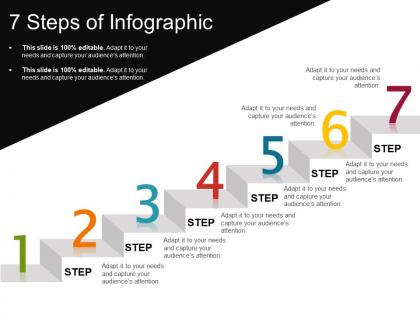
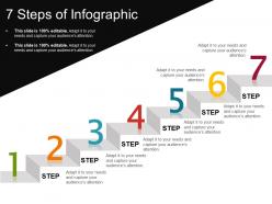
We bring to you our pre-made 7 steps of infographic PPT presentation examples. It is ready for your immediate use and is easy to handle. This 7 steps PPT model saves all your precious time and efforts. Our successive steps PowerPoint slide template is created by our team of field experts. The slide graphic has rare deftness to visualize any data one wants to share. It is one of the most flexible and most versatile slide design, which makes it just the right option for a variety of purposes. The provided slide proves to be a perfect management tool to illustrate the concept of strategic planning, product lifecycle, and all kinds of chain processes. More precisely, the slide is a boon for explaining anything that requires several steps or stages. The slide gives the presenter an opportunity to deliver the topic in the most organized way so that the steps follow regular succession. Go for broke with our 7 Steps Of Infographic Ppt Presentation Examples. The gamble will certainly pay off.
People who downloaded this PowerPoint presentation also viewed the following :
7 steps of infographic ppt presentation examples with all 5 slides:
Believe in your fortunes with our 7 Steps Of Infographic Ppt Presentation Examples. They forecast a fabulous future.
FAQs for 7 steps of infographic
Okay so for your infographic you definitely need a catchy headline first. Then focus on data viz that actually tells a story - not just random pretty charts, you know? Flow is huge too. Keep text super minimal and highlight the main points. Stick to maybe 3 colors max (trust me on this one). Don't forget your sources or you'll look sketchy. Oh and definitely test it on a projector before presenting! I learned that the hard way - stuff that looks perfect on my laptop becomes tiny and unreadable when projected. Add a call-to-action at the end and keep your branding consistent throughout.
Honestly, color choices can make or break your infographic. Blue's your safe bet for data stuff - people automatically trust it more. Red screams "pay attention!" so save it for your most important stats. If you're doing anything finance or eco-related, green's obvious but it works. Yellow and orange are tricky though, they're energizing but man, too much and it's like visual caffeine overload. I'd stick to 2-3 colors tops and actually think about what vibe you want. Your audience expects certain things - don't fight that. Use colors to literally walk people through your content.
Think of typography as your secret weapon for guiding people's eyes where you want them to go. Big, bold headers? That's what they'll read first. Then they'll move to your smaller supporting text. I swear, half the infographics I see online completely bomb because everything's the same boring size - don't do that! Your font choice sets the whole vibe too. Playful stuff works great for fun topics, but stick with clean fonts when you're dealing with serious data. Oh, and keep it simple - maybe 2-3 font styles tops. Nobody wants to squint at tiny text during presentations.
Look at what you're trying to show first. Got numbers or trends? Charts and graphs work best. Walking people through steps? Go with a timeline or flowchart. I honestly used to stress about this way too much lol. For heavy data stuff, bar charts and pie charts are your friends. Complex topics that need explaining work better with those educational layouts - you know, sections with callouts and everything. Mixed content is tricky but magazine-style usually does the job since you can throw in different elements. Just sketch your main points first, then see what format makes them pop. Way easier than overthinking it!
Ugh, the worst thing people do is cram way too much info on one slide - like, nobody can read that mess. Also those awful color combos where you can't even see the text? Don't do that. Low-res images are another pet peeve of mine - nothing screams "amateur hour" like a pixelated chart blown up on the big screen. You still need to explain stuff though; pretty visuals alone won't cut it. Oh, and don't make it crazy complex if you've only got 5 minutes to present. Test it on the actual screen beforehand too - trust me on this one.
Think of your infographic like telling a story to a friend over coffee. Hook them first - throw in a crazy stat or something they'll actually relate to. Then don't just dump all your data at once (honestly, nobody has patience for that). Instead, connect your points so each one leads naturally to the next. I like sketching mine out as a comic strip first - sounds weird but it totally works! Make abstract numbers feel real by adding characters or timelines. Visual metaphors help too. The whole point is getting people curious about what comes next as they scroll through your data.
Canva's honestly your safest bet here - super user-friendly with loads of templates. I've wasted way too much time trying to get Adobe Illustrator to cooperate, but if you're already comfortable with design software, it's powerful stuff. Piktochart's pretty solid too, especially since it's made specifically for infographics and handles charts really well. My advice? Try Canva's free version first. You can always upgrade later if you need fancier features. All three can produce great results, just depends on your skill level and patience!
Pick your best stats first - the ones that actually make people stop scrolling. Round off weird decimals (like 73.2% just becomes "3 out of 4 people"). Clean charts beat walls of numbers every time. Your strongest stat should hit them right away, then back it up with supporting data as you go. Oh and definitely cite your sources at the bottom or people won't trust it. I learned that one the hard way lol. Don't dump every statistic you found - just the ones that actually prove your point.
Keep it short - like 5-10 minutes tops. Nobody wants to sit through a marathon presentation these days, trust me. Around 7 minutes is perfect because you can actually explain your data without people checking their phones. Give each section maybe 1-2 minutes depending on how complicated it gets. Honestly, if you're hitting 10+ minutes, you've probably stuffed too much in there. Practice with a timer (I know, sounds nerdy but it works) and cut the fluff. Your audience will love you for it.
Start by digging into your audience's cultural background - colors and symbols can mean wildly different things. Red's lucky in China but screams danger here in the West. Don't fall into stereotype traps, and make your diversity feel real, not forced. Honestly, testing with actual people from those cultures is clutch if you can swing it. Also heads up - some languages read right-to-left, so your whole layout might need tweaking. Make sure your fonts can handle different alphabets too. When you're unsure, just ask someone from that community. Way better than guessing wrong.
Here's what works for me: Make your main headline huge, then size everything else smaller from there. Bold colors grab attention for the important stuff, while muted tones work for background info. Honestly, white space saves everything – without it, your design just screams at people. Most readers scan top-left first, so put your key points there. Oh, and try squinting at your design when you're done. Sounds weird but if the main elements don't pop when you squint, they won't work normally either. Color contrast is basically everything.
Honestly, less is more with animations. Go for gentle fades or simple slides - nothing that screams early 2000s PowerPoint hell. The whole point is guiding attention to your key stuff, not making people dizzy. I like using them to reveal info step by step or highlight important numbers. Here's the thing though - if someone's more focused on your fancy transitions than what you're actually saying, you've gone overboard. Also, don't rush the timing! People need a second to actually read before you throw the next thing at them.
Different platforms need different sizes, so make versions for Instagram, Facebook, Twitter - the whole deal. Most people see these on mobile, so make your text big enough to actually read. I can't tell you how many gorgeous infographics I've scrolled past because the text was microscopic. Put your best info at the top since that's what shows in preview. Don't go crazy with your logo size. Write a good caption that hints at what's inside. Oh, and try posting at different times - your audience might be night owls or early birds.
Track the usual stuff - how long people looked at it, shares, downloads, questions they asked after. But honestly? The real measure is whether they remember anything a week later. Most infographics are pretty but forgettable. I'd just casually ask people what stuck with them, or do a quick survey if you're feeling fancy. Also check if you got what you wanted - more sign-ups, people actually changing behavior, whatever your goal was. Oh, and definitely measure this stuff before your next one so you can compare. That's where you'll really see if it worked.
Put your sources right on the infographic - nobody wants to go hunting for citations later. Small text at the bottom works fine, or just make a little "Sources" box. Make sure they're detailed enough that people can actually track down the original stuff. You know what drives me crazy? Those infographics that just say "studies show" with zero backup. Totally worthless. If you're presenting it live, mention the big sources when you're talking about specific numbers. Oh, and here's something that works well - number your sources and put those numbers next to the stats throughout the whole thing.
-
Much better than the original! Thanks for the quick turnaround.
-
Top Quality presentations that are easily editable.