


8 step process infographic slide layout





Try Before you Buy Download Free Sample Product
 Impress Your
 Audience
 100%
100% Editable
 Save Hours
 of Time


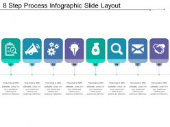
Represent the growth structure of your business processes with our 8 step process PowerPoint design. You can use this 8 stages process flow PPT slide image to describe the business processes which is divided into the eight phases. Such as the business decision-making process, new product developments process, business analysis process, business process re-engineering and many more. Thus in addition to the above, you can describe the various advantages of this 8 step business process PPT layout to your business. It helps in increasing the source of income for your business while managing your business cost and more. This process flow chart PowerPoint image can also help in enhancing the overall efficiency and effectiveness of your company operations. Express your idea of inventiveness in style with this exclusive PPT layout design. It is specially designed by the team of our experienced professionals. Thus, it is ready to use directive info graphic PowerPoint template design. Our 8 Step Process Infographic Slide Layout ensure consistency of effort. Your approach will never be halting.
People who downloaded this PowerPoint presentation also viewed the following :
8 step process infographic slide layout with all 5 slides:
Facts get included in our 8 Step Process Infographic Slide Layout after complete investigation. You can depend on it to be irrefutable.


FAQs for 8 step process
Three things matter most: clear hierarchy, consistent visuals, and data that actually tells a story. Guide people's eyes with smart use of size, color, and spacing. Your color palette should be tight - seriously, I see way too many rainbow disasters. Pick fonts that work at different sizes. But here's the thing: pretty charts mean nothing if your data doesn't connect with people. Figure out your main message first, then build everything else around it. Don't get tempted to stuff in every piece of info just because you've got room.
Dude, color theory is a game changer for infographics! You want contrast to separate your data sections - think dark blues with light yellows so nothing gets muddy. Warm colors like reds grab attention for your important stats. Cool colors? Perfect for backgrounds. I swear, most infographics look like someone threw up a crayon box. Stick to maybe 3-4 colors tops. Use different shades of the same color to show how data connects. Your brain processes this stuff way better when it's not fighting through visual chaos. People will actually read it instead of just scrolling past.
Oh man, typography for infographics is tricky but here's what works: Keep it simple with maybe 2-3 fonts tops. I always go with a clean sans-serif for headers and something super readable for the body text. Don't get tempted by those fancy script fonts - they look awful on phones and most people view these on mobile anyway. Actually made that mistake once and it was embarrassing! Size contrast between your headers and body text is huge for creating hierarchy. Pro tip: squint at your design when you're done. If you can still see the text structure clearly, you nailed it.
Think about who's actually looking at this thing - they'll spend maybe 10 seconds scanning it. Pick your main point first. What's the ONE thing you want them to remember? Then only add data that backs that up. I've seen so many infographics that try to cram everything in. Don't do that. If you need paragraphs to explain it, you've already lost people. Here's what I do: explain the whole thing in one sentence to yourself first. If you can't? Too complicated. Test it on someone random at work. If they don't get it right away, strip out more stuff. Less really is more here.
So visual hierarchy is like creating a path for people's eyes to follow through your infographic. Use bigger text for headlines - that's what grabs attention first. Then your supporting images and graphics pull them deeper. Body text comes last in the pecking order. Honestly, I've seen so many infographics where everything's the same size and it's just visual chaos. People end up scanning randomly and bounce right off. Start with your biggest point as the anchor, then arrange everything else to guide them through your story step by step. Color and contrast help tons too.
Think portrait mode first - that's how everyone scrolls anyway. Your text needs to be at least 14pt, though honestly I go bigger since squinting at tiny fonts is the worst. Stack your sections vertically instead of cramming them side-by-side. White space is your friend here - cramped layouts look awful on phones. Here's the thing though: always test on your actual phone before you hit publish. I've seen so many infographics that looked perfect on desktop but were completely unreadable once you're actually holding the thing. Start with mobile, then worry about how it'll look on bigger screens later.
Honestly, just start with Canva - the templates are actually decent and you won't hate yourself trying to figure it out. Adobe Illustrator is obviously the best if you're going pro, but man, that learning curve will crush your soul. Piktochart and Venngage are pretty solid too, especially for data stuff. Oh, and Figma's everywhere now if you're already messing around with it for other projects. My advice? Get comfortable with layouts on Canva first. You can always graduate to the fancy tools once you figure out what actually looks good.
Your brain processes visuals way faster than text, so icons are basically cheat codes for infographics. A little house symbol instantly says "housing data" without anyone having to read some boring label. They break up all that dense info too - nobody wants to stare at a wall of numbers. Plus they create a visual flow that guides people through your data. I'm probably obsessed with good icons, but seriously, pick ones that make sense to your audience. Don't go throwing random symbols around or you'll just confuse everyone more than help.
Your infographic needs a story, trust me on this one. People's brains are wired for narratives - we remember stories way better than random facts thrown at us. Think of it like taking someone on a journey instead of just dumping data on them. You can create characters, show before/after scenarios, or build up tension around a problem your data actually solves. Here's what works: outline your story first, then design around it. Structure your visuals to follow that narrative arc. It's the difference between someone scrolling past or actually stopping to read your stuff.
Dude, check your data sources twice before you even start designing. Trust me on this - I've seen people get absolutely roasted for viral graphics with bogus numbers. Cross-reference stats when you can and be upfront about where everything comes from. Don't mess with scales or pick weird timeframes just to make your point look better either. People are trusting you to be straight with them. Always slap the source somewhere visible on your design. And honestly? If any number feels sketchy, just dig deeper or flag it. Way better than dealing with the fallout later.
Honestly, infographics work everywhere in your marketing funnel. Social media, emails, blog posts, sales decks - people just absorb visual info way better than text blocks. Perfect for breaking down complex products or showing survey data. I'd start by looking at your most text-heavy content right now and see what you could turn visual. Each one should target a specific audience though, not just be pretty for pretty's sake. Oh, and definitely track which styles get shared most - that'll tell you what actually resonates. Way more engaging than another boring paragraph, trust me.
Okay so the worst thing you can do is cram everything onto one graphic - like, nobody's reading a novel on an infographic. Also those tiny fonts? Instant turnoff. I've seen people use neon green text on bright yellow backgrounds and honestly it hurts to look at. Always double-check your facts and cite where you got stuff from. Generic stock photos make everything look cheap. Complex charts just confuse people instead of helping them understand. Make sure there's a clear flow - your eye should move naturally from point to point. Oh and start with your main message first, then build around that.
Three big things to nail down: color contrast, readable text, and good structure. Don't just rely on color alone - throw in some icons or labels too. Screen readers need logical flow to work properly, so organize everything with clear hierarchy. Font size matters - 12pt minimum, and honestly, skip the fancy decorative fonts that look cool but are impossible to read. Always write alt text for the whole thing. Oh, and definitely run your colors through a contrast checker first - saves you from having to redo everything later when you realize half your text is basically invisible.
Interactive stuff is really taking off - like letting people click through data stories instead of just staring at static charts. Minimalist designs are everywhere too, focusing on just one big insight rather than cramming everything in. Oh, and animated infographics, though honestly half of them give me a headache lol. Mobile-first is obviously crucial since everyone's scrolling on their phones. Color-wise, you're seeing way more sophisticated gradients and custom illustrations instead of those cheesy stock icons. But seriously, don't try chasing every trend - pick what actually fits your vibe and get really good at that instead.
Try adding stuff people can actually click on - hover effects, tabs, those little expandable sections. Progressive disclosure is clutch too, where info reveals itself bit by bit instead of overwhelming everyone upfront. Even basic tooltips work wonders, honestly. I always forget how much of a difference they make until I see people actually staying on the page longer. Give viewers control over their experience, you know? Let them dig deeper if they want to. Start with simple hover states on your charts or whatever - I bet you'll notice people engaging way more. Small changes, big impact.
-
Amazing product with appealing content and design.
-
I discovered this website through a google search, the services matched my needs perfectly and the pricing was very reasonable. I was thrilled with the product and the customer service. I will definitely use their slides again for my presentations and recommend them to other colleagues.