


Mapeamento de Atividades das Estratégias de Funções de Recursos Humanos para Melhorar as Funções de RH




Try Before you Buy Download Free Sample Product
 Impress Your
 Audience
 100%
100% Editable
 Save Hours
 of Time


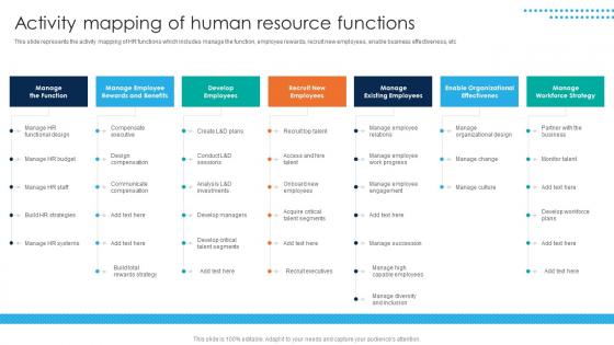
Essa apresentação representa o mapeamento de atividades das funções de RH, que incluem gerenciar a função, recompensas aos funcionários, recrutar novos funcionários, habilitar a eficácia dos negócios, entre outros.
Atividade de Mapeamento das Funções de Recursos Humanos
As funções de Recursos Humanos incluem gerenciar a função, recompensar os funcionários, recrutar novos funcionários, habilitar a eficácia dos negócios, entre outros.
Esta ferramenta pode ser usada para discussão e navegação em Recursos Humanos, Negócios e Eficácia.
O modelo está disponível para edição conforme necessário para sua organização. Faça o download agora.
People who downloaded this PowerPoint presentation also viewed the following :
Mapeamento de Atividades das Estratégias de Funções de Recursos Humanos para Melhorar as Funções de RH Slide 1: Introdução ao Mapeamento de Atividades Slide 2: Análise das Funções de RH - Recrutamento e Seleção - Treinamento e Desenvolvimento - Gestão de Desempenho - Remuneração e Benefícios - Relações Trabalhistas Slide 3: Identificação de Oportunidades de Melhoria - Eficiência dos Processos - Alinhamento Estratégico - Satisfação dos Funcionários Slide 4: Desenvolvimento de Estratégias - Automatização de Tarefas - Descentralização de Responsabilidades - Melhoria da Comunicação Slide 5: Implementação das Estratégias - Plano de Ação - Acompanhamento e Monitoramento Slide 6: Resultados Esperados - Melhoria da Produtividade - Redução de Custos - Maior Satisfação dos Funcionários
Utilize nossas Estratégias de Mapeamento de Atividades das Funções de Recursos Humanos para melhorar efetivamente as funções de RH e economizar seu tempo valioso. Elas estão prontas para se encaixar em qualquer estrutura de apresentação.






FAQs for Activity Mapping Of Human Resource Functions Strategies To
Okay so first thing - break your project into actual tasks, then figure out what depends on what. You'll want to map out which stuff has to happen before other stuff can start. Honestly, most people skip the critical path part but that's where you'll spot potential delays. Duration estimates are huge too, and don't be overly optimistic there (learned that the hard way). Assign who's doing what for each activity. Oh and definitely use something visual like Gantt charts - makes everything way clearer when you can actually see the connections. Start simple though, you can always add more detail later.
So activity mapping is basically like getting everyone on the same page visually - no more "wait, whose job was that again?" chaos. You map out who does what and when, which honestly saves so much drama later. Dependencies become super obvious, so you know exactly who to bug when something's stuck. It also exposes all those weird gaps where tasks just... fall through the cracks somehow. My advice? Pick one process that's been driving everyone nuts and map that first. You'll probably be shocked at how much clearer your meetings get after that.
Honestly, I'd start with Miro or Lucidchart - both are pretty intuitive and great for collaborating. Visio's decent if you're already using Microsoft stuff, but it feels kinda outdated? Draw.io is your best bet for free options. ProcessOn has some nice process mapping templates too. I'm partial to Miro though - the sticky notes make brainstorming way less painful, and I always end up using those more than I expect. Try the free versions first since they're usually enough to figure out what works for you. No point paying upfront when you can test drive them.
Don't try mapping every tiny detail right away - you'll burn out before you finish anything useful. Go broad first, then zoom in on what actually matters. Here's what I've seen screw teams up: they build these gorgeous maps in a vacuum. Zero real user input. Bad move. Your assumptions are probably wrong (mine usually are). Also, map how different user paths crash into each other. That's where the real problems hide. Pick one main flow, test it with actual humans, then build out from there. Way less painful than starting over.
So basically you map out every single step in your process - who's doing what, how long it takes, all that stuff. It's wild how much clearer things get when you actually see it all written down. Hunt for those annoying handoffs where things sit around waiting, or spots where people are doing the same work twice. Steps that don't really add value? Those gotta go. The people actually doing the job should help you map this out - they know where the real problems are. Pick your messiest process first and go from there.
So mapping out activities basically shows you what's actually happening vs what you think is happening in your processes - and honestly, there's always a gap. You'll catch bottlenecks and weird redundancies that would totally mess up your strategic plans later. It's pretty wild how much resources get wasted on stuff that doesn't even connect to your main goals. I'd start with just one important process from start to finish. You'll immediately spot opportunities you completely missed before, plus it makes your planning way more realistic since you're working with actual data instead of assumptions.
Yeah, cultural stuff makes a huge difference with global teams and activity mapping. You've got some cultures that want everything planned out upfront, others prefer figuring it out as they go. Communication styles vary too - some teams are super direct, others dance around feedback more. Time zones are annoying but honestly, different interpretations of deadlines across cultures? That's the real challenge. I'd survey your team first about how they like to work. Then build in flexibility so you can adapt the mapping sessions. Some people hate challenging existing processes while others love tearing things apart.
Check cycle times and error rates - those numbers don't lie about whether things actually improved. Customer satisfaction scores matter too since smoother processes usually make people happier. I'd also look at employee engagement because when people get how their work connects to everything else, they're way more into it. Cost per transaction is solid data, plus count how many useless steps you've cut out. Honestly though, the real test is just asking your team regularly if they're using the map and if it's helping them get stuff done faster day-to-day.
Yeah, definitely works with both! Activity mapping is more like a visualization thing anyway, not really competing with your methodology. Waterfall projects can map out all those sequential phases upfront - stakeholders actually love seeing the whole picture laid out like that. Agile's different though, you'd probably map each sprint or epic separately so the team can see flow within iterations. Oh, and start high-level first, then get into whatever detail your approach needs. The granularity thing is pretty flexible depending on what you're doing.
So stakeholder analysis is basically mapping out who actually matters for each step you're documenting. List everyone who touches an activity - who's doing it, who gets impacted, who makes decisions. People skip this part all the time because it feels obvious, but trust me, you'll miss key handoffs otherwise. I learned this the hard way on a project last year. Look for where communication usually breaks down and which people can actually help fix problems. Short version: identify everyone involved, then rank them by how much influence they have. It saves you from guessing how work really moves around.
So basically, activity mapping lets you see your whole project laid out visually - all the tasks and how they connect. Makes it super easy to catch problems before they hit. You'll spot bottlenecks and critical paths right away. Honestly, stakeholders get it way better when you can actually show them what you're talking about instead of just explaining. The scary part is watching how one delayed task can mess up everything downstream. Oh, and definitely keep updating the map - we use ours in risk meetings to play out different scenarios. Works pretty well.
Honestly, visual aids are a game-changer for activity mapping. Your brain just processes that stuff way faster when you can actually see the flow laid out. I used to hate staring at endless text lists - such a slog. With flowcharts or swimlane diagrams, patterns and bottlenecks literally jump out at you. Redundancies become obvious. Stakeholders get it immediately too since they're looking at the actual process, not trying to decode paragraphs. Trust me, try it once and you'll never go back to text-only mapping.
Quarterly is usually a good baseline, but it really depends on how crazy your workplace gets. Monthly updates make sense if you're dealing with constant changes - I've watched teams waste so much time with maps that were basically useless because everything shifted. More stable processes? You can probably stretch it to six months. Watch for red flags though: new steps popping up, people switching roles, or that classic "we don't actually do it that way anymore" response. Honestly, just set a reminder and treat it like regular maintenance. Way better than scrambling later when nothing matches reality.
Set up monthly or quarterly check-ins where you compare your maps to what's actually going down. Track metrics at each step and get input from the people doing the real work - they'll spot stuff you missed. Then update your maps based on what you find. Don't make it a one-time thing though, that's where most people mess up. Pick one important process first and get into a solid review rhythm with it. I know it sounds boring, but this is honestly where you'll see the biggest improvements. Reality never matches the plan anyway.
Manufacturing and healthcare kill it with activity mapping - they cut tons of waste because their processes are so repetitive and visual. Financial services does pretty well too. Really, any place with complex workflows and lots of handoffs between people works great. You just need processes folks actually follow, not whatever's gathering dust in some manual somewhere. Industries with standardized procedures and clear inputs/outputs? You'll see good returns. Oh, and definitely tackle your biggest bottleneck first - that's where you'll feel the difference immediately.
-
SlideTeam never fails to surprise me with its amazing PPT designs. Thanks team for providing me with your constant support!
-
Perfect template with attractive color combination.