


Adding value to a company powerpoint layout




Try Before you Buy Download Free Sample Product
 Impress Your
 Audience
 100%
100% Editable
 Save Hours
 of Time


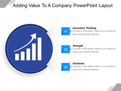
Get access to our adding value to a company PowerPoint layout for your next business presentation. This PPT graphic gives an opportunity to business professionals to show their worth at their workplace and take their career to the next level. Every individual wants to get a promotion but only few ask how I can add value to the company. Corporate firms recruit, train and retain skilled employees that add value to the business and with this presentation slide, you can show your employees that you have trust in their skills and liability as far as business growth is concerned. This PowerPoint visual helps both business leaders and employees to gain trust in each other and work as a team to achieve company goals and objectives. Some important points shown in the PPT sample are innovative thinking, strength and initiatives. These are the attributes that employees must have in order to add value to the business. You need to be proactive and innovative to come up with effective ideas for business development. Download it now. Join the cloth with our Adding Value To A Company Powerpoint Layout. Get all the edges to fit exactly.
People who downloaded this PowerPoint presentation also viewed the following :
Adding value to a company powerpoint layout with all 5 slides:
Own the day with our Adding Value To A Company Powerpoint Layout. Your audience will rise in applause.
FAQs for Adding value to a
So here's the thing - good presentations actually solve problems instead of just throwing info at people. Ask yourself "what does my audience need to DO with this?" before you even touch PowerPoint. Traditional ones are basically documents read out loud (ugh, we've all sat through those). Value-added designs include stuff like interactive elements or custom visuals that help people make real decisions. They anticipate questions and give your audience tools they can use later. Honestly, most presenters forget their job isn't just to inform - it's to make that info actually useful.
Honestly, people remember stories way better than random facts thrown at them. Your presentation should feel more like a movie than a boring data dump. Each slide builds up to your main point - kind of like scenes leading to a climax. We're just wired that way, you know? Charts and images need to guide people through this whole journey you're creating. I always tell people to find that one thread connecting everything first. Makes the whole thing way easier. Short sentences work. But mix in some longer ones so it doesn't sound choppy. Your audience will actually connect with what you're saying instead of zoning out halfway through.
Honestly, audience analysis can make or break your whole presentation. I've watched so many people crash and burn because they just assumed everyone cared about what they cared about - big mistake. You've got to figure out their pain points first, what they actually know, how they make decisions. What problem are you solving for them specifically? Once you nail that down, everything else falls into place. Your examples hit different, your whole message lands better. It's like... why would you give the same pitch to your CEO and your intern, you know? Success looks totally different depending on who's sitting across from you.
Colors seriously mess with people's heads - warm ones make you feel hyped up while blues and greens are super chill and trustworthy. You've gotta match that vibe to whatever you're trying to say. Then use contrast and clear hierarchy so people actually know where to look first. I swear, I've watched presentations completely bomb because someone thought red text on green was a good idea (my eyes are still recovering). Oh and definitely check how your slides look on different screens beforehand - what looks great on your laptop might be a disaster on the projector.
Only use multimedia when it actually helps your message - not just because it looks cool. I'd say max one video/animation per 3-4 slides or people get distracted. Test everything on their actual setup first because tech ALWAYS fails when it matters most (seriously, every time). Your files shouldn't be huge either or the whole thing crashes. Figure out your three main points first, then see which ones really need visuals. Oh and have a backup ready - you should be able to explain what each clip shows if the audio cuts out or whatever.
Honestly, just focus on three things: colors, fonts, and your logo. Swap out their color scheme for your brand colors - but seriously, stick to like 2-3 colors max or it'll look crazy. Then switch to your brand fonts (or something close). Your logo should go in corners or headers, not everywhere - that always looks desperate lol. The whole thing is about restraint though. Keep their clean layout but just layer your stuff in strategically. Oh and definitely test it on a few slides first because sometimes what looks good in your head ends up looking cluttered as hell.
Honestly, start with Canva - it's ridiculously easy and has tons of templates. Way better than struggling with basic PowerPoint (though PowerPoint's actually gotten pretty decent lately with their Designer thing). If you want to get fancy later, Adobe Creative Suite is where it's at. Figma's also solid for collaborative stuff. Oh, and don't sleep on Unsplash and Pexels for photos - saved my butt so many times when I needed good stock images that didn't look terrible. My advice? Learn the basics in Canva first. Then you can always upgrade to Adobe tools once you're not fumbling around with design fundamentals.
Honestly, infographics are just about turning boring data into something people actually want to look at. Break your info into bite-sized pieces with icons and charts that flow naturally - like breadcrumbs leading somewhere instead of dumping everything at once. I always sketch out my main points first, then figure out the visuals later (saves so much time). Stick to one big message per graphic and keep your colors consistent. The whole point is replacing those awful bullet-heavy slides with clean visuals that tell the story faster. It's pretty satisfying when it clicks!
Okay so three things that actually work: chunking, repetition, and visual stuff. Don't dump everything at once - break it into like 3-5 points max because our brains hate information overload. That whole "tell them what you're gonna say, say it, then tell them what you said" thing? It works. Pair your main points with visuals or icons too. I swear half the presentations I sit through are just paragraphs copy-pasted onto slides - it's brutal. Do mini-recaps every 10-15 minutes. Start with chunking first since it's the easiest fix.
Dude, whitespace is seriously underrated! I used to pack slides like I was moving apartments - terrible idea. Your brain needs breathing room or it just shuts down. Cut your content in half, then double the spacing around everything. Sounds crazy but trust me on this. Short sentences work better than long ones. The empty space actually guides people's eyes to what matters most. My slides went from looking like ransom notes to something almost... professional? It's weird how removing stuff makes everything cleaner.
Dude, don't cram a novel onto each slide - people read way faster than you talk anyway. Those tiny fonts will kill you, and please skip the cheesy stock photos that look like they're from 2003. One main point per slide, that's it. Spinning animations are the worst (seriously, who thought that was a good idea?). Mix up your slide designs so people don't fall asleep. Practice your transitions beforehand so you're not just robotically clicking through. Oh, and use visuals that actually help make your point, not random clipart.
Okay so first things first - use high contrast colors and readable fonts. I've sat through way too many presentations where I'm literally squinting at the screen lol. Make your font at least 24pt and add alt text for images. Videos need captions too. Don't rely just on color to show important stuff - screen readers hate that. Keep layouts super simple because complex ones mess with how screen readers work. Oh and send handouts early! Some people process info better that way. Honestly just run it through an accessibility checker real quick before you present. Takes like 5 minutes but saves everyone a headache.
Dude, feedback loops are game-changers for presentations. Basically you're turning each one into a mini experiment. Ask your audience stuff afterward - surveys work, but honestly just watching faces during your talk tells you tons. Then actually use what you learn for next time. I know it sounds obvious but most people just wing it every single time and wonder why nothing improves. After a few rounds you'll notice patterns in what bombs vs. what kills. My advice? Pick three specific questions after your next presentation and write down the answers. It's like A/B testing your slides.
Look, animations can totally make or break your presentation. Simple fades and slides? Great for guiding attention and revealing info at the right moment. But those spinning text effects and crazy whooshing sounds? Hard pass - you'll look like you're still in 7th grade computer class lol. I've seen way too many presentations ruined by overboard animations that just distract from the actual content. Keep it consistent and purposeful. Your story should be the star, not some dissolving cube transition that makes everyone dizzy.
Interactive stuff is where it's at right now - clickable prototypes, polls you can actually click on, animations that aren't just there to be pretty. Data storytelling is huge too. Like, instead of boring charts, people want infographics that actually tell you something interesting. Minimalist design with really bold visuals is everywhere. Oh, and modular slides are getting popular since you can swap things around for different crowds on the spot. Honestly, if you're still doing those text-heavy presentations, you're kind of behind. Pick one thing that matches your style and just try it out next time.
-
Easily Understandable slides.
-
Editable templates with innovative design and color combination.