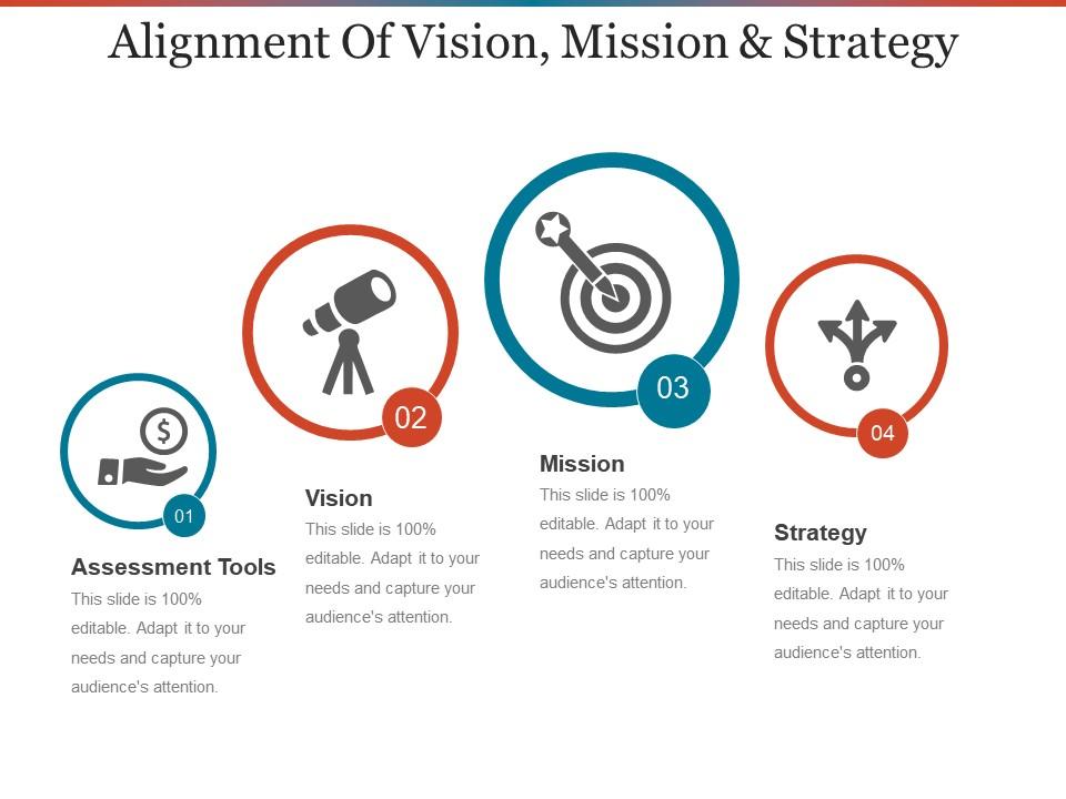
Alignment of vision mission and strategy powerpoint show

Rating:
90%
Alignment of vision mission and strategy powerpoint show
Slide 1 of 5
Favourites Favourites

Try Before you Buy Download Free Sample Product

Audience Impress Your
Audience
Editable 100%
Editable
Time Save Hours
of Time
The Biggest Sale is ending soon in
0
0
:
0
0
:
0
0
Rating:
90%
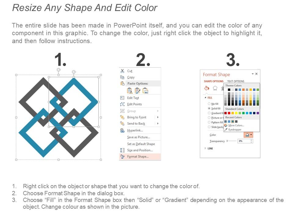
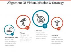
Presenting a slide named Alignment of vision mission and strategy Powerpoint show. Individualize the slide and give it the look as you want. Quality content can be added anywhere in the slide. Easily change colors, text, fonts and backgrounds. The slide is convertible in PDF or JPG formats. Customize the shape, size or color of the icon. It’s compatibility with Google Slides make it available anywhere .You can easily add or remove the icons in the slide to make it more impactful. This PPT slide is available both in standard screen size and wide screen size. Edit the slide according to your desirability. Download this icon and save your time.

FAQs for Alignment of vision mission and

Okay so there are three main things to focus on: visual consistency, content hierarchy, and knowing your audience. Everything needs to line up properly - your text, images, bullets should all follow invisible grid lines. Most people totally bomb the hierarchy part because they just throw everything on there at once instead of going from main points to details. Also, talk about what your audience actually wants to hear, not whatever you think sounds smart. Oh and definitely use those slide master templates and alignment guides - honestly they're lifesavers and make everything look way more professional without extra work.

Honestly, good alignment is like having a clean room - your brain just processes things better when stuff isn't all over the place. When text and images line up properly, people's eyes flow naturally through your content. But when things are wonky? Total distraction. I remember this one presentation where the alignment was so bad I spent the whole time staring at how crooked everything looked instead of listening. Super annoying! The fix is pretty simple though - stick to consistent margins and use grid systems. Makes everything look way more polished without much effort.

Look, alignment just means your slides actually connect to each other instead of being random thoughts thrown together. Each point should build on the last one so people can follow along without their brain hurting. I've seen too many presentations where slide 7 has nothing to do with slide 3 - it's like presentation whiplash honestly. Your story needs to flow smoothly, whether you're going problem-to-solution or whatever structure works. Quick test: read just your slide titles in order. Do they tell a coherent story by themselves? If not, you've got some rearranging to do.

Dude, when your slides are all misaligned it just screams "I threw this together last minute." Your audience's eyes don't know where to look first - super distracting. People's brains crave order, so wonky alignment actually pulls focus from whatever you're trying to say. Plus it kills your credibility before you even open your mouth. Nobody wants to squint at chaotic slides trying to figure out what goes where. Honestly, this is such an easy fix though - just use those alignment tools in PowerPoint or whatever you're using to snap everything into neat rows.

Left-align your text - way easier to read than centered stuff. Images should match whatever alignment you pick throughout the whole deck. Don't just throw images anywhere though! Make them feel purposeful. Timeline or process slides work best when everything flows left to right visually. Oh, and leave breathing room around everything - cramped slides look awful. One thing that really helps: use those built-in guides in your slide master. Keeps everything lined up perfectly without you having to eyeball it every time. Trust me, it's a game changer.

So for corporate stuff, just stick with left-aligned text and center your headings. Executives love that predictable, clean look. But creative presentations? Way different story - you can actually use alignment as part of your design. Right-align things, go asymmetrical, scatter text around if it makes sense. Here's the thing though: corporate people want to scan info quickly and hate surprises. Creative audiences are the opposite - they'll appreciate when your alignment choices actually add to your message. Oh, and don't overthink it. Match what your audience expects, but if you're doing something creative, breaking the rules on purpose can work really well.

Dude, alignment is seriously a game-changer for making slides look professional. Like, people can't always tell what's wrong with messy presentations, but they definitely notice something's off. When your text and images line up properly, it just flows better - your audience can actually follow what you're saying instead of getting distracted. I used to eyeball everything and wonder why my slides looked amateur. Then I started using the alignment tools and gridlines in PowerPoint (or whatever you're using) and wow, such a difference. Takes like 2 seconds but makes you look way more put-together.

Oh dude, just use the alignment tools! Way easier than trying to eyeball everything. Select all your objects and hit those alignment buttons in the toolbar - works in PowerPoint, Google Slides, whatever you're using. Turn on gridlines too, they'll snap things into place automatically as you drag stuff around. Those smart guides that pop up are clutch for centering things perfectly. Honestly I used to spend forever moving things pixel by pixel like an idiot. Now I just select everything and let the software do the work.

Dude, this stuff actually matters way more than you'd think. Western audiences expect left-aligned text since that's how we read, but if you're presenting to Arabic or Hebrew speakers, it feels totally backwards to them. Asian cultures often dig centered layouts - something about balance and harmony. Americans are pretty straightforward with clean left alignment. Oh, and spacing is weird too - what looks organized to some feels cramped to others. Honestly, I'd just ask someone local to glance at your slides before you present. They'll catch stuff you'd never think of.

Good alignment helps people actually remember your stuff because their brain isn't working overtime trying to figure out what they're looking at. It's like - you know when someone's PowerPoint is all over the place and you can't focus on what they're saying? Same deal here. Your audience gets to think about your message instead of decoding messy layout. Honestly, most people don't realize how much bad alignment messes with comprehension. Just stick to left-aligning your text and keep spacing consistent. Makes a huge difference in how well people retain information.

Here's what works for me - mess with your alignment on purpose to create a focal point. So if everything's lined up left or center, throw your main headline or CTA somewhere unexpected. It's like that one crooked picture that you can't stop staring at, you know? You could also mix styles on the same slide. Center your title, then left-align everything else underneath. The contrast pulls people's eyes exactly where you want them. Just don't make it look like an accident - that's when it gets messy instead of intentional.

First thing - get everyone in a room (or Zoom) beforehand to nail down your key points and who's saying what. Make a shared outline because nothing's worse than that awkward pause when two people start talking at once. Use the same fonts and colors so it doesn't look like a patchwork quilt. Plan your transitions ahead of time - maybe a nod or "Sarah's gonna walk you through the numbers now." Honestly, someone will probably go rogue and ramble, so just roll with it and bridge back to your main points. Keep a Google doc open during the presentation so you can make quick adjustments if things go sideways.

Oh man, this drives me crazy too! Your grid can be mathematically perfect but still look wonky because of visual weight. Bold text feels heavier and throws off balance, while light colors seem to just drift around looking misaligned. I swear I've wasted hours micro-adjusting stuff that was already positioned correctly. Font sizes mess with your perception too – bigger text pulls your eye more than smaller stuff. Sometimes you gotta ignore the rulers and trust what looks right. Make tiny tweaks based on how heavy things feel visually, not just where the guidelines say they should go.

Honestly, the worst thing you can do is mix alignments all over the place. I see people center their title, left-align the bullet points, then randomly center a quote - it's chaos. Also, never center big chunks of text because your eyes get lost trying to find where each line starts. Super annoying to read. Just pick one alignment and stick with it throughout your whole deck. Left-align is usually your best bet for readability. The only stuff worth centering? Short things like titles or maybe a punchy quote, but that's it.

Honestly, online presentations are brutal because everyone's just staring at their laptop getting distracted by notifications. Your slides have to work way harder - I'm talking bold text, super clear formatting, the whole nine yards. You can't rely on walking around or hand gestures like you would in person. The screen is basically doing all the work for you. Oh, and definitely test it on whatever platform you're using first! I learned this the hard way when my carefully aligned slides looked like garbage on Zoom. Different screen sizes will mess with your formatting if you're not careful.

Ratings and Reviews

90% of 100
Review Form
Write a review
Most Relevant Reviews
  1. 100%

    by Edmund Ortega

    Informative design.
  2. 80%

    by Dick Ryan

    Editable templates with innovative design and color combination.

2 Item(s)

per page: