


As is to be template ppt icon




Try Before you Buy Download Free Sample Product
 Impress Your
 Audience
 100%
100% Editable
 Save Hours
 of Time


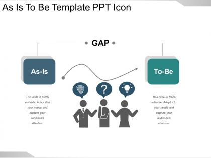
We have created this as is to be template PPT icon slide to enable you and your business to analyze the current state of your business operation and clarify how the same works at the same time organize your goals and targets an align them in order to reach the future that is desired by the business. As is to be PowerPoint icon slide template shows you current state (as is) of the business project on the left side, wherein you may feed your business' data as per your needs and current status. Then, the PPT shows the future or the desired state (to be) of the business on the right side. The gap between the two sides signifies the new techniques, strategies, policies and important procedures to be implemented and followed to be able to reach the desired or the to state. The slide can be edited as per your company's data. Get included in the campaign with our As Is To Be Template Ppt Icon. Be able to join the cause.
People who downloaded this PowerPoint presentation also viewed the following :
As is to be template ppt icon with all 5 slides:
Our As Is To Be Template Ppt Icon avoid all gibberish. They contain essential aspects.
FAQs for As is to be
You'll want three core sections: where you are now ("As Is"), where you want to be ("To Be"), and what's missing between them. Start with documenting your current mess - processes, problems, actual numbers. Don't sugarcoat it. Then map out your ideal future state with real metrics you can track. The gap analysis shows what needs fixing to bridge that divide. Oh, and add timeline + ownership columns or this thing will just collect digital dust. Seriously, I've seen so many of these die in forgotten folders. Most people skip the current state details and regret it later.
So these "As Is To Be" templates are actually pretty solid for mapping out where you're at now vs where you want to end up. Start with the "as is" side - and don't sugarcoat anything, be real about what's broken. Then work backwards from your dream scenario on the "to be" side. Honestly, the visual aspect is what makes them work so well. Gets everyone on the same page instead of having those endless meetings where nobody agrees on the problem. Plus you can actually track if you're making progress or just spinning your wheels. They're basically forcing you to think through the whole mess in a structured way, which... yeah, that's usually half the battle.
Manufacturing and healthcare companies get crazy good results from As Is To Be templates - basically because they're drowning in regulations and need to document everything anyway. Financial services too, obviously. IT consultants are obsessed with them since they're always trying to fix their clients' messy operations. Honestly though, any company dealing with compliance nightmares should try this approach. The whole point is mapping your current disaster of a process against what you actually want it to look like. Pick your most annoying workflow first - you'll see results fast and then people will actually want to use it elsewhere.
Honestly, these "As Is To Be" templates are game-changers because you literally see your current situation right next to where you want to end up. No more juggling everything in your head. The visual comparison makes gaps super obvious - like you'll immediately spot what's broken or missing. Way better than those vague strategy docs that go nowhere. You're forced to get specific about both sides too, which is half the battle. I'd definitely try one for your next project - you'll probably find issues you didn't even realize were there. It's basically a reality check in template form.
Don't get sucked into documenting every little detail in your "As Is" - seriously, you'll be there forever. Focus on the actual pain points that matter. And yeah, I know it's uncomfortable, but don't sugarcoat how broken things are right now. Your "To Be" vision needs real numbers and specific outcomes, not fluffy stuff like "we'll be more efficient." Most people totally skip the roadmap part though - like, how do you actually get there? That's the whole point. Oh, and tackle your worst problems first. Keep each section tight and decision-focused.
Get everyone together - doesn't matter if it's in person or on Zoom. Walk through your "As Is" stuff first and let people poke holes in it. They'll spot things you totally missed, plus it gets them bought in. Once they agree on where you're starting from, showing the "To Be" vision hits different because now they can actually see the gap. Trust me, this saves you from those annoying "wait, that's not how we do things" conversations later. Oh, and write down when people disagree or you're making assumptions - that stuff matters. The whole point is making sure everyone gets what needs to change.
Moving your templates to digital platforms like Miro totally changes the game. Everyone can jump in at once instead of that annoying back-and-forth email thing. Interactive stuff - clickable flows, embedded videos - actually keeps people awake during reviews. Live data integration is huge too since it stops your "current state" from being three months old (been there). The automation piece is honestly my favorite part - stakeholders get pinged automatically when things change. Oh, and Lucidchart works great too if you're more into structured diagrams. Just pick one platform and migrate your next template. You'll see the difference right away.
Look, stakeholder feedback is what makes these templates actually work instead of just sitting in a folder somewhere. Without their input, you're basically guessing about the current state and dreaming up some future that might be totally unrealistic. These people deal with the day-to-day stuff, so they'll catch things you missed and tell you if your timeline is nuts. Plus - and this is huge - they need to actually support the changes or you're screwed. Get their thoughts early and often, not just when everything's already locked down. Trust me, it's way better than finding out later that your brilliant plan has major blind spots.
Absolutely! Netflix did this when they switched from mailing DVDs to streaming - mapped out all their distribution centers and mail stuff as the "current state," then designed the whole digital delivery system as their "future state." Toyota's another classic example during their lean manufacturing overhaul. They documented how messy their assembly lines were, then compared it to the optimized workflows they wanted. Honestly, I've seen it work on smaller stuff too. Our marketing team was drowning in social media chaos, so they mapped that disaster against a clean content calendar system. The trick is don't sugarcoat how broken things are right now - then get super specific about what "better" actually looks like with real metrics.
Split your "As Is" and "To Be" sections with contrasting colors or a thick line down the middle. Makes the difference super obvious. Arrows showing the transformation help too. Bullet points over paragraphs - way easier to scan. I swear, some templates look like newspaper articles when they should be more visual. Icons work great for quick concepts. Don't cram everything together though. White space is your friend. Two columns is usually the sweet spot to start with, then you can get fancier later.
Honestly, these "As Is To Be" templates are game changers for getting everyone aligned fast. You literally put the current mess next to your dream scenario - way better than trying to explain it all in some rambling email (we've all been there). Your team can actually see what you're talking about instead of guessing. The side-by-side thing forces you to get specific about problems AND solutions, which cuts way down on those annoying clarification chains. I'd totally use one at your next project kickoff. Trust me, stakeholders love when they can visualize the goal from day one.
First thing - map out exactly what's happening now, not what some old manual says should happen. Talk to people actually doing the work and watch them. I know it sounds obvious, but you'd be surprised how many people skip this step. Get real numbers on timing and costs. Document the weird workarounds everyone uses but pretends don't exist. Don't pretty it up for presentations either. You want the messy truth about bottlenecks, systems, and those random processes that somehow became "the way we do things." Brutal honesty beats polished lies every time.
Set up KPIs that directly connect your current state to where you want to be. I'd track both hard numbers (process time, error rates, cost savings) plus softer stuff through employee surveys. Honestly, the biggest mistake is only measuring at the end - check progress at milestones throughout. We learned that one the hard way on a project last year. Build your measurement plan right into the template from day one. Define what success actually looks like upfront. Oh, and don't forget the "before" baseline - sounds obvious but you'd be surprised how often people skip that step.
Lean Six Sigma pairs really well with those templates - great for spotting waste visually. Agile teams use them constantly since they show progress super clearly. I'm a huge fan of combining them with change management stuff like ADKAR because you get both the process AND people angles covered. Business process reengineering is obvious but works perfectly. Oh, and root cause analysis feeds right into your "as is" state - I probably should've mentioned that first. Honestly though? Just pick whatever methodology you already know and throw the template on top. Don't overcomplicate it.
Oh man, this is such a real thing! Your team members will see problems totally differently based on their backgrounds. Like, some cultures think hierarchy issues are just how things work, while others see them as major roadblocks. Success means different stuff too - individual wins versus team achievements, you know? Risk tolerance is another big one that'll surprise you. I'd say get everyone talking about both where you are now and where you want to be. The trick is finding that sweet spot where different viewpoints actually work together instead of clashing.
-
Professional and unique presentations.
-
Much better than the original! Thanks for the quick turnaround.