


Target ppt icon good





Try Before you Buy Download Free Sample Product
 Impress Your
 Audience
 100%
100% Editable
 Save Hours
 of Time


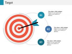
Advertise the jobs with our Target Ppt Icon Good. Display information about the criteria.
People who downloaded this PowerPoint presentation also viewed the following :
Target ppt icon good with all 5 slides:
Develop their intellect with our Target Ppt Icon Good. Acquaint them with good exercises for the brain.
FAQs for Target
Honestly, just go super simple with your Target PPT icon. Bold lines, high contrast - stuff that'll still look good when it's shrunk down to nothing. Most people mess this up by adding too much detail. Stick with 2-3 colors tops. I learned this the hard way when my "amazing" design turned into a blob at small sizes lol. Test it at different dimensions before you call it done. Something that looks killer at 500px might be totally unreadable at 32px. Oh, and make sure it still fits your brand but doesn't look boring.
Dude, icon colors totally make or break how people see your presentation. Red screams "pay attention!" and feels urgent. Blue comes across professional and trustworthy. Green says success or growth. But here's the thing - most people just pick whatever PowerPoint throws at them first, which is kinda lazy honestly. Your colors need to match your overall vibe and what you're actually saying on each slide. Oh, and definitely check how they look from across the room because sometimes what looks great up close turns into a blurry mess from the back.
Honestly, everyone's doing super clean minimalist target icons right now. Flat design is everywhere - simple bullseyes in corporate blues and greens, plus that coral shade that's weirdly popular. Those chunky 3D effects? Dead. Thin outlines and negative space are where it's at, especially stuff that plays nice with charts and data viz. Oh, and here's something I learned the hard way - go monochrome first, then you can recolor however you want later. Way easier when your boss inevitably asks you to match the rebrand colors at the last minute.
So target icons are basically like visual breadcrumbs for your presentation - they show people exactly where to look instead of drowning them in boring bullet points. Each target becomes a milestone or challenge in whatever story you're telling. People instantly get what a bullseye means, so you don't have to explain anything. I'd drop them at major turning points or when you're introducing new goals. Honestly, they're way more engaging than just talking at people. Plus they create this nice flow that keeps everyone following along instead of zoning out halfway through.
Oh man, biggest thing? Don't overcomplicate them. Target's whole vibe is clean and simple, so stick to their red/white colors and avoid cramming in tons of detail. I learned this the hard way - made these super intricate icons once and they looked like blobs when projected. Make them big enough so people in the back can actually see what they are. Also, contrast is huge! Nothing worse than icons that just vanish against a busy background. Keep the style consistent throughout your deck and honestly? Test them at actual presentation size first. Trust me on that one.
Oh this is actually pretty easy! Right-click any icon and hit "format" - that's where all the good stuff is. Change colors, outlines, effects, whatever matches your brand. Resize them but keep proportions intact or they'll look weird. Once you get one icon looking perfect, copy those exact settings to the others. Trust me, consistency is everything here. Also - and this might save you tons of time later - save your formatted icons as templates. I learned this the hard way after redoing the same formatting like five times. Way easier to just reuse what you've already perfected.
Honestly, I'd start by looking at what your team already likes visually. Target people are super used to that clean, red-branded look - so lean into minimalist vibes. Everyone's drowning in PowerPoints anyway, so they'll love icons that actually make sense at first glance. Oh and those conference rooms are always weirdly dark, right? Test your icons for people who might struggle to see smaller details. Some folks present on tiny laptop screens while others get the massive wall displays. I'd definitely run a few versions by real users first - way better than guessing what works and then having to redo everything later.
Those animated target icons are actually pretty solid for presentations. Your audience will stop scrolling through their phones when a target does that smooth zoom-in thing. I've watched people literally sit up straighter when the animation hits. Super useful for quarterly goals or when you're revealing big metrics. The movement just draws your eye naturally - way better than static slides. Don't spam them though or you'll annoy everyone. Oh, and they work great for any "hitting our objectives" type moments. Sometimes the cheesy animations are exactly what you need to wake people up.
Honestly, I'd just check PowerPoint's built-in icons first - they're way better than they used to be. If those don't work, Adobe Illustrator is your best bet for custom stuff since it keeps everything crisp when you resize. Canva's pretty user-friendly if you don't want to mess with Illustrator's learning curve. Oh, and Figma's great too, especially if you're working with other people since it's all online. I probably spend too much time tweaking icons in Illustrator, but it's worth it if you need something specific.
Tons of industries throw target icons into their presentations to show what they're aiming for. Healthcare uses them for patient outcomes, tech companies are obsessed with user acquisition targets - seriously, every startup deck has like five of them. Financial companies show revenue goals, manufacturing highlights production numbers or safety stuff. The cool thing is everyone gets what a target means, no matter where they're from. Oh, and definitely add actual numbers or dates to yours - makes the whole slide way more convincing than just having a random bullseye sitting there.
Totally! Bullseyes and crosshairs are perfect for sales decks. Marketing teams always throw them next to their main objectives. Arrow-target combos work great too - product managers are obsessed with using them for feature priorities. Dashboard presentations love target icons in KPI sections. The simple ones beat fancy animated stuff every time, trust me on that. Oh and make sure the style matches your other icons or it'll look weird. Sometimes I see people go overboard with the design when clean and basic would've been way more effective.
Keep your Target PPT icons super simple - trust me on this one. Your audience shouldn't have to squint and figure out what the hell you're trying to show them. Clean designs with basic shapes and maybe 2-3 colors max work way better than anything fancy. They'll actually be visible from the back row too, which... yeah, that matters more than you'd think. Simple stuff scales better when you resize slides anyway. Just pick one clear idea per icon and don't try cramming everything together. Less is definitely more here.
Yeah, icons can be tricky across cultures. That thumbs up you think is positive? Actually offensive in parts of the Middle East. Colors are weird too - red screams "danger" to us but means good luck in China. Religious symbols are obviously risky territory. Even arrows can confuse people who read right-to-left (didn't think of that one until recently). I'd run your slides by teammates from different backgrounds first. Or just play it safe with basic shapes and skip anything culturally loaded. Better boring than accidentally insulting half your audience, you know?
Just search "target icon" or "bullseye icon" - those work best. "Goal icon" is solid too. If you want something fancier, try "dartboard icon." Always add "vector" or "PNG" depending on what file type you need. "Achievement icon" sometimes gives good stuff, though it's kinda hit or miss. Don't bother with "business icons" because you'll get buried in random junk. Oh, and "objective icon" works decent too. Pro tip: combine terms like "target goal icon PPT" to get presentation-ready stuff right away. Saves you from scrolling through a million results.
Don't skip scalability for your PPT icons - it's honestly make or break. I've watched presentations get totally derailed by pixelated icons that looked terrible on the big screen. Design them as vectors first, then test at different sizes to make sure they stay readable. You'll thank me later when you don't have to recreate everything for mobile vs. desktop. Oh, and different platforms have weird DPI quirks, so scalable saves you tons of headache. Start big, then scale down to check if they still look good small.
-
Excellent template with unique design.
-
Very well designed and informative templates.