

Target ppt slide styles





Try Before you Buy Download Free Sample Product
 Impress Your
 Audience
 100%
100% Editable
 Save Hours
 of Time


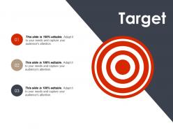
Showcase your ideas for reaching the goals and achieving the success using this Target PPT Slide Styles template. Create a professional presentation slide with ease and illustrate the different types of short term and long term goals of your business organization. Elucidate the entire procedure of setting targets and achieving the set targets with the assistance of this goals PowerPoint graphics. Explain the target setting process and the different entities that are involved in setting the goals. The readily available mission PPT template is of great use for the students, teachers, business managers, consultants, analysts and for professionals as well. Setting the targets will help you in making optimum utilization of resources and this can be easily depicted by employing our vision PowerPoint graphics. Create a list of your targets and present it in front of your viewers by downloading it with a mere click.
People who downloaded this PowerPoint presentation also viewed the following :
Target ppt slide styles with all 5 slides:
Include every angle in your assessment with our Target Ppt Slide Styles. Adopt an expansive approach.

FAQs for Target
So Target's pretty strict about their branding - stick with that red and white color scheme and clean fonts like Helvetica. Don't go crazy with text, maybe 3-5 bullets max per slide. Bold headers help people scan quickly. Honestly, the biggest mistake I see is people cramming way too much onto one slide. Give it some breathing room! Each slide should focus on just one main point. And if you're adding visuals, make sure they actually serve a purpose instead of just taking up space. Try to grab their official template first if you can.
Dude, color schemes will totally change how your Target presentation looks! Use their red strategically though - like for important stuff, not plastered everywhere. I made that mistake once and it was way too much. Stick with grays and whites mostly, maybe throw in one accent color if you want. Keep it consistent across slides or it'll look messy. Three colors max is usually the sweet spot. Oh and don't forget - the red should highlight your key points, not compete with them for attention.
Dude, font choice matters WAY more than people think for Target slides. Stick with their approved ones - Helvetica Neue or Arial work great. They're clean and won't make your content look amateur. Obviously avoid Comic Sans (I mean, come on). Make sure you're using different weights and sizes so there's clear hierarchy - people need to follow along easily. Oh and keep body text at 24pt minimum because the folks in back can't squint their way through tiny fonts. You want everything looking as sharp as Target's actual brand. Trust me on this one.
Grab Target's brand guidelines first - you'll need that signature red (
-
Much better than the original! Thanks for the quick turnaround.
-
Wonderful templates design to use in business meetings.