


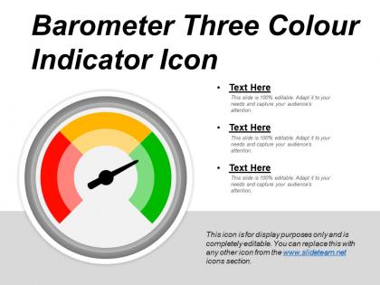
Barometer three colour indicator icon




Try Before you Buy Download Free Sample Product
 Impress Your
 Audience
 100%
100% Editable
 Save Hours
 of Time


Explain the benefits of joint accounts with our Barometer Three Colour Indicator Icon. Elaborate on banking issues.
People who downloaded this PowerPoint presentation also viewed the following :
Barometer three colour indicator icon with all 5 slides:
When you role the importance that presentations play in any successful business then you?d understand why having a powerful presentation is important. Our Barometer Three Colour Indicator Icon are there to help you produce powerful presentations.
FAQs for Barometer three
Oh, the barometer icon! Yeah, it's perfect for showing measurements or performance stuff in presentations. People instantly get that it means you're tracking something - no explanation needed. Super useful for dashboards, KPI slides, risk assessments, whatever. I see it everywhere in corporate decks honestly. Just make sure your audience knows what you're actually measuring since it's pretty vague on its own. Works great for showing if metrics are going up or down. It's one of those icons that just makes sense to people right away.
Barometer icons are perfect for this! Use different needle positions or colors - green for good trends, red for bad ones. Makes it super obvious at a glance whether things are going up or down. I always use these in quarterly reviews because people immediately get the direction without squinting at numbers. Just don't go crazy with tiny increments that nobody can actually see. Keep it clean and simple. Oh, and definitely put the actual numbers underneath too - some people want the exact figures even after they see the visual trend. Works every time.
So basically it's from those old mercury barometers - Torricelli invented them back in 1643. You know, the glass tubes where mercury goes up and down when air pressure changes? Early weather apps just copied what the actual thing looked like since everyone knew what barometers were. Makes sense, right? These things were in like every house for centuries, so when designers needed a pressure icon, they went with the familiar tube shape. Honestly, most apps still use that same vertical gauge look today. If you're making weather stuff, just stick with the classic design - people get it immediately.
Colors totally change how people read your barometer icon. Red usually screams high pressure or alerts. Blue feels more like low pressure/calm vibes. Green comes across neutral or "all good," and yellow's that cautionary middle ground. But honestly? Meteorological color standards are kinda all over the place, so don't get too creative or you'll just confuse people. Match whatever color system your app already uses for weather stuff. Test it with real users too - that's gonna tell you way more than guessing. Oh, and don't forget accessibility obviously. Some color combos are just impossible for certain people to distinguish.
Yeah, totally! Barometer icons work great for tons of stuff beyond weather. I've seen them on sales dashboards, customer satisfaction trackers - honestly pretty cool how the "pressure" thing translates to different metrics. People get it intuitively since everyone knows barometers show changes over time. Market pressure, team performance, whatever. Just don't forget to label things clearly or people might wonder why you're showing weather data on your quarterly report lol. The visual metaphor is solid as long as your audience understands what kind of "pressure" you're actually measuring.
Go with a simple circular gauge - the classic needle design works best. Make it big enough so people can actually see where the needle's pointing from the back row. High contrast colors are your friend here, especially against whatever background you're using. Honestly, skip the fancy gradients unless your whole presentation is super polished. Animation could be cool if you're showing pressure changes over time - just have the needle move between readings. Oh, and make sure it matches your overall design style or it'll stick out weird.
Animate that needle sweeping from low to high pressure - it's way more engaging than just showing static numbers. Try adding a subtle pulse around the dial when you hit critical thresholds too. Honestly, even boring weather data becomes interesting with the right animation. When you're presenting, sync the needle movement with whatever you're explaining. The visual really helps people follow along. Oh, and keep it smooth - nothing too flashy or people won't focus on what you're actually saying. I learned that the hard way last time I went overboard with effects.
Honestly, the worst thing you can do is confuse a barometer with a weather forecast icon - barometers just measure air pressure, they don't predict anything. Don't overcomplicate the design either. I've seen so many weather apps where they cram way too much detail into these tiny icons and it looks awful. Make sure it actually resembles a real barometer, not some random gauge you found online. Clean design works best here. Test it at different sizes too because what looks good big might be unreadable small. Oh, and clear pressure indicators are key - people need to instantly recognize what they're looking at.
Barometer icons are perfect for showing measurements or tracking things that change over time. Weather apps, dashboards, performance metrics - stuff like that. Most people instantly get the whole pressure/measurement thing, which is honestly pretty handy. They work great with color coding too (red for danger zones, green for all good). Use them for data that actually moves around, not static info. Short sentences hit different sometimes. Just double-check your audience knows what a barometer is - though if you're dealing with any kind of data visualization, they probably do. They're really solid for that quick "at a glance" understanding.
Dude, barometer icons are actually pretty genius for presentations. Way better than drowning people in bullet points about "high pressure situations" - just show them an actual pressure gauge instead. Your audience will get trends and status updates so much faster when they see a visual rather than random numbers. Different barometer positions work great for showing progress over time too, or you can line up several to compare metrics. The custom ones are nice because they match your brand colors and everything looks put-together. Honestly beats the hell out of boring charts. Makes abstract stuff like performance metrics or risk levels way more memorable.
Honestly, just start with Canva - their weather icon collection is pretty solid and way easier than starting from scratch. If you need something more custom that matches your brand, Illustrator's your best bet. But real talk, most people way overcomplicate this stuff when simple icons work just fine for presentations. You can also snag decent ones from Icon8 or Flaticon and drop them straight into PowerPoint. Figma's another good option if you're already using it for other design work. Don't stress too much about finding the "perfect" barometer icon - your audience won't notice those tiny details anyway.
Honestly, size matters way more than you'd think. Make it big enough so people in the back can actually see the needle and numbers - I'm talking at least 20% of your slide width if it's important data. Too many presentations have these tiny barometer icons that just disappear into everything else. But don't go crazy and make it dominate the whole slide either. Quick test: step back from your screen. Can you read it immediately? If not, bump it up. The worst thing is squinting audience members who've already tuned out because they can't see what you're showing them.
Definitely throw in the current pressure reading with units - inHg or hPa, whatever you prefer. Timestamp's crucial too, otherwise people are just looking at some random icon that could be from yesterday. Trend indicators are honestly the most useful part though - showing if pressure's rising, falling, or staying put. That's what actually helps with weather predictions. Short sentences work better for this stuff. Also think about adding location data if it's for a weather app, since pressure changes with altitude and geography. I learned that the hard way when I moved to Colorado! Main thing is users shouldn't have to guess what they're looking at.
The barometer thing actually works really well for this! Think of external pressures like weather - when pressure rises, you've got growing demand or good vibes coming. Drops mean trouble ahead. What's cool is you can track economic indicators, consumer confidence, even competitor moves as these "atmospheric changes." Just like real barometers predict storms before they hit, you can spin your analysis as early warning signals. Shows stakeholders why you're pivoting strategy before everyone else catches on. Honestly, it's way more intuitive than most business metaphors once people get it.
Barometers are all about precision and reliability - people see them and think "careful observation." That's why they pop up everywhere from weather apps to financial stuff. The whole measuring atmospheric pressure thing makes people feel prepared and informed, you know? Honestly, it's pretty clever symbolism. Short version: use barometer icons when you need to show accuracy or forecasting vibes. They're perfect for analytics tools or monitoring systems. Basically anywhere users need to trust the data they're seeing. Works every time.
-
Great product with effective design. Helped a lot in our corporate presentations. Easy to edit and stunning visuals.
-
Excellent work done on template design and graphics.