

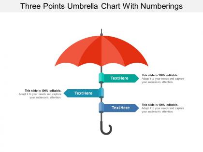
Three points umbrella chart with numberings




Try Before you Buy Download Free Sample Product
 Impress Your
 Audience
 100%
100% Editable
 Save Hours
 of Time


Our Three Points Umbrella Chart With Numberings don't allow flaws to enter. They clamp down on hard on errors.
People who downloaded this PowerPoint presentation also viewed the following :
Three points umbrella chart with numberings with all 5 slides:
Highlight your hard work by adding vibrant full color Three Points Umbrella Chart With Numberings to your presentations. We work hard to compliment your hard work.
FAQs for Three points umbrella
Honestly, most people screw up umbrella charts by duplicating config values everywhere - total pain to maintain. You'll want a clear hierarchy mapping your main dependencies first. Centralized config management is huge here. Keep your templates modular so they're actually reusable. Documentation matters too, even though it's boring to write. The whole thing should be simple enough that your team doesn't get lost trying to figure out what's running where. Oh, and consistent versioning across sub-charts - learned that one the hard way. Start by cleaning up whatever redundant stuff you've got now.
Honestly, umbrella charts are perfect when you've got a bunch of related data that all fits under one big theme. Like if you're showing how different departments add to company revenue - way cleaner than shoving everything into one chaotic mess. Each "spoke" becomes its own little story that people can actually follow. I'd start by grouping your data into logical chunks first. Then build each section as a mini-chart under your main concept. Your audience won't get lost trying to decode some overwhelming visualization, and you'll still show the complete picture without making their eyes glaze over.
Honestly, umbrella charts are perfect for when you've got a bunch of microservices that need similar configs but with tweaks for each one. Super useful once you hit like 3-4+ related services. The biggest win? No more copy-paste nightmare across different Helm charts - I've been there and it sucks. When you need to push out global updates like new security policies, you just change the umbrella chart once instead of tracking down every individual chart. My team uses them for our monitoring configs and it's saved us so much headache. Basically they're templates that keep everything consistent.
Don't try cramming too many sub-charts into one umbrella chart - it becomes a nightmare to manage. Inconsistent naming across dependencies will bite you later when you're debugging at 2am. Also, watch out for duplicate values between your umbrella and sub-charts because the override conflicts get weird fast. I learned this the hard way honestly. Pin your sub-chart versions to something specific instead of "latest" or you'll randomly break deployments. Test your overrides thoroughly. Always validate those final rendered templates before hitting deploy - saves you from some really embarrassing rollbacks.
Honestly, the colors you pick can totally make or break how readable your chart is. High contrast between segments is key - otherwise people can't tell your data layers apart. I usually go with darker shades for main categories, then lighter ones for the subcategories underneath. Skip anything too bright or busy though, that stuff just hurts to look at. Your theme needs to support what the data's saying, not fight against it. Oh, and here's a good test - step back a few feet from your screen. Can't read it clearly? Then nobody else will be able to either.
Include your main metric and break it down by sub-components - like revenue by product line or traffic by channel. Clear time periods are key too. Label everything super clearly because these charts get confusing quick if people can't tell what they're looking at. I always add percentages next to the raw numbers since stakeholders want both the big picture and what matters most. Honestly, if someone stares at your chart for more than 30 seconds trying to figure it out, you probably need better labels or simpler categories.
Honestly, umbrella charts are perfect for this stuff. You can group all your related data together instead of flipping between like 5 different charts. Makes spotting trends so much easier - especially when everything dips at once or starts climbing together. I've caught correlations I totally would've missed otherwise. The unified view just makes patterns jump out at you, you know? Plus it's way faster for analyzing KPIs that are connected. Actually saved me a ton of time last quarter when I was trying to figure out what was causing our weird metrics.
Lucidchart and Visio are your best bets - they've got templates specifically for org charts that'll save you hours. PowerPoint works too if you're already used to it, though it gets annoying with really complex stuff. I've actually seen some surprisingly good ones made in Canva if you want something that looks less corporate-y. SmartDraw's pretty nice too, drag-and-drop makes everything way easier. But honestly? Just use whatever your team already knows. You'll waste more time figuring out new software than it's worth, especially if you're on a tight deadline.
Oh totally, umbrella charts are clutch for marketing presentations! Perfect for showing how all your different campaigns and product lines tie back to your main brand strategy. Executives eat that stuff up - they love seeing the whole picture at once. I'd use them when you're presenting how various initiatives support your big goals, or for comprehensive campaigns with multiple touchpoints. One thing though - don't jam too much in there. Stick to maybe 4-6 branches tops or people's eyes will just glaze over. Trust me on that one.
So umbrella charts basically let you group your strategies under bigger themes - like a visual decision tree but cleaner. When you've got way too many ideas floating around (which happens to all of us), these charts help you spot what's overlapping or missing. I actually love how they force you to think top-down instead of getting stuck in random details. You can see dependencies between different paths super clearly. Just start by dumping your current strategies into broad categories - you'll be shocked at what gaps pop up immediately. Makes prioritizing your resources so much less painful.
Honestly, umbrella charts are perfect for when you've got hierarchical stuff going on. Bar charts just show basic comparisons, but umbrella charts actually let you see how the small pieces fit into the bigger picture. Like, you can visualize budget breakdowns or org structures where everything connects to something else. I used to stick with bar charts for everything - probably out of habit more than anything - but once you try umbrella charts for layered data, regular bars feel pretty flat. Your audience will get those part-to-whole relationships way faster. Definitely worth switching over next time you're presenting complex data structures.
Yeah, so most charting tools these days let you swap out the default colors for your brand palette - which honestly saves so much time. You can change fonts to match your corporate style, mess with grid lines, backgrounds, all that stuff. I'd start by making a template with your brand specs first. That way you're not redoing the same formatting decisions over and over. Throw your logo on there, adjust spacing how you want it. The styling options are actually pretty solid now. Just make sure everything flows together visually and matches your brand standards.
Annotations are like captions for your data - they explain what's actually happening so people aren't just staring at random spikes going "huh?" Definitely use them for outliers or weird drops that need context. You can highlight key points or explain sudden changes that would confuse viewers otherwise. Main categories should be labeled clearly too. Honestly, most people won't dig deep into charts on their own, so annotations guide them to the important stuff. It's the difference between showing data and actually telling a story with it. Makes everything way more digestible.
Honestly, healthcare and manufacturing are sleeping on umbrella charts big time. Patient care pathways? Multi-stage production stuff? Perfect for umbrella visualization but everyone just sticks with those same old flowcharts. Like, why though? Umbrella charts actually show dependencies way clearer. Financial services could totally use them for risk frameworks too - I saw this one bank presentation last month that was so confusing with their traditional charts. If you're in any of these fields, just switching your visualization style would probably blow people's minds. Easy win.
Honestly, bar charts are probably your best bet - I use that combo constantly because you get the breakdown AND the totals. Line graphs work really well too if you're showing trends over time. Heat maps are solid for geographic stuff, though that might be overkill depending on your data. You could even throw tiny pie charts inside each umbrella section, but that gets messy fast. Oh, and don't go crazy with multiple chart types right away - pick one extra visualization first and see what patterns pop up. The main thing is making sure they actually complement each other instead of just cluttering everything up.
-
Great product with effective design. Helped a lot in our corporate presentations. Easy to edit and stunning visuals.
-
Great product with effective design. Helped a lot in our corporate presentations. Easy to edit and stunning visuals.