


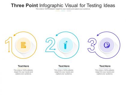
Three point visual for testing ideas infographic template




Try Before you Buy Download Free Sample Product
 Impress Your
 Audience
 100%
100% Editable
 Save Hours
 of Time


Our Three Point Visual For Testing Ideas Infographic Template are topically designed to provide an attractive backdrop to any subject. Use them to look like a presentation pro.
People who downloaded this PowerPoint presentation also viewed the following :
Three point visual for testing ideas infographic template with all 2 slides:
Use our Three Point Visual For Testing Ideas Infographic Template to effectively help you save your valuable time. They are readymade to fit into any presentation structure.
FAQs for Three point visual for testing
Honestly, three points just works better than cramming everything in. Your brain loves that "rule of three" thing - it's way easier to remember. Plus you're forced to pick your best stuff instead of throwing in every random thought (guilty as charged lol). The whole visual format thing? Game changer. People actually stay awake instead of zoning out during bullet point hell. I'd grab your three strongest ideas first, then build everything else around those. Trust me, you'll notice people actually listening for once instead of checking their phones.
Honestly, breaking stuff into three points just works better. Your brain processes it easier, and people actually remember what you said instead of spacing out halfway through. The rule of three is like this weird psychological thing - feels complete but not overwhelming, you know? Each point needs its own visual though, maybe different colors or icons. Makes it look way more professional. I always use those natural breaks between points to let people absorb what I just said. Works for different learning styles too - some people need to see it, others just listen. Way better than watching everyone's eyes glaze over during a massive info dump.
Three-point formats are great when stuff naturally falls into three buckets - like problem/solution/result or past/present/future. Perfect for step-by-step processes too. Honestly? Three just hits different than other numbers. Not too much info to overwhelm people, but enough to feel complete. I use them all the time for survey findings, comparing competitors, or breaking down complicated topics into digestible chunks. The key thing is making sure your three points are actually distinct and carry equal weight. Otherwise it feels super forced and awkward. Also works well for those before/during/after scenarios if you're explaining how something unfolds over time.
Honestly, the three-point thing is a game changer because it makes you cut out all the random stuff nobody cares about. You'll have to pick your top three points and toss the rest - which sounds brutal but it's actually pretty freeing. Your brain dump everything first, then get ruthless with the editing. People follow along way better when they're not drowning in details. Short chunks just stick better in your head, you know? Plus it creates this natural flow where each point builds on the last one. I used to try cramming everything in and it was a mess.
Start with visual hierarchy - make sure all three points look equally important so nothing gets buried. Same icons, colors, spacing between sections. Keep your headers consistent and body text easy to read. Honestly, white space is where I always screw up at first. Don't jam everything together! Think about how people's eyes will move - left to right, top to bottom, whatever works. The goal is someone can glance at it for like 10 seconds and still get your main point. Show it to a friend quickly and see what sticks. That'll tell you everything.
Oh definitely match your colors to the vibe you want! Blue works great for trustworthy stuff, red grabs attention for urgent points, green's perfect for growth/success vibes. People pick up on these associations without even thinking about it. Just make sure they actually look good together - I've seen some truly terrible color combos that made my eyes hurt lol. The whole thing falls apart if your colors are fighting each other. Honestly, run it by someone else first. What feels obvious to you might totally miss the mark for them. Quick gut check saves you from looking silly later.
Honestly, the biggest thing that kills these is when people make their three sections totally uneven - like one tiny box and two massive ones. Looks super weird. Keep each section roughly the same size. Also, way too much text! People just scan these things, so don't write paragraphs. Colors are another trap - I've seen some truly hideous combos. Stick to 2-3 colors that actually work together. Same with fonts - pick one and stick with it. Oh and leave some breathing room with white space. Trust me on this one. Sketch it out first before you start designing, saves tons of headache later.
Make sure your three points have the same weight - don't go super detailed on one and barely explain another. I'd organize them in whatever order makes sense: chronologically, by importance, or problem then solution. The visual flow matters too. Use matching colors and fonts so people's eyes move naturally from 1 to 2 to 3. Here's a quick test: show it to someone for just 10 seconds. Can they get your main point plus the three supports? If not, you're probably overcomplicating it. Oh, and don't let that third point become an afterthought - I see that mistake constantly!
Honestly, just use Canva - their templates are pretty solid and you can whip something up fast. Yeah, Illustrator gives you way more control but unless you're already decent at design, it's probably too much. Figma's good too, especially if you need to share it with other people since it's all online. Oh and don't sleep on PowerPoint! I know it sounds basic but it actually works great for simple stuff like this. I'd mess around with Canva's free version first though - might be all you need without spending money.
Here's how I'd track if your infographic actually works: Watch engagement stuff like how long people look at it and if they're sharing it around. Heat maps are honestly pretty cool for this - shows you exactly where people's eyes go first. Test if they actually got it by asking viewers to remember your three main points afterwards. Maybe run some A/B tests too, comparing your design against other formats. Oh and feedback surveys help, though people don't always fill those out. The trick is measuring both the attention-grabbing part AND whether they understood anything, not just if it looks nice.
Honestly, three-point infographics are my go-to when info gets messy. Perfect for breaking down processes like "Plan → Execute → Measure" or comparing options. People's brains just handle three things really well - no decision fatigue, you know? I probably overuse them but whatever, they work. Great for highlighting your top benefits, features, steps, literally anything. Plus they look clean without being overwhelming. Oh, and they're solid for explaining sequences too. Next time you're drowning in complex stuff, just try grouping it into threes. Works way better than you'd think.
So basically, when you make those three-point infographics, storytelling is what makes people actually care. Instead of random facts, you're guiding them through like beginning-middle-end. Problem-solution-result works great, or past-present-future – you know the drill. Your brain remembers stories way better than bullet points anyway. Makes complicated stuff feel less overwhelming too. I mean, nobody wants to stare at dry data points. When you're making one, just think: what story are these three things telling together? Trust me, it'll make your infographic way more engaging.
Buffer's "3 Ways to Boost Social Media Engagement" is pretty solid, and HubSpot does those problem-solution-result templates really well. But honestly? Airbnb crushed it with their "Plan, Book, Stay" travel thing - I swear I see it on Pinterest constantly. The CDC nailed the healthcare angle too with "Stop, Cover, Throw" for flu season. What works is the visual flow - your eye just moves naturally from point to point with good icons backing up the message. Oh, and Canva's got tons of templates you can totally rip off for layouts.
So basically match your audience - bright colors and casual talk for younger crowds, but keep it muted and professional for work settings. Executives just want the big picture stuff while tech people need all the nitty-gritty details. Font choice is weirdly important too (I learned this the hard way). Your main three points should stay the same, just change how you present them. Oh and if it's international, think about cultural differences. Definitely run it by a few people from your target group first - way better than bombing in the actual presentation!
Honestly, if three points isn't cutting it, there's tons of other ways to organize stuff. Five-point layouts work awesome for complicated topics. Two columns are perfect when you're comparing things side by side. Timeline formats are seriously underrated – they're so clear for step-by-step processes or anything chronological. Pyramid structures make sense for hierarchical info, and circular diagrams work well if your content loops back on itself. I always think about how people naturally process the topic first, then choose whatever layout clicks. List your main points out, then see which format feels most logical. Sometimes the weirdest structure ends up being the clearest one.
-
Unique design & color.
-
Great product with highly impressive and engaging designs.
-
Professional and unique presentations.
-
Perfect template with attractive color combination.
-
Best way of representation of the topic.
-
Perfect template with attractive color combination.
-
Perfect template with attractive color combination.