

Basic three concepts ppt slides download




Try Before you Buy Download Free Sample Product
 Impress Your
 Audience
 100%
100% Editable
 Save Hours
 of Time


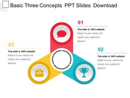
Convey your message with an impact using our template Basic Three Concepts PPT Slides Download. Say goodbye to cliché bullet points. Grab this simple yet powerful slide design created by SlideTeam professionals and explain the three important concepts steps, tasks, roles, processes, and more.The template has a creative infographic which shows the 3 concepts in a form of a clipart. Every concept merges into center pointing to a common goal and objective. This colorful yet neat diagram makes the presentation looks elegant and powerful. So, represent any three business concepts using this presentation template and impress the audience. You can add your text in the placeholders, change the font and colors to suit your branding requirements. This creative presentation layout can be used by professionals of any industry, be it sales, consulting, marketing, automotive, law, education, etc. A professional PowerPoint template is a great time saver for professionals across industry verticals so use our presentation template and take your business to the next level. Benefit from a good call with our Basic Three Concepts Ppt Slides Download. The impact will confirm the correctness of your choice.
People who downloaded this PowerPoint presentation also viewed the following :
Basic three concepts ppt slides download with all 5 slides:
Let the audience enjoy a frolic with our Basic Three Concepts Ppt Slides Download. They will feel absolutely entertained.
FAQs for Basic three concepts
Start with a clear title and simple definition - nothing fancy. Then add 2-3 key points about what makes it tick. Real-world examples are clutch here (honestly, this is where most people bomb by getting too textbook-y). Visuals beat text walls every time - icons, diagrams, whatever works. Keep bullets short and formatting consistent. I always end with "why should you care?" because otherwise people zone out. Oh, and once you've got this template down, you can basically copy-paste the structure for any concept. Makes life so much easier.
Honestly, visuals are game-changers for making confusing stuff actually make sense. People need something concrete to latch onto - our brains just work better that way. Flowcharts for step-by-step processes, simple icons for different categories, that kind of thing. Nobody wants to stare at a wall of text (learned that the hard way in college). The trick is keeping it simple though. Don't overcomplicate with fancy graphics that confuse more than they help. Just pick your most confusing concept and find one clear visual that breaks it into bite-sized pieces. Trust me, your audience will thank you.
Stick to one concept per slide - seriously, cramming everything together just confuses people. Use analogies they already know, like comparing databases to filing cabinets or whatever makes sense. Visual stuff helps a ton too. Bullet points, simple diagrams, numbered lists instead of walls of text. I always do this "grandmother test" thing - if she wouldn't understand it in 30 seconds, it's too complicated. Also, don't dump all the complex stuff at once. Build it up slowly across multiple slides. Oh, and skip the fancy jargon unless you absolutely have to use it. Keep things conversational.
Know your audience first - total beginners? Go minimal with tons of white space and one idea per slide. Experienced people can handle more info packed in. I always use clean layouts for basic concepts because you don't want some crazy template fighting against what you're trying to teach. Step-by-step flows work great. Building block visuals too. Honestly, I've watched so many presentations bomb just because someone got seduced by a flashy design that totally buried their message. Oh, and definitely test your flow on someone who's clueless about the topic beforehand.
Dude, color psychology is a game changer for concept slides. Blues and greens? They make people feel calm and trusting - perfect when you're explaining tricky stuff. Red's great for grabbing attention but don't go crazy with it (I bombed a client presentation doing exactly that). Keep it simple with 2-3 colors tops. Dark text on light backgrounds is your friend for readability. Oh, and consistent colors help people follow your logic way better. Honestly, I think most people underestimate how much the right colors can boost comprehension. Your audience will actually get what you're saying instead of getting distracted by visual chaos.
Dude, you've gotta get people doing stuff instead of just staring at you blankly. Polls work great for checking if they actually get it. Clickable things, drag-and-drop activities - even just "raise your hand if you've ever..." gets them engaged. The thing is, nobody retains info when you're just lecturing at them for twenty minutes straight. That's brutal for everyone involved. Break it up every few slides with something interactive. Doesn't have to be fancy - just something where they can't zone out. Trust me, concepts stick way better when people actually participate instead of going into autopilot mode.
Don't cram a novel onto each slide - people will just read and ignore you talking. Use bigger fonts too, those tiny ones are impossible to see from the back. Busy backgrounds are the worst, honestly. I learned that one the hard way. Skip the bullet points for everything and definitely explain any jargon first. Random animations are just distracting unless they actually help make your point. One main idea per slide works way better than trying to fit everything. Oh and ditch the cheesy clip art - it's 2024! Keep it clean and simple.
Honestly, bullet points are a lifesaver for concept slides. Your audience can scan them quickly instead of drowning in paragraphs. I've sat through way too many presentations where someone just dumps walls of text everywhere - brutal. Break stuff into chunks people can actually digest. Each bullet should cover one clear point, and keep them short. Also try to make the structure consistent across bullets (sounds better). Don't go crazy though - maybe 5-7 max per slide or people's eyes will glaze over. The whole point is helping them follow your thinking without their brain shutting off halfway through.
Okay so the 6x6 thing actually works - 6 bullets, 6 words max each. Start with action verbs and cut filler words like "the" whenever you can. Honestly, text-heavy slides are the worst because people zone out anyway. Just use keywords that remind you what to talk about, not full sentences. Swap wordy phrases for simple ones - "utilize" is just "use," you know? Your slide backs up what you're saying, it shouldn't be reading it verbatim. Here's a quick test: look at each slide for 3 seconds. If the main point isn't obvious right away, you've got too much text. Works every time.
Honestly, it's all about reading the room. Executives want the big picture - ROI, outcomes, that stuff. Skip the technical weirdness. But with dev teams? Go nuts with the details and jargon they actually care about. New people need way more context than you think. I learned this the hard way after watching too many blank stares during presentations lol. Here's what works: before building slides, ask yourself what THIS specific group needs to remember afterward. Same info, totally different delivery. Oh, and throw in a quick knowledge check early on. Saves you from either boring people or losing them completely.
Quick polls or exit tickets work great for checking if people actually get it. Body language tells you a lot too - I'm always watching faces during presentations. Try asking "what questions do you have?" instead of "any questions?" It assumes they'll have some, which honestly they always do. The 3-2-1 thing is solid: 3 things learned, 2 questions, 1 thing they want more info on. Thumbs up/down checks after key points are simple but effective. Just pick one method first - don't overthink it.
Turn your concept slides into mini-stories instead of just listing definitions. Start with a problem people actually face, then reveal your concept as the fix. Way more engaging than boring bullet points, trust me. Create scenarios or case studies where someone deals with this stuff in real life. Think setup, conflict, then resolution - like any good story. Oh, and try opening with "Picture this scenario..." rather than diving straight into technical jargon. Your audience will connect emotionally with the material and remember it better. I've seen this work so much better than traditional presentation styles.
Bullet points are your best friend here - they break everything up nicely. Charts and diagrams work great too, way better than paragraphs nobody wants to read. Stick to short phrases instead of full sentences, and definitely use colors or little icons to separate different ideas. Here's the thing though: max 3-5 concepts per slide or people's eyes just glaze over. I always do this quick test - look at your slide for like 5 seconds and see if you get it immediately. If not, cut more stuff out. Oh, and comparison charts are surprisingly effective if you're showing how things relate to each other.
Just keep animations super simple for basic presentations. Fade or appear effects work great when you're revealing bullet points one by one. I've sat through way too many presentations with spinning text that literally made me nauseous - not fun. Between slides, stick with basic fade transitions or honestly just use none at all. Your content's what matters here, not flashy effects. Save the fancy animations for creative stuff. Only use them if they actually help explain your concept step-by-step, otherwise you'll just distract people from what you're trying to teach.
Honestly, just start with Google Scholar or your school's library database for the solid stuff. Wikipedia's actually perfect for getting the basics down (ignore anyone who says otherwise). Then dig into peer-reviewed articles and textbooks. Government sites are clutch for stats and official definitions - same with professional organizations in whatever field you're researching. For visuals, Unsplash and Pexels have good free photos. Canva works if you need templates but aren't feeling artsy. Oh, and definitely check your main points against multiple sources so you're not accidentally spreading misinformation or whatever.
-
Awesome use of colors and designs in product templates.
-
Perfect template with attractive color combination.