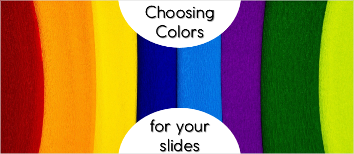
Colors speak a language of their own. A language that has been universally understood even before Sir Isaac Newton created the first color wheel back in 1706.
Our past associations and everyday observations color the way we decode colors. Bright sunny mornings bathed in yellow sunshine naturally elicit happy emotions in us. It also inspired one of the many famous paintings “The Yellow House” by the legendary painter Vincent Van Gogh:
 The painting reflects happy memories of childhood and the street where Van Gogh grew up in. Will this work in your presentation? Yes, provided you choose the right color combinations. Too much of yellow can hurt eyes.
Choosing the right color for your presentation slides isn’t as easy as it seems. There can be hundreds of color combinations that you can try. So, how do you zero down on the one you need?
By answering these 3 simple questions:
1) Which Industry or Subject does your presentation cover?
Each industry has its own personality. We normally associate law with conformity and strictness, education with knowledge, medical professional with healing powers, engineering with tall and mighty structures, fashion with fun and innovation. It’s but natural that certain colors suit a particular profession more than it does others. That’s one reason why medical presentations usually use the color blue as it exudes calmness and tranquility. Lawyers can use red in their presentations to show the danger that follows upon breaking rules.
Here are some visual examples to show the colors that would suit your industry and can thus be used as a theme for your presentation:
Blackboard Green for Education-based Presentation
What comes to your mind when you hear the word education: textbooks, yellow school bus, pencil, blackboard, etc. All the colors are apt for your presentation. But since black background with white text can appear dull for your presentation, you can use a dark green background and white for text as shown in the template below. If your presentation is to do with school kids, you can add a little bit of color to make it appear playful and exciting.
The painting reflects happy memories of childhood and the street where Van Gogh grew up in. Will this work in your presentation? Yes, provided you choose the right color combinations. Too much of yellow can hurt eyes.
Choosing the right color for your presentation slides isn’t as easy as it seems. There can be hundreds of color combinations that you can try. So, how do you zero down on the one you need?
By answering these 3 simple questions:
1) Which Industry or Subject does your presentation cover?
Each industry has its own personality. We normally associate law with conformity and strictness, education with knowledge, medical professional with healing powers, engineering with tall and mighty structures, fashion with fun and innovation. It’s but natural that certain colors suit a particular profession more than it does others. That’s one reason why medical presentations usually use the color blue as it exudes calmness and tranquility. Lawyers can use red in their presentations to show the danger that follows upon breaking rules.
Here are some visual examples to show the colors that would suit your industry and can thus be used as a theme for your presentation:
Blackboard Green for Education-based Presentation
What comes to your mind when you hear the word education: textbooks, yellow school bus, pencil, blackboard, etc. All the colors are apt for your presentation. But since black background with white text can appear dull for your presentation, you can use a dark green background and white for text as shown in the template below. If your presentation is to do with school kids, you can add a little bit of color to make it appear playful and exciting.
 If you wish to use this template for your presentation, you can download it from here.
Orange and White for Construction or Transportation-based Presentation
Construction invokes cement and workers wearing helmets. A cemented background would look perfect for a presentation related to this topic. If you want to make it more lively and optimistic, you can use a warm color like Orange along with the orange and white under-construction signs. This would be great for showing the growth potential in this sector or for that matter, an idea or plan that is still under construction:
If you wish to use this template for your presentation, you can download it from here.
Orange and White for Construction or Transportation-based Presentation
Construction invokes cement and workers wearing helmets. A cemented background would look perfect for a presentation related to this topic. If you want to make it more lively and optimistic, you can use a warm color like Orange along with the orange and white under-construction signs. This would be great for showing the growth potential in this sector or for that matter, an idea or plan that is still under construction:
 If you want to make this template yours, download it right away from here.
Fiery Red for Emergencies, Fight or Flight Response
Red is a very strong color that can convey a number of meanings depending on the context it is used in. A warm red can convey feeling of love and warmth while a dark shade can convey danger or anger. Since red is the most attention-grabbing color and also represents the will to survive, it is used as the standard color for fire extinguishers and fire trucks. Red background and white text is a great contrast that infuses life in your presentations too.
If you want to make this template yours, download it right away from here.
Fiery Red for Emergencies, Fight or Flight Response
Red is a very strong color that can convey a number of meanings depending on the context it is used in. A warm red can convey feeling of love and warmth while a dark shade can convey danger or anger. Since red is the most attention-grabbing color and also represents the will to survive, it is used as the standard color for fire extinguishers and fire trucks. Red background and white text is a great contrast that infuses life in your presentations too.
 Make this template yours by downloading it from here.
Cool Blue for Medical and Health Industry
Blue happens to be called the world’s favorite color, with both genders reporting it as one of their favorite colors. We are naturally built to feel calm and relaxed on seeing sky blue. Therefore, as pointed earlier too it’s the favorite choice for medical professionals to use in their presentations.
Make this template yours by downloading it from here.
Cool Blue for Medical and Health Industry
Blue happens to be called the world’s favorite color, with both genders reporting it as one of their favorite colors. We are naturally built to feel calm and relaxed on seeing sky blue. Therefore, as pointed earlier too it’s the favorite choice for medical professionals to use in their presentations.
 Click here to download this template.
Color Mixture for Marketing, Social Media Trends, Financial Analysis
For presentations targeting the youth and their activities on social media or for showing results on a survey, you can use three to four colors to differentiate the groups. It also adds dynamism to your presentation. The slide below shows how you can impress audiences with the right use of colors (Tip: Keep the background light for your slide content to stand out):
Click here to download this template.
Color Mixture for Marketing, Social Media Trends, Financial Analysis
For presentations targeting the youth and their activities on social media or for showing results on a survey, you can use three to four colors to differentiate the groups. It also adds dynamism to your presentation. The slide below shows how you can impress audiences with the right use of colors (Tip: Keep the background light for your slide content to stand out):
 2) What emotions do you wish to evoke in your audience?
Colors play a very important role in influencing how your audience feels about your presentation. Colors can be divided into 2 main categories based on the effect they produce: Cool colors (blue, green, purple) as these have a calming effect on us and Warm colors (red, yellow, orange) as they show excitement.
As highlighted earlier, some colors have been associated with some professions owing to their nature of work. You can however override that consideration if you wish to elicit a certain emotion in your audiences.
For instance, even if you are a medical professional highlighting importance of certain foods in minimizing risks, you can go for a warm orange or yellow color to make your presentation a relishing affair, rather than using a cool blue color that does not excite the audience at all. You can go with this template:
2) What emotions do you wish to evoke in your audience?
Colors play a very important role in influencing how your audience feels about your presentation. Colors can be divided into 2 main categories based on the effect they produce: Cool colors (blue, green, purple) as these have a calming effect on us and Warm colors (red, yellow, orange) as they show excitement.
As highlighted earlier, some colors have been associated with some professions owing to their nature of work. You can however override that consideration if you wish to elicit a certain emotion in your audiences.
For instance, even if you are a medical professional highlighting importance of certain foods in minimizing risks, you can go for a warm orange or yellow color to make your presentation a relishing affair, rather than using a cool blue color that does not excite the audience at all. You can go with this template:
 So imagine how you want your audience to feel in the end and choose the color accordingly. Refer to the list below explaining the most common feelings evoked by different colors:
Colors & their Psychological Properties
1. Yellow
Positive: Fun, humor, optimism, lightness, intellect, logic, creativity, confidence, extroversion
Negative: Too much of it or bad combination with other colors can show irrationality, fear, anxiety
2. Orange
Positive: Warmth, creativity, productivity, pleasure, optimism, enthusiasm, fun, emotional
Negative: Too much of it can be interpreted as non-serious
3. Red
Positive: Physical energy, vitality, stamina, excitement, spontaneity, passion, masculinity, survival
Negative: Defiance, aggression
4. Blue
Positive: Calmness, peace, honesty, trust, kindness, truth, inner peace, emotional depth, devotion
Negative: Coldness, aloofness, lack of emotion, unfriendliness
5. Green
Positive: Balance, harmony, balance, refreshment, universal love, rest, restoration, reassurance, nature, peace.
Negative: Poorly used with other colors can highlight stagnation, blandness
6. Violet
Positive: Intuition, spiritual awareness, imagination, universal flow, meditation, artistic qualities, royalty, luxury, quality
Negative: Too much of it can reflect introversion and inferiority
7. Pink
Positive: Femininity, nurturance, love, warmth, hope, tenderness
Negative: Physical weakness, inhibition
8. Grey
Neutral color. On the negative side, lack of confidence and energy
9. Black
Positive: Glamour, sophistication, clarity, emotional safety, power, control
Negative: Evil, oppression
10. White
Positive: Purity, innocence, hygiene, wholeness, simplicity, sophistication, cleanness
Negative: Cold, unfriendly, sterility
11. Brown
Positive: Nature, earthiness, reliability, support
Negative: Lack of humor and sophistication
3) Who’s your audience?
Color choice depends a lot on your industry as well as presentation objective. Yet, it’s important to know the demographic, geographic and psychographic variables of your audience. If you are presenting an in-house presentation, it’s given that you know all three. However, when you are presenting at a conference or an international audience, it’s wise to know their cultural practices, including use of colors. While in certain cultures, white is associated with death and mourning, in some others, black is associated with the same. So, choose the color of your slides (as well as your attire) accordingly.
General Tips:
- Go for high-contrast colors (as shown in the examples above). You can either go for a dark background and light text or a light background and dark text.
- Never go for fluorescent colors. They will surely blind your audiences.
- Go for color consistency. Use the theme color throughout the slides with little variations if need be.
- Use background graphics and patterns with caution. Too much variations in the pattern can affect the readability of your content.
- Make use of color wheel (choose the opposite ends of the color wheel to find high-contrast color combinations)
- Use online color resources like Adobe Kuler and Color Lovers. They can help you pick the perfect color combination for your slides.
- Communication expert Garr Reynolds advises dark background with light text if you are presenting in a dark room. Vice versa, he advises presenters to use a white background with dark text if you plan to keep most of the lights on.
Add color to your presentations. If you’re still in doubt and want professional designers to give final touches to your presentation (or make it from scratch), get in touch with our custom presentation design agency. We’ll get your presentation ready in 48 hours.
Looking for innovative PowerPoint Slides Design? Let us help you. Contact our Presentation Design Agency to ease your work.


 Customer Reviews
 If you wish to use this template for your presentation, you can download it from here.
Orange and White for Construction or Transportation-based Presentation
Construction invokes cement and workers wearing helmets. A cemented background would look perfect for a presentation related to this topic. If you want to make it more lively and optimistic, you can use a warm color like Orange along with the orange and white under-construction signs. This would be great for showing the growth potential in this sector or for that matter, an idea or plan that is still under construction:
If you wish to use this template for your presentation, you can download it from here.
Orange and White for Construction or Transportation-based Presentation
Construction invokes cement and workers wearing helmets. A cemented background would look perfect for a presentation related to this topic. If you want to make it more lively and optimistic, you can use a warm color like Orange along with the orange and white under-construction signs. This would be great for showing the growth potential in this sector or for that matter, an idea or plan that is still under construction:
 If you want to make this template yours, download it right away from here.
Fiery Red for Emergencies, Fight or Flight Response
Red is a very strong color that can convey a number of meanings depending on the context it is used in. A warm red can convey feeling of love and warmth while a dark shade can convey danger or anger. Since red is the most attention-grabbing color and also represents the will to survive, it is used as the standard color for fire extinguishers and fire trucks. Red background and white text is a great contrast that infuses life in your presentations too.
If you want to make this template yours, download it right away from here.
Fiery Red for Emergencies, Fight or Flight Response
Red is a very strong color that can convey a number of meanings depending on the context it is used in. A warm red can convey feeling of love and warmth while a dark shade can convey danger or anger. Since red is the most attention-grabbing color and also represents the will to survive, it is used as the standard color for fire extinguishers and fire trucks. Red background and white text is a great contrast that infuses life in your presentations too.
 Make this template yours by downloading it from here.
Cool Blue for Medical and Health Industry
Blue happens to be called the world’s favorite color, with both genders reporting it as one of their favorite colors. We are naturally built to feel calm and relaxed on seeing sky blue. Therefore, as pointed earlier too it’s the favorite choice for medical professionals to use in their presentations.
Make this template yours by downloading it from here.
Cool Blue for Medical and Health Industry
Blue happens to be called the world’s favorite color, with both genders reporting it as one of their favorite colors. We are naturally built to feel calm and relaxed on seeing sky blue. Therefore, as pointed earlier too it’s the favorite choice for medical professionals to use in their presentations.
 Click here to download this template.
Color Mixture for Marketing, Social Media Trends, Financial Analysis
For presentations targeting the youth and their activities on social media or for showing results on a survey, you can use three to four colors to differentiate the groups. It also adds dynamism to your presentation. The slide below shows how you can impress audiences with the right use of colors (Tip: Keep the background light for your slide content to stand out):
Click here to download this template.
Color Mixture for Marketing, Social Media Trends, Financial Analysis
For presentations targeting the youth and their activities on social media or for showing results on a survey, you can use three to four colors to differentiate the groups. It also adds dynamism to your presentation. The slide below shows how you can impress audiences with the right use of colors (Tip: Keep the background light for your slide content to stand out):
 2) What emotions do you wish to evoke in your audience?
Colors play a very important role in influencing how your audience feels about your presentation. Colors can be divided into 2 main categories based on the effect they produce: Cool colors (blue, green, purple) as these have a calming effect on us and Warm colors (red, yellow, orange) as they show excitement.
As highlighted earlier, some colors have been associated with some professions owing to their nature of work. You can however override that consideration if you wish to elicit a certain emotion in your audiences.
For instance, even if you are a medical professional highlighting importance of certain foods in minimizing risks, you can go for a warm orange or yellow color to make your presentation a relishing affair, rather than using a cool blue color that does not excite the audience at all. You can go with this template:
2) What emotions do you wish to evoke in your audience?
Colors play a very important role in influencing how your audience feels about your presentation. Colors can be divided into 2 main categories based on the effect they produce: Cool colors (blue, green, purple) as these have a calming effect on us and Warm colors (red, yellow, orange) as they show excitement.
As highlighted earlier, some colors have been associated with some professions owing to their nature of work. You can however override that consideration if you wish to elicit a certain emotion in your audiences.
For instance, even if you are a medical professional highlighting importance of certain foods in minimizing risks, you can go for a warm orange or yellow color to make your presentation a relishing affair, rather than using a cool blue color that does not excite the audience at all. You can go with this template:
 So imagine how you want your audience to feel in the end and choose the color accordingly. Refer to the list below explaining the most common feelings evoked by different colors:


2023-02-28 08:37:05 at