


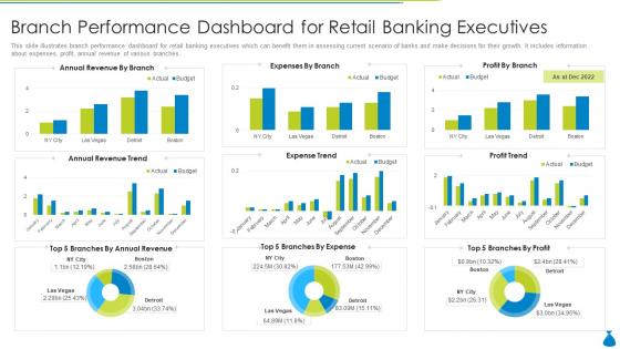
Branch performance dashboard for retail banking executives




Try Before you Buy Download Free Sample Product
 Impress Your
 Audience
 100%
100% Editable
 Save Hours
 of Time


Our Branch Performance Dashboard For Retail Banking Executives are topically designed to provide an attractive backdrop to any subject. Use them to look like a presentation pro.
People who downloaded this PowerPoint presentation also viewed the following :
Branch performance dashboard for retail banking executives with all 7 slides:
Use our Branch Performance Dashboard For Retail Banking Executives to effectively help you save your valuable time. They are readymade to fit into any presentation structure.





FAQs for Branch performance dashboard for
Honestly, just stick to what actually moves the needle - revenue per branch, customer acquisition, and your loan-to-deposit ratios. Those are the big ones. Customer satisfaction scores matter too, obviously. Then throw in some operational stuff like transaction times and cost per transaction. Staff productivity is huge - sales per employee tells you a lot. Keep your main dashboard clean though, maybe 6-8 KPIs tops. Nobody wants to stare at a wall of numbers. You can always click through for more detail, but the main view should give you the full picture in like 10 seconds.
Honestly, visualizing your branch data is so much better than staring at spreadsheets all day. Heat maps will show you instantly which locations are killing it vs. the ones that need help. Trend lines reveal seasonal stuff you'd totally miss otherwise. Interactive dashboards are where it gets fun though - you can zoom from big picture regional view down to individual branches super quick. I'd figure out your most important metrics first, then pick chart types that actually tell the story. Your brain processes visual patterns way faster than rows of numbers anyway.
Honestly, you need real-time data or your dashboard is pretty much pointless. Like, imagine trying to manage your branches with yesterday's numbers - that's just asking for trouble. When wait times suddenly spike or sales tank, you'll actually know about it as it happens instead of finding out way too late. Then you can actually do something about it, you know? The key is making sure your refresh rates are fast enough to matter. I learned this the hard way when we had hourly updates but needed minute-by-minute data during peak hours.
So you'll want to start by figuring out what each branch actually cares about - like retail spots probably want foot traffic data while service branches are all about resolution times. The dashboard lets you drag widgets around and mess with time ranges, plus you can change colors if they're picky about branding. Honestly some managers go widget-crazy but whatever works for them! Set up alerts for their specific thresholds too. Oh and definitely have each branch manager show you their dream layout first - saves you from guessing what they want.
Group your metrics by category - financial, customer satisfaction, operational stuff - but keep them on the same dashboard so you can actually see connections. We totally screwed this up once and missed that our top-performing store had awful customer ratings for like 3 months. Make your most important KPIs stand out visually. Connect your non-financial metrics to money outcomes with ratios - revenue per visit, cost per transaction, that kind of thing. Oh, and set up alerts when the non-financial numbers start dropping because those usually hit your bottom line first.
Talk to your users - seriously, just ask them what sucks. Surveys work, but honestly? Sit with a few branch managers for like 10 minutes while they actually use the thing. You'll cringe at what they're struggling with that you thought was super clear. Your top power users will tell you which KPIs they actually need (spoiler: probably not the ones you think), what charts make zero sense, and where the navigation feels weird. I'd start with your best 3 users and ask what pisses them off most. Fix those first since they're the ones who'd normally just deal with crappy design without complaining.
Honestly, go with Power BI or Tableau for branch dashboards. Power BI's way cheaper and works great if you're already using Microsoft stuff (which, let's be real, everyone is). Tableau has cooler features but you'll pay for it. Google Data Studio is decent too if budget's tight - I was surprised how well it worked for basic stuff. The main thing is hooking these up to your banking system or data warehouse. Oh, and the dashboards actually need to make sense to whoever's looking at them. Start with Power BI if you've got Office 365.
So basically you'd set up forecasting models that crunch your historical data to predict stuff like sales and foot traffic for next month or quarter. Tools like Tableau and Power BI already have machine learning baked in, which honestly makes this way easier than it used to be. I'd start small though - pick one metric like monthly revenue, nail that down first. Your dashboard would show current numbers alongside the predictions, plus confidence intervals so you know if it's actually reliable or just throwing darts. Once your team stops side-eyeing the forecasts, then roll it out to other KPIs.
Honestly, the worst thing you can do is cram everything onto one screen. You'll just stare at it and get overwhelmed. Pick maybe 5-7 metrics that actually matter - stuff like revenue per branch, customer acquisition costs, operational efficiency. Keep it simple. Oh and here's what everyone screws up: they show raw numbers without any context. Useless! You need benchmarks, trends, comparisons to last quarter or whatever. I learned this the hard way on my last project. Bottom line - if looking at a metric doesn't make you want to DO something about it, ditch it. Clean dashboards win every time.
Honestly, dashboards work because nobody wants to be dead last every month. When all your branches can see each other's numbers in real-time - sales, customer scores, whatever matters most - people naturally step up their game. Makes sense, right? Plus you'll finally have actual data for performance reviews instead of just winging it based on how you feel about someone. I'd set up weekly reports that auto-send so managers actually look at their numbers regularly. Way better than everyone panicking at month-end trying to figure out what went wrong.
Benchmarking is your reality check - shows you if your branch performance actually rocks or just looks decent in a bubble. You can compare against industry standards, top performers, whatever makes sense for your situation. Honestly, without it you're just guessing. Like thinking 15% conversion is killer until you realize industry average hits 22% - ouch. Set up the right comparison points in your dashboard and you'll quickly spot which branches are crushing it vs which ones need help. Makes prioritizing so much easier than just staring at random numbers all day.
Honestly, having mobile access is a game changer for keeping tabs on your branches. I'm always checking mine over morning coffee - probably too much lol. But you can catch stuff right away, like if sales tank or someone calls out sick. The best part? You don't have to wait until you're back at the office to actually do something about it. Just text your branch manager immediately when something's off. Oh, and definitely set up those push notifications for the big metrics. Trust me, you'll want to know the second something important changes.
Set up automated rules that catch bad data before it reaches your dashboard - saves you so much headache later. Weekly reconciliation between branch reports and your main systems is crucial too. Honestly, I've watched perfectly good dashboards turn into garbage because nobody bothered checking the source data. Train your branch teams on proper entry standards and give them clear guidelines. Oh, and build these validation steps right into your regular process instead of scrambling to fix things after the fact. Data's only useful if it's actually accurate, you know?
Honestly, dashboards are a game-changer for catching patterns in your data. The visual format beats staring at endless spreadsheet rows any day. You'll spot trends way faster - like which branches keep underperforming or when customer satisfaction starts tanking. I love how you can see spikes during certain periods and actually catch declining foot traffic before it becomes a real headache. Plus you can identify your star locations and figure out what they're doing right. Oh, and definitely set up alerts for your key metrics - saves you from constantly checking everything manually.
Honestly, these dashboards are game-changers for seeing which branches actually perform vs. just look busy. You'll spot patterns fast - like why the midwest locations crush it every Q4 while others flatline. Perfect for deciding where to throw your budget instead of spreading it everywhere like peanut butter. High-performers show you what works so you can copy it elsewhere. Plus the data helps with staffing and realistic goal-setting. Oh, and definitely set up alerts for your key metrics - I learned that the hard way from checking manually every damn day.
-
Editable templates with innovative design and color combination.
-
Presentation Design is very nice, good work with the content as well.