


Business Pitch Deck Our Client Testimonial Ppt Template




Try Before you Buy Download Free Sample Product
 Impress Your
 Audience
 100%
100% Editable
 Save Hours
 of Time


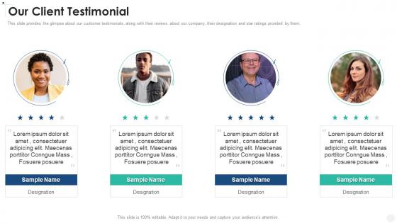
This slide provides the glimpse about our customer testimonials, along with their reviews about our company, their designation and star ratings provided by them.
People who downloaded this PowerPoint presentation also viewed the following :
Business Pitch Deck Our Client Testimonial Ppt Template with all 6 slides:
Use our Business Pitch Deck Our Client Testimonial Ppt Template to effectively help you save your valuable time. They are readymade to fit into any presentation structure.






FAQs for Business Pitch Deck Our Client
Keep it to 10-12 slides max - anything longer and they'll check out mentally. Hit the basics: what problem you're solving (make it relatable), your solution, market size, how you make money, and any traction you've got. Even small numbers are better than no numbers, trust me. Don't forget competition, your team, financials, and the funding ask. Be super specific about what you need the money for - investors hate vague "growth and marketing" requests. Oh, and that problem slide? It should make them nod and think "ugh yes, I hate dealing with that too."
Look, investors aren't all the same - you've gotta tailor your pitch to what they actually want to hear. VCs are obsessed with massive scale and your growth plan. Angels? They're way more interested in your team and whether you have any real traction yet. Corporate investors want to see how you fit into their existing world (honestly, sometimes they just want to acquire you later). Family offices are the conservative ones - they want steady returns, not some crazy moonshot. Do your homework on each investor first. Check out their portfolio companies to figure out what makes them tick, then adjust your story accordingly.
Honestly, white space is your best friend here. Don't cram everything together - let your slides breathe. Stick to maybe 2-3 fonts max and keep the same colors throughout (I've watched too many presentations that looked like someone threw paint at the wall). Make sure people in the back can actually read your text, and skip the cheesy stock photos. Oh, and go easy on animations - they're distracting. Quick test: squint at your slide. If you can't tell what's most important right away, you need to clean it up.
One main idea per slide - that's it. Don't dump everything you know onto one screen because people just tune out. I learned this the hard way lol. Keep it under 6-7 lines with lots of white space. Your slides should back up what you're saying, not steal the show. Quick test: if you can't get through a slide in under a minute, split it up. Honestly, most presentations have way too much text anyway. Cut ruthlessly. Your audience will actually pay attention instead of trying to read War and Peace while you're talking.
Stick to problem-solution-outcome structure as your foundation. Start with a customer pain point people can relate to, then show how you fixed their world. I swear by the "explain it to your mom over coffee" test - works every time. Real customer examples beat generic ones. Grab actual quotes if you can. Build tension by showing what happens when the problem goes unsolved (honestly, this part hooks investors). End with solid metrics proving your impact. Oh, and make sure it's retellable - investors need to pitch your story to their partners later.
Dude, get your value prop on slides 2-3 max. Start with the problem, then boom - here's how you fix it better than anyone else. I've seen so many decks where this gets buried way later and it's painful to watch. Throw in real numbers whenever you can - like "saves 3 hours weekly" hits way harder than some vague "efficiency boost" nonsense. Every slide after should somehow tie back to that main thing you're solving. Oh, and here's a quick test I always do: if someone only saw your first few slides, would they actually understand what you're about? If you're hesitating on that answer, time to make it way more obvious.
Start with TAM, SAM, and realistic market share projections - yeah, the numbers will look insane at first but that's normal. Investors just want to see you get the actual scope of things. Traction is where you really need to be smart though. Pick 3-5 metrics that actually prove your business model works - think MRR, customer acquisition cost, lifetime value, retention rates. Don't fall into the trap of showing off total downloads or whatever. Those vanity metrics are basically useless. Focus on growth numbers that matter to how you make money and whether people genuinely want what you're building.
Your pitch deck and business plan need to tell the exact same story - like different versions of the same book. Pull your main strategic stuff (market positioning, revenue model, growth plans) straight into the slides. I've seen way too many decks that feel completely disconnected from what the company actually does. Your problem statement should match your real target market, solution needs to reflect your actual product roadmap, and financials have to align with operations. Honestly, if someone can't understand your core strategy just from the deck alone, you're doing it wrong. Quick sanity check before presenting helps.
Don't stuff your slides with walls of text - they want to hear YOU talk. And please, actually explain the problem you're solving instead of rushing past it. The whole "billion dollar market" thing is so lazy - break down your actual addressable market. I cringe every time I see those ridiculous hockey stick projections with no real data behind them. Your team slide matters too - calling someone with 2 years experience a "seasoned executive" just looks desperate. Oh, and time yourself practicing because going over is awkward for everyone. End with a specific ask, not some vague "let's chat" nonsense.
Honestly, the trick is making your data feel like proof, not homework. Lead with your story first - what problem exists, how you'll solve it, what's the opportunity. Then drop in numbers that back up each part. I learned this the hard way after boring investors to death with spreadsheet dumps! Show them "our customers are losing $X every month" before you reveal your solution. Pick maybe 2-3 strong metrics per slide max. The best presentations feel like you're connecting dots naturally. Your data should make people go "oh damn, that makes total sense" instead of glazing over.
Dude, visuals are everything in pitch decks. Complex ideas become way easier to digest when you've got clean charts and graphs backing you up. I've watched so many presentations bomb because they were just endless bullet points - investors' eyes glaze over instantly. Your infographics should tell the story of your market size and growth without making people work for it. Plus, when they're looking at 20 decks later, yours will actually stick in their memory. Just don't go overboard with fancy graphics that don't mean anything. Every visual needs to punch home your main points, not just fill space.
Dude, start keeping notes on what investors actually ask you - that's pure gold. Make a simple list of the stuff that keeps coming up, like if your revenue projections seem sketchy or whatever. I always jot things down right after each pitch (yeah I know, sounds nerdy but trust me). When three different VCs question your go-to-market slide, that's your sign it sucks. Don't get distracted by random one-off comments though. Look for patterns and fix those slides first. Oh and test your changes on someone friendly before your next real pitch - saves you from looking dumb twice.
Dude, you gotta check out Airbnb's original Series A deck and Buffer's seed presentation - Buffer's is crazy transparent. Uber's Series A is clean as hell too. Facebook's first deck? Wild to see now that it's Meta. Most companies shared these online so they're easy to find. Canva's Series A is solid, and WeWork's early stuff is interesting even though... yeah, that didn't end great lol. Don't copy their designs exactly though - focus on how they structure the story. Pick 2-3 from your industry and use those as your starting point.
Honestly, refresh it every 3-6 months or after big milestones. Revenue jumps, new funding, product launches - update immediately. I've watched founders pitch with ancient metrics and it's just... painful. Quarterly updates work for smaller stuff like team changes. Oh, and keep a master version plus audience-specific ones - you don't want to scramble when that perfect investor suddenly wants to meet. Trust me, they'll spot six-month-old data instantly and wonder what else you're not on top of.
Watch what confidential stuff you put in there, especially if tons of people will see it. Slap a confidentiality notice on it and maybe get NDAs signed first. Don't promise any specific returns - SEC will come for you lol. Keep projections realistic and call them estimates, not facts. Make sure you actually own all the images and content you're using. Oh and honestly? If you're raising real money, just pay a lawyer to look it over. Way better than dealing with legal drama later when you're trying to close deals.
-
The quality of PowerPoint templates I found here is unique and unbeatable. Keep up the good work and continue providing us with the best slides!
-
Qualitative and comprehensive slides.