


Pitch deck for investor our target market ppt template





Try Before you Buy Download Free Sample Product
 Impress Your
 Audience
 100%
100% Editable
 Save Hours
 of Time


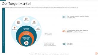
This slide provides the glimpse about our target market which focuses on different target market for funding purpose for various types of startups such as health care, technology, retail, etc.
People who downloaded this PowerPoint presentation also viewed the following :
Pitch deck for investor our target market ppt template with all 6 slides:
Use our Pitch Deck For Investor Our Target Market Ppt Template to effectively help you save your valuable time. They are readymade to fit into any presentation structure.





FAQs for Pitch deck for investor our target
So you need the basics: problem, solution, market size, business model, traction, competition, team, financials, and your ask. The team slide is honestly way more critical than people realize - investors back founders, not just concepts. Hook them early with a solid problem that actually matters, then show how you fix it and why you'll dominate. One thing per slide, don't cram everything together. Oh and if you can nail that problem-solution connection upfront? You're already crushing most of the decks they see.
Dude, visuals are everything in pitch decks. Your brain processes images like 60,000 times faster than text - crazy right? Charts make those financial projections actually readable instead of just numbers everywhere. Product screenshots beat long explanations every time. I've sat through way too many decks that were just walls of text and honestly? Everyone zones out. Market data gets interesting when you turn it into clean infographics. Just don't go overboard - one solid visual per slide hits different than cramming stuff together. Each slide should work like a billboard basically.
Dude, seriously - cut the text down. Investors want to hear YOU talk, not read paragraphs off your screen. One main point per slide, throw in some visuals. And please, for the love of god, skip those "trillion dollar market" stats everyone's seen a million times. Your projections need to actually make sense too, not some crazy hockey stick thing. Oh and don't hide your ask somewhere random or use confusing terms. Practice the timing beforehand - running over just kills the whole vibe. Find someone who'll be brutally honest about your practice run. Trust me on this one.
Dude, storytelling is everything when you're pitching. Nobody wants to sit through a spreadsheet presentation - investors hear like 50 of those a week. You've got to hook them with a real problem that makes sense, then show how your solution fits perfectly. I always tell people to think of it like explaining to your mom why this startup matters. Connect with them emotionally first. The numbers can come after. Paint a picture of someone actually struggling with this problem, then boom - here's how you fix it. That's what sticks in their heads later.
Show them revenue growth and customer acquisition first - that's what gets investors excited. Monthly recurring revenue is gold if you have it. Market size data (TAM/SAM stuff) is pretty much required these days, even though it feels like homework. Retention rates matter way more than most founders think - I'd actually put those before vanity metrics. Unit economics too if they're solid. Pick maybe 4-5 numbers max that tell your growth story. Trends over time beat random snapshots every time. Don't dump every spreadsheet on them - they'll tune out fast.
Honestly, you gotta know your audience before you even open that deck. Investors? Hit them with market size and your financials right away - they're thinking dollar signs. But customers want to hear about their actual problems and how you fix them. Your internal team probably just wants to know when stuff gets done and what resources they need. I'd keep the same basic deck structure (why make more work for yourself?) but swap slides around depending who's listening. Like, maybe lead with the problem slide for customers but jump straight to traction for investors. Research beforehand though - nothing's worse than pitching the wrong angle. Practice a few versions so you don't stumble when switching gears.
Dark text on light backgrounds is your friend - navy, charcoal, or black with white backgrounds work great. Then pick one accent color for highlights and important stuff. Honestly, I've seen too many pitch decks that look like a unicorn exploded on them. Not a good look. Two fonts max, lots of white space, and don't cram everything onto one slide. The whole point is getting investors to listen to you, not wonder why you chose hot pink for your financial projections. Oh, and definitely test it on a few different screens first - colors can look totally different on various displays.
Honestly, pitch deck templates are lifesavers because you're not sitting there wondering what the hell to put on slide 7. They follow the flow investors expect - problem, solution, market size, all that stuff. You can focus on nailing your story instead of figuring out slide order. Most templates hit the points VCs actually care about rather than letting you go down rabbit holes with fancy graphics (been there). Just find a decent template, swap in your content, and boom - professional deck in way less time. Way better than staring at a blank PowerPoint for hours.
Honestly, branding can make or break your pitch deck. Without it, you'll just look like you threw some slides together last minute. Pick your logo, 2-3 colors max, and maybe one clean font - then actually stick to them throughout. I've seen way too many decks that look like a rainbow exploded on them. The whole point isn't just aesthetics though. Consistent branding makes investors remember you and shows you've got your act together. It's like putting on a good outfit before a job interview - small thing, but it matters way more than you'd think.
Start with the problem you're fixing and who needs it - that's what grabs people. You've got maybe 10 seconds before someone clicks away, so make your value crystal clear upfront. Here's what I do: read each sentence and ask "so what?" If the answer isn't obvious, get more specific about the actual benefit. Ditch all the corporate buzzwords - they're meaningless. Focus on real, measurable results instead. Honestly, the best test is writing like you're telling your grandma why she should care about your thing over everything else out there. If she'd be confused, you're probably being too vague or using too much jargon.
Honestly, content beats pretty slides every single time. I've watched so many founders blow weeks on fancy animations while their actual story is garbage - investors can smell that from a mile away. Get your problem-solution fit solid first, nail down your market size, make sure your traction numbers actually mean something. After that's locked down? Then worry about clean visuals. Simple fonts, don't go crazy with colors, keep text minimal per slide. Good design just makes your strong content hit harder. But if your story sucks, no amount of polish will save you. Story first, then make it look decent so people can actually follow along.
Dude, feedback from old presentations is pure gold. I always look for patterns - like when the same confused looks pop up or people ask identical questions. That's where your slides totally suck and need fixing. The worst is realizing you've explained something three different ways because your original slide made zero sense. Also watch for phone-checking moments vs when people actually paid attention. Those reactions tell you everything. Update your template based on what actually happened, not what you think should work. Way better than just guessing what might land.
Honestly, just pick whatever you're comfortable with first. Canva's my go-to because the templates are solid and you don't need design skills. PowerPoint works fine too if you're already used to it. Figma's awesome but maybe overkill unless you're really into design stuff. Beautiful.ai has this AI thing that suggests layouts - pretty cool actually. Google Slides is free and gets the job done. Oh, and if you've got charts or data, Excel works or there's Chartio for fancier stuff. But here's the thing - nail your story first. You can make it look pretty later, but if your narrative sucks, no amount of fancy animations will save you.
Update your pitch deck every 3-6 months, or when big stuff happens in your business. New metrics, product changes, market shifts - all good reasons to refresh it. I cringe when I see founders pitching with numbers from like a year ago (happens way more than you'd think). Your deck needs to show where you are now, not last quarter. Always update traction and financials before investor meetings though. Oh and keep a master deck that you touch up monthly - saves you from that last-minute panic scramble.
Honestly, just practice that pitch until you could do it in your sleep. Your slides should back up what you're saying, not be your crutch - I learned this the hard way when I bombed a presentation by basically reading off them like a robot. Keep eye contact going and tell it like a story instead of rattling off features. Yeah, the template gives you structure, but it's your excitement that'll actually sell people on the idea. Oh, and work on those slide transitions! Nothing kills momentum like awkward pauses between sections. You've got this.
-
Very unique and reliable designs.
-
Use of icon with content is very relateable, informative and appealing.