


Business Pitch Deck Ppt Template




Try Before you Buy Download Free Sample Product
 Impress Your
 Audience
 100%
100% Editable
 Save Hours
 of Time


Business Decks gives an overview of the company, which will help the entrepreneurs to understand the financing rounds of investments. Check out our efficiently designed Business Pitch Deck that covers the problem faced by the customers and the solutions offered by our company. We have also provided an outline of the company and its objectives. The details of the product and services are covered in this deck, along with target customers, business model, go-to-market plans, and roll-out plans. To understand the market better, we have focused on the competitors, competitive analysis, and market size of the company. In this PowerPoint presentation, we have discussed the funding investments, project performance over the years, company traction, milestones, business strategy, team details, and client testimonials. Customize this 100 percent editable pitch deck based on your specific business needs.
People who downloaded this PowerPoint presentation also viewed the following :
Content of this Powerpoint Presentation
Slide 1: This slide introduces Business Pitch Deck. State Your Company Name and begin.
Slide 2: This slide presents Table of Content for the presentation.
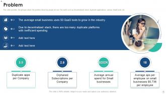
Slide 3: This slide provides the glimpse about the problem faced by people all over the world such as decentralized stack, duplicate applications, various SaaS tools, etc.
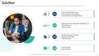
Slide 4: This slide provides the glimpse about the solution offered by our company for expense tracking and optimization.
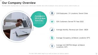
Slide 5: This slide provides the glimpse about our company overview which focuses o foundation date, number of employees, revenue earned per customer, etc.
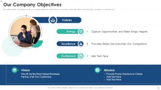
Slide 6: This slide provides the glimpse about our company objectives which focuses on mission, vision and values such as energy, excellence, excitement, etc.
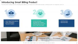
Slide 7: This slide provides the glimpse about the smart billing product offered by our company such as unified SaaS subscription, centralized payment, etc.
Slide 8: This slide exhibits target customers which focuses on startups with less than 100 employees, top level management handles the subscriptions, etc.
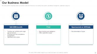
Slide 9: This slide provides the glimpse about our business model which focuses on user activity track system, cancellations management, application usage, etc.
Slide 10: This slide highlights company’s go to market plan which focuses on organic website visits, customer acquisition cost, organic video views, etc.
Slide 11: This slide illustrates roll out plan which focuses on our future plan such as beta release, intelligence features in our app, monthly active users, etc.
Slide 12: This slide provides the glimpse about our competitors along with their funding investments, number of employees and other details.
Slide 13: This slide displays competitive analysis of our company with others, which focuses on low cost, customer service, mobile application, on demand service, etc.
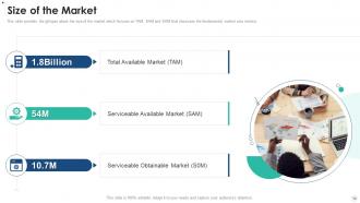
Slide 14: This slide provides the glimpse about the size of the market which focuses on TAM, SAM and SOM that showcase the fundamental market size metrics.
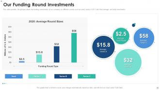
Slide 15: This slide presents funding investments of our company on different rounds such as seed, series A, B, C with their average and total investments.
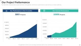
Slide 16: This slide provides the glimpse about our project performance in the organization which focuses on growth rate of our project and how our company is performing.
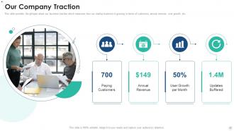
Slide 17: This slide exhibits business traction which measures how our startup business is growing in terms of customers, annual revenue, user growth, etc.
Slide 18: This slide displays company milestones which focuses on business process tracking and our plan has been implemented within the organization.
Slide 19: This slide provides the glimpse about our company business model which focuses on trial model, customer churn, projected revenues, etc.
Slide 20: This slide provides the glimpse about our company organization structure which focuses on different departments and their team members.
Slide 21: This slide presents customer testimonials, along with their reviews about our company, their designation and star ratings provided by them.
Slide 22: This slide displays Icons for Business Pitch Deck.
Slide 23: This slide is titled as Additional Slides for moving forward.
Slide 24: This is About Us slide to show company specifications etc.
Slide 25: This is Our Mission slide with related imagery and text.
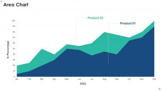
Slide 26: This slide depicts Area chart with two products comparison.
Slide 27: This slide shows Post It Notes. Post your important notes here.
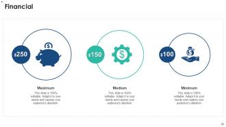
Slide 28: This is a Financial slide. Show your finance related stuff here.
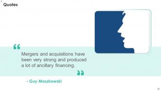
Slide 29: This is a Quotes slide to convey message, beliefs etc.
Slide 30: This is a Comparison slide to state comparison between commodities, entities etc.
Slide 31: This slide presents Roadmap with additional textboxes.
Slide 32: This is a Thank You slide with address, contact numbers and email address.
Business Pitch Deck Ppt Template with all 37 slides:
Use our Business Pitch Deck Ppt Template to effectively help you save your valuable time. They are readymade to fit into any presentation structure.
-

Business Pitch Deck
-
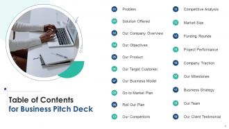
Table of Contents for Business Pitch Deck
-
Problem
-
Solution
-
Our Company Overview
-
Our Company Objectives
-
Introducing Smart Billing Product
-

Our Target Customer
-
Our Business Model
-
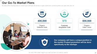
Our Go To Market Plans
-
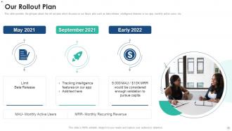
Our Rollout Plan
-
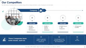
Our Competitors
-
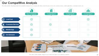
Our Competitive Analysis
-
Size of the Market
-
Our Funding Round Investments
-
Our Project Performance
-
Our Company Traction
-
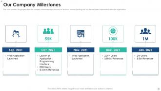
Our Company Milestones
-
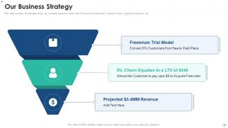
Our Business Strategy
-
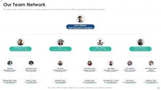
Our Team Network
-
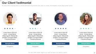
Our Client Testimonial
-
Icons Slide for Business Pitch Deck
-
Additional Slides
-
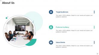
About Us
-
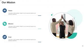
Our Mission
-
Area Chart
-
Post it Notes
-
Financial
-
Quotes
-
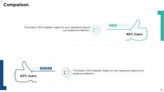
Comparison
-
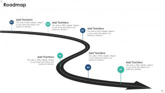
Roadmap
-

Thank You
-

-

-

-

-

FAQs for Business Pitch
Aim for 10-12 slides hitting the basics: problem, solution, market size, business model, traction, team, financials, and your ask. Lead with a problem people actually give a damn about - make it hit home. Your solution comes next, plus why you're not just another me-too startup. Honestly? The traction slide makes or breaks everything. Real numbers only - investors smell BS from miles away. Show you understand your market and how you'll actually turn a profit. One focused point per slide works best. Oh, and practice transitions between slides until it flows naturally. You want this to feel like a story, not some boring data dump that puts everyone to sleep.
Dude, you gotta turn your pitch into an actual story. Nobody remembers boring data dumps. Create a real narrative - problem, why people care, how you fix it. Don't just say "we have 50K users." Tell them about Sarah and how your app literally solved her nightmare problem. I swear, half the decks I see are just feature lists with zero emotion. Lead with human impact first - make them actually give a shit about your mission, not just the numbers. That's what sticks with investors after they've seen 20 pitches in one day.
Dude, investors look at SO many pitch decks daily - yours has to pop but not in an annoying way. Pick one clean font and actually use white space (I swear people forget this exists). Those tiny charts nobody can read? Don't be that person. One main point per slide, keep your colors simple - like 2-3 max. Good design honestly makes you look way more legit and prepared. If someone's squinting at your slides trying to figure out what you're saying, you've already lost the room. Clean visuals = credibility.
Dude, you gotta totally switch up your deck depending on who you're pitching. Angels are usually ex-entrepreneurs, so they care way more about your story and whether you actually get the problem you're solving. They're literally betting on YOU. VCs though? Different beast entirely - they want all the numbers, market size, how you'll scale, exit strategy, the whole nine yards. Honestly angels are way less intimidating to pitch to. With angels, focus heavy on your team slides and the narrative. For VCs, you'll need those financial projections to be bulletproof and really dig into competitive analysis.
Honestly, investors want to see real proof people will actually pay for your stuff. Pre-orders are amazing if you can get them. Waitlist signups work too, or results from pilot programs. Any revenue numbers - even tiny ones - are way better than market research surveys (which are pretty much useless tbh). Customer testimonials hit different, especially from companies people recognize. Partnerships or letters of intent are solid gold too. The whole point is showing actual demand beyond "we interviewed a bunch of people." Focus on metrics that prove customers aren't just being polite - they're willing to open their wallets.
Stick to 3-5 metrics that actually matter for your business - revenue growth, customer acquisition cost, burn rate are usually good picks. Don't dump a massive spreadsheet on them. Clean visuals work way better. I've seen investors literally zone out when slides are packed with tiny numbers everywhere. Project out maybe 3-5 years max, and throw your key assumptions underneath so people get how you landed on those figures. Oh, and here's the thing - if you can't explain a number in like 30 seconds, it probably shouldn't be there. Keep it simple.
Ugh, the worst ones have like 30 slides packed with tiny text. Nobody wants to read a novel on your screen! Start with the problem you're solving before jumping into your product - I see people mess this up constantly. Tell a story: problem, solution, market, traction, what you need. Keep it visual and practice your timing so you don't sound rushed. Don't skip financials even if you're basically guessing. And seriously, test your screen share beforehand. There's nothing more awkward than fumbling with tech while investors sit there waiting.
Honestly, visuals are a game-changer for pitch decks. Our brains process images like 6x faster than text, so investors actually remember what you showed them. Charts make data way easier to digest than paragraphs of numbers. Plus nobody wants to stare at bullet point after bullet point - that's just brutal. Here's the thing though: don't just throw in random graphics. Each visual should actually support your point, not just look pretty. I'd swap out at least half your text for simple charts or icons. Makes everything cleaner and way more memorable.
Look, branding makes a huge difference in pitch decks. Consistent colors and fonts throughout show you're not just winging it - investors definitely pick up on sloppy presentation work. Your logo placement should be clean but not screaming for attention. Honestly, I've watched people bomb just because their slides looked thrown together last minute. Build a simple template first with your brand stuff, then add content. The whole thing should feel cohesive without being distracting. Your brand needs to match your company's vibe too - don't go corporate if you're a scrappy startup. Keep it professional but let your personality show through.
Just nail down what problem you're solving and why you're better at it than everyone else. Skip the bullshit buzzwords - "revolutionary" makes investors roll their eyes. Be stupidly specific instead. Like "We cut restaurant food waste by 40% with AI inventory tracking" vs "We're disrupting food tech" (ugh). Put this on slide 2 or 3, right after you explain the problem. Here's the thing - if your neighbor can't understand your value prop in 5 seconds, it's too complicated. I learned this the hard way. Test it on someone who doesn't know your industry at all first.
Stick to 10-12 slides, takes about 10-15 minutes to get through. That leaves room for questions without rushing. Trust me, investors zone out hard after 20 minutes - I've seen it happen. One main point per slide works best. Practice your timing so you're not speed-running the crucial bits at the end because you ran long (been there). Got extra details? Throw them in an appendix or save for later convos. Oh and definitely test it on a few people first - they'll tell you exactly when their eyes start glazing over.
Be crazy specific about what you want next - none of this "let's chat" nonsense. Ask for exactly what you need: "We're seeking $2M in Series A funding and would love a 30-minute follow-up to discuss terms" or "Can we set up a pilot with your team next month?" Honestly, I've watched so many decks die with those generic "questions?" slides. Give them clear next steps with actual timelines. Throw in your contact info and suggest a few meeting times if you can - makes it stupid easy for them to just say yes instead of going back and forth forever.
Honestly, ditch the boring slides and try Prezi or Genially for something interactive. Video pitches are killing it right now - just record yourself talking through the main points with some screen sharing. I've seen founders do live demos right in their presentation, which is bold but works. Some people are going full storytelling mode, following like a customer's whole journey. There's this one startup that used a comic strip layout (sounds ridiculous, I know) but it actually made sense for their consumer app. Just don't get too weird with it - pick whatever actually makes your story clearer, not just different for the sake of being different.
Dude, you HAVE to practice - like, seriously can't skip this part. I've watched founders with incredible ideas completely crash because they obviously didn't rehearse. Your deck could be gorgeous, but if you're stumbling through it? Investors bail fast. When you run through it with your actual slides, you'll spot weird timing stuff and transitions that don't work. Also catches places where you need better visuals. Honestly, do it at least 5-10 times before anything important. You'll feel so much more confident instead of just winging it and reading off slides.
Definitely send a thank-you email within 24 hours - include whatever they asked for or stuff that came up during Q&A. Then hit them up weekly with quick updates that actually matter. Industry news, new partnerships, hitting milestones, whatever. Most investors are totally swamped with pitches, so you gotta stay visible. Three or four follow-ups with radio silence? Back off and try again in a month. Oh, and keep everything short - nobody wants to read a novel. Always end with what you need from them next.
-
“I really like the convenient operation and professionalism I saw on the SlideTeam website. I want to express my regards and appreciation to the team.”
-
Excellent template with unique design.