

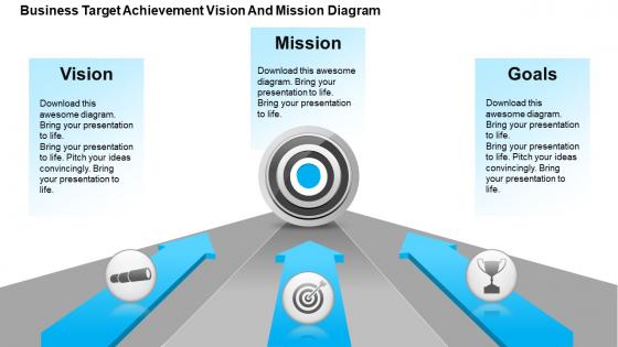
Business target achievement vision and mission diagram powerpoint templates





Try Before you Buy Download Free Sample Product
 Impress Your
 Audience
 100%
100% Editable
 Save Hours
 of Time


Are you worried about your business? Are you eager to know how to achieve milestone in your business? To help you out We have come up with PowerPoint presentation on business target achievement vision and mission which will be very decisive to make you understand the fundamentals of prosperous business. Our beautiful presentation templates decipher how to achieve target. In order to attain business target, you should review the mission or purpose, estimate the available resources and evaluate the results. Apart from this, our PPT slides explain the key concepts of strategy planning required for success of the business. Above and all, you can download the PowerPoint slides that explain how to determine the targets, note down the goals and communicate them to all who need to know. The only thing you should do is to click on the presentation slides and discover your knowledge and mark your presence before the target audience. Our Business Target Achievement Vision And Mission Diagram Powerpoint Templates eliminate foolish differences. They ensure hatred diminishes.
People who downloaded this PowerPoint presentation also viewed the following :
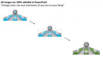
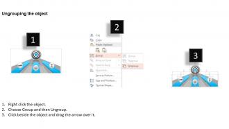
Business target achievement vision and mission diagram powerpoint templates with all 5 slides:
Have a hassle free experience with our Business Target Achievement Vision And Mission Diagram Powerpoint Templates.They enable easy functioning.

FAQs for Business target achievement vision and mission
Put your main vision statement right in the center - that's your anchor. Then add 3-4 key focus areas around it, plus your timeline like "by 2030." Don't forget who actually benefits from this vision. Honestly, the visual stuff matters more than people think - throw in some icons or colors so it doesn't look boring. You want someone to "get it" in under 30 seconds. If they're squinting and confused, you've made it too complex. Oh, and definitely run it by a couple people first. They'll catch things you missed.
Honestly, mission statement diagrams work because they make your company's purpose actually visible instead of buried in some random document. Your team can see how their work connects to the big picture. No more "wait, should we be doing this?" moments every five minutes. Short sentences hit different than walls of text - people remember visuals way better. I'd stick it somewhere high-traffic where everyone walks by daily. You'll probably catch people pointing to it during meetings more than you'd expect. It becomes this reference point that keeps everyone aligned without being preachy about it.
Honestly, keep it super clean - pyramid shapes or roadmap flows work way better than messy flowcharts. White space is your friend here. I've watched people's eyes glaze over at diagrams that look like abstract art gone wrong. Max 2-3 colors, same shapes for similar stuff, and make the text big enough so people in the back can actually read it. Clarity beats pretty every time. Oh, and sketch it first! Don't jump straight into PowerPoint or whatever - you'll save yourself tons of headaches later.
Dude, skip the massive text blocks - nobody reads those anyway. Flowcharts work way better for showing your strategy, and infographics can break down your values without putting people to sleep. Visual roadmaps are clutch for timelines too. I swear people's brains just shut off when they see paragraph after paragraph of mission statement stuff. A one-page visual that mixes your mission, goals, and timeline? That's gold for presentations. Gets everyone actually understanding where you're going instead of just nodding politely while they zone out.
So vision goes at the top - that's your "what we want to become" dream goal. Mission sits underneath as the "how we'll get there" daily grind stuff. I always think of it like... vision is the mountaintop, mission is actually hiking the trail (okay that's corny but whatever). Most diagrams show vision flowing down into mission, then mission branches out to strategies and tactics. Oh and when you're making these, use different colors or shapes for vision so it pops as your north star. Mission should connect directly to all the day-to-day operational stuff below it.
So here's the thing - infographics totally beat boring bullet points when it comes to core values. Nobody remembers reading "integrity" in some list, but show it with actual scenarios or cool visuals? That sticks. You're basically turning abstract stuff into visual stories that people actually get. Colors, icons, layouts - they help employees connect emotionally and see how values play out day-to-day. Honestly, abstract concepts are just hard for brains to grab onto sometimes. Try making one simple infographic per value. It'll make your company culture feel way more real and actionable instead of just corporate fluff.
Honestly, I'd go with Lucidchart first - it plays nice with Google Workspace and has decent business templates. Miro's really good too, especially if you're working with other people on this. Canva Business works but feels more... marketing-y? Microsoft Visio is still around if your company has it, though it's kind of clunky now. Oh, and definitely try the free versions first before paying for anything. Each one has a different vibe so you'll know pretty quick which one doesn't make you want to throw your laptop out the window.
Honestly, diagrams are game-changers for hitting your business goals. Instead of wandering around confused, you get this visual roadmap showing exactly where you stand. Flowcharts with milestones, progress bars, whatever works. I'm kinda obsessed with milestone diagrams lately - they make bottlenecks super obvious and keep everyone on the same page about what we're actually trying to achieve. Your team won't be guessing what "success" means anymore. Start simple with next quarter's stuff and update weekly. Trust me, everything just clicks better when you can see it.
Honestly, color choice makes a huge difference for those vision/mission diagrams. Blues work great for trust vibes, greens for growth - you get it. I can't tell you how many presentations I've sat through where someone went totally overboard with colors and it just looked chaotic. Stick to maybe 2-3 colors that actually match your brand. People will subconsciously connect those colors with your message, which is pretty cool when you think about it. Just make sure there's decent contrast so folks can actually read the thing! Simple palettes always win.
Honestly, just switch up the language and focus for each group. Employees need to see how their actual job ties into the big picture - use the internal lingo they already know. Customers? They're way more interested in what they get out of it than your grand vision (let's be real). Investors want growth potential and market positioning spelled out. Board members care about strategy and numbers they can track. Figure out what each audience values most, then tweak your wording and which parts you highlight. It's the same core message but packaged differently - kind of like how you'd explain the same news story to your mom versus your boss.
Ugh, two huge things mess people up. First - way too much clutter on one diagram. Like, I get it, you want to show everything but nobody can actually read that mess. Second thing that bugs me? All those empty buzzwords. "Synergy" and "excellence" mean literally nothing without real examples backing them up. Clean visuals work better anyway. Use words your team actually says in meetings, not corporate speak. Oh and test it on someone fresh - if they're confused, you'll know right away. Visual hierarchy matters too but honestly, clarity beats everything.
Oh totally, you should def be updating those! I mean, what worked when you had like 5 employees isn't gonna cut it when you're scaling up. Start simple with basic text boxes for your core stuff, but then add layers as you grow - maybe break out different customer types or show how your various teams connect back to the big picture. Honestly, I've seen too many companies with mission statements gathering dust that have nothing to do with their actual business anymore. Just make it a regular thing during your planning sessions so it actually reflects where you're headed, not where you were ages ago.
Dude, get your team to look at those diagrams before you finalize anything. They'll catch stuff you completely missed - like weird jargon or connections that don't actually make sense. What looks obvious to you might be total gibberish to everyone else. I swear, every time I think a diagram is perfect, someone points out something that makes me go "oh crap, yeah." Different brains process visuals differently too. Just grab everyone for 20 minutes, show them what you've got, and ask straight up: "What's confusing here?" You'll be surprised how much better it gets.
The Nike swoosh with "Just Do It" is classic - you can literally see movement and motivation in that simple design. Google nails it with their bright, clean visuals that match their whole "organize the world's information" thing. Apple keeps it minimal and premium, obviously. Starbucks goes for that cozy community vibe to show they're your "third place" between work and home. Here's what I've noticed though - none of these companies just throw text on a boring slide. They actually make their diagrams feel like their brand personality, which honestly makes way more sense than most corporate attempts I've seen.
Ditch the bullet points and think like you're telling a story instead. Your current state becomes chapter one, the journey to your vision is the messy middle part, and boom - transformed future as the ending. Visual metaphors are your friend here - roadmaps, climbing mountains, whatever clicks. Some teams even create little character personas for different stakeholders which honestly works better than you'd think. The whole point is making people feel like they're following an actual story arc, not drowning in corporate jargon. I'd sketch it out as a basic three-act thing first and see how it feels.
-
Helpful product design for delivering presentation.
-
The Designed Graphic are very professional and classic.