


Mission vision goals and objectives ppt layouts styles





Try Before you Buy Download Free Sample Product
 Impress Your
 Audience
 100%
100% Editable
 Save Hours
 of Time


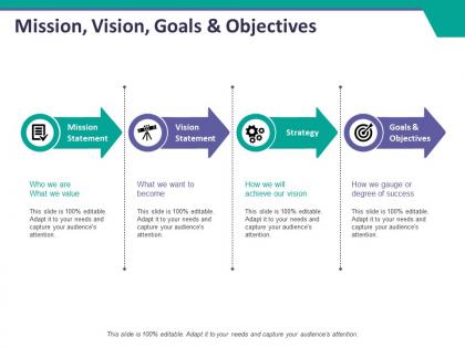
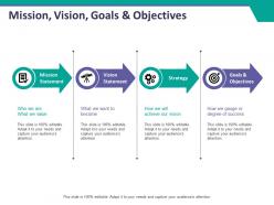
If you need to represent your business future goals and objectives through a professional presentation, then download our ready to use mission vision goals and objectives PPT layouts styles. This stunning business targets and objectives PowerPoint template design has been crafted using an icon of a notepad with a check mark, binocular, gears, and a dartboard with an arrow pointing towards it. Use this vision mission presentation slide to represent the concept of strategic business planning. Graphics of an arrow has been utilized in this template design that makes it look professional and most appealing. Deploying the smart goals and targets template layout, you can highlight four important business aspects which are a mission statement, vision statement, goals, and objectives. You can also explain who we are and what we value, what we want to become, how we will achieve our vision, and how we gauge or degree of success. Incorporate this smart goal slide design to create a PPT on business management, strategic business planning, strategic management, business success, and organizational development. Download this mission vision goal and objectives presentation template with a click. Build the ethos with our Mission Vision Goals And Objectives Ppt Layouts Styles. Create an enabling environment.
People who downloaded this PowerPoint presentation also viewed the following :
Mission vision goals and objectives ppt layouts styles with all 5 slides:
Adjust the data as you desire with our Mission Vision Goals And Objectives Ppt Layouts Styles. Your ideas acquire a great degree of accuracy.
FAQs for Mission vision goals and objectives
Four sections work best: mission, vision, goals, then objectives. Keep slides clean with minimal text - people zone out otherwise. Skip the corporate buzzwords that make everyone's eyes glaze over. Just talk like a normal person. Your objectives need timelines and should connect back to everything else (objectives feed goals, goals support vision, etc). Oh and definitely end with next steps. Nothing's worse than a presentation that just... stops. People sit there like "okay, so now what?" Make it clear what happens next.
Look, a solid mission statement is basically your company's GPS. Everyone knows where you're headed and why it matters. Your team makes way better decisions when they get the bigger picture - I've seen this work magic honestly. It also helps you hire people who actually fit and keeps customers interested in what you're doing. The trick is making it specific enough to be useful but not so wordy that nobody remembers it. Then you've got to actually reference it when making real decisions, not just stick it on the wall and forget about it.
Honestly, ditch the bullet points and go heavy on visuals – like really inspiring images that show your future state. People's attention spans are shot, so one concept per slide max. You'll want to tell a story connecting where you are to where you're heading. Real examples help tons since employees need something they can actually picture. Maybe throw in a short video or animation? Breaks up all that static stuff. Oh, and practice like crazy so you sound genuinely excited about the vision, not like you're just reading off slides. Trust me on this one.
So basically, goals are your big dreams and objectives are the actual steps to get there. Like "boost customer happiness" vs "hit 90% satisfaction by Q3 using weekly surveys." Goals give you direction, but objectives? That's where you can actually measure if you're winning or not. Honestly, I've seen too many teams chase vague goals and wonder why nothing gets done. You need both - the inspiring vision AND the concrete targets. When you're putting together that presentation, just make sure everyone knows which bucket each thing falls into. Otherwise people get confused about what they're supposed to deliver.
Go with clean, bold visuals that hit people right away. Big headers for your mission/vision statements, maybe some icons or imagery that actually connects to what you're about. I'm obsessed with split-screen layouts - mission one side, vision on the other. Text needs to be huge so people in back can read it. Don't jam everything onto one slide though, that's amateur hour. Use your brand colors too. Here's the thing - memorable beats readable every time. You want people leaving actually remembering what you stand for, not just thinking "oh, nice PowerPoint."
Okay so first figure out what your company's actually trying to achieve - sounds basic but tons of teams just wing it without this step. Then work backwards from there. Like if they're all about keeping customers happy, maybe your department tackles faster response times or whatever quality stuff matters. The trick is being super specific about how your work connects to the big picture. Honestly, a simple chart helps tons here - shows your team exactly why their daily grind matters. Share it around so everyone gets it, not just management.
You definitely want to get feedback from stakeholders - employees, customers, investors, whoever's actually involved with your company. They'll spot stuff you missed and call out confusing or overly corporate language (which honestly happens way too often). Focus groups work great during the drafting stage. Test different versions before you finalize anything for your presentation. Without their input, you risk creating something that sounds good to you but doesn't actually connect with people. Their perspectives help make your mission and vision feel real instead of just fancy words nobody relates to.
Break them up visually - different colors or even separate slides work best. I put short-term stuff (6-12 months) on the left with actual deadlines and metrics. Long-term vision goes on the right with bigger picture outcomes. People's eyes glaze over if it all looks identical, trust me. Use action words for short-term goals like "Launch" and "Implement." For long-term, go aspirational - "Become" or "Transform." Oh, and add a simple timeline graphic showing how the quick wins connect to your bigger goals. Makes it way easier for people to follow along.
Ugh, the worst thing you can do is stuff it full of corporate jargon nobody actually talks like. Skip anything with "synergies" - that screams consultant template. Make sure your mission and vision aren't basically the same thing either (one's current reality, other's future goals). I see this all the time - people set these pie-in-the-sky objectives with zero way to measure success. Like, how will you even know if you hit it? Give yourself real deadlines and actual numbers. Oh, and definitely run it by your team first because what sounds brilliant in your head might be total word salad to everyone else. Keep it genuine to what your company actually does.
Yeah, cultural stuff really matters here. What sounds amazing in one place can bomb somewhere else - like pushing individual success in cultures that are all about the team. Direct language might work great in Germany but come off as rude in Japan, you know? Power distance is huge too. Some cultures want aspirational, dreamy language while others need concrete details or they'll think you're just blowing smoke. Honestly, I'd run different versions past focus groups from your target areas before you commit to anything. Maybe even create adapted versions for different regions if you can swing it.
Dude, skip basic PowerPoint for sure. Canva's honestly your best friend here - they've got killer mission/vision templates that'll make you look way more put-together than you probably are lol. If you're feeling fancy, Figma or Adobe Creative Suite give you total control but that's overkill unless you're super picky. Prezi adds cool movement so people don't fall asleep during long strategy stuff. Google Slides is solid too if your team needs to jump in and edit together. Start with Canva though - throw in your logo and colors, grab a clean template, boom you're done in like 30 minutes.
Track stuff like completion rates, budget variance, and how happy your stakeholders are - the usual suspects. But honestly? The soft stuff matters way more. Are people actually changing how they work? Is your team engaged or just going through the motions? Sometimes I get caught up in spreadsheets when a quick chat tells me everything I need to know. Set up monthly check-ins to see if you're moving toward your bigger vision, not just checking boxes. Course-correct fast when things feel off.
Start with the "why" - tell them what problem you're solving or what future you're building. Don't just read your mission statement out loud (seriously, nobody cares about corporate speak). Share a quick story about a customer or employee that shows what you actually mean. When you explain each objective, paint a picture - "picture this: we hit this goal and here's what a normal Tuesday looks like for our team." People remember stories, not bullet points. I always think the concrete examples are what make things click. Wrap up by telling everyone their part in making it all happen.
Dude, remote presentations are rough - attention spans are like 30 seconds max. Break everything into separate slides instead of cramming it all together. Visual stuff works way better than text blocks that nobody reads anyway. Throw in polls or chat questions between sections to wake people up. I always send slides ahead of time now so people aren't squinting at their screens trying to follow along. Stories are your best friend here - connect your mission stuff to actual work examples they'll recognize. Oh, and pause more than you think you need to. Silence feels weird but it actually helps things stick.
Dude, skip the bullet point slides - they're presentation death. Use icons for each mission pillar and timeline graphics for your roadmap. Visual metaphors work great too, like a mountain climb for big goals or puzzle pieces for teamwork stuff. Infographics showing your impact metrics actually stick in people's heads way longer than text walls. Charts help folks understand how your mission connects to specific targets. Oh, and test this - someone should be able to explain your main points just by looking at the visuals. Simple but memorable wins every time.
-
Qualitative and comprehensive slides.
-
Attractive design and informative presentation.