


Call Center Performance Monitoring Dashboard For Quality Assurance




Try Before you Buy Download Free Sample Product
 Impress Your
 Audience
 100%
100% Editable
 Save Hours
 of Time


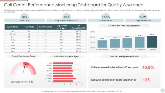
This slide showcases quality management dashboard that can help in monitoring the call center agents performance and reduce the call abandon rates. Its key components are total calls, avg answer speed, abandon rate and and avg calls or minute.
People who downloaded this PowerPoint presentation also viewed the following :
Call Center Performance Monitoring Dashboard For Quality Assurance with all 7 slides:
Use our Call Center Performance Monitoring Dashboard For Quality Assurance to effectively help you save your valuable time. They are readymade to fit into any presentation structure.





FAQs for Call Center Performance Monitoring Dashboard
Honestly, just stick to the basics that matter most. Average handle time and first call resolution are your bread and butter - they'll tell you if things are actually working. Customer satisfaction scores are obvious but crucial. Track your abandon rate and service level too (like how many calls get answered in 30 seconds). Agent utilization is super important, though it's kinda tricky because you don't want to turn into a micromanager, you know? Queue times and callback rates fill out the picture. Keep it to maybe 6-8 metrics total. More than that and your dashboard becomes this overwhelming mess nobody wants to look at.
Honestly, these dashboards are a total lifesaver. You get real-time data on everything - queue lengths, wait times, how your agents are doing. No more waiting around for end-of-day reports to find out things went sideways. Soon as call volumes spike or someone's struggling with their handle times, you can move people around or jump in to help. The alerts are clutch too - set them up so you'll know instantly when something hits your thresholds. Way better than hearing about problems from angry customers later. Trust me, once you start catching issues before they blow up, you won't go back.
Real-time gauges are your best friend for stuff like wait times and how many agents are free - gives you that instant pulse check. I'd use line charts to track call volume patterns throughout the day, super helpful. Heat maps are honestly amazing for spotting your crazy busy hours (way more useful than people think). Bar charts work well when you're comparing agent performance or different departments. Just... avoid pie charts, they're awful for actually comparing anything meaningful. Start with maybe 3-4 main metrics up top where you can't miss them, then add the detailed stuff underneath.
Dashboards are game-changers for keeping agents accountable. You get live data on everything - call volumes, how fast they're solving issues, customer satisfaction ratings. Agents can see exactly where they stand, and trust me, nobody wants to be the worst performer up on the big screen! It's way better than managers just guessing who's doing well. You can spot training opportunities instantly or celebrate the rockstars. The best part? Set up alerts so you catch problems early instead of dealing with disasters later. Way more effective than the old "check in once a week" approach.
Look, customer satisfaction is like your reality check - shows if all those other numbers actually mean anything to the people calling. CSAT scores, NPS, survey feedback - you want these sitting right next to handle times and resolution rates. Honestly? It's the most important one because your agents can nail every target and customers still walk away pissed off. Watch how satisfaction moves when you change things operationally. Without this stuff you're just guessing what actually drives results (learned that the hard way at my last job).
So basically, you can use AI to predict when your call center's gonna get slammed and figure out staffing ahead of time. The algorithms pick up on patterns too - like if someone's call history and tone suggests they're about to bail on your service. Start with predicting call volumes first since that's the easiest thing to nail down. Your dashboard can also guess which calls might blow up into supervisor territory or how long different issue types usually take to resolve. Honestly, the churn prediction stuff is pretty wild when it actually works. You'll see immediate results with better team scheduling.
Dude, role-based dashboards are a game changer. Agents need queue stats and customer details right there - they're not gonna dig through menus mid-call. Supervisors want performance stuff and escalation alerts. Managers? They care about trends and planning, not every tiny call detail (honestly such overkill for them). When everyone sees their relevant info, decisions happen faster and you catch issues early. Oh and here's what works - ask each team what three things they actually look at daily, then start there. Way better than guessing what they need.
So these dashboards basically crunch your old call data plus what's happening right now to predict when things get crazy. You'll start seeing patterns - like how Mondays are always hell or whatever your busy season looks like. Once you've got enough data, the predictions get surprisingly spot-on. It shows your forecasted call volume next to how many people you actually have scheduled, so you can catch staffing gaps early. Way better than panicking when your queue suddenly explodes. I'd say start with weekly patterns first, then get more specific with daily and hourly stuff to really nail your scheduling.
Focus on real-time stuff first - response times, abandonment rates, first-call resolution. Queue wait times and agent availability are clutch too. Honestly, color-coded alerts saved my butt so many times when things started going sideways. You want drill-down options by department or time periods. Set up alerts before you hit SLA thresholds, not after. The whole point is seeing everything at once so you can react fast. Oh, and make sure you can track how close you're getting to missing targets - that's usually where the panic starts.
Line charts are your best bet here - show your data over whatever time periods make sense. Moving averages will save your sanity because raw daily numbers look absolutely chaotic. I'd set up different timeframes so you can zoom in or out depending on what you're analyzing. Color-coding different metrics is clutch. Oh, and make sure whatever historical stuff you're tracking actually matches your current KPIs, otherwise you won't catch any real patterns. Start with your most important metrics first, then expand from there once you've got the basics down.
Keep it dead simple - show agents what they actually need: queue status, call volumes, their personal stats. Red/yellow/green color coding works perfectly. Don't cram everything on one screen though, that just stresses people out. Critical alerts need to be obvious, like impossible to ignore. Organize your widgets so supervisors can quickly scan during the chaos. You're designing for split-second decisions when things get crazy. Definitely test with real users first - they'll catch the annoying stuff you totally missed. The whole point is helping people make fast calls under pressure.
So basically when you connect all your customer data - phone, email, chat, social stuff - you stop getting those annoying fragmented conversations. You'll actually see the whole picture instead of just random pieces. Like you can spot customers who always get mad after trying to help themselves first, or figure out which channels are just making people more frustrated. Honestly, it saves you from so many headaches because you catch problems early. Plus you can send people to the right agents who actually know their history. Oh, and don't try to do everything at once - just start with your main 3 channels.
Start with encryption and role-based access - that's your foundation. Only show agents data they actually need for their current call, not everything in someone's file. Auto session timeouts are a must because people constantly forget to log out (drives me crazy). Mask sensitive stuff like SSNs and payment details whenever you can. Security audits should happen regularly, not just when something goes wrong. Oh, and definitely audit who has access to what right now - you'll probably find way too many people can see way too much. Tighten those permissions first.
Honestly, agent feedback is a game changer for dashboards. Most of the ones I've seen look fancy but agents totally ignore them because they don't match how work actually gets done. Your team knows which metrics actually matter vs the flashy stuff that executives love but doesn't help anyone. Ask them monthly what's useful and what's just visual clutter. They'll tell you which KPIs connect to real customer outcomes - that insight is gold. Sometimes they'll suggest metrics you never thought of. Turn those feedback sessions into dashboard updates and you'll have something people actually use instead of another pretty report gathering dust.
Honestly, data integration will probably be your biggest pain point - nothing wants to sync up the way it should. Your team's gonna push back hard at first because nobody likes learning new systems. Pick KPIs that actually tell you something useful, not just pretty numbers that look good in meetings. Technical problems are basically inevitable during rollout, and training takes way longer than you think it will. Oh, and definitely test with a small group first instead of rolling it out everywhere at once. Trust me on that one - I've seen too many companies mess this up by going big right away.
-
Love the template collection they have! I have prepared for my meetings much faster without worrying about designing a whole presentation from scratch.
-
It’s really cool, and you can find pretty much everything you could need for your work or school.