


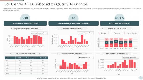
Call Center Kpi Dashboard For Quality Assurance




Try Before you Buy Download Free Sample Product
 Impress Your
 Audience
 100%
100% Editable
 Save Hours
 of Time


This slide showcases review sheet that can help call center to review the performance of customer service agents and take actions to improve the call quality. Its key components are call handling skills, problem solving skills and closure of call. This slide showcases KPI dashboard that can help organization to identify top performing agents and improve call center quality. Its key components are average response time, first call resolution, abandonment rate, average transfer rate and average hold time.
People who downloaded this PowerPoint presentation also viewed the following :
Call Center Kpi Dashboard For Quality Assurance with all 7 slides:
Use our Call Center Kpi Dashboard For Quality Assurance to effectively help you save your valuable time. They are readymade to fit into any presentation structure.





FAQs for Call Center Kpi Dashboard
Focus on the big four metrics first: Average Handle Time, First Call Resolution, Customer Satisfaction, and Service Level. Those hit your main bases - speed, quality, happy customers. Abandonment rate matters too since nobody wants callers hanging up in frustration. For managing your team, track agent utilization and occupancy rates. Honestly, I've seen way too many dashboards that are just metric overload - total nightmare to read. Keep it simple with these core ones first. You can always add more later based on what your operation actually struggles with. Start clean, build from there.
Look, data visualization basically turns all those messy call center spreadsheets into charts you can actually understand. Peak call times, agent performance issues, customer satisfaction drops - you'll spot them instantly instead of hunting through rows of numbers. It's honestly night and day compared to staring at raw data. Real-time dashboards are where I'd start if I were you. Your team will catch problems way faster, and honestly, everyone prefers looking at colorful graphs over boring spreadsheets anyway. Plus you won't feel like you need a statistics degree just to figure out what's happening.
AHT measures total call time - talking plus whatever paperwork agents do after. It's your main efficiency metric, but here's the thing: don't get too obsessed with it. Sure, lower numbers usually mean better productivity and costs. But I've watched teams get so focused on speed they started rushing customers off calls. Quality scores went straight down the drain. You really need both metrics on your dashboard - AHT and customer satisfaction scores. That way you're not accidentally screwing over service quality just to hit some arbitrary time target. Find the balance.
Look, nobody wants to explain their problem twice - it's literally the worst. FCR matters because customers can tell when your team actually knows what they're doing. Fix it on the first call? You've got their trust. The numbers back this up too. Even bumping FCR by 5% can increase satisfaction by 15-20%, which is pretty solid. If your FCR scores are tanking, that's basically a warning sign. Time to look at training or maybe your processes are just broken. Don't wait until people start leaving over it.
Honestly, the worst mistake is tunnel vision on single metrics. Like, your handle time looks awful but first call resolution is crushing it? That's actually awesome. I've watched managers completely freak out over hourly blips that literally don't matter at all. You can't compare Monday morning numbers to Friday afternoon either - totally different animals. Seasonal stuff will mess with your data too, plus random events that throw everything off. Look at multiple KPIs together and think about what was actually happening when you see those weird spikes.
Honestly, 15-30 seconds is what you want for the crucial stuff - queue lengths, wait times, how many agents are free. Your team needs that info now, not five minutes from now when it's useless. Daily trends and performance reports? Those can update every few minutes since they're not changing by the second anyway. I've seen places try to get away with longer refresh rates and it just doesn't work in call centers. Everything moves too fast. Start with 30-second updates and see how your system handles it - you can always dial it back if needed.
So definitely add predictive analytics and real-time sentiment analysis to what you've got. ML models can predict when call volume's gonna spike and how many agents you'll need. Speech analytics will catch frustrated customers before things blow up - honestly way better than trying to review everything manually. Text mining spots patterns across all your interactions too. Oh, and set up anomaly detection so you get alerts when numbers go weird. If you're just starting out though, I'd begin with sentiment scoring. Pretty straightforward to get running and you'll see customer experience trends right away.
So here's what works - keep an eye on wait times and how many people are stacked up in queue. Once wait times hit like 2-3 minutes, start pulling people from other stuff or add more agents fast. Queue depth is honestly my go-to metric now because it warns you before everything goes sideways. Track when people bail throughout the day too - you'll start seeing patterns. Peak times always need more bodies, obviously. Oh and set up alerts so you're not glued to your screen constantly watching numbers all day.
Track the basics like first call resolution and handle time, but add remote-specific stuff too. Login times are key since people love to get creative with schedules when working from home. System uptime becomes a bigger headache - home wifi fails way more than office connections. Quality scores need more frequent monitoring through call reviews. Customer satisfaction scores matter even more without face-to-face coaching happening. Also watch collaboration metrics - are people actually using internal chat and escalating when they should? Your dashboard should balance individual performance with how well everyone's connecting as a team. Remote work changes everything, honestly.
Honestly, start with monthly pulse surveys and track your eNPS alongside the usual stuff like AHT and CSAT. Absenteeism rates tell you a lot too. Pay attention to what comes up in 1:1s and team meetings - sometimes the best intel is just from random hallway conversations, you know? Voluntary turnover is huge. Also watch how people engage with team activities and how fast they respond to internal messages. Build a dashboard mixing hard numbers with the softer engagement stuff. You'll start seeing patterns where low morale tanks your other metrics. Trust me, it's worth the effort.
So instead of randomly tracking every metric you can think of, organize your call center KPIs into four buckets. Financial stuff like cost per call and revenue per agent. Customer metrics - CSAT, NPS, first call resolution. Internal processes cover average handle time and abandonment rates. Then learning & growth tracks agent training and employee satisfaction. Honestly, most teams just throw everything on a dashboard and call it done. This way you'll actually see connections - like how training your agents improves customer scores, which boosts your numbers. Start with maybe 2-3 metrics per bucket so it doesn't get overwhelming.
Ugh, turnover will absolutely wreck your call center numbers. New agents take forever to handle calls, so your average handle time goes through the roof. First call resolution? Forget about it - rookies just don't have the experience yet. Customer satisfaction tanks too, obviously. The money side is brutal - you're constantly hiring and training people. Your good agents who stick around get completely burned out covering extra shifts and babysitting the new folks. Honestly, I'd put turnover right on your main dashboard as an early warning system. Catch those trends before they spiral and destroy everything else.
Tableau, Power BI, and Looker are your best bets for call center dashboards. Power BI's honestly clutch if you're already in the Microsoft ecosystem - the integration just works. Tableau looks prettier but yeah, it'll drain your budget quick. Five9 and Genesys have decent built-in dashboards too, though they're kinda basic. Really depends what data sources you're pulling from. Start there first, then see which tool plays nice with your current setup. You don't want to be wrestling with connections when you just need to track AHT and resolution rates.
Honestly, just think about what each person actually does all day. Your frontline supervisors? They're dealing with agents constantly - so give them real-time stuff like queue status and performance alerts. Middle management needs the bigger picture, like weekly trends and team comparisons for process tweaks. C-suite just wants the money stuff - customer satisfaction, cost per call, business impact metrics. Don't overwhelm anyone with data they can't act on. Here's what I'd do: literally go ask each group what decisions they make daily, then build around that. Way easier than guessing.
Make your data tell a clear story - nobody wants to stare at a rainbow mess trying to figure out what's going on. Group similar stuff together and use colors that actually make sense. Different audiences care about different things, so show execs the high-level numbers while floor managers need the nitty-gritty details. I always add quick notes when something looks weird in the data. Short sentences work great sometimes. But honestly, the biggest thing is answering "so what?" - don't just dump numbers on people. Tell them what they should actually DO about it.
-
A fantastic collection of templates. I'll likely use this as my go-to resource for future templates and support.
-
Fantastic collection. Loved how we can personalize these templates as per the requirements.