


Circular organization chart powerpoint ppt template bundles




Try Before you Buy Download Free Sample Product
 Impress Your
 Audience
 100%
100% Editable
 Save Hours
 of Time


Our Circular Organization Chart Powerpoint Ppt Template Bundles are topically designed to provide an attractive backdrop to any subject. Use them to look like a presentation pro.
People who downloaded this PowerPoint presentation also viewed the following :
Circular organization chart powerpoint ppt template bundles with all 12 slides:
Use our Circular Organization Chart Powerpoint Ppt Template Bundles to effectively help you save your valuable time. They are readymade to fit into any presentation structure.
-
Circular Organization Chart
-

Eight Departments in Circular Organization Chart
-
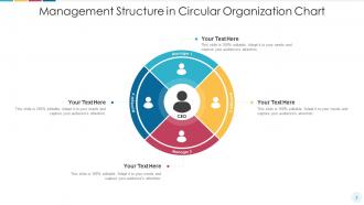
Management Structure in Circular Organization Chart
-

Circular Organization Chart with Research and Finance Department
-

Firm Circular Organization Chart Depicting Employees
-
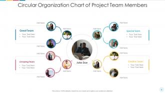
Circular Organization Chart of Project Team Members
-

Circular Organization Chart with Team Supervisors
-

Circular Organization Chart with Departmental Units
-
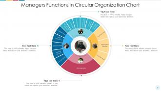
Managers Functions in Circular Organization Chart
-
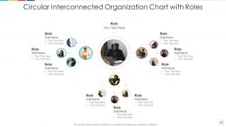
Circular Interconnected Organization Chart with Roles
-
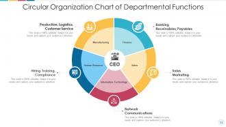
Circular Organization Chart of Departmental Functions
-

Thank You
FAQs for Circular organization chart powerpoint
Honestly, circular org charts are so much better for showing how teams actually work together. Instead of that pyramid thing where everyone's just looking up the chain, you get this visual that makes collaboration feel real. People seem more connected to each other, not just their boss. Works great for flatter companies too - you can actually see those cross-department relationships that matter. I tried sketching my team in a circle once (felt weird at first), but different patterns totally jumped out at me. Way less of that departmental drama when everyone looks equal on paper.
Dude, circular org charts are game-changers. They totally demolish those stuffy hierarchies that make everyone afraid to talk to each other. People stop thinking "I need to go through my manager's manager" and just connect directly with who they actually need. The visual itself shows everyone matters equally - way better than those pyramid things that basically scream "know your place." Cross-functional work becomes so much easier because you can see how roles actually connect. Oh, and here's something cool - try mapping your current projects against it. You'll instantly spot where collaboration is breaking down.
Honestly, circular org charts are great when you want to show everyone's collaborating instead of following strict chains of command. Flat organizations love them. So do startups and creative agencies where the whole "we're all equals" vibe matters - even if it's not totally true lol. They work really well for cross-functional teams too. The thing is, they show how departments connect around one central mission or whatever. But here's the catch - if your company actually has clear reporting structures, you might just end up confusing people. Like, sometimes the traditional chart is boring but at least everyone knows who their boss is, you know?
Put your CEO right in the middle, then work outward with departments in circles based on who reports to who. Pick maybe 3-4 colors and stick with them - one messy rainbow org chart killed my motivation once, don't do that to people! Make sure the font's big enough to actually read. Connect everything with lines or arrows so the reporting structure makes sense. Oh, and leave some breathing room with white space or it'll look like a hot mess. I always do the basic structure first, then worry about making it pretty afterward.
Start with concentric circles - put your core mission right in the middle, then build rings around it for different teams. Color code them or throw in some icons to show who does what (decision-making, execution, support stuff). Don't forget connecting lines between the circles so people can see how teams actually work together. Brief role descriptions work best - nobody wants to read a novel. Oh, and definitely add a legend because people will get confused by your symbols otherwise. It's honestly way better than those boring traditional org charts once everyone gets the hang of it.
Lucidchart is probably your best option here - they've got flexible tools that make circular layouts way easier than most platforms. Draw.io works well too and it's free. Canva has some templates but honestly they're pretty basic for org charts. You could use PowerPoint if you want, though you'll be dragging shapes around manually which gets old fast. Oh, and Lucidchart has a free version you can try first. Their circular templates might be exactly what you need without starting from scratch.
So circular org charts are pretty cool - they ditch that whole pyramid thing where some people look "lower" than others. Everyone just appears equally valued, which honestly makes more sense anyway. Instead of focusing on who's above who, it shows how connected everyone is. People actually speak up more because they don't feel visually stuck at the bottom of some hierarchy. I mean, it's such a simple switch but it really changes how teams interact. Worth trying if you want more collaboration and less of that awkward "I'm just a bottom-tier employee" vibe.
Getting people used to the new layout is the hardest part - it just feels super weird initially. Your team will push back hard because we're all so used to traditional hierarchies, you know? Circular charts are visually overwhelming too since they cram way more relationship info into one space. Decision-making paths become tricky to map out clearly. Honestly, I'd start small with maybe one team first? Get their honest feedback before rolling it out everywhere. Once you figure out how information actually flows in practice, the rest becomes way more manageable. Don't rush it.
Honestly, circular org charts work so much better for cross-functional stuff! Place your departments around the circle, then use lines or overlapping sections to show who's actually collaborating. Way more realistic than those old-school hierarchical charts that make everything look totally separate. Colors and dotted lines help too - or you can literally put people between departments if they have dual roles. The whole circular thing just feels more natural for teamwork, you know? I'd sketch out your current project teams this way and see what patterns jump out at you.
Honestly, color coding is a game changer for circular org charts. Your brain processes colors way faster than text, so people can spot patterns instantly. I'd assign different colors to each department - marketing gets blue, finance gets green, whatever works. You could also do it by hierarchy levels or reporting lines. The cool thing is it becomes like a visual shortcut instead of people having to read every single text box (which let's be real, nobody wants to do). Just keep the same colors across all your org stuff so people start remembering what means what.
Start from the center and work your way out - that's how I always do it. When someone leaves or joins, move them first, then shuffle everyone connected around them. Honestly, it's like rearranging seats at a wedding (way more stressful than it should be). If departments merge or split, you might need whole new rings. Keep related teams next to each other so it doesn't look completely random. Oh, and definitely save a copy with the date before you mess with anything - learned that one the hard way.
Dude, circular org charts are game-changers for strategic planning! They totally break down those stuffy hierarchical walls that usually shut people up. Instead of the typical top-down pyramid thing, you see how departments actually connect and work together. Teams contribute way more ideas when they feel like part of a network rather than just some box reporting upward. The whole conversation changes - it's wild how much more collaborative everyone gets. I mean, who wants to stare at another boring pyramid chart anyway? Give it a shot in your next planning meeting and watch what happens.
Circular org charts are great for showing how teams actually work together instead of just the reporting structure. Perfect for cross-functional projects since you can highlight all those connections between departments that regular charts totally miss. They look way more modern too - honestly makes any presentation feel less corporate and stuffy. I'd use them for matrix orgs or project teams where you need to show interdependence. Just don't dump it on a slide and walk away though. You'll need to actually explain the connections or people will just sit there confused trying to decode it themselves.
Oh yeah, there are some solid examples! Haier (that huge Chinese appliance company) broke itself into thousands of self-managed circular teams. Morning Star's probably the best case study though - they've been doing the whole circular, self-organizing thing with tomato processing for ages. Buffer and Spotify have their own versions too, where teams basically form circles around specific projects instead of those old-school hierarchies. Companies swear it speeds up decisions and keeps people more engaged. Honestly, if you're thinking about trying it, I'd just map out who your team actually talks to every day first - you'll probably see the natural circles already forming.
Circular org charts totally change the power dynamic - instead of your CEO looming at the top like some corporate overlord, everyone sits around the same circle. Way less intimidating, right? You can still show who reports to who with lines or colors, but suddenly it feels more like a team huddle than a military chain of command. Short sentences hit different too. The whole vibe shifts from "bow down to leadership" to "we're all working together here." Honestly, if you're trying to break down those weird office hierarchies or make leadership seem more approachable, going circular actually works. It's kind of psychology meets org design.
-
Unique and attractive product design.
-
Much better than the original! Thanks for the quick turnaround.
-
Commendable slides with attractive designs. Extremely pleased with the fact that they are easy to modify. Great work!
-
Easily Understandable slides.
-
Much better than the original! Thanks for the quick turnaround.