


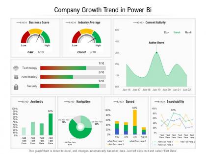
Company growth trend in power bi




Try Before you Buy Download Free Sample Product
 Impress Your
 Audience
 100%
100% Editable
 Save Hours
 of Time


Our Company Growth Trend In Power Bi are topically designed to provide an attractive backdrop to any subject. Use them to look like a presentation pro.
People who downloaded this PowerPoint presentation also viewed the following :
Company growth trend in power bi with all 2 slides:
Use our Company Growth Trend In Power Bi to effectively help you save your valuable time. They are readymade to fit into any presentation structure.
FAQs for Company growth trend
Honestly, start with the big three: revenue growth, customer acquisition cost, and lifetime value. Those will tell you the most. If you're SaaS, monthly recurring revenue is obviously crucial. Churn rate matters too - nobody talks about it enough but it's huge. I'd also track employee headcount because it shows how fast you're actually scaling. Oh, and net promoter score if your customers will actually fill those out. Year-over-year comparisons work better than quarterly since things get weird seasonally. Throw in gross margin and cash burn so you don't go broke. Start simple with maybe six metrics in Power BI, then add whatever your board keeps bugging you about.
Honestly, Power BI blows Excel charts out of the water for tracking growth. Instead of those boring static charts, you get dashboards where people can actually click around and dig into different time periods or regions themselves. The coolest part? You can stack multiple metrics together and spot patterns you'd totally miss in a regular spreadsheet. Your team won't bug you every five minutes for new charts since they can explore on their own - which is honestly a lifesaver. I'd start simple with line charts, then throw in some slicers and filters to make everything clickable.
Start with the basics - pull your revenue, expenses, and profit margins from whatever accounting system you're using. Sales data from your CRM comes next, plus customer metrics and operational stuff like headcount. External data (market trends, competitor intel) is where things get messy though - that's honestly a pain to automate well. Make sure your date ranges match up across everything or you'll be comparing totally different time periods. Oh, and don't try to do everything at once. Pick 2-3 main data sources first, get those running smoothly, then add more later.
So DAX functions are perfect for growth calculations in Power BI. DATEADD and SAMEPERIODLASTYEAR handle year-over-year stuff, while PARALLELPERIOD does custom comparisons. You can get really creative when you mix these with CALCULATE for filtering. I'd start with SAMEPERIODLASTYEAR for basic YoY calculations - it's pretty straightforward once you see it work. Then you can build up to the fancier trend analysis. Trust me, it beats doing percentage calculations by hand every time. The time-based comparisons alone will change how you look at data.
Power BI's forecasting is like having a crystal ball for your business trends. You can use the built-in stuff on line charts for quick predictions, or go deeper with DAX if you're feeling ambitious. Honestly, I use it way more than I thought I would - it's actually pretty solid for catching growth plateaus and seasonal patterns before they smack you. The seasonal stuff is probably my favorite feature. Just don't expect miracles if your historical data is messy. Clean data in, decent predictions out. Garbage in... well, you know how that goes.
You've gotta break down your growth data by different stuff - region, product type, customer segments, whatever matters to your business. Honestly, looking at just the total numbers is pretty useless. Like you might see "10% growth this quarter" but miss that enterprise customers are tanking while small businesses are crushing it. Or your West Coast team could be hiding how badly other regions are doing. I always tell people it's like going from fuzzy vision to contacts - suddenly everything makes sense. Just build separate charts in Power BI for each segment and compare them side by side. The patterns will jump out at you.
Dude, line charts are definitely your best bet for growth trends - they show changes over time really well. You can throw multiple metrics on there too which is handy. Area charts are another solid option, especially if you want to highlight how big the growth actually is (and yeah, they do look pretty slick). Oh, and combo charts work when you're mixing different data types - like growth percentages with actual revenue numbers. Just don't use pie charts for this stuff, they're completely pointless. One thing that really helps is adding a trend line to your line charts. Makes it super clear for people who might not catch the patterns right away.
Honestly, your time window makes or breaks these growth charts. Go too short and you'll freak out over random spikes that don't mean anything. Longer periods smooth out seasonal stuff so you can actually see what's happening underneath. I watched someone lose their mind over a monthly drop that looked totally fine when we pulled back to quarterly - classic mistake. Daily growth rates are just noise most of the time. Annual ones might miss important shifts though. My approach? Start wide to catch the big picture, then zoom in on weird spots to figure out what's going on.
Oh man, the worst thing you can do is mix up your time periods - like comparing January to a full quarter or whatever. Your numbers will be completely wrong. Clean your data first too because missing stuff and duplicates are sneaky little gremlins. Outliers mess everything up badly, especially those random seasonal spikes that come out of nowhere. If your company uses a weird fiscal year, set that up properly or you'll hate yourself later. Honestly, I always double-check a few calculations by hand first - saves so much headache when something looks off.
You'll want to try conditional formatting - it's a game changer for spotting growth trends quickly. Basically you set rules that auto-color your data. Green for positive growth, red for declines, yellow for flat stuff. Works on tables, matrices, even those KPI cards. I probably use it way too much but honestly, who has time to scan through endless rows of numbers? Set it up once and boom - your problem areas just jump out at you. Your reports basically tell their own story without you having to hunt for patterns.
So growth trend analysis is basically your roadmap for making better business decisions. Look at your key metrics over 12+ months to spot real patterns. You'll see which products are crushing it and which markets are dead weight - honestly saves you from throwing money at losing bets. Plus you can catch problems early instead of scrambling later. When budget season rolls around, having solid trend data makes your pitch way stronger. It's not magic, just smart use of the numbers you already have. Start simple and track what actually moves the needle for your business.
Dude, Power BI's interactive stuff is where it gets fun. Slicers let you filter by dates, regions, whatever - way better than staring at boring static charts. Click on any data point and drill straight into the details behind it. The cross-filtering thing is pretty slick too - select something on one chart and watch everything else update automatically. You start seeing connections you'd totally miss otherwise. Oh, and definitely build a dashboard where people can switch between different growth metrics. Makes the whole analysis feel like you're actually exploring the data instead of just... looking at it, you know?
So Power BI's actually pretty solid for team collaboration on growth analysis. You can share dashboards directly through their service and create workspaces where everyone can edit together. The commenting system rocks - you can @mention people to pull them into discussions about specific data points. Automatic refreshes keep everyone seeing the latest metrics, which is clutch. Oh, and you can set different permission levels so your boss can peek at the data without accidentally messing up your beautiful charts (learned that one the hard way). I'd start with a dedicated workspace for the whole project.
Power BI's forecasting stuff is actually pretty solid for this. Add a forecast line to your time series charts - it'll use exponential smoothing to project future values from your historical patterns. The AI insights feature is weirdly good at catching trends you'd totally miss otherwise. You need at least 12-24 months of clean data though, or the predictions get wonky. Set up your date tables right and pick reasonable confidence intervals. Oh, and definitely test forecasts against stuff you already know happened to see how accurate they are. I'd start with basic revenue or customer metrics first - easier to wrap your head around.
First thing - switch to DirectQuery or composite models for big datasets. Trust me on this one. Import mode will kill you later. Set up incremental refresh for your historical stuff and throw in some aggregation tables to speed things up. Don't go crazy with complex DAX in visuals that refresh all the time either. Oh, and if different teams need access, plan your row-level security from day one instead of trying to bolt it on later (learned that the hard way). Most crucial part? Test everything with real data volumes before you launch. Performance always tanks once people actually start clicking around.
-
Use of icon with content is very relateable, informative and appealing.
-
Good research work and creative work done on every template.
-
Easy to edit slides with easy to understand instructions.