

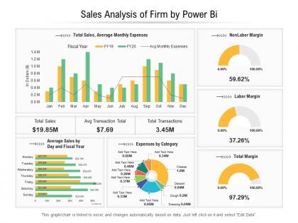
Sales analysis of firm by power bi




Try Before you Buy Download Free Sample Product
 Impress Your
 Audience
 100%
100% Editable
 Save Hours
 of Time


Our Sales Analysis Of Firm By Power Bi are topically designed to provide an attractive backdrop to any subject. Use them to look like a presentation pro.
People who downloaded this PowerPoint presentation also viewed the following :
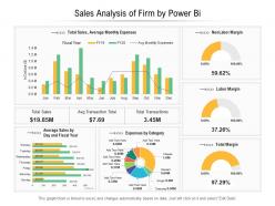
Sales analysis of firm by power bi with all 2 slides:
Use our Sales Analysis Of Firm By Power Bi to effectively help you save your valuable time. They are readymade to fit into any presentation structure.
FAQs for Sales analysis of firm
Honestly, Power BI is great because it fixes that nightmare of having data everywhere - your CRM, random Excel files, different databases. Everything gets pulled into one dashboard that actually shows you what's happening with sales. The drag-and-drop thing is pretty easy to figure out, so you won't be bugging IT constantly for new reports. Your team can check stuff on their phones too, which is super handy when you're out meeting clients. Oh, and definitely start with whatever manual report is driving you crazy right now - automate that sucker first.
So start with Get Data in Power BI - connects to pretty much everything. Excel, SQL, APIs, SharePoint, you name it. Power Query is where the magic happens though. Clean everything up there before bringing it into your model. I always get sucked into tweaking stuff for hours in Power Query, but honestly it saves you later. Use common fields like product IDs or dates to link your tables together. Oh and definitely start with whatever data source you trust most, then add the rest. Test those relationships early or you'll hate yourself.
Line charts are your best bet for tracking trends over time. Bar charts work well when you're comparing different products or regions. I'd throw in some cards for those key metrics like total revenue - keeps things clean. Scatter plots are solid for showing relationships, like how price affects quantity sold. Maps look amazing if you've got geographic data, though honestly they can be overkill sometimes. Don't get too fancy with the visuals - I've seen people create these elaborate dashboards that nobody actually uses. Simple tables with some conditional formatting often tell the story better than complex charts. Just focus on what actually answers your business questions first.
Calculated measures are perfect for sales analysis - you can build custom metrics that update automatically when you filter data. Way better than basic sales numbers. You'll be able to track year-over-year growth, running totals, average deal sizes by region, stuff like that. They calculate in real-time which honestly beats calculated columns every time. I'd start with simple ratios first though. Once you're comfortable, try the time intelligence functions for things like "this quarter vs last year" or rolling 12-month averages. Trust me, it's so much easier than wrestling with those Excel formulas that never seem to work right.
First thing - get your data model sorted out. Sales, customer, and product tables need to connect cleanly or you'll hate yourself later. Put the big metrics up top: revenue, units sold, conversion rates. Month-over-month trend charts are a must because execs eat that stuff up. Add filters for dates, regions, product categories so people can dig into specifics. Don't go crazy with colors or cram too much on one screen - learned that the hard way. Oh, and definitely run it by the actual sales team first. They'll spot problems you totally missed.
So for Power BI, import both your sales and target data first. Then use a clustered column chart - though honestly I prefer combo charts since they make trends way more obvious. Create a variance measure that shows the difference between actual vs target. The conditional formatting trick is clutch here - set underperforming stuff to show red so problem areas jump out immediately. Oh, and start with monthly views before getting into the weedy daily breakdowns. Makes the whole thing less overwhelming when you're presenting it.
DAX is the formula language for building custom calculations in Power BI - way more powerful than Excel formulas. You can create stuff like year-over-year growth, rolling averages, filtered totals that update automatically when people click around your dashboards. Not gonna lie, it's confusing at first. Functions like CALCULATE and SUMX will become your best friends though. They let you analyze sales data in ways basic visuals just can't handle. I'd start simple - total sales, average deal size, that kind of thing. Gets you used to how the syntax works before diving into the complex stuff.
So here's what I'd do - connect your CRM and SQL stuff directly to Power BI first. Then set up automatic refreshes, maybe start with daily just to make sure nothing breaks. Once that's solid, you can bump it up to hourly or even 15 minutes if you've got Premium (totally worth it btw). The streaming datasets thing is actually pretty slick for live data. Oh and definitely set up email alerts when your key numbers hit certain points - saves you from constantly checking dashboards. Your team will love getting those automated updates instead of asking for reports all the time.
Oh man, data modeling will mess you up if you're not careful. Don't just throw everything into one giant table - I made that mistake once and it was a nightmare. Set up proper fact/dimension tables instead. Your date table needs to be rock solid too, no gaps or you'll get weird results. Double-counting is another killer, especially with multiple sales channels. Honestly the hierarchy stuff gets confusing fast. Always check your numbers against the source before showing anyone - learned that one the embarrassing way! Start with basic stuff first, then add the fancy metrics later.
So Power BI segmentation is basically breaking down your sales data into chunks that actually make sense. Like by customer type, region, product lines - whatever matters to your business. The cool part? You'll find stuff that's totally hidden in those big aggregate numbers. Maybe your best product is tanking in the west coast, or your smallest customers are way more profitable than you thought. Honestly beats staring at summary totals all day. I'd start with whatever questions keep you up at night about the business and segment around those first.
So Power BI's forecasting stuff is actually pretty cool - it'll predict your sales trends and spot seasonal patterns using your old data. You can see which products might tank or blow up, plus when your crazy busy times are coming. The revenue projections for next quarter are solid too. Oh, and those confidence intervals on the charts? Super helpful for knowing if you can actually trust what it's telling you. Just make sure your data isn't a mess first - garbage in, garbage out, you know? Keep updating the models or they'll get stale fast.
Power BI is perfect for this! Start with basic customer segmentation - that's your foundation. Connect your CRM and sales data, then build visuals for purchase patterns, frequency, and lifetime value. The heat maps showing when people buy stuff are actually fascinating (I got lost in those for hours). Track repeat purchases, average order values, and churn rates. Make it interactive so you can zoom from big-picture trends down to specific customers. Seasonal buying habits and product preferences are goldmines too. Don't overcomplicate it initially though - get the segmentation working first, then expand from there.
First thing - clean your data before it even touches Power BI. Check for dupes, missing stuff, weird formatting in your CRM. Power Query can catch errors during refresh if you set up rules right. Create columns that flag sketchy entries (negative quantities are always sus). I made this mistake once and had duplicate customers all over my dashboard - never again lol. Build quick sanity check visuals too, compare totals across different views. Oh and document your transformation steps! You'll thank me later when something breaks. Set up regular audits so issues don't pile up.
Power BI has some really solid tools for digging into sales data. Quick Insights is probably your best starting point - just right-click any chart and it'll find patterns you'd totally miss. The Decomposition Tree is great for drilling down into what's actually driving your numbers. Key Influencers shows which factors hit your sales hardest. Smart narratives will literally write up explanations of your trends, which honestly saves tons of time. You can also throw trend lines and forecasting onto visuals through the Analytics pane. I'd definitely start with Quick Insights though - it's like having a data analyst peek over your shoulder.
First thing - publish your reports to the Power BI service. Then hit the "Share" button and add your team's emails. They'll get links to view everything right in their browser, which honestly beats having everyone install Desktop. For ongoing stuff, set up a shared workspace where people can actually edit together. Just heads up though - everyone needs Pro or Premium licenses to access shared reports. I'd probably test it with just one report first to see how it works for your team before going all-in.
-
Design layout is very impressive.
-
Excellent design and quick turnaround.
-
Unique design & color.