

Diapositivas de presentación de Powerpoint del perfil de la empresa






Try Before you Buy Download Free Sample Product
 Impress Your
Audience
 100%
Editable
 Save Hours
of Time


Presentar el perfil de una empresa es una tarea un poco complicada y, para ayudarle, hemos creado esta presentación de PowerPoint del perfil de la empresa lista para el contenido. Puede ser presentado por la gerencia media / alta de la empresa a terceros como bancos, clientes, inversores. La plantilla PPT de descripción general corporativa consta de 59 diapositivas que incluyen la agenda, sobre nosotros, fundadores de la empresa, descripción general, visión y misión, departamentos y equipos, metas y objetivos, valores fundamentales, nuestro equipo, estructura de la organización, perfil de miembro, servicios comerciales, soluciones , flujo de trabajo en la organización, cronograma del proyecto, proyectos futuros, competencia en el mercado, crecimiento empresarial, generación de ingresos, desempeño, clientes, estudio de caso, testimonios de clientes, ubicación, presencia global, finanzas clave, instantáneas financieras, enlaces a redes sociales, contáctenos y muchos más . Estos gráficos de presentación de resumen corporativo están destinados a presentar temas como componentes comerciales, información comercial, resumen corporativo, estructura de la organización, imagen corporativa, características e Introducción. Descargue las diapositivas PPT de nuestro perfil de empresa para mantener a la audiencia comprometida hasta el final. Conviértalos en acción con nuestras diapositivas de presentación en PowerPoint del perfil de la empresa. Se sentirán cargados.
People who downloaded this PowerPoint presentation also viewed the following :
Contenido de esta presentación de Powerpoint
Diapositiva 1 : esta diapositiva presenta el perfil de su empresa. Indique el nombre de la empresa para comenzar.
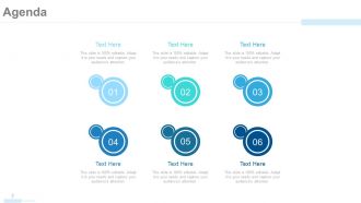
Diapositiva 2 : Esta es una diapositiva de Agenda. Indique sus agendas, etc. aquí.
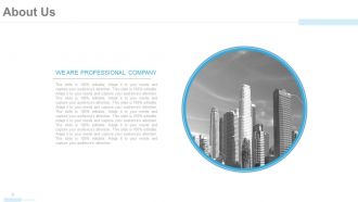
Diapositiva 3 : Esta es una diapositiva Acerca de nosotros para mostrar las especificaciones de la empresa / equipo, información, etc.
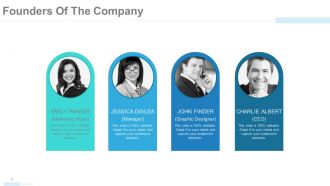
Diapositiva 4 : Esta diapositiva muestra a los fundadores de la empresa con nombre, designación, etc.
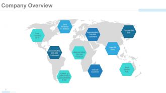
Diapositiva 5 : esta diapositiva muestra la descripción general de la empresa en una imagen de mapa mundial. Puede cambiar / editar contenidos según sus necesidades.
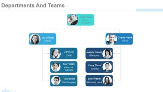
Diapositiva 6 : Esta diapositiva muestra los departamentos y equipos con nombre, designación, etc. en forma de diagrama de árbol / gráfico.
Diapositiva 7 : Esta es Nuestra visión y misión, diapositiva en estado.
Diapositiva 8 : Esta diapositiva también establece nuestra visión y misión.
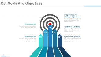
Diapositiva 9 : Esta diapositiva establece nuestras metas y objetivos. Estos incluyen: Programadores para Objetivos Estratégicos, Sistemas y Soluciones, Operación de Soluciones, Plan de Negocios.
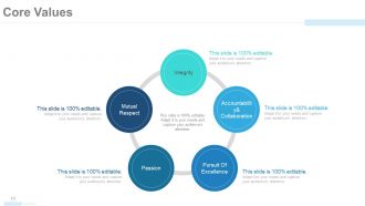
Diapositiva 10 : Esta diapositiva muestra los valores fundamentales en una forma de imagen circular. Estos son: integridad, responsabilidad y colaboración, mutuo, respeto, pasión, búsqueda de la excelencia.
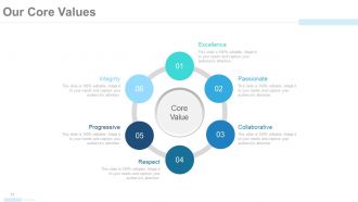
Diapositiva 11 : Esta diapositiva establece Nuestros valores fundamentales en forma de imagen circular. Estos incluyen: Excelencia, Apasionado, Colaborativo, Respeto, Progresivo, Integridad.
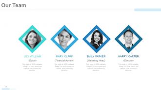
Diapositiva 12 : Esta diapositiva muestra a Nuestro equipo con nombre, cuadros de imagen para completar la información.
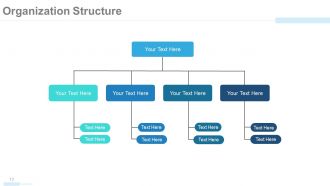
Diapositiva 13 : Esta diapositiva muestra la estructura organizativa de la empresa en forma de diagrama de árbol.
Diapositiva 14 : Esta diapositiva muestra el perfil del miembro con el nombre y otros detalles relevantes.
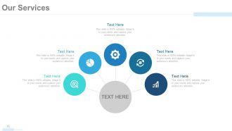
Diapositiva 15 : Esta diapositiva presenta Nuestros Servicios con imágenes respectivas.
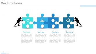
Diapositiva 16 : Esta diapositiva presenta Nuestras soluciones con rompecabezas e imágenes humanas.
Diapositiva 17 : Esta es otra diapositiva que indica Nuestras soluciones con sus respectivos iconos.
Diapositiva 18 : Esta es la diapositiva Flujo de trabajo en la organización con iconos.
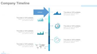
Diapositiva 19 : Esta diapositiva presenta el cronograma de la empresa para representar el crecimiento, los hitos, etc.
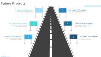
Diapositiva 20 : Esta diapositiva presenta los proyectos futuros de la empresa con una hoja de ruta y cuadros de texto.
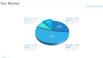
Diapositiva 21 : Esta es la diapositiva Nuestro mercado en forma de gráfico circular.
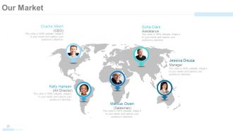
Diapositiva 22 : Esta diapositiva también presenta Nuestro mercado con nombre, designación, etc. en una imagen de mapa mundial.
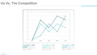
Diapositiva 23 : Somos nosotros vs. La competencia se desliza en un gráfico de líneas / gráfico para establecer la comparación entre las materias primas / entidades, etc.
Diapositiva 24 : Esta diapositiva también muestra Nosotros vs. La Competencia en silhouttes de personas.
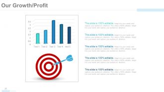
Diapositiva 25 : Esta diapositiva muestra nuestro crecimiento / beneficio en tablas y gráficos e imágenes de destino.
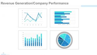
Diapositiva 26 : Esta diapositiva muestra la Generación de ingresos / Desempeño de la empresa en cuadros y gráficos.
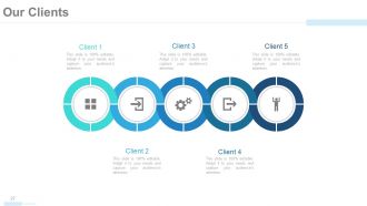
Diapositiva 27 : Esta diapositiva presenta a Nuestros Clientes en forma de imagen circular e íconos para acompañar.
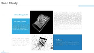
Diapositiva 28 : Esta es una diapositiva de un estudio de caso para presentar los antecedentes del cliente. También establece Solución, Beneficio y Desafíos.
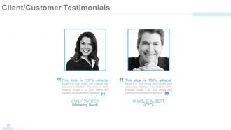
Diapositiva 29 : Esta diapositiva presenta los testimonios de clientes con nombre, imagen y cuadros de texto.
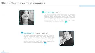
Diapositiva 30 : Esta es otra diapositiva que muestra los testimonios de clientes.
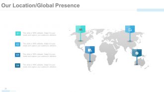
Diapositiva 31 : Esta diapositiva muestra Nuestra ubicación / Presencia global en un formulario de imagen de mapa mundial.
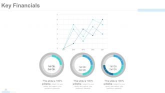
Diapositiva 32 : Esta diapositiva indica las puntuaciones, aspectos, etc. de Key Financials en cuadros y gráficos.
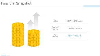
Diapositiva 33 : Esta diapositiva muestra una instantánea financiera de las ventas, los ingresos operativos y los ingresos netos con imágenes relevantes.
Diapositiva 34 : Esta es la diapositiva Find Us On Social Media con sus respectivos iconos.
Diapositiva 35 : Esta es la diapositiva Contáctenos. Indique sus datos, etc. aquí.
Diapositiva 36 : esta diapositiva avanza a Diapositivas adicionales. Puede cambiar / editar contenido según sus necesidades.
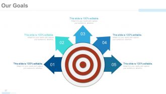
Diapositiva 37 : Esta diapositiva muestra Nuestros objetivos con flechas e imágenes de destino. Indique aquí sus metas, aspiraciones, etc.
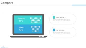
Diapositiva 38 : Esta diapositiva se titula Comparar para establecer una comparación entre entidades / productos, etc.
Diapositiva 39 : Esta es una diapositiva de Cotizaciones para transmitir mensajes, creencias, etc. Puede cambiar / editar el contenido según sus necesidades.
Diapositiva 40 : Esta es una diapositiva de Ubicación en una imagen de mapa mundial para mostrar el crecimiento global, la presencia, etc.
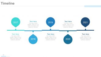
Diapositiva 41 : Esta diapositiva presenta una línea de tiempo para mostrar el crecimiento, los hitos, etc.
Diapositiva 42 : Esta es una diapositiva Publicarlo para marcar recordatorios, eventos, etc.
Diapositiva 43 : Esta es una diapositiva de periódico para mostrar noticias, eventos, etc. Puede cambiar el contenido de la diapositiva según sus necesidades.
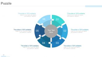
Diapositiva 44 : esta es una diapositiva de imagen de rompecabezas para mostrar información, especificaciones, etc.
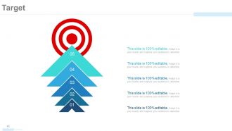
Diapositiva 45 : esta es una diapositiva de destino con flechas e imágenes de destino. Indique sus objetivos, etc. aquí.
Diapositiva 46 : Esta diapositiva presenta los puntajes financieros en un cuadro / gráfico combinado.
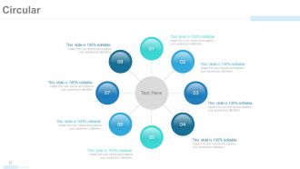
Diapositiva 47 : Esta es una diapositiva de imagen circular para mostrar información, especificaciones, etc.
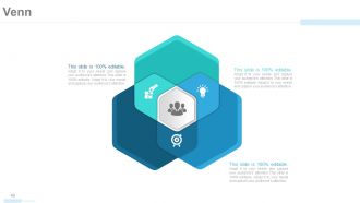
Diapositiva 48 : Esta es una diapositiva de imagen de diagrama de Venn para indicar información, especificaciones, etc.
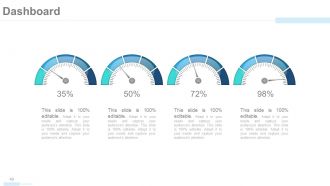
Diapositiva 49 : esta diapositiva muestra un panel con imágenes métricas. Puede presentar kpis, métricas, etc. aquí.
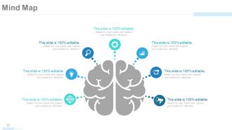
Diapositiva 50 : Esta es una diapositiva de mapa mental para mostrar la segmentación del comportamiento, información o cualquier cosa específica.
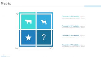
Diapositiva 51 : Esta diapositiva muestra una matriz en términos de alto y bajo. Puede alterar / modificar el contenido según sea necesario.
Diapositiva 52 : Esta es una diapositiva de bloques de Lego para presentar información, especificaciones, etc.
Diapositiva 53 : Esta es una diapositiva de Siluetas para mostrar información orientada a las personas, especificaciones, etc.
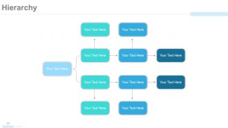
Diapositiva 54 : Esta es una diapositiva de jerarquía para presentar el equipo, las especificaciones, etc. en forma de diagrama de árbol.
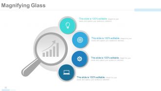
Diapositiva 55 : Esta es una diapositiva con imagen de lupa para mostrar información, especificaciones, etc.
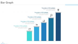
Diapositiva 56 : Esta es una diapositiva de imagen de gráfico de barras para mostrar la comparación de productos, el crecimiento, etc.
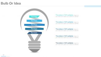
Diapositiva 57 : Esta es una diapositiva de imagen de bombilla o idea para presentar información, aspectos innovadores, etc.
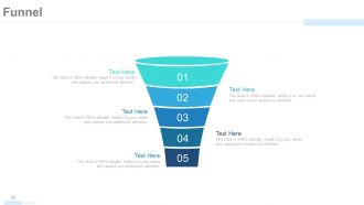
Diapositiva 58 : esta diapositiva muestra una imagen de embudo con cuadros de texto. Estado de información, proceso en forma de embudo aquí.
Diapositiva 59 : Esta es una diapositiva de agradecimiento con la dirección # número de calle, ciudad, estado, números de contacto, dirección de correo electrónico.
Perfil de la empresa Presentación en PowerPoint con las 59 diapositivas:
Descubra formas ingeniosas con nuestras diapositivas de presentación en PowerPoint del perfil de la empresa. Maneje los obstáculos de una manera inteligente.





FAQs for Company profile
Honestly, the animation system is what hooked me - you don't need any design background but can still make stuff look super professional. Saves me tons of time compared to other tools that are either too basic or way too complicated. The collaboration thing is pretty neat too, people can drop comments right on specific parts of slides. Oh, and it automatically pulls your brand colors and fonts once you upload them, which is clutch. But here's the cool part - you get analytics showing which slides people actually paid attention to. I'd mess around with the animation builder first, that's where you'll really see why it's different from everything else out there.
Honestly, we put a lot of work into researching what different industries actually need instead of just winging it. So you'll see templates for tech startups, consulting, creative agencies, boring corporate stuff - we study their specific problems and test everything with real users first. The whole variety thing was huge for us because generic templates are pretty much useless, right? Each one has the right language, metrics, and visual style for that sector. I'd probably start by filtering to your industry, then tweak it to match your company's vibe from there.
So we usually start by figuring out what's actually frustrating people in their daily work - like what makes them want to throw their laptop across the room. Then it's wireframes first, which honestly look pretty ugly at this stage. Our designers get way too obsessed with pixel-perfect mockups after that (they'll spend an hour debating button corners, I swear). The real magic happens when we prototype and test with actual humans though. You'd be surprised how often something that looks amazing just... doesn't work. We iterate based on what users tell us, not what we think looks cool. Want me to break down how we approach any specific template?
Honestly, just keep everything clean and don't overthink it. Make sure people can actually find stuff without hunting around forever. Fast loading times are huge - nobody's waiting around these days. Also, literally everyone's on mobile now so test that first. Map out where users actually go on your site before you design anything. Readable fonts, lots of white space, clear navigation. Sounds boring but it works. The hierarchy thing matters too - like what they see first vs second. Bottom line: if someone can't do what they came to do easily, you've already lost them.
We put out new template updates every quarter, so fresh stuff drops about every 3 months. Design trends are crazy fast right now - like, blink and you missed something. But quarterly works because we can actually see what's gonna stick around vs just random hype. Monthly we'll do little fixes if something big happens in the industry. Oh, and definitely peek at our "What's New" section when each quarter starts. That's where all the good additions live, plus trend updates you'll probably want for your projects.
Yeah, the templates are actually pretty flexible! Colors, fonts, layouts - you can mess with basically all the visual stuff to match your brand. Adding or removing sections is easy too, and you can swap out the placeholder text. The drag-and-drop thing is weirdly satisfying once you start using it. Honestly, I probably spend too much time tweaking things when I should be working. You can save whatever changes you make as new templates, which is nice. I'd just grab one of the base templates and mess around with the customization panel - that's how I figured out what worked for me.
We track this stuff a few different ways. Popup surveys after downloads asking about template quality - though honestly people barely fill those out. Way better data comes from our quarterly interviews with around 50 active users about their actual workflow issues. Analytics show us which templates people download versus which ones they ditch halfway through editing. That abandonment data is pretty telling. Oh, and definitely watch support ticket patterns - I always flag those to product since they reveal template gaps we're totally missing. The user interviews are honestly where we get the best insights though.
Yeah totally! The template gallery has theme filters right at the top - sustainability, tech, healthcare, finance, bunch of others. Way better than scrolling through hundreds of random templates tbh. They come with matching colors and visuals already built in, plus some have industry-specific content sections. Super helpful if you're trying to match your company vibe. Oh, and the sustainability ones are pretty versatile - I've seen people use them for totally different industries and they still look good. Start there maybe?
Yeah, so we stick to WCAG 2.1 AA standards - basically the gold standard for accessibility stuff. All our templates have proper color contrast, alt text, keyboard navigation, the works. Honestly, we actually test with real assistive tech because you can't just wing it and hope it works. Your templates get semantic HTML, focus indicators, scalable fonts - all that good stuff. Oh, and screen reader compatibility obviously. The best part? You won't have to worry about legal headaches later, plus any client can use them confidently knowing they'll actually work for everyone.
Just hit the "Insert" tab in the template editor and you'll see options for videos, audio, images, all that stuff. The drag-and-drop thing is pretty smooth - honestly got carried away playing with it yesterday lol. Watch your file sizes though, nobody wants to sit through a slow-loading presentation. For company profiles, I'd throw in a quick intro video and some solid product shots or team photos. Oh and definitely preview it on your phone or tablet first - I've learned that lesson the hard way when text gets all wonky on smaller screens.
Dude, this stuff is SO important but people totally overlook it. Colors literally trigger emotions before anyone even processes what they're looking at. Blue = trustworthy, orange = energetic, you get it. Same with fonts - serif looks traditional and established, sans-serif feels fresh and modern. I'm probably way too obsessed with this lol, but when you get both right? Your brand's already communicating before people read anything. Oh and here's the thing - most businesses just pick whatever looks "nice" instead of thinking about what message they're actually sending. Next time you're looking at designs, ask yourself what vibe the colors and typography are giving off.
Look, you don't need to be some design wizard for these. They're made for regular people like us who can barely match socks. Just swap in your own stuff - the colors and fonts are already picked out professionally. There are video walkthroughs too, which honestly saved me when I first started. If you mess something up (and you probably will at first, we all do), their chat support is actually helpful. Start with the ones tagged "beginner-friendly" - trust me on this one. You can always get fancier later once you figure out what you're doing.
Oh totally! CloudSync and Artisan Home Co. are probably our best examples - both landed huge deals using our templates. CloudSync's presentation looked amazing when I saw it last week, honestly couldn't tell it wasn't custom. We've had consulting firms, real estate people, even some nonprofits use them for investor pitches. Saved them like weeks of design headaches. The retail brands especially seem to love how polished everything looks without the crazy price tag. Want me to find some examples that match what you're working on? I can probably dig up something more specific to your industry.
Oh perfect timing - I literally just helped my sister with this last week! Start with their "Presentation Basics" tutorial, it's actually pretty solid. The beginner templates are a lifesaver honestly, way better than staring at a blank slide wondering what the hell you're doing. They've got weekly live sessions too where you can bug them with questions. There's also this community forum that's surprisingly active - people share random tips and tricks all the time. I'd grab a template first and just mess around with it while going through the tutorial. You'll get the hang of it quick!
Yeah, copyright's covered - you get full commercial rights when you download. Use them for client work, personal projects, whatever. Just can't resell the actual template files, but honestly who'd want to do that anyway? Stock images and fonts that come with them are legit too. Short sentences work. Longer ones flow better when you're explaining the nitty-gritty details about licensing stuff. Each download includes a license file that breaks down exactly what you can and can't do with it - probably worth skimming that just to be safe.
-
absolutely is perfect
-
convenient for design. I can save time
-
very good
-
Editable templates with innovative design and color combination.
-
Enough space for editing and adding your own content.
-
This is a great template. It generates many 8deas and resembles our dashboards.