


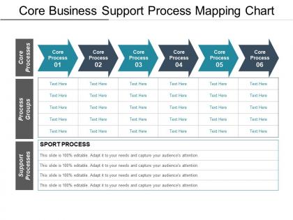
Core business support process mapping chart




Try Before you Buy Download Free Sample Product
 Impress Your
 Audience
 100%
100% Editable
 Save Hours
 of Time


Convince folks about the Doctrine of Humanity with our Core Business Support Process Mapping Chart. Be able to curb communal conflicts.
People who downloaded this PowerPoint presentation also viewed the following :
Core business support process mapping chart with all 5 slides:
Export your thoughts on our Core Business Support Process Mapping Chart. Dispatch them to all corners of the earth.



FAQs for Core business support
You'll want clear start/end points, decision diamonds, and process rectangles with arrows showing the flow. But here's the thing - most maps totally bomb because nobody assigns ownership to each step. That's huge. Also include your inputs, outputs, and whatever systems you're using. Don't stress about perfect symbols though, just stay consistent. Oh, and start with sticky notes on a wall first! Way easier than jumping straight into software. Once everyone agrees on the flow, then you can make it all digital and pretty.
Dude, process mapping is a game changer - it shows you exactly where your workflows are bleeding time and money. When you actually map out something you think you know well, it's wild how many bottlenecks and pointless steps you'll find. Plus all those confusing handoff points where nobody knows who's supposed to do what. I swear, half the time teams are just standing around waiting for clarification. Map it out visually and you can cut the fat, speed things up, get everyone on the same page. Pick that one process that's been driving your team crazy and start there.
Honestly, I'd go with Lucidchart or Miro first - they're super easy to use and your whole team can edit stuff together. Visio works if you already have it, but it feels pretty dated compared to the newer options. Draw.io is decent for free basic mapping. There are fancier tools like Bizagi for complex analysis, though that's probably way more than you need right now. I actually switched from Visio to Miro last year and haven't looked back. You'll literally be creating maps within minutes of setting up an account.
So basically when you map out your whole process, all the messy spots become super obvious. Like you'll see where work just sits waiting forever or where everything funnels into one poor person who's drowning. Instead of just feeling like "ugh this is slow," you can actually pinpoint why. The visual part is huge - patterns jump out that you'd never notice otherwise. Maybe Karen in accounting is accidentally bottlenecking three different workflows (sorry Karen). Once you spot these problem areas on paper, you can actually fix them instead of just complaining about how things drag.
So basically, high-level maps are just the main steps - maybe 5-10 boxes showing the big picture stuff. Detailed ones get into everything: who's doing what, which systems they're using, all the weird exceptions that pop up (and there's always some random edge case nobody mentions upfront). I'd go high-level when you're talking to executives or onboarding someone new. Save the detailed maps for training people or when you're trying to fix something that's broken. Honestly, always start simple first. Way easier to add details later than trying to untangle some overcomplicated mess of a flowchart.
Honestly, process mapping is a game changer for getting teams aligned. You know how projects always seem to go sideways because everyone has different ideas about who's doing what? A simple flowchart fixes that. Instead of playing telephone with instructions, everyone's looking at the same visual roadmap. Makes it super easy to spot where things get stuck too - like when Sarah's team is waiting on data that Mike's team didn't know they needed to provide. I've seen it save so many headaches. Worth sketching out your workflow before your next big project kicks off.
Honestly, you gotta map out what's happening now before trying to fix anything. I've watched so many teams mess this up - they jump straight into "solutions" without understanding the actual process first. Crazy waste of time. Map your current state to spot bottlenecks and pain points. That becomes your baseline for measuring if stuff actually improves. Then sketch out your ideal future state, make changes, and update the maps based on what really worked (not what you hoped would work). Oh, and don't just file these away - treat them like living documents you actually revisit during improvement cycles.
Dude, you HAVE to talk to the actual people doing the work first. I learned this the hard way - spent weeks on a beautiful process map that was totally wrong because I didn't ask anyone what really happens. The frontline staff know all the workarounds and weird exceptions that never get written down anywhere. Interview people at different levels before you start mapping anything. Short conversations work fine, just figure out who touches each part of the process. Otherwise you're just making stuff up that looks official but doesn't reflect reality at all.
Honestly, process mapping is a lifesaver for compliance stuff. You're basically creating visual proof of how work actually happens, and auditors eat that up. Maps help you catch missing controls before they become problems - think of it as your early warning system. When regulations change (which feels like every other week), you can quickly see what needs updating. They're also great for training new people on the right way to do things. Oh, and if you're just starting out, focus on your riskiest processes first since those will give you the biggest bang for your buck.
Honestly, the worst thing you can do is try mapping everything at once - I learned that the hard way. Start with the big picture flow instead of getting stuck in tiny details right away. And for the love of god, talk to the people who actually do the work! Your assumptions about their process are probably way off. Skip fancy software at first. Sticky notes work fine. Also don't obsess over making it perfect from day one - that's how you never finish anything. Get something rough together, test it with real people, then fix what's broken. Way less painful that way.
Honestly, process maps are like cheat codes for training new people. You can literally show them how work moves through your team instead of dumping some boring manual on them (who even reads those?). New hires actually see where they fit and what connects to what. During training, you can walk through real situations using the map. Here's something cool though - get the new person to mark up your process map or ask questions about it. They'll catch stuff you totally missed because you're too close to it. Fresh perspective is everything.
Okay so swimlane diagrams are basically lifesavers for messy processes. You literally split everything into lanes - one for each department or person involved. What's brilliant is you can immediately see who owns what step. No more "wait, whose job is this again?" moments. The handoffs between teams become super obvious, which is usually where things fall apart anyway. Regular flowcharts just show the steps, but this shows the people drama too (and there's always people drama). You'll spot duplicated work and those weird gaps where nobody's actually responsible. My manager made us use these last year and honestly? Total game changer for our quarterly reviews.
So automation is totally changing how we do process mapping now. AI tools can actually watch your systems and auto-generate maps from your data flows - no more drawing everything by hand. The maps update themselves in real-time too, which honestly saves so much time. They'll spot bottlenecks and suggest improvements without you having to dig through everything manually. RPA integration is huge because it shows you exactly which steps you should automate first. Oh, and definitely check out process mining tools - you'll be shocked at how different your actual processes are from what you thought they were doing.
Honestly, start with the basics - cycle time and lead time are your bread and butter. Cycle time shows how long your whole process takes, lead time is what customers actually experience waiting. Throughput's good too (how much you're cranking out per hour/day/whatever). My personal favorite though? Value-added vs non-value steps. Sounds boring but it's like a lightbulb moment when you see how much waste there is. Queue times and error rates matter obviously. Oh, and don't forget resource utilization. Pick maybe 2-3 that'll actually move the needle for your customers or budget first. You can always add more later.
Think of process mapping as your early warning system. You're basically walking through each step to catch where stuff might blow up. Honestly, it's one of those things that seems boring but saves your butt later. Map it out and you'll see the bottlenecks, weird dependencies, and spots where one hiccup could mess up everything downstream. Then you can actually plan for the risky parts instead of just crossing your fingers. I'd start with whatever process would cause the most chaos if it failed - that's usually where you get the biggest bang for your effort.
-
Designs have enough space to add content.
-
Illustrative design with editable content. Exceptional value for money. Highly pleased with the product.