


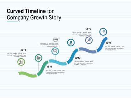
Curved timeline for company growth story




Try Before you Buy Download Free Sample Product
 Impress Your
 Audience
 100%
100% Editable
 Save Hours
 of Time


Ensure your group comes to no harm with our Curved Timeline For Company Growth Story. Be able to handle insidious attempts.
People who downloaded this PowerPoint presentation also viewed the following :
Curved timeline for company growth story with all 5 slides:
Fight insidious diseases with our Curved Timeline For Company Growth Story. Enlighten folks about early detection.
FAQs for Curved timeline for
Honestly, curved timelines just look way better than straight boring lines. Your audience actually follows them instead of zoning out - there's something about the visual flow that keeps people engaged. Plus you can pack more info into less space since curves use the whole slide efficiently. Key milestones pop more when you put them at curve peaks too. I'm obsessed with S-curves lately, they make even the dullest project timeline feel modern. Straight lines are so 2010, you know? Try a gentle spiral next time - it's wild how much more dynamic your presentation feels. People actually pay attention.
Oh man, curved timelines are game-changers! Your audience actually follows the flow instead of getting lost in boring bullet points. The curve literally shows momentum - like when you're walking through how a project evolved or where things are headed next. Makes transitions super smooth too, not all choppy like those default PowerPoint templates (which honestly look terrible). Short sentences hit different. The visual itself becomes part of your story, you know? Try it for milestones or growth charts - people won't zone out halfway through. Way more engaging than straight lines.
Curved timelines are perfect for storytelling stuff - like career paths, project evolution, or personal journeys. They work way better than straight lines when you're showing growth or transformation. I've noticed they're amazing for user journey maps or portfolios where you want to highlight how skills developed over time. The curve pulls your eye forward and builds momentum naturally. Oh, and if your story has clear turning points or peaks? Definitely go curved. It just feels more dynamic than boring straight timelines. Really makes the whole narrative feel alive, you know?
Honestly, curved timelines are so much better for keeping people engaged. Your brain just naturally wants to follow that flowing path - way more interesting than some boring straight line marching across the screen. It makes the whole thing feel like you're telling a story instead of just rattling off dates. You get more creative freedom too with the spacing and layout. Key milestones pop better when they're positioned along an S-curve or gentle arc. I swear people actually pay attention instead of immediately checking their phones. Try it on your next project - you'll see what I mean.
Adobe Illustrator or Canva are your best bet - they handle curved paths really well. PowerPoint works too if you're already used to it, but honestly the curve tools are kind of annoying. I always get frustrated with those bezier handles. For interactive stuff, check out Timeline JS or Preceden. But I'd probably just start with Canva since their templates are pretty good and you can tweak the curve however you want. Oh, and don't make the text too small when it follows the curve - that's where everyone screws up and it becomes impossible to read.
Oh totally - marketing teams are obsessed with curved timelines, especially when campaigns ramp up toward launch. Software devs use them all the time too since sprints get absolutely nuts near deadlines. Event planning is probably the biggest one though (weddings are insane those last few weeks). Construction and manufacturing rely on them because resource stuff and task dependencies make everything non-linear. Honestly, curved timelines just make more sense than straight ones for most projects. Worth thinking about next time you're planning phases - does your workflow actually stay consistent or does it build momentum?
Honestly, the biggest thing is not going overboard with the curve itself - I've seen people make them so dramatic they're basically unreadable. Also cramming tons of text along curved paths? Total nightmare. Your timeline needs to make sense logically even with the fancy curve, and test it on mobile because curves can look awful on phones. Oh, and spacing! You don't want elements overlapping in weird ways. The thing that trips people up most though is assuming it looks as clear to users as it does to you - always test with real people first.
Dude, color theory is a game changer for curved timelines! Use contrasting colors to separate different periods or categories - maybe try a cool-to-warm gradient that flows with your curve. Complementary colors are perfect for making key milestones pop against the main line. Also, color intensity can show importance or how time progresses. Group related events with similar colors so they feel connected. Oh, and don't go crazy - stick to like 3-4 colors max or it'll look messy. Test them against your background first though, trust me on that one.
Honestly, curved timelines are a game changer for showing how events actually connect. Like with WWI - there's the assassination, rising nationalism, all those messy alliances happening at once. When you curve the timeline, you can visually link those overlapping causes instead of just listing dates in a boring straight line. Your audience finally gets the "why" behind everything, not just when stuff happened. I started doing this for presentations and wow, what a difference. Try sketching your next timeline with some strategic bends - you'll see how much clearer your story gets.
So basically, our brains are wired to see sharp angles as threatening while curves feel safe and natural. Weird but true! Curved timelines flow better too - people can actually follow the info progression more easily. There's something about curves that suggests movement, you know? Makes the whole thing feel less rigid and boring. I've noticed users stick around longer when you use softer shapes instead of harsh straight lines. The content feels way less overwhelming. Honestly, even subtle curves make a huge difference in how approachable your timeline feels.
So you've got a few solid options here. Hover effects and clickable nodes are your bread and butter - let users click on events to expand details or pop up modals. Most timeline libraries make binding those click events pretty straightforward. The curve can be zoomable and draggable too, which honestly makes everything feel way more polished. For animations, CSS transitions work fine but GSAP is *chef's kiss* if you want buttery smooth stuff. I'd start simple with basic click-to-expand, then get fancy with animated transitions between different timeline sections once that's working.
Okay so with curved timelines, short labels are your friend. I usually put them all on the outside of the curve, but you can alternate sides if things get crowded. The apex is where everything goes to hell - that's when you'll want leader lines or callout boxes. Don't rotate your text to follow the curve though, it looks cool but nobody can actually read it. Keep everything horizontal instead. Oh and if you've got events bunched up together, just group them into clusters with sub-labels. Way cleaner that way. Test it at actual size before you call it done.
Honestly? Curved timelines usually make things harder to read, not easier. We're wired to read time left-to-right or top-to-bottom in straight lines. When you bend that into curves, people have to mentally work harder to follow what comes next. Yeah, they look way cooler than boring straight lines - I totally get wanting something that pops visually. But you'll sacrifice clarity for style. It becomes trickier to eyeball how long tasks take or spot where things overlap. For stakeholder meetings where people need to make quick decisions, definitely go linear. Save the curved ones for when the visual wow factor actually matters more than the details.
So the biggest thing right now is interactive curved timelines - you can actually click through different phases instead of just staring at a static image. Way better engagement. Spirals and S-curves are everywhere too, which honestly makes sense for guiding people through complex stuff like project phases or company histories. The color gradients have gotten really slick for showing progression. Some designs are getting ridiculously over-the-top though. But when done right? They actually work. I'd say match your curves to your content - spirals for cyclical stuff, gentle arcs for straightforward progressions. Oh, and make sure the curve helps tell your story rather than just looking pretty.
So definitely get feedback early and often - test it with real users before you commit to anything. Watch how people actually navigate your curved timeline, not just what they say about it. I've made this mistake before where I thought something was super intuitive but users were totally lost! Run quick surveys asking about readability and whether the curve helps or confuses them. Sometimes people get tripped up in weird spots you'd never expect. Set up those feedback sessions with a few different types of users if you can. Then just keep tweaking based on what you discover - don't take their first reactions personally.
No Reviews