


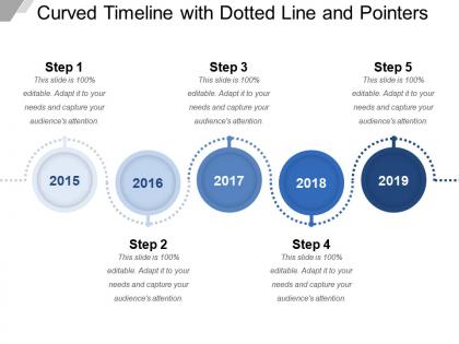
Curved timeline with dotted line and pointers




Try Before you Buy Download Free Sample Product
 Impress Your
 Audience
 100%
100% Editable
 Save Hours
 of Time


Feel the delight of having immense choices with our Curved Timeline With Dotted Line And Pointers. Enjoy an abundance of ideas.
People who downloaded this PowerPoint presentation also viewed the following :
Curved timeline with dotted line and pointers with all 5 slides:
Our Curved Timeline With Dotted Line And Pointers get you in harmony with yourself. Your thoughts will emerge in a coherent fashion.


FAQs for Curved timeline with dotted
Honestly, curved timelines are a game changer for fitting more info without cramming everything together. They show connections between events way more naturally than straight lines do. Perfect for cyclical stuff - like seasonal data or anything that repeats. People actually follow them better too, instead of doing that endless horizontal scrolling thing (which is honestly pretty annoying). Mobile users especially love them since they don't have to constantly zoom in and out. I'd definitely try them for project timelines or historical stuff where you want to highlight how different time periods connect. Way more engaging visually.
Honestly, curved timelines are way better than those boring straight ones everyone uses. They guide your eye in this smooth, natural arc that actually keeps people interested - I swear straight timelines just make me zone out immediately. You can play with the curves to highlight important moments too, like making the bend tighter or spacing things out differently. Creates these nice pause points in your story. S-curves work great for complex stuff with multiple phases, or try spirals if you're feeling fancy. Your audience will actually follow along instead of glazing over halfway through.
Focus on three main things: smooth curves, consistent spacing, and clear hierarchy. Jerky curves are honestly just annoying to navigate, so keep that arc predictable. Space your timeline points proportionally along the path—don't let them bunch up weird. Keep text labels horizontal too, not tilted to match the curve (trust me on this one). Clockwise direction feels more natural for most people. Oh, and definitely test it with real content first! I learned that the hard way when my "perfect" design looked terrible with actual data.
So for colors on your curved timeline - warm ones like reds and oranges are perfect for the big important stuff you want people to notice first. Cool blues and greens work better for background info. Please don't go nuts with rainbow gradients (I've seen some truly awful examples). Sequential color schemes show progression really nicely, or use different colors for different data categories. The curve actually helps here since color transitions look way more natural when they're gradual. Oh, and try varying saturation levels to show how intense or important different events were.
Interactive stuff makes curved timelines way more engaging! Hover tooltips work great for extra details. Clickable nodes that expand? Even better. People definitely spend more time exploring when they can actually interact instead of just staring at a static timeline. Zoom and pan controls are clutch - lets users move at their own speed. Honestly, drag-to-navigate feels super natural once you try it. The whole point is giving users control over how they explore your data. I'd start simple with hover states first, then see what your users actually want. No point overbuilding if they just need the basics, you know?
Honestly, D3.js is your best bet if you can handle some coding - gives you total control over whatever weird curves you want. Tableau and Power BI are decent for basic stuff, but their curve options kinda suck tbh. If coding isn't your thing, Chart.js or Highcharts are pretty solid middle ground. Adobe Illustrator works great too if you just need static designs. Oh, and Figma's surprisingly good for mockups. My advice? Sketch out what you actually want first - like, what specific curve style - then work backwards to pick the tool. Interactive vs static makes a huge difference in what you should use.
Dude, curved timelines are game-changers for project mapping. Instead of boring straight lines, you bend them to show how milestones actually flow together. When milestone B can't start until A wraps up, the curve makes that dependency super obvious. Bottlenecks jump right out at you. Stakeholders love them too - way more engaging than those clunky Gantt charts nobody wants to stare at. They're perfect for iterative work where phases loop back on themselves. I used one for our last sprint and honestly? The whole team finally got how everything connected.
Don't go crazy with the curve - I learned this the hard way when half my timeline became unreadable. Gentle arcs work way better than dramatic swooshes. Space your points evenly and watch out for text getting cramped at the edges. Font size should stay consistent throughout (obvious but people mess this up constantly). Adding little connecting dots helps anchor each event to the curve. Oh and definitely test on mobile since curves can look totally different on smaller screens. Start subtle - you can always make it more dramatic if it looks boring, but fixing an over-curved disaster is annoying.
So for curved timelines with tons of data, start with just the big stuff visible. Then let people click to see more details - way better than cramming everything on there at once. I learned this the hard way on a project last year, total mess otherwise! Different sized dots or colors help show what's most important. You can also group similar events together so they expand when clicked. Oh and leave plenty of breathing room along the curve. Sounds obvious but makes a huge difference. People should feel curious to explore, not overwhelmed right away.
Ok so typography can totally make or break curved timelines. Sans-serif fonts are your friend here - they stay readable when text gets rotated at weird angles. Serif fonts just get messy. Size matters more than usual since people's eyes follow curves differently. I swear, bad text placement is like timeline design kryptonite. Mix up where you put labels - inside the curve sometimes, outside when there's more room. Keep everything short and punchy. Oh, and definitely check how it looks zoomed in/out before you call it done.
Honestly, curved timelines are a nightmare on mobile. Just go vertical or do a super gentle S-curve that won't make people want to throw their phone. Those fancy desktop spirals? Total disaster on small screens - learned that the hard way once. Start with a straight timeline, then use media queries to add the curves for bigger screens. Make your touch targets chunky so people can actually tap them. The content needs to scroll smoothly too. Test on real devices constantly, not just browser dev tools.
Tesla does this really well - their investor presentations use curved timelines to map out how different car models connect over time instead of just showing linear steps. Way more intuitive than those rigid Gantt charts, honestly. Airbnb pulls the same trick when showing market expansion - the curves make their global growth look natural rather than choppy. McKinsey uses them for client projects too, which makes sense since transformation work is messy and interconnected. Try curves when you've got milestones that build on each other or when you want that flowing feel over hard deadlines.
So here's the thing - people from right-to-left reading cultures will follow your curved timeline backwards from what you'd expect. Pretty obvious once you think about it, right? Some cultures see time as cyclical instead of linear, which honestly makes curves feel more natural to them. Colors are tricky too since red doesn't mean "stop" everywhere. I'd test this stuff with different user groups first. Maybe add some arrows or give people layout options? You don't want half your users completely confused about which direction time's supposed to flow.
Honestly, the worst thing you can do is make that curve way too dramatic - it'll look like a roller coaster! Don't cram tons of text along the path either because it gets all warped and nobody can read it. I've totally seen people go nuts with animations that just make everyone dizzy. Keep it gentle. Space out your timeline points so they breathe a little. Oh, and definitely check how it looks from the back of the room - curves can create these weird viewing angles. Clean fonts work best, or maybe put your labels outside the curve instead.
Honestly, user feedback is everything when you're tweaking curved timeline templates. People will tell you straight up if your navigation is confusing or if they can't follow the flow. I've watched designers get obsessed with these gorgeous swoopy curves that users absolutely hate navigating - it's painful to watch. Test different curve styles and see what clicks. Also worth checking how screen readers handle your layouts since curves can mess with accessibility. Run some user sessions, check your analytics for drop-off points. Then actually use that data to fix things instead of just going with what looks pretty.
-
Great designs, Easily Editable.
-
Very unique and reliable designs.