


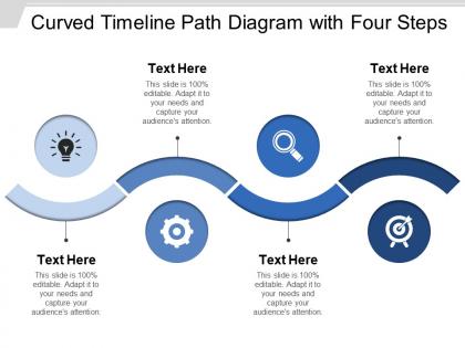
Curved timeline path diagram with four steps




Try Before you Buy Download Free Sample Product
 Impress Your
 Audience
 100%
100% Editable
 Save Hours
 of Time


Create conditions conducive for the infirm with our Curved Timeline Path Diagram With Four Steps. It helps cater for the disabled.
People who downloaded this PowerPoint presentation also viewed the following :
Curved timeline path diagram with four steps with all 5 slides:
Charge their grey cells with our Curved Timeline Path Diagram With Four Steps. Give them great ideas to chew upon.
FAQs for Curved timeline path diagram
Honestly, curved timelines are game-changers when you've got tons of events to show. They pack way more info into tight spaces without making people scroll forever. Straight lines? Kinda boring if I'm being real. The curved thing naturally shows cycles and patterns better too - like when historical events repeat or project phases overlap weirdly. I started using them whenever I hit 15+ data points and wow, such a cleaner look. Your audience stays way more engaged since there's actual visual flow instead of just... a line. Worth trying next time you're drowning in timeline data.
Honestly, curved timelines are perfect for stuff that builds momentum - like revolutions or tech breakthroughs where things snowball. Life stories work great too since nobody's life feels like a straight line, you know? The curve shows those turning points and how events actually connect to each other. Regular timelines are fine but they're kind of... boring? If your events have clear phases or show real progression (not just dates in order), go curved. Makes complex historical patterns way easier to follow. Oh, and social movements are another good fit - they rarely move in straight lines anyway.
Think of it like directing a movie instead of just listing facts. Curved timelines guide people's emotions through your story - tension builds, hits the peak, then resolves. Way more engaging than flat bullet points, honestly. The visual curve literally pulls their eyes along the journey you're creating. Put your biggest moments at the peaks and turns where they'll hit hardest. Steep curves work great for dramatic stuff, gentler slopes for the quieter transitions. It's weird how much difference the shape makes, but people actually *feel* the story instead of just reading it.
Definitely go for smooth, flowing curves - nothing too crazy or it'll look like a mess. Good contrast between your timeline and background is key so people can actually read the thing. Space out your events properly too, cramped timelines are the worst. I always make my milestone markers the same size and style, keeps everything looking clean. Oh and test it at different zoom levels! I learned that one the hard way when my beautiful timeline turned into tiny unreadable dots. Gentle curves work way better than dramatic swoopy ones, trust me.
Honestly, colors and fonts can totally make or break your timeline. Use bold, contrasting colors to guide people's eyes and make important stuff pop. But don't go overboard—I've seen timelines where someone used like 5 different fancy fonts and it was impossible to read! Stick to 2-3 colors max. Dark ones for major events, lighter shades for the smaller details. Keep your headers bold and body text simple. Oh, and readable fonts are key—nobody wants to squint at decorative script when they're trying to follow your story. Trust me, clean design keeps people actually engaged.
Figma's probably your best bet - it's free and the curve tools are solid. Plus working with others is super easy if that matters. Adobe Illustrator gives you way more control over bezier curves, but honestly it might be overkill unless you're doing something really detailed. Lucidchart and Canva work fine for simpler stuff, though they're not as flexible. PowerPoint can even handle basic curved timelines if you're already comfortable with it (I know, I know, but it actually works). I'd mess around with Figma first since it won't cost you anything, then upgrade to Illustrator later if you need the extra features.
Totally! Curved timelines actually work really well, especially for messy projects with lots of moving parts. I've used them on creative stuff where everything's constantly shifting around. The curves help show where different teams need to connect or when big decisions happen. Works way better than those rigid Gantt charts sometimes - honestly, those things can be such a pain when your project doesn't follow a straight line. Just make sure everyone can still figure out what's due when. Maybe try sketching one out next time you're planning? Could be a game-changer for tracking dependencies without the usual timeline headaches.
Ugh, don't cram everything onto one timeline - it'll look messy as hell. Space your events consistently or people won't get the timing. I learned this the hard way! Also, dramatic curves might look cool but they're confusing to follow. Label everything clearly and keep text readable (no sideways words). Colors need good contrast too. The whole thing should flow naturally so readers don't have to squint or get lost halfway through. Short version: less is more, test it out first.
Hotspots are your best bet - add clickable points that show pop-up cards with dates, pics, or videos when people hover. You could make the timeline animate as users scroll, or throw in a slider so they can scrub through different periods. I've seen people go overboard with parallax stuff, but honestly it just makes me dizzy. Start with simple hover effects first. Then build up based on what actually helps people understand your content better, not just what looks cool. The fancy animations can wait - focus on making it useful first, then worry about the flashy bits.
Yeah, you'll see them a lot in creative stuff - marketing agencies, design firms, entertainment companies. They love the storytelling aspect since visual flow matters just as much as the actual timeline. Tech companies use curved ones for user journeys and product roadmaps too. Honestly? They're everywhere in consulting presentations right now - kinda trendy. The curve just makes progression feel more natural than those boring linear steps. If you're doing client work where you need to tell a story, definitely try one. Way more engaging than straight timelines.
Honestly, spacing makes or breaks curved timelines. Without it, you'll have a hot mess nobody can follow. I always use consistent gaps between events - the curve naturally bunches things up at turns, which is annoying. Break complex timelines into chunks so people don't get overwhelmed. Color coding helps too, especially for different phases. Trust me, I've made the mistake of cramming everything together before. You can't tell what happened when! Visual breaks are your friend here. Do this right and you won't hate yourself later when you're trying to read your own timeline.
Put your icons at the important spots - milestones, key processes, that kind of stuff. Don't just scatter them everywhere for decoration. Keep them the same style and size because mixing cartoon ones with realistic icons looks awful (learned that the hard way). Simple, high-contrast images work best since they'll still be readable when you zoom out. You can stick them right on the timeline or offset them with little connecting lines. Oh, and test different zoom levels - nothing's worse than icons that disappear when you're trying to actually use the thing. Make your biggest events stand out the most.
Short labels work best - don't make people squint to read tiny text crammed everywhere. Pick one side of the curve or alternate them so it's not a mess. Honestly, I've seen too many timelines where everything's smooshed together and you can't tell what happened when. Leader lines are your friend when space gets tight. Stick with the same date format throughout (seriously, mixing "Jan 2020" and "January 2020" looks sloppy). Color coding helps if you've got different types of events. But here's the thing - readability beats looking pretty every time. Show it to someone who doesn't know the topic first. If they're confused, you'll know what needs fixing.
Honestly, curved timeline animations are a game-changer for presentations. They naturally pull your audience's eye along the path instead of just throwing all the info at them upfront. The curves look way more interesting than straight lines - I mean, who wants to stare at something that looks like a boring timeline from history class? Movement keeps people focused, and you can reveal stuff at just the right moments to build some actual suspense. Works great for project milestones or when you're walking through historical events. Plus breaking down complex sequences this way just makes more sense.
Test it with pre/post quizzes to see if people actually get it better than straight timelines. Ask specific questions about how they understood the sequence right after they look at it. Honestly, A/B testing is probably your smartest move here - gives you real data instead of guessing. Track how long it takes people to figure things out and how many mistakes they make. Heat mapping shows where their eyes get stuck or wander off. Follow-up interviews help too, though they're more work. I'd start small with like 20-30 people before doing anything major.
-
It saves your time and decrease your efforts in half.
-
Content of slide is easy to understand and edit.