


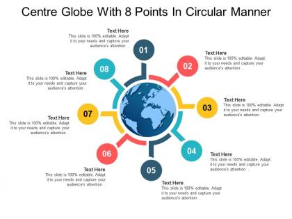
Centre globe with 8 points in circular manner




Try Before you Buy Download Free Sample Product
 Impress Your
 Audience
 100%
100% Editable
 Save Hours
 of Time


Handle attempts to induce discord with our Centre Globe With 8 Points In Circular Manner. Address any biased journalism.
People who downloaded this PowerPoint presentation also viewed the following :
Centre globe with 8 points in circular manner with all 5 slides:
Bring the jibes to an end with our Centre Globe With 8 Points In Circular Manner. Ensure folks amend incorrect impressions.
FAQs for Centre globe with 8 points
Globe diagrams are clutch for showing worldwide reach or international data - way better than cramming detailed maps onto slides. Your audience instantly gets the scale without you having to explain everything. Super useful when you're pitching market expansion or talking about global partnerships to stakeholders. Honestly, they just look way more professional than listing countries in bullet points (which is kinda boring anyway). Perfect for emphasizing your company's international presence too. The visual impact really helps people grasp how big your reach actually is across different continents.
Honestly, globe diagrams are perfect when you need that big picture view - flat maps always mess up the proportions somehow. Your audience can actually see how countries relate to each other without those weird stretched-out distortions. Works amazing for global stuff like trade routes or climate patterns since people can visualize the real distances. Interactive ones where you can spin and zoom? Chef's kiss. Just make your data points big enough so they don't disappear when it rotates. Way more engaging than those rectangular maps that put everyone to sleep.
Honestly, Adobe Illustrator is probably your best bet for globe diagrams. You get complete control over colors and styling, and most people already know how to use it. QGIS is solid too if you need real geographic data - it's free but kinda annoying to learn at first. For something quick and dirty, PowerPoint or Canva work fine with their globe templates. ArcGIS is overkill unless you're doing serious mapping work. I'd just use whatever you've got installed first and see how it goes before buying anything new.
Globes are honestly so much better than flat maps for teaching geography! Your students can actually see how countries relate to each other size-wise and spin it around to explore different regions. Time zones make way more sense on a globe too. Have them use string to measure distances between cities - it's pretty mind-blowing how huge our planet really is. They'll get engaged tracing shipping routes or comparing continent sizes. Plus there's something satisfying about physically rotating it instead of just staring at a boring textbook page. Weather patterns are easier to explain this way too.
Start with colors and fonts - ditch those default blues/greens for your actual brand colors. Your company fonts should replace whatever generic ones are there. Logo goes in a corner, maybe as a light watermark so it's not screaming at people. Most folks totally overdo this part and it looks like a mess, honestly. Keep continent lines simple but maybe highlight regions that actually matter to your business with different shades. The whole point is making it obviously yours while people can still read the thing. Those three changes alone will get you a decent branded globe that won't make your presentation look amateur.
Honestly, go with 2D for print stuff and presentations where everyone needs to see the same thing. 3D looks fancy but it's kind of annoying when you just want to show a specific region - people start spinning it around and get distracted. Plus 2D loads way faster and you can actually put labels on it without them getting all weird. Textbooks work better with flat diagrams too, obviously. I mean, 3D is fun for interactive exploring, but if you just need to communicate something clearly? Save yourself the hassle and stick with good old 2D.
Oh, globe diagrams are honestly perfect for climate stuff! You can see the whole planet at once - temperatures, sea ice, rainfall patterns, whatever. The cool thing is how they show that climate change isn't hitting everywhere the same way. Like, the Arctic is getting absolutely hammered while other places are more subtle. Plus there's something about seeing it on an actual globe that makes people realize we're talking about our entire planet, not just random weather reports. Definitely use color gradients or animations if you can - makes the changes way more obvious.
Ugh, the main problem is you're squishing 3D stuff onto a flat screen - something's gotta give. Greenland ends up looking bigger than Africa (which is wild if you think about it), while places near the equator get totally smooshed. Half the globe is always hiding too, so good luck showing everything at once. Colors can look completely different depending on the angle you're viewing from. Honestly, projection distortion is just unavoidable. I'd say throw in a legend explaining what method you used, and if you can make it interactive with different angles, even better.
Honestly, color schemes will make or break your globe diagram. Go for high contrast - dark blue oceans with bright land masses work great because people can instantly tell elements apart. Don't use similar hues though (like green forests next to blue-green water - I totally messed that up on a project last year and it looked awful). Test your colors with something like Coblis so colorblind people can read it too. Keep it simple with maybe 3-4 main colors max. Visual chaos is real! Always check how it looks on different screens before you present.
First figure out who's actually looking at this thing - do they know what map projections are or will they freak out when Greenland looks massive? Some people need everything labeled while others get data viz immediately. Younger crowds expect stuff they can click and mess with. Don't go all US-centric if you've got international people. Make sure colorblind folks can read it too with good contrast. Honestly, cultural context is huge here - what makes sense to one group might be totally confusing to another. Just run it by a couple people from your target group first. Saves you headaches later.
Honestly, globe diagrams are perfect for this. You can plot all your suppliers and manufacturers with connecting lines showing material flows between countries. Different colors work great for product categories, and bigger nodes show higher volume spots. Way better than flat maps - you actually see the real distances and spatial relationships. Short routes vs long ones become super obvious to stakeholders. The 3D view makes bottlenecks jump out immediately. Oh, and try adding time zone overlays if you're dealing with coordination headaches across regions. Makes those scheduling issues way more visual.
Honestly, globe diagrams are a game-changer for international expansion planning. You can color-code your current markets, targets, and places you're avoiding - gives you instant visual clarity. Way better than staring at endless spreadsheets (though I still end up using both, let's be real). They're perfect for showing execs that big-picture view they love, plus you can spot gaps in your coverage super easily. I'd grab a world map template and start plotting market penetration levels by region. You'll see logical expansion sequences pop out based on proximity or cultural similarities. Trust me, it's so much clearer than trying to explain your strategy with bullet points.
Okay so animations are clutch when you're showing how data changes over time - like climate shifts year by year. Don't just dump everything at once though. Build it up layer by layer instead. I swear, half the globe animations I see just spin endlessly and make me nauseous lol. You'll want smooth transitions between different datasets. Keep the speed reasonable so people can actually follow what's happening. Add some subtle highlights or little pulses when certain regions become important in your story. The key is revealing information progressively rather than overwhelming viewers right away.
Honestly? Consulting firms are obsessed with these things - they slap globe diagrams on everything to show "market expansion strategies." Tech companies do it too for user bases and server locations. Airlines and shipping companies obviously make sense since they're literally moving stuff around the world. Supply chain folks love them for distribution networks. Oh, and any multinational corporation trying to impress stakeholders with their "global reach." Look, if you're talking about anything that crosses borders, just use the globe diagram. Way better than boring bullet points that put people to sleep.
Ugh, the worst thing you can do is mess up the proportions - like making Antarctica look massive compared to Asia. Super annoying to look at. Don't go crazy with labels either, honestly it just makes everything look cluttered and messy. I'd start with basic continent shapes first, then slowly add stuff so you don't get overwhelmed. Oh and pick colors that actually contrast! Nothing worse than squinting to read faded text. Also maybe this is just me being picky, but keep continents roughly the right size compared to each other or it'll bug people.
-
Illustrative design with editable content. Exceptional value for money. Highly pleased with the product.
-
Awesome use of colors and designs in product templates.