


Four quadrant circle presentation images




Try Before you Buy Download Free Sample Product
 Impress Your
 Audience
 100%
100% Editable
 Save Hours
 of Time


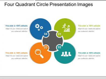
Use our editable four quadrant circle presentation images. Elaborate the concept of growth, research, team management and internal functionality of your business through this PPT design. We have displayed a four-stage dynamic process in circular format with business-related icons. Every state plays a significant role in the overall functionality of the process and the coinciding of these patterns displays the same. This PowerPoint slide is editable, so you may put your data in this Ppt slide and make personal presentations based on your data. Crafted by the team of creative and innovative designers these layouts are thoroughly researched and analyzed with respect to the business processes required. Text boxes evident here allows you to write a brief about the topic in concern and provides knowledge to the viewer. Success requires courage, have the strength to take the right step by using four quadrant circle ppt images and manage wisely. Focus on creating intelligent individuals with our Four Quadrant Circle Presentation Images. Beam down inspiration.
People who downloaded this PowerPoint presentation also viewed the following :
Four quadrant circle presentation images with all 5 slides:
Our Four Quadrant Circle Presentation Images facilitate a grand celebration. It will impart huge joy.
FAQs for Four quadrant
So it's just a circle split into four equal parts - like a pie chart with exactly four slices. You can drop different concepts, data, or strategies into each section. Business people love using them for SWOT analysis or those priority matrix things. Honestly, they look way cleaner than regular 2x2 grids for some reason. The circular shape just feels more balanced, you know? Perfect for comparing four options against two different criteria. Way better than boring bullet points when you're presenting - your audience actually pays attention. I've seen them work really well in meetings.
Dude, you should totally try four quadrant circle diagrams instead of those boring bar charts. They show two dimensions at once, so you'll spot patterns and weird outliers way faster. It's honestly night and day compared to regular graphs. The circle creates these natural boundaries that make it super obvious which combos are high vs low performance. You can even add bubble sizes or colors for extra layers - though that might be overkill depending on your audience. I started using these for performance reviews and people actually pay attention now instead of glazing over spreadsheets.
Honestly, the axes are what make or break the whole thing. You want two dimensions that actually oppose each other - like the classic urgent/important combo from those productivity matrices everyone loves. Your quadrant labels can't overlap or people will get confused about where stuff goes. Test it out first though! Sketch the axes and drop a few data points in to see if it actually makes sense. Sometimes you'll want specific plotting, other times just broad categories work fine. Really depends on your data. Short sentences help readability too. Don't overthink the visual part until you've nailed down whether your quadrants are actually useful.
Honestly, these work great when you're juggling a bunch of competing priorities and can't see the forest for the trees. Pick two variables that actually matter - like effort vs impact, or importance vs urgency (that one's everywhere but it works). The circle format shows how close different options are to each other, which beats making boring lists. Perfect for strategic stuff or when you're doing risk assessments. I use them whenever I'm stuck between multiple decent choices and need perspective. Just don't overthink the axes - they've gotta be relevant to what you're deciding or you'll waste time.
Color coding is a game changer for four quadrant diagrams! Your audience will instantly get the visual hierarchy instead of squinting at text first. Each quadrant gets its own color = people understand relationships super fast. Just make sure the colors actually contrast well (I've seen too many diagrams where everything looks muddy). Stay consistent with your choices and think about what makes sense for your brand. It's like organizing your closet by color - way easier to find stuff. The whole point is giving viewers that mental shortcut so they don't have to work as hard.
Honestly, these four-quadrant diagrams are everywhere in business. Consulting firms are obsessed with them - you know, like the BCG matrix thing. Marketing teams use them constantly for customer segments and product positioning. Tech companies? Same deal, but more for prioritizing features and mapping user experiences. Finance and healthcare lean on them too, mainly for risk stuff. I swear, if you're comparing any two variables in a presentation, someone's gonna suggest this format because stakeholders just... get it, I guess. Pretty much any industry where people need to make sense of complex relationships between factors.
Start with Q1 in the top-right and go clockwise - that's just how math people do it, so stick with that. Make your labels big enough that people don't have to squint at them! I always put mine near the center where the lines cross instead of shoving them in the corners. Color-coding works great if you're not stuck with black and white printing. Oh, and definitely add a little legend explaining what each section means. Trust me, you'll forget what Q3 was supposed to represent like three weeks later. Keep the formatting consistent across all four labels too.
Design choices totally change how people look at your quadrants. Angular, sharp stuff creates urgency - perfect for high-priority items. Rounded shapes feel friendlier, better for brainstorming content. I've watched people obsess over making it look Instagram-perfect and completely miss the point though. Your design should guide eyes from important stuff to less critical items naturally. Bold borders work great, contrasting colors too. Oh, and icons help a ton. Map out what's actually important first, then make the design support that flow. Function beats pretty every time.
Honestly, I'd start with draw.io since it's free and pretty decent. Lucidchart's another good option - both have solid templates for business stuff. PowerPoint works fine too if you're already using it (design people hate when I say that lol). Canva's gotten way better lately and has a bunch of quadrant templates you can just customize. Visio's obviously the fancy option but costs a fortune. Just try draw.io first - worst case you realize you need something fancier later.
Hey! So for digital stuff, I always animate those four-quadrant circles - like revealing one section at a time or adding hover effects. Keeps people actually paying attention instead of zoning out. Print's a whole different beast though. You need way more contrast and bigger fonts because people can't just zoom in when your text looks tiny. Honestly, I've screwed this up before - made this gorgeous pastel version that looked completely washed out once printed. My usual approach? Start with the digital version first, get all your animations working, then strip it down for print. Beef up those colors and font sizes or you'll regret it.
Don't cram a novel into each box - nobody wants to squint at tiny text. Your axes need to be super clear too, not some abstract nonsense that requires a PhD to decode. I see people trying to shove everything into neat little squares, but honestly? Some stuff just lives on the borders and that's fine. Short labels work better than lengthy explanations. Make sure your horizontal and vertical dimensions actually make sense together - like, they should have some logical relationship. Oh, and definitely run it by someone else first. If they're confused without your explanation, you've got more work to do.
Four quadrant circles are super dependent on context - like, you literally can't make sense of them without knowing what you're actually looking at. Same exact spot in the "high-high" corner could mean "drop everything and fix this now" for risk stuff, but "we're crushing it, don't change anything" for performance data. The framework stays identical but tells completely different stories. Your axis labels matter huge. So does your data source and what decision you're trying to make. I always mess this up honestly - jumping straight into the pretty diagram without explaining what it represents first. Frame the data and your goal before showing the quadrants.
Dude, you HAVE to tell a story with those quadrant diagrams or people will zone out completely. Start somewhere logical - like current problems, then work through solutions and next steps. I swear, half the presentations I sit through just throw random stuff in boxes with zero flow. Your story explains why things land in each spot and how they actually connect. Frame it like "okay, here's our mess right now, and here's how we dig ourselves out." Makes such a difference. Without that narrative thread, it's just another chart people will forget the second they walk out.
Honestly, feedback on your four quadrant diagrams is super valuable - it shows you exactly where people get lost or zone out. Watch which quadrants they look at first and where they seem confused. Their questions will reveal if your labels are unclear or if the data placement feels weird. Sometimes what seems obvious to you makes zero sense to everyone else (been there!). I'd test it with a few people before your main presentation. Use their confusion as your roadmap for fixes. You'll catch issues you never would've spotted on your own.
Oh man, the McKinsey "Ambition vs. Performance" matrix is legendary - they presented it to Fortune 500 CEOs and everyone still references it. Basically helped companies figure out if they're stars, question marks, or total dogs. Covey's urgent/important grid from "7 Habits" is solid too, though that's more from his book. Product teams absolutely love these for plotting features by effort vs. impact. Risk assessments use them constantly - probability on one axis, severity on the other. Honestly, any time you're drowning in competing priorities, just throw your options into four boxes. Makes everything way clearer.
-
Use of icon with content is very relateable, informative and appealing.
-
Design layout is very impressive.