


Dark Store Powerpoint Ppt Template Bundles





Try Before you Buy Download Free Sample Product
 Impress Your
 Audience
 100%
100% Editable
 Save Hours
 of Time


Our Dark Store Powerpoint Ppt Template Bundles are topically designed to provide an attractive backdrop to any subject. Use them to look like a presentation pro.
People who downloaded this PowerPoint presentation also viewed the following :
Content of this Powerpoint Presentation
Slide 1: This slide introduces Dark Store. State your company name and begin.
Slide 2: This slide outlines the various tips to manage and optimize dark store activities effectively. Best practices included are leveraging Artificial Intelligence (AI) and Machine Learning (ML)etc.
Slide 3: This slide represents the ways of order fulfillment used by the dark stores to ensure timely product deliveries. Various techniques involved are home delivery, curbside pickups etc.
Slide 4: This slide demonstrates the growing market size for dark stores globally. Various growth factors included are larger online audience, expedited and quick deliveries etc.
Slide 5: This slide mentions the various practices to streamline dark store operations. Different strategies involved are using robotics, using applications etc.
Slide 6: This slide illustrates the features of dark stores used by e-commerce operators to fulfill customer orders on time. It includes type of buildings used for dark stores, its reach etc.
Slide 7: This slide highlights the multiple issues faced in managing the dark store operations. Various challenges included are high real estate expenses, poor employee retention etc.
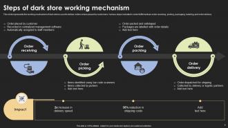
Slide 8: This slide represents the working mechanism of dark stores used to deliver online orders placed by customers. Various steps included in order fulfillment are order receiving, picking etc.
Slide 9: This slide mentions the stats indicating the growth of dark store retailing models in recent years. Various stats included are the percentage increase in revenue generated from dark stores etc.
Slide 10: This slide represents the best alternatives to dark stores available for small retailers. Various options included are micro-fulfillment hubs, third-party logistics etc.
Slide 11: This slide mentions the major constituents needed to effectively setup a dark store. Various components included are inventory replenishment system, layout, IT integrations, guidelines etc.
Slide 12: This slide inculcates the numerous advantages of dark stores for retailers. Various benefits included are reducing shipping costs, decreasing delivery errors etc.
Slide 13: This slide contains the factors ensuring high profitability for dark store retailers. Various steps to ensure profitability are ensuring adequate demand, selecting low cost locations etc.
Slide 14: This slide presents Dark store retail distribution outlet icon.
Slide 15: This slide showcases E-commerce retailing dark store icon.
Slide 16: This slide describes Dark store icon for online order fulfilment.
Slide 17: This is a Thank You slide with address, contact numbers and email address along with socials
Dark Store Powerpoint Ppt Template Bundles with all 25 slides:
Use our Dark Store Powerpoint Ppt Template Bundles to effectively help you save your valuable time. They are readymade to fit into any presentation structure.












FAQs for Dark Store Powerpoint
For your Dark Store template, definitely focus on inventory turnover and fulfillment speed metrics first. Cost-per-order breakdowns are huge too. I'd throw in comparison charts - dark store performance vs traditional retail really shows the difference. Customer radius mapping is what always gets executives excited, trust me on that one. Order volume capacity slides matter, plus you need those operational workflow diagrams. Oh, and don't skip competitive analysis since it's all about efficiency positioning. Scalability projections should wrap it up. That covers your main bases, then you can tweak based on your specific situation.
Bright colors are your best friend here - electric blue, vibrant orange, lime green. They'll make your important stuff jump right off that dark background. Red's perfect when you're talking problems or creating urgency. Green obviously works for growth metrics and wins. I'd throw in some warmer tones too, like yellow or coral for opportunities since they just feel more optimistic. But honestly? Stick to 2-3 accent colors total or it gets messy fast. The trick is being intentional about which colors go where and keeping it consistent. Sounds simple but you'd be surprised how many people just randomly pick colors.
Definitely hit the online grocery boom and how dark stores fix delivery headaches. Post-pandemic shopping habits are totally different now - quick commerce is everything. People literally expect groceries in 15-30 minutes, it's wild. Talk about the shift from regular stores to these micro-fulfillment centers, plus automation is changing the game. Amazon Fresh and Instacart are going all-in on this model. Real estate costs are way lower than traditional stores too. Oh, and definitely throw in some market growth numbers and ROI data to back everything up - makes it sound more legit.
Okay so visuals are absolutely critical here - you're explaining something most people have never heard of before. Floor plans and workflow diagrams work great, plus before/after shots showing how these spaces transform from regular stores. Real photos of dark store setups are money, especially the picking routes and how inventory gets organized. People need to actually see the operational flow or the whole "store without shoppers" concept just sounds bizarre, you know? Throw in some data charts comparing traditional retail metrics vs. dark store performance. That'll really sell the story.
So for your market analysis slide, start with market size and growth projections for quick commerce in your area. Then map out the competitive landscape - who's delivering where and how fast. Customer demand stuff is crucial too: order frequency, basket sizes, when people actually want their groceries delivered (spoiler: it's usually when you're trying to have dinner). Oh, and don't forget zoning regulations because dark stores can get weird with local laws. Include real numbers, not fluffy estimates. A heat map showing demand hotspots works great - executives love visuals they can understand without squinting.
Your dark template is perfect for animations - they really stand out against that background. Keep transitions smooth though, nobody wants those jerky slide changes that make you dizzy. Simple stuff works best: fade-ins, things sliding from the sides, maybe a gentle zoom here and there. Dark backgrounds make your key metrics and product shots look amazing when they animate in. Oh, and definitely reveal bullet points one at a time - otherwise people just read everything and tune you out. I learned that the hard way! Don't get too crazy with effects or you'll be *that* presenter everyone remembers for the wrong reasons.
Dude, you NEED solid numbers or they'll think it's just another fad. Lead with the delivery speed - 15-30 minutes versus 2+ hours is massive. Real estate costs drop like 60-80% compared to regular stores, which is honestly insane when you think about it. Order accuracy rates are usually way higher too. ROI projections are key, plus customer satisfaction scores. Without data backing you up, executives won't take it seriously. Find some case studies from companies already crushing it with dark stores. Trust me, comparative data makes all the difference.
High-contrast quote cards work really well with dark backgrounds - go with white or light gray text. You can either make a whole testimonial section or just drop quotes throughout your slides. Honestly, the dark look is perfect for this because it feels more intimate, kinda like those sleek product review sites. Don't cram too much though - 2-3 testimonials per slide max or people get overwhelmed. Make sure the text's big enough to actually read, and maybe throw in some accent colors to highlight the best parts. Oh, and customer photos help a ton if you've got them.
Dude, definitely track order fulfillment time and pick accuracy first - those are your bread and butter. Cost per order is what the bosses actually care about though, trust me on that one. Labor productivity matters too (like orders per hour per picker), plus inventory turnover and space utilization. Oh, and don't forget customer satisfaction scores and on-time delivery stats since those hit your profits directly. I'd throw together a dashboard with the main KPIs up top, then maybe add some weekly trend slides underneath? Honestly, keeping it simple works best for these things.
Dark backgrounds look sick with bright white text - way better contrast. Use chunky fonts so people in the back can actually see (learned this the hard way lol). Don't cram everything on one slide, throw in some charts or just leave space so it's not overwhelming. Animations work really well with dark themes since they look more movie-like, but honestly don't get carried away. One main point per slide is clutch. Otherwise people zone out reading ahead instead of listening to you. Oh and avoid those tiny fonts - nobody's bringing binoculars to your presentation.
Okay so basically you keep the same deck structure but swap out what you emphasize. Investors? Hit them with market size, revenue projections, all that money stuff - they only care if you'll make them rich lol. But logistics partners want the boring operational details like fulfillment speeds and how your systems actually integrate with theirs. I'd honestly just create a master presentation with different data slides you can plug in. Show growth charts to investors, process flows to logistics people. Same story, different numbers. Oh and definitely have those case studies ready - just pick ones that match your audience's priorities.
Skip the logistics jargon - you'll lose people instantly. Don't oversell it as "revolutionary" either, that stuff makes everyone roll their eyes now. The big thing is explaining how customers actually benefit, not just the warehouse side. Honestly, most people still don't get what dark stores even are. Concrete numbers work better than flowcharts unless you're talking to ops folks. Address the job concerns upfront - don't dance around it. Oh, and hit them with real delivery times and satisfaction scores. Wrap up with actual next steps they can follow.
Make some solid case study slides showing your dark store wins - before/after numbers really sell it. Include the usual suspects: fulfillment speed, inventory turnover, customer satisfaction. Data does the heavy lifting here, honestly. Keep your layout consistent with client logos, the challenge they faced, how you solved it, plus hard results. Screenshots of your actual systems work great (just double-check you can use client names first - learned that one the hard way). Oh, and create 2-3 template versions so you can quickly swap stories based on who you're pitching to.
For dark backgrounds, go with high contrast stuff - white text or bright colors really pop. Bar charts and line graphs are perfect since they're super readable. Icon-based infographics work amazing for process flows too. But seriously, avoid gradients - they look terrible on dark templates, trust me on this one. I learned that the hard way lol. Simple geometric shapes are your friend here. Bold fonts too. Don't overthink it trying to be all artsy. Your audience wants to actually see the data, not squint at some fancy design mess. High contrast + simple = you're golden.
Hey! So for your Dark Store thing - definitely bump up your font size to at least 14pt because you'll be squinting otherwise. Trust me on this one. Keep your speaker notes super simple with just bullet points, not full sentences. That way you won't sound like you're reading a script. Oh and practice in dim lighting first! I learned this the hard way when I couldn't see anything during my last presentation. Add some timing notes between slides too. The key is staying conversational - nobody wants to hear someone just reading word for word.
-
Design layout is very impressive.
-
Every time I ask for something out-of-the-box from them and they never fail in delivering that. No words for their excellence!