


Escalation process for projects gantt chart with project progress bar




Try Before you Buy Download Free Sample Product
 Impress Your
 Audience
 100%
100% Editable
 Save Hours
 of Time


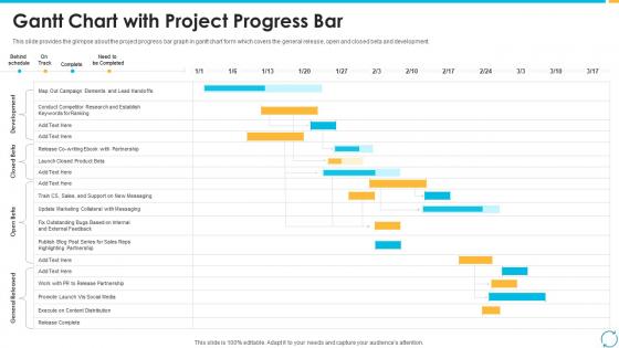
This slide provides the glimpse about the project progress bar graph in gantt chart form which covers the general release, open and closed beta and development.
People who downloaded this PowerPoint presentation also viewed the following :
Escalation process for projects gantt chart with project progress bar with all 9 slides:
Use our Escalation Process For Projects Gantt Chart With Project Progress Bar to effectively help you save your valuable time. They are readymade to fit into any presentation structure.








FAQs for Escalation process for projects gantt chart with
So for your Gantt chart, start with issue identification and logging, then move through first-level review, stakeholder notification, and escalation triggers. Communication checkpoints are super important - I've seen so many processes crash because someone forgot to update people. Build in timeline buffers too since nothing ever goes according to plan, right? Map out different escalation paths based on severity levels so your team doesn't have to guess. Don't skip the resolution and post-mortem phase either. That's honestly where you learn the most for next time.
Honestly, Gantt charts are a lifesaver for this stuff. Everyone can see exactly where each escalation sits and who needs to do what next. No more "hey what's the status on X?" emails clogging your inbox - people can just check the chart themselves. You'll spot bottlenecks right away, like when legal's had something for three days or customer success is waiting on you. Dependencies are super clear too, so if one thing gets delayed, the whole timeline adjusts automatically. Just set up deadline notifications and you won't have to chase anyone down anymore. Game changer, seriously.
Honestly, Microsoft Project is your best bet if your company already pays for it - tons of features but kinda overkill sometimes. Smartsheet's way easier to use and handles those dependency chains really well. Look, even Excel works for basic stuff, though it gets messy fast with complex timelines. Monday.com and Asana hit that sweet spot where people actually enjoy using them (which matters more than you'd think). The real trick? Don't overthink it. Start with whatever your team already knows instead of forcing everyone to learn some new fancy tool. You'll spend more time training than actually tracking escalations.
Honestly, it really comes down to how complicated your issue is and whether people actually respond on time. I usually give Level 1 support about 24-48 hours, then management gets 2-3 days, executives maybe a week. But here's the thing - always add buffer time because everyone's "too busy" these days. Short sentences work better than long ones. If you've got historical data, use that, otherwise just look at what other companies do. Don't set timelines based on what you want to happen, set them for what actually happens. Start conservative, then tweak it once you see how things really go.
Honestly, the biggest mistake is making your timeline way too rigid - you need buffer time for when things get messy. Also don't cram every little detail into the chart or it becomes this overwhelming document nobody wants to touch. Time zones are another thing that'll bite you - I've seen so many escalations sit there because someone's asleep in a different country. Make sure your escalation criteria are actually clear too, not some wishy-washy "when things seem bad" nonsense. People need to know exactly when to pull the trigger. Start simple, test it out on a few practice scenarios first.
For milestones, I always go with diamond shapes or bright colors - they really pop when people are scanning through. Most Gantt tools will do this automatically once you mark something as a milestone. Honestly, the bright colors work best because stakeholders love to skim these things fast. Don't forget clear labels describing what actually needs to happen at each point. Oh, and try grouping related milestones together visually. Makes it way easier to track how you're progressing through each stage. Bold text works too if you're not into the colorful approach.
Stakeholder feedback is like your sanity check - shows you what's broken before you mess up company-wide. The Gantt chart has those review phases where people actually test stuff and tell you what sucks. Without it, you're basically throwing darts blindfolded. They'll catch things like confusing communication or crazy deadlines that looked fine on paper. Missing approval steps too - that's always fun to discover later. Just don't skip those feedback sessions thinking they're optional. Trust me, schedule them properly or you'll regret it when everything falls apart.
Just create parallel tracks on your Gantt chart for backup scenarios. Like if Level 2 support isn't around, show the direct jump to Level 3. I always use dotted lines or different colors for these alternatives - makes them super obvious when everything hits the fan (and trust me, it will). Build in buffer time too, because timelines are basically wishful thinking anyway. The whole point is having these backup routes mapped out beforehand so your team doesn't panic and can pivot smoothly. Honestly, the "what-if" branches end up being more useful than the main plan half the time.
Update that thing daily when you're dealing with active incidents - trust me on this. I got burned once when our CEO wanted an update and my data was like a week old. Super awkward. Track your actual vs planned timelines for each step, and definitely flag any blockers in red so they're obvious. Dependencies between teams are huge - mark those clearly. When timelines shift (and they will), tell stakeholders right away instead of pretending the original dates still work. Set morning reminders or you'll totally forget about it.
Set up swim lanes for each team - IT, Legal, Operations, whatever you've got. Color-coding is honestly a lifesaver here, makes everything so much easier to scan. Map out their specific tasks within your escalation timeline, but focus on those handoff points between teams as dependencies. That's where stuff always gets stuck. Each function needs clear task owners so nobody can point fingers later. Oh, and figure out which teams jump in at each escalation level first, then work backwards to plot what prep work they need. Just don't go overboard with details or it'll look like spaghetti.
Color code your escalation levels - green for level 1, yellow for level 2, red for critical. Bold the important task bars so they actually stand out. I'd put responsible party labels right on the timeline instead of making people hunt through a legend (so annoying). Use clear milestone markers for handoffs and decision points. Different bar patterns help distinguish escalation types too. Oh and leave plenty of white space - cramped charts are the worst when you're trying to think during a crisis. Make sure your font's big enough for projectors since half the team will be squinting otherwise.
Honestly, just dig into your old incident data - that's where the gold is. Pull up your last 10-15 escalations and see how long stuff actually took vs. what you planned. I bet you'll be shocked at some of the gaps! Like, legal reviews that you thought would take a day but consistently ate up three days. Build those real timeframes into your Gantt chart, not the wishful thinking ones. Look for patterns across multiple cases too, since one-off incidents can be misleading. Oh, and definitely add buffer time between stages - trust me on this one. The bottlenecks will become obvious pretty quickly once you start tracking.
Definitely track response times and resolution rates - those are your bread and butter. Handoff delays between teams will show you where things get stuck (and trust me, there's always that one department that drags). Volume by category matters too, plus how often stuff gets bounced back up the chain. The re-escalation count is honestly more telling than people realize. Set up alerts when numbers get weird so you can fix things before they blow up. Oh, and make sure you're actually measuring if issues get solved, not just shuffled around forever.
Honestly, that Gantt chart is perfect for training new hires. Just walk them through the whole escalation timeline step by step - show them exactly when to escalate and who handles what. New people always freak out about this stuff (I swear it's like their biggest fear). The chart removes all that guesswork since it maps out timeframes and who's responsible at each stage. You could even run practice scenarios where they follow the path. Oh, and definitely keep a copy at their desk for the first month or so - they'll reference it constantly.
Use percentage thresholds instead of hard deadlines - they'll shift automatically when your timeline changes. Monthly reviews of your criteria work well too. Most teams totally skip this step and then act surprised when everything falls apart! Update your contact lists regularly. I'd also map out different scenario paths in your project plan, just in case. The whole thing needs to stay flexible - you can't just write it once and call it done. Oh, and conditional paths in Gantt charts are clutch for this stuff.
-
Best way of representation of the topic.
-
I discovered this website through a google search, the services matched my needs perfectly and the pricing was very reasonable. I was thrilled with the product and the customer service. I will definitely use their slides again for my presentations and recommend them to other colleagues.
-
Use of icon with content is very relateable, informative and appealing.