

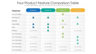
Tabela de comparação de quatro características de produto





Try Before you Buy Download Free Sample Product
 Impress Your
Audience
 100%
Editable
 Save Hours
of Time


Nossa tabela de comparação de quatro características de produto é projetada topicamente para fornecer um pano de fundo atraente para qualquer assunto. Use-os para se parecer com um profissional de apresentação.
People who downloaded this PowerPoint presentation also viewed the following :
Quatro tabelas de comparação de recursos do produto com todos os 2 slides:
Use nossa Tabela de comparação de quatro recursos de produtos para ajudá-lo de forma eficaz a economizar seu valioso tempo. Eles estão prontos para caber em qualquer estrutura de apresentação.

FAQs for Four product
Honestly, I'd start by checking if the design looks consistent throughout - nothing worse than slides that feel totally random. See how customizable it is too, and whether the colors/fonts actually fit your brand. Some templates are super basic with like 3 layouts, which is annoying. Also think about whether you're presenting on screen or printing (makes a difference). The best move? Grab some free samples first and actually mess around with them - you'll know pretty quick if they're user-friendly or a pain to work with.
Yeah, design totally affects engagement but it's all about matching your style to the situation. Product demos work better with clean, minimal slides so people focus on what you're showing them. Sales pitches though? Go bolder - you want that emotional hook. I've watched so many good presentations die because of messy, overcrowded slides (seriously painful to sit through). Who's your audience matters a ton too. Executives want sleek and data-heavy, but creative teams love dynamic, colorful stuff. Figure out your main goal first, then pick visuals that actually help instead of competing with your message.
Honestly, corporate people are super picky about templates - stick with clean, minimal designs and boring colors like navy or gray. White space is your friend there. Educational stuff though? Go wild! Bright colors, fun graphics, whatever keeps people awake during those long training sessions. I learned this the hard way after using a playful template for a board meeting once... yikes. Educators actually want you to break up all that dense info with visual elements. My suggestion? Keep two different template sets saved so you're not panicking at 2am before a big presentation.
Dude, UX matters SO much for presentation templates. Bad navigation or weird layouts? You'll spend forever just trying to edit the thing instead of working on your actual content. Honestly, I've been there and it's the worst. Clean templates with intuitive tools make everything flow better - both for you while editing and for your audience watching. The good ones have logical slide progression and visual hierarchy that just makes sense. Skip anything that feels clunky to customize. Your presentation will look way more professional when the template doesn't fight you.
Honestly, I'd go customizable if you've got the time. Pre-designed templates are faster to launch with, but you're basically stuck with whatever the designer thought looked good. Customizable ones let you actually change colors, fonts, layouts - the whole thing can match what your company's about instead of picking the "eh, this'll work" option. Yeah, it takes longer upfront and kinda feels overwhelming at first. But you won't outgrow it as fast. Those gallery templates might save you weeks now, but you'll probably want something different in like six months anyway.
Oh man, this totally depends on what you're working with! PowerPoint's pretty basic - you get your standard bar charts and pie stuff, nothing crazy. Canva looks way prettier but you can't really dig into complex data much. Google Slides is fine if you're pulling from Sheets already. Honestly though? If you need anything serious, just export from Excel or Tableau first - saves so much headache. Prezi's cool too but might be overkill. I'd just throw your actual data into a couple different ones and see what doesn't make you want to scream.
Dude, test your template in whatever software you actually use before you buy it. PowerPoint, Google Slides, Keynote - they all handle stuff differently. I learned this the hard way when I downloaded this amazing template and half the fonts looked weird when I opened it in PowerPoint. Custom fonts are honestly the worst culprits for this. The animations might break too, or embedded videos won't play right. It's super annoying to discover formatting issues when you're already stressed about your presentation. Just open it in your regular program first - you'll thank me later when everything actually works.
Honestly, mobile-friendly templates are a game changer for accessibility. Your content actually becomes readable on phones - font sizes adjust automatically, spacing works properly, touch targets get bigger. People with motor issues have way less trouble navigating. The semantic structure is usually better too, which screen readers depend on (crazy how many regular templates just ignore this completely). Oh and responsive design means tablets work great too. My advice? Start with mobile-friendly templates rather than trying to fix things later - I learned that the hard way. Always test on your actual phone before sending it out.
Honestly, everyone's going crazy for high-contrast colors right now - like really bold stuff. Interactive elements are huge too, way better than boring static slides. I'm talking clickable hotspots, embedded polls, that kind of thing. Minimalist layouts are still popular but paired with striking fonts and tons of white space. Those gradient photo overlays are everywhere (getting kinda overdone if you ask me, but whatever). Data storytelling is big now. Also modular designs you can rearrange easily. You should definitely add 2-3 interactive slide formats to your templates - that's what clients actually notice these days.
Oh man, you definitely need a solid brand guide that covers all your templates. Same colors, fonts, logos - the whole deal. I've watched teams where everyone just does their own thing and honestly? It looks like a total mess from slide to slide. Build template libraries with your brand stuff already built in so people can't grab the wrong blue or some ancient logo version. Your product comparison layouts should follow the same visual setup too. Start by checking what templates you've got now and getting those brand elements consistent across everything.
Look, your audience is totally different depending on the format. Webinars need slides that work on tiny laptop screens - people are literally squinting at their phones sometimes. But live events? Go big or go home with visuals since half the crowd is probably chatting or grabbing coffee. I've watched so many good speakers crash and burn using identical decks for both. You need flexible layouts and fonts that actually scale. Short sentences for live stuff, longer explanations work fine virtually. Create one master template with like 2-3 variations. Trust me, you'll thank yourself later when you're not scrambling to reformat everything last minute.
Honestly, user reviews are your best friend here. Don't even bother with anything under 4 stars - just filter those out from the start. The recent reviews will tell you everything: whether the fonts look weird, if it crashes PowerPoint, or if those fancy animations are actually cool or just annoying. Some templates look amazing but are impossible to edit (learned that the hard way). Also check if people mention your specific situation - like "worked great for my thesis defense" or whatever. Reviews save you so much trial and error time.
Don't just pick whatever looks pretty - I learned this the hard way when my content looked awful in this "gorgeous" template. Test your actual slides first! Skip anything with crazy animations too. Those spinning transitions? Total amateur hour. Your audience matters - that funky creative design will crash and burn in a stuffy corporate meeting. Also make sure you can actually read the text colors (why do so many templates have gray text on white backgrounds??). Have a backup ready because templates love to break at the worst possible moment.
Honestly, go for templates you can actually edit without wanting to throw your laptop out the window. I've wasted so much money on "amazing" templates that turned into digital paperweights the second I needed to change something. You know how it is - your brand evolves, colors change, you need different layouts. If you can't easily swap things around, you'll just end up buying new templates every few months (been there). Stick with ones that use common formats and have simple editing - nothing worse than being stuck with outdated stuff because it requires some weird proprietary software you don't have anymore.
Dude, color choice is way more important than people think. Blues make you look trustworthy and professional. Reds get people pumped up but can feel aggressive. Greens are chill and make people think "growth." I've literally watched presentations fail because the colors were so jarring nobody could focus - though honestly the guy was pretty boring too. Warm colors grab attention fast but they'll exhaust your audience. Cool tones keep people engaged longer. Just match your colors to what you're selling. Like, don't pitch a bank with neon yellow, you know?
-
Best Representation of topics, really appreciable.
-
The Designed Graphic are very professional and classic.
-
Easy to edit slides with easy to understand instructions.
-
Illustrative design with editable content. Exceptional value for money. Highly pleased with the product.
-
Awesome use of colors and designs in product templates.
-
Great product with highly impressive and engaging designs.
-
Innovative and Colorful designs.