


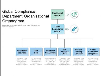
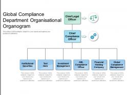
Global compliance department organisational organogram




Try Before you Buy Download Free Sample Product
 Impress Your
 Audience
 100%
100% Editable
 Save Hours
 of Time


Give delinquents a better chance with our Global Compliance Department Organisational Organogram. Enhance their ability to amend their habits.
People who downloaded this PowerPoint presentation also viewed the following :
Global compliance department organisational organogram with all 2 slides:
Enhance the ability to amend bad habits with our Global Compliance Department Organisational Organogram. Give delinquents a better chance.
FAQs for Global compliance
Yeah, organogram and organizational chart are literally the same thing - just different names for those diagrams that show company structure. It's more of a regional thing honestly. Brits tend to say "organogram" while we usually just say "org chart." Both show who reports to who and how departments connect. The whole "organogram sounds fancier" debate is kind of silly if you ask me. Just use whatever your workplace calls it and spend your energy making sure the thing actually reflects reality - half the ones I've seen are totally outdated anyway.
Definitely include job titles and who reports to whom - that's the basic stuff. Names are super important too, plus contact info like emails or phone extensions. Trust me, it saves everyone from playing phone tag later. Show both direct reporting and dotted-line relationships, especially if your company has that matrix structure where people answer to multiple bosses (which is honestly confusing but whatever). Keep the design clean with consistent colors and formatting. Oh, and actually update the thing regularly! Nothing worse than a new hire staring at an org chart from 2019 wondering why half the people don't work there anymore.
Okay so basically an organogram shows you who reports to who, which saves you from that whole "um who do I even ask about this" awkwardness. New people especially love these things because figuring out company hierarchy is honestly confusing at first. You'll know exactly where to escalate stuff or who the right person is for different projects. It cuts down on all that back-and-forth between departments too. Oh and pro tip - whenever you're stuck on some process, check the org chart first before randomly emailing people. Trust me on this one.
Dude, organograms are actually clutch for project management. They show who reports to who instantly - no more guessing games. I used to think they were pointless busywork (my bad), but they're total lifesavers when things get messy. You'll spot decision-makers fast and know exactly who to bug when problems come up. Plus they help with resource planning and catching workflow issues before they bite you. Honestly, just sketch one out early in your next project. Trust me, it beats those awkward moments where nobody knows who's actually running the show.
So for flat orgs, skip the whole pyramid thing and go more circular or network-style - cluster teams around what they actually do together. Hierarchical ones are easier tbh, just do the classic tree with clear lines going up through management layers. The main thing is mapping who really makes decisions, not just official titles. Flat structures look way better when you show the collaboration happening horizontally. With hierarchical setups, lean into that top-down flow but maybe adjust box sizes based on actual influence rather than just what someone's business card says. Colors help too for showing different functions.
Honestly, Canva's probably your best bet if you want something that looks good fast. Lucidchart's solid too - way more customization but takes longer to figure out. Visio's the old school option, though it's kinda clunky unless you're already used to it. Oh, and Draw.io is totally free which is nice if budget's tight. It's called diagrams.net now for some reason. BambooHR has this interactive org chart thing that's pretty cool if you're already using them. I'd just start with Canva honestly - their templates don't suck and you'll have something decent in like 20 minutes.
Honestly, just update it whenever something actually changes - new hires, people leaving, promotions, team shuffles. I'd check it quarterly at least, but if your company's growing fast, maybe monthly? Otherwise you'll look at it six months later and be like "who are half these people." The worst is when someone asks who reports to who and you're scrambling. Set up something simple where HR shoots you a message when stuff happens. Oh and put a reminder in your calendar or you'll totally forget - I always do that with this kind of thing.
Oh definitely use colors! Makes everything so much easier to scan. I usually do blue for IT, green for finance, that kind of thing. Or you could go darker colors for senior people and lighter for junior roles. Honestly saves you from staring at a million identical boxes trying to figure out who's who. Just don't go crazy with like 10 different colors - your eyes will hate you. Three or four max works best. Oh and heads up, some people can't distinguish certain colors so maybe add little icons too if it's really important.
So basically, organograms are clutch for new people - shows them the whole company layout without having to awkwardly ask around. Your new hire can see who reports to who, which teams work together, all that stuff. Takes away the stress of not knowing who to contact for what. Honestly, some people think org charts are boring but they're actually super helpful those first few weeks when everything feels chaotic. I'd definitely go through it with them on day one, maybe even print it out? Just makes the whole onboarding thing way smoother.
Honestly, the worst part is dealing with people who hate change. Leadership gets weird about reporting lines, and nobody wants to see themselves "boxed in" - it's like you're threatening their identity or something. Matrix structures are a total pain to map out cleanly too. But here's what really gets you: the second you finish it, someone quits or gets promoted and boom, it's already wrong. If your company's super project-based, the whole thing might feel pointless anyway since teams shift constantly. Start basic though. Get the big bosses on board first, then build in regular update cycles from the start or you'll regret it.
Honestly, less is more with these things. Just stick to the main roles - leadership and department heads mostly. Don't try cramming every single person in there or it'll look like a mess. Make sure your shapes and colors match throughout (I learned this the hard way when mine looked like a kindergarten art project). Give everything room to breathe with white space between boxes. If you've got a massive company, split it into separate charts by division instead of one giant nightmare diagram. Start simple with the core structure first - you can always get more detailed later for specific teams if needed.
Dude, skip the boring box charts! Use actual photos of your team members - makes it way more personal. I've seen people get super creative with themes too. Like a tree where each branch is a department, or even a solar system with the CEO as the sun (sounds cheesy but it actually worked). Interactive slides are clutch - click through to reveal different levels or show how info flows between roles. One company I know used building floors which was pretty clever. Just match whatever theme fits your company vibe and make sure people in the back can still read it.
Oh man, this is such a real thing! Japan and Germany love seeing every single reporting level laid out clearly - they want that hierarchy visible. Meanwhile, if you show too many layers to Scandinavian teams, they'll just stare at you confused since they're used to everyone collaborating directly. Plus some cultures read right-to-left anyway, which... yeah, that's a whole other mess. We totally bombed with our org chart in Singapore because we didn't think about this stuff. Honestly, just show it to your local people first before you embarrass yourself globally!
Don't make it stupidly complicated - that's the worst trap. Like, I've seen org charts that look like subway maps because someone tried to fit literally everyone on there. Also people just copy their current setup without asking "wait, does this even work?" You know those random reporting relationships that make zero sense? Yeah, don't preserve those. Keep titles consistent and make sure it actually matches who reports to who in reality. Oh and update the damn thing when people change roles! Can't tell you how many companies create one and then it sits there getting more wrong by the month.
Oh totally! Remote teams actually need them more than in-person ones honestly - nobody can just peek over cubicles to see who's who. I'd definitely add time zones and locations since that's crucial for virtual work. Color-coding by region is pretty smart too. The tricky part is keeping it current because remote setups change way more often. We learned that the hard way at my last job lol. Make sure it's somewhere everyone can actually find it - not buried in some random shared folder.
No Reviews