


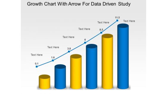
Growth chart with arrow for data driven study powerpoint slides




Try Before you Buy Download Free Sample Product
 Impress Your
 Audience
 100%
100% Editable
 Save Hours
 of Time


Folks find focus with our Growth Chart With Arrow For Data Driven Study Powerpoint Slides. They encourage a feeling of creativity.
People who downloaded this PowerPoint presentation also viewed the following :
Growth chart with arrow for data driven study powerpoint slides with all 3 slides:
Our Growth Chart With Arrow For Data Driven Study Powerpoint Slides are completely convincing. The audience will gladly accept your views.

FAQs for Growth chart with arrow for data driven
So basically you need age on the bottom, whatever you're measuring on the side. Then those percentile curves - like 5th, 50th, 95th - should be super clear and maybe color-coded so you're not squinting at it forever. Good gridlines help too because honestly some of these charts are impossible to read. Leave room to plot tons of points since you'll be tracking this stuff for years. The whole point is seeing the pattern quickly, right? Oh and make sure the percentile bands really stand out - that's what parents actually care about when they're trying to figure out if their kid's growing normally.
So growth charts are like your early warning system - you track height, weight, and head size over months/years. Single measurements don't mean much, but patterns? That's where the magic happens. If your kid drops from 75th percentile down to 25th, definitely worth a chat with the pediatrician. I learned this the hard way with my nephew actually. They catch stuff like nutrition issues or hormone problems way before you'd notice otherwise. Don't stress about day-to-day fluctuations though - it's all about the bigger trend over time.
So percentile charts basically tell you where your kid ranks - like 75th percentile means they're taller than 75% of other kids their age. Z-scores are different though, they measure how many standard deviations away from average a child is. Honestly, both track the same growth stuff, but z-scores get way more accurate when you're dealing with extremes. Think really premature babies or kids with serious growth issues - percentiles kinda fall apart there since you can't go below 0% or above 100%. For regular checkups, percentiles work fine and parents get them easier. But those outlier cases? Definitely go with z-scores.
Yeah so growth charts are tricky because they're based on specific populations. Kids from different ethnic backgrounds often have totally different growth patterns - some groups naturally grow slower or end up shorter/taller. I definitely learned this the hard way lol. Family history matters a ton too, plus nutrition and cultural eating patterns. There are population-specific charts sometimes which help. But honestly? Don't get hung up on exact percentiles. Track the individual kid's trend over time instead - that's way more useful than where they land on any single chart.
Growth charts are honestly your best screening tool for catching metabolic issues early. Plot the measurements over time - that's where you'll spot the weird patterns. Look for kids consistently falling off their percentiles or suddenly plateauing when they should be growing. Red flags? Failure to thrive even with good nutrition, wonky weight-to-height ratios, or growth velocity just tanking. Don't rely on single measurements though - the trend tells the real story. I always think crossing multiple growth curve lines is pretty concerning. If you're seeing sketchy patterns, time to dig deeper with metabolic workups and maybe loop in endocrinology.
Honestly, the worst thing parents do is treat percentiles like report cards. Your kid hits 10th percentile and suddenly you're panicking? Nah. Percentiles just show where they stack up against other kids - has nothing to do with whether they're actually healthy. Plus growth isn't this perfect straight line anyway. Some months they'll shoot up, others they barely budge. I mean, we're talking about tiny humans here, not robots! What doctors actually care about is the overall trend over time. Is your kid following their own growth pattern? That's what matters.
So basically they do these huge studies every 10-20 years where they measure tons of kids. The CDC and WHO crunch all that height/weight data looking for trends - like how kids are getting taller or heavier on average. Pretty wild how much populations change over time, honestly. When they spot big shifts, they update those percentile curves. The US redid theirs in 2000 because our population got way more diverse. Oh, and definitely ask your doctor which version they're using - some places still have the old charts hanging up which throws things off.
Honestly, R with ggplot2 is your best option if you can code - super flexible for percentile stuff. Python works well too with matplotlib. Tableau's decent but kinda overkill for this tbh. There's also specialized medical tools like growthcharts.org that have WHO/CDC data baked in, which is nice if you don't want to mess with the reference calculations yourself. Start with whatever you already know though. Even Excel can handle basic growth charts if you're comfortable there first. Then you can always level up to the fancier tools once you get the hang of it.
Honestly, just focus on the trend, not individual measurements. Show parents the actual growth curve so they can see their kid's been consistent over time. Simple language works best - like "she's growing at her own steady pace" instead of scary percentile talk. Because yeah, hearing "5th percentile" would make anyone panic! Address their worries head-on but reassure them when the pattern looks normal. Each kid has their own growth story anyway. Some days I think we overthink this stuff - consistency matters way more than landing on some "perfect" number.
Hey! So growth spurts are basically when kids shoot up super fast on those charts - totally normal though. Your kid might gain like several inches in just a few months, which honestly seems crazy when you're constantly buying new pants lol. The percentile lines will jump way up during these times. But here's the thing - it's temporary. After that rapid phase, things slow back down to normal speed again. Don't expect smooth, steady growth over time. It's more like bursts of craziness followed by chill periods. Way more dramatic than you'd think!
Growth charts are super helpful for tracking if kids are developing normally - just plot their height and weight over time. Watch for measurements that fall way outside normal percentile ranges or sudden shifts from their usual pattern. Honestly, the consistency part is kind of annoying but it's crucial - same equipment, regular intervals. That way you get reliable data. Flag anything weird and loop in parents or the school nurse. Oh, and don't stress if you mess up the first few times, it takes practice to spot the patterns that actually matter.
So basically once you're an adult, those charts are way different from the kid versions. Your height's done changing after your growth plates close (like early twenties-ish), so they only really track weight and BMI now. Kids' charts are all about "is everything developing okay?" but yours will be more focused on whether you're keeping a healthy weight over time. The percentile thing works totally differently too since you're not supposed to keep growing obviously. Honestly, I'd just ask your doctor what BMI range actually makes sense for you specifically - sometimes those standard ranges are kinda wonky depending on your build and age.
Digital growth charts are seriously helpful for telehealth appointments. Parents can see the actual visual progress instead of just hearing percentiles, which honestly makes them way more likely to follow through with recommendations. You'll be able to track trends between visits and share data instantly - no more trying to explain complex measurements over a blurry video call. The tricky part? You're depending on parents to measure accurately at home instead of your trained staff doing it. I'd definitely send families a quick how-to video beforehand so they know what they're doing. The convenience factor alone makes it worth dealing with those measurement hiccups though.
Growth charts are honestly pretty useful - they show you where a kid actually stands instead of just guessing. Like if your kid's always been 25th percentile for height but 75th for weight, that's telling you something specific about what they need. Way more reliable than just eyeballing it, you know? You can spot patterns over time and adjust their food or activities based on real data instead of generic advice. I mean, every kid's different so why use cookie-cutter plans? The charts help you set goals that actually make sense for them.
Watch out for stigma stuff - don't make kids or parents feel bad about the numbers. Growth charts are just screening tools, not report cards or whatever. Use charts that actually match your patient population too. Honestly, I've watched providers get way too obsessed with percentiles and forget there's a real kid sitting there. Context matters more than anything - family history, how the kid's been growing over time, their overall health. A single measurement doesn't mean much. You're looking for weird trends, not trying to freak everyone out over normal differences between kids.
-
Commendable slides with attractive designs. Extremely pleased with the fact that they are easy to modify. Great work!
-
Designs have enough space to add content.