

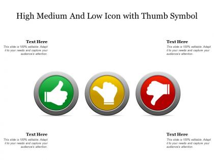
High medium and low icon with thumb symbol




Try Before you Buy Download Free Sample Product
 Impress Your
 Audience
 100%
100% Editable
 Save Hours
 of Time


Our High Medium And Low Icon With Thumb Symbol are explicit and effective. They combine clarity and concise expression.
People who downloaded this PowerPoint presentation also viewed the following :
High medium and low icon with thumb symbol with all 2 slides:
Give your audience a fulfilling experience. They will find our High Medium And Low Icon With Thumb Symbol elevating.
FAQs for High medium and low icon
Focus on clarity and simplicity first - strip out details that don't matter. Your icons need to work tiny, so the core concept has to shine through immediately. Keep stroke weights the same across everything (inconsistent styling is such a pet peeve of mine). Familiar metaphors help, but sometimes you'll need to invent new visual language for tricky concepts. Oh, and definitely test them at actual size! Don't just zoom out on your artboard last minute. Make sure they work in light and dark modes too. Consistency is everything - corner radii, spacing, the whole deal.
Dude, colors totally change how people feel about your icons. Red screams "warning!" or "stop!" while blue feels super trustworthy and chill. Green's your friend for success stuff or "go" buttons. Picture a bright yellow delete button – weird, right? You'd hesitate to click it. Blues and greens work great for finance apps since they feel stable, but orange might seem too playful for serious money stuff. Oh, here's something I learned the hard way: design your icons in grayscale first. If they don't work without color, you're screwed. Then add the color magic to boost the vibe you want.
Okay so scalability is huge - your icons have to look good at 16px AND 512px, which is honestly kind of a pain. When I scale down, all my careful details just vanish into pixelated chaos. Super frustrating. The trick is testing at the smallest size first, then working your way up. Don't rely on auto-scaling because it'll make everything look like garbage. Instead, create different versions for different sizes. Keep stroke weights thick enough to survive shrinking, and honestly? Simplify way more than you think you need to. I always underestimate how much detail disappears at tiny sizes.
Do your research on who's actually using your app and test with different people constantly. So many designers still slap on Western symbols without thinking - mailbox icons that look nothing like what people see in their countries, hand gestures that are straight-up rude elsewhere. Colors mean totally different things too depending where you are. Get local teams involved or hire cultural consultants if you're targeting specific regions. But honestly? Just test with real users from those places before you launch. I've seen apps bomb because they skipped this step. Quick user feedback beats guessing every time.
Honestly, Figma's probably your best bet if you're just starting out - it's free and web-based so no fancy setup needed. Adobe Illustrator is the gold standard for vector work, makes super crisp scalable icons. Figma's also killer for working with other people and has tons of icon libraries you can study. Mac users love Sketch still. Oh and Affinity Designer is solid if you hate Adobe's subscription prices (which, fair). Some people sketch initial ideas in Procreate first but that's more of a bonus thing. I'd just dive into Figma honestly - worst case you learn something useful without spending money.
Honestly, simple icons are just way easier to understand at a glance. Users won't have to sit there squinting at some overly detailed mess trying to figure out what it means. Clean, minimal designs let people scan through your interface super quickly - which is the whole point, right? Plus they look way better when you shrink them down for mobile. I learned this the hard way on my last project where I got way too fancy with the details. Stick to maybe 2-3 main visual elements and you'll be golden. Less cognitive load means users can actually focus on getting stuff done instead of decoding your icons.
Ugh, biggest mistake? Making them way too detailed. Icons need to work tiny, so keep it simple. Also don't mix styles - pick one vibe and stick with it throughout your whole set. I see this all the time - people make every icon look identical and users can't tell them apart. Super frustrating. Don't get too abstract or "artistic" either, honestly. Test them at real size first! And definitely ask someone else what they think each one means before you're done. Fresh eyes catch stuff you'll miss.
So flat icons are super clean - just solid colors, no shadows or fancy effects. 3D ones have all the gradients and depth that make them jump out at you. I'd go flat for modern apps and websites since they load faster and look consistent (especially on mobile). But 3D icons are honestly way better when you want something eye-catching - like in games or creative tools where you want that tactile vibe. The main thing is just matching whatever style fits your overall design. Oh, and don't mix them randomly - that always looks weird.
Dude, you really need consistent icon styles - it's what separates amateur designs from professional ones. Mixed styles look messy and confuse users when they're trying to navigate. Same line weights, corner radius, all that stuff should match. It's like wearing a suit with sneakers... technically works but looks off, you know? Users scan icons super fast, so jarring differences slow them down. I learned this the hard way on my first project. Create style guidelines early and stick to them religiously. Your whole interface will feel way more polished and cohesive.
Honestly, just stick to symbols everyone already knows - trash cans for delete, magnifying glasses for search, that stuff. Strip out anything fancy or clever that might confuse people. The trick is combining simple shapes in smart ways. Like a document with a tiny plus sign? Boom, "create new file" without any guesswork. I always test mine on random coworkers who have no clue what I'm designing. If they can't figure it out in 3 seconds, it's back to the drawing board. Start with basic shapes first, then make 'em pretty later.
Icons are going super minimalist right now - think outlines instead of filled shapes. Way cleaner look. Glassmorphism's still around but honestly getting kinda tired at this point. Small sizes are where icons live or die though, so that's gotta be your priority since they're everywhere from phones to desktops. Rounded corners are huge, and people want those consistent stroke weights across the whole set. Oh, and geometric shapes are having a moment. Focus on building full icon families rather than random individual ones - that's what makes the difference between looking amateur vs. pro.
So basically you want your icons and text to match visually - same thickness, style, all that. Pick icons that have similar stroke weight to your font. If your typeface has rounded corners, find icons that do too. Honestly, mismatched weights are my biggest pet peeve - like when someone uses super thin icons with chunky bold text. It just screams amateur hour. Try to grab icons and fonts from the same designer if you can. Also make sure they're aligned properly on the baseline. Oh and don't overthink the proportions thing, but they should feel like they belong in the same design family.
Honestly, just grab 5-10 people and show them your icons without any context - see if they can actually tell what they represent. Time how long it takes too. Good icons should be obvious right away. Then A/B test the real thing with actual users in your interface. I always sneak in a couple questionable ones just to see what happens lol. Don't forget to check how they look tiny on mobile vs desktop - that's where most designs fall apart. My advice? Start testing way before you think it's ready. You'll save yourself so much headache later.
Start getting feedback way earlier than you think you should - like, show people your messy sketches before you've even cleaned them up. I used to polish everything first and it was such a waste of time. Figma's great for this since people can drop comments right on the design. Instead of asking "what do you think?" (which gets you nowhere), try "does this feel like the right action to you?" Keep notes on what feedback keeps coming up - that's your roadmap for fixes. Make a few different versions based on the biggest complaints. And honestly? If you can test with real users, their behavior tells you everything the opinions can't.
SVGs are definitely the way to go - they stay crisp at any size and work great for web and mobile. Clean up your paths first though, get rid of extra anchor points and metadata before exporting. I made the mistake once of skipping this step and my icons looked terrible on phones! PNG works as backup for really complex stuff, just export at 2x and 3x for retina. Oh and run everything through SVGO or similar to compress file sizes. Honestly, thinking SVG-first from the start will save you so much frustration down the road.
No Reviews