


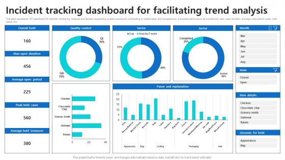
Incident Tracking Dashboard For Facilitating Trend Analysis




Try Before you Buy Download Free Sample Product
 Impress Your
 Audience
 100%
100% Editable
 Save Hours
 of Time


This slide represents KPI dashboard for real time monitoring, analysis and decision supporting incident tracking by contributing to collaboration and transparency. It includes metrics such as overall hold, max open duration, average open period, peak held cases, etc.
People who downloaded this PowerPoint presentation also viewed the following :
Incident Tracking Dashboard For Facilitating Trend Analysis with all 10 slides:
Use our Incident Tracking Dashboard For Facilitating Trend Analysis to effectively help you save your valuable time. They are readymade to fit into any presentation structure.








FAQs for Incident Tracking Dashboard For
Honestly, start with real-time updates and clear priority levels - that's your foundation. Automated alerts when stuff breaks are a lifesaver too. Your team needs customizable filters to sort by severity or whoever's handling it. Timeline views are pretty clutch for seeing the whole mess from start to finish. Don't even think about a platform that won't play nice with your existing tools - juggling multiple dashboards during an outage is actual hell. SLA tracking and basic reporting help you figure out what went wrong later. Those are the essentials, then just add whatever your team actually ends up using.
Dude, visual dashboards are a game changer for incident tracking. You'll spot trends and bottlenecks instantly instead of scrolling through endless spreadsheet rows. Heat maps show your worst-performing systems, timeline charts catch response delays, and real-time boards keep everyone on the same page during chaos. It's honestly night and day compared to text-heavy reports. Executives actually understand what you're showing them too, which is huge for buy-in. I'd start simple - just chart your incident volume and response times first. The problem areas become super obvious right away, and you can focus your team where it actually matters.
Start with the obvious stuff - total incidents, how long they take to fix, and whether you're hitting your SLAs. Break it down by priority and who's handling what so you can see where things get stuck. Reopened tickets are annoying but you gotta track them. Customer satisfaction scores matter too, obviously. I'd also do some kind of breakdown by incident type or what caused them in the first place. Week-over-week trends are where you'll actually learn something useful - way more than just looking at raw numbers. You can always get fancier with the metrics later once everyone's actually using the thing.
So basically you just tweak the fields and metrics to fit whatever industry you're in. Healthcare teams track patient safety stuff and compliance - totally different vibe than tech companies. Manufacturing focuses more on equipment breakdowns and safety violations, retail cares about customer complaints and inventory problems. You can mess with alert settings, report templates, user permissions too. Honestly the key is figuring out what incidents actually matter for your specific work, then just build your categories around that. Way easier than trying to force some generic setup to work for you.
Honestly, data quality is going to be your biggest headache. All your incident info is spread across random tools and formats - total mess to pull together. Getting people to actually log stuff consistently? Yeah, that's not happening unless you make it stupid easy. Everyone hates adding steps to their day. You'll waste time on vanity metrics that look good in meetings but don't actually help. Oh, and whatever tools you're using now? They definitely won't play nice together. My advice - pick one team first. Get their process dialed in before you even think about expanding. Way less painful that way.
So basically, integration cuts out all that annoying manual copying between systems. Your incident dashboard talks directly to ServiceNow or Jira, syncing tickets automatically. No more playing digital secretary! Real-time updates happen without you lifting a finger, and your team can stick with their favorite tools while everything stays in sync. The reporting gets way cleaner too since there's just one source feeding everything. Honestly, the time savings alone make it worth it. I'd map out what tools you're using most first, then check what APIs they've got available.
Dude, you need real-time data or you're basically screwed. When something breaks, you'll know instantly instead of finding out from angry users on Twitter (been there, not fun). Live updates help you figure out which crisis to tackle first and whether your fixes are actually doing anything. Your stakeholders stay happy because they get updates without pestering your team every five minutes. Honestly, it's also great for catching weird patterns before they explode into bigger disasters. Just set up some alerts on your important stuff so you don't have to babysit the dashboard all day.
So basically, you're looking at your past incidents to figure out what's gonna break next. Pretty smart approach, honestly. The data shows you which systems are constantly causing headaches and when things tend to go sideways - like if you always get slammed during Black Friday or whatever. Focus on your biggest problem areas from last year first. The dashboard breaks down frequency, how bad things got, and what actually caused the mess. You'll start seeing patterns pop up that help you decide where to throw your money at prevention. It's way better than just guessing and hoping for the best.
Honestly, get your team involved in building it from the start - they'll actually want to use something they helped create. Focus on solving problems they're already complaining about. Keep it dead simple... if people need a manual to log stuff, you've already lost. I'd skip the fancy training sessions and just show them how it saves time or catches things before they blow up. Oh, and make sure your boss uses it too - nothing kills adoption faster than leadership ignoring their own tools. Quick wins are everything here.
Honestly, these dashboards are lifesavers for compliance stuff. Everything gets timestamped automatically - incidents, how fast you responded, resolutions, the whole thing. So when your boss needs board reports or some regulator shows up, you're not frantically digging through emails. The reports can match whatever framework you're dealing with (SOX, HIPAA, etc.). They'll calculate your mean resolution times and SLA numbers without you having to mess around in Excel. Trust me, set up those report templates now. You don't want to be scrambling during audit season - been there, it sucks.
Honestly, mobile dashboards are a game changer for incident response. When alerts hit your phone, you can jump on issues instantly - no waiting to get back to your computer. I've fixed critical stuff while literally standing in line at Starbucks, which sounds ridiculous but it works. The apps let you reassign tickets, chat with your team, and push quick fixes on the go. Response times get way better since there's zero delay between something breaking and you actually doing something about it. Start with setting up notifications for your high-priority stuff first.
Put your biggest stuff right up top - active incidents, how bad they are, response times. Color code it but don't go nuts (I once made a dashboard that looked like a kindergarten art project). Red for critical, yellow for warnings, you know the drill. Group related things together and make sure people can click through for more details. Filters are clutch - let teams sort by severity, time ranges, whatever they need. The whole point is telling the story without making anyone dig around. Oh, and definitely test it with your actual on-call folks first. They'll spot the annoying stuff you totally missed.
Just ask each team what info they'd actually find useful - that's honestly the best starting point. Executives usually want the big picture stuff like trends and key metrics. Your support folks need the nitty-gritty: ticket queues, real-time updates, that kind of thing. IT managers? They're probably more interested in workload balance and whether you're hitting SLAs. Most dashboard tools have role permissions built in, so you can create different views pretty easily. Map out who needs what first, then start building. Way easier than guessing what everyone wants and getting it wrong.
Role-based access control is your friend here - you don't want everyone seeing customer names or security issues on public dashboards. Mask sensitive fields and set up proper session timeouts. Browsers cache everything (seriously, they're terrible for this), so watch what data gets stored locally. Different teams need different views anyway - finance doesn't need to see the same stuff as your dev team. One huge dashboard where everyone sees everything? That's just asking for trouble. Oh, and if you've got monitors in common areas, definitely scrub any internal system details from those views.
Honestly, these dashboards are lifesavers during outages. Everyone can see what's happening in real-time instead of drowning in scattered Slack messages. You'll know who's handling what, track updates as they come in, and actually avoid people duplicating work or missing stuff. Plus you can assign owners and set priorities right there. The automated alerts are clutch - saves you from manually pinging people every time something changes. We had an incident last month that would've been way messier without it. Just makes the whole thing less of a dumpster fire, you know?
-
Wow! The design and quality of templates on SlideTeam are simply the best.
-
Unique design & color.