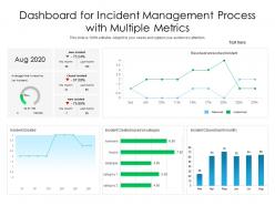
Dashboard for incident management process with multiple metrics
Try Before you Buy Download Free Sample Product
Audience
Editable
of Time
Our Dashboard For Incident Management Process With Multiple Metrics are topically designed to provide an attractive backdrop to any subject. Use them to look like a presentation pro.
People who downloaded this PowerPoint presentation also viewed the following :
Dashboard for incident management process with multiple metrics with all 2 slides:
Use our Dashboard For Incident Management Process With Multiple Metrics to effectively help you save your valuable time. They are readymade to fit into any presentation structure.
FAQs for Dashboard for incident management process
Look at MTTD and MTTR first - those are gonna be your main indicators. Incident volume trends too. Track which services keep breaking (that's the real goldmine honestly) plus severity breakdown and how often stuff gets escalated. Customer impact metrics are clutch since that's what the bosses actually care about. Oh and make sure you can filter by different time ranges and teams. When everything hits the fan, you'll want to spot patterns fast before they turn into bigger headaches. The escalation rate thing has saved my butt so many times.
Dude, these dashboards are honestly game-changers for response times. You get this real-time view of everything happening instead of frantically searching through logs when shit hits the fan. Quick pattern spotting, easy escalation to whoever needs to handle it, progress tracking - all right there. The automated alerts are clutch though, and you gotta have clear ownership mapped out or stuff will definitely slip through the cracks. I learned that one the hard way during a midnight outage last year. Basically gives you mission control vibes for your whole infrastructure setup.
Honestly, data visualization saves you from drowning in spreadsheets. Charts and heat maps let you spot trends instantly instead of scrolling through endless rows of numbers. Your team can see what's urgent vs. what can wait - way faster than digging through tables. I've seen people miss huge patterns just because they're stuck staring at raw data all day. Heat maps are especially clutch for showing where problems cluster. Start simple with incident volume charts and severity trends. You'll be shocked how obvious the problem areas become once you can actually see them visually.
Honestly, it's a total game changer. Your dashboard stops being just a "look but don't touch" situation and becomes where you actually get stuff done. When alerts fire, tickets get created automatically and you can assign them right there. No more juggling tabs between your monitoring tool, Jira, Slack, whatever else you've got running. The real win though? Everything stays connected. You can see the whole story from alert to resolution, which makes those post-incident reviews way less painful. I'd say start with whatever ticketing system your team lives in most - probably see results pretty much immediately.
Okay so first thing - set up severity levels like Critical, High, Medium, Low. Critical is when everything's on fire and nobody can work. Low is like "this button looks weird" stuff that can wait forever. Color-code everything because honestly, nobody wants to read paragraphs when they're stressed. Also break things down by type - network issues, apps, security whatever. That way people instantly know if it's their problem or not. Here's the thing though - don't let urgency fool you into bad priorities. The CEO's laptop being slow isn't actually Critical just because they're important. Impact AND urgency both matter. Keep definitions simple and make sure everyone's on the same page about what each level means.
Dude, real-time updates are clutch for incident response. When stuff breaks, you need to see what's happening NOW - not when some dashboard decides to refresh 10 minutes later. I've watched teams spiral chasing alerts that were already fixed (so painful). Live data lets you actually prioritize which fires need attention first and pivot when your initial fix isn't working. Plus stakeholders stop breathing down your neck when you can give them accurate updates instead of "uh, we're still investigating." Just make sure your refresh rate matches how urgent things actually are.
Oh man, cramming everything onto one screen is the worst move. Your team will hate you for it. Skip the vanity metrics that look cool but are useless when shit hits the fan. I've worked with dashboards that were basically art projects - zero help during actual incidents. Hide critical stuff like severity levels? That's just cruel to your on-call people. Really focus on what responders actually need: current status, who's handling what, next steps. Test it with your team first though, because what looks obvious to you might be confusing as hell to someone getting paged at 3am.
Put the critical stuff right at the top - active incidents, severity levels, current status. High-priority alerts need to be impossible to miss. Trend charts and resolution metrics should go below that so you can catch patterns. Honestly, I've watched teams struggle with dashboards that look pretty but hide the important info under layers of graphics. Don't fall into that trap. Your color coding needs to stay consistent, and everything should update in real-time. Oh, and definitely test it during a real incident with your team first - you'll quickly see what's actually useful versus what just looks good.
So there's actually a ton you can do with the dashboard. Custom widgets let you track whatever metrics your team cares about most. Honestly, the drag-and-drop layout thing is weirdly fun to play with. You can set up filters for priority, status, all that stuff - plus automated alerts so you're not drowning in notifications about everything. Oh, and you can save different dashboard views too. Like one for daily stuff and maybe another when the executives want their reports. I'd just grab one of their templates first and then customize from there - way easier than starting from scratch.
ML can totally transform your incident dashboard. Start with automated ticket classification - biggest time-saver by far. It'll predict issues before they blow up into real problems, plus auto-categorize tickets and assign severity scores. The pattern recognition stuff is honestly wild these days. Learns from your old data to suggest what's causing issues and how to fix them. Also helps with staffing - figures out workload spikes and matches the right people to specific incident types. Oh, and root cause analysis gets way faster too. That's probably where you'll see the most immediate impact.
Dude, user feedback is everything for dashboards. Your team will straight up tell you when something's buried or slowing them down during incidents. The best improvements honestly come from those angry 2am messages during outages - that's when people really know what they need. They'll ask for custom views, better filters, different alert settings based on how they actually use it. I mean, why guess when you can just ask the people who live in that thing when everything's on fire? Set up feedback sessions with your incident responders and actually listen. They know what works.
Honestly, automation is a game changer - it handles all the boring stuff like creating tickets from alerts and assigning them based on whatever rules you set up. Your team stops wasting time on spreadsheet updates and can actually focus on fixing real problems. The system automatically sends notifications to the right people and updates everything as incidents move through resolution. Plus no more human error in tracking, which is huge. Dashboard shows everything in real-time without anyone manually entering data. I sound like a salesperson but seriously, once you set the rules up it just runs itself.
So basically everyone can see the same real-time data instead of that annoying game of telephone that always happens. Your devs, ops people, business folks - they're all looking at the actual current situation. You can assign tasks right from there, see who's doing what, post updates that ping the right people automatically. Honestly, the timeline feature is clutch for those post-incident meetings where everyone "remembers" totally different things happening. Just make sure people actually know how to use it beforehand - there's nothing worse than trying to figure out new tools when everything's on fire.
Line charts are your best bet for tracking incidents over time - they'll show you patterns and when stuff starts going wrong. Bar charts work well if you're comparing specific periods, like this month vs last month. Heat maps are honestly my favorite for showing when incidents cluster (like Tuesday mornings or whatever). Color code everything - red for critical, yellow for medium priority. Oh, and those little trend arrows showing if you're improving or not? Super helpful. Just don't go crazy with fancy visuals right away. Start with one solid chart that your team will actually look at, then add more based on what they find useful.
Make those buttons way bigger - nobody wants to fumble around with tiny targets when they're dealing with an emergency. Ask your field people what they actually use most (probably status updates, reassigning tasks, and uploading photos) then nail those three things first. Dark mode is clutch, trust me on this one. Your team needs offline sync for basic stuff since cell towers aren't exactly reliable in crisis zones. Oh, and test on real phones, not just your browser's mobile view - that's where you'll catch the annoying stuff. Honestly, keep it dead simple.
-
Visually stunning presentation, love the content.
-
I discovered this website through a google search, the services matched my needs perfectly and the pricing was very reasonable. I was thrilled with the product and the customer service. I will definitely use their slides again for my presentations and recommend them to other colleagues.
-
Excellent Designs.