


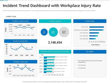
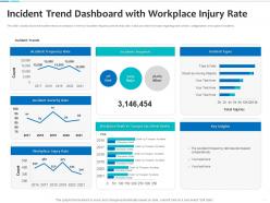
Incident trend dashboard snapshot with workplace injury rate




Try Before you Buy Download Free Sample Product
 Impress Your
 Audience
 100%
100% Editable
 Save Hours
 of Time


Our Incident Trend Dashboard Snapshot With Workplace Injury Rate are topically designed to provide an attractive backdrop to any subject. Use them to look like a presentation pro.
People who downloaded this PowerPoint presentation also viewed the following :
Incident trend dashboard snapshot with workplace injury rate with all 2 slides:
Use our Incident Trend Dashboard Snapshot With Workplace Injury Rate to effectively help you save your valuable time. They are readymade to fit into any presentation structure.
FAQs for Incident trend dashboard snapshot with
Track your incident frequency and how severe they are first - that's the basics. Time to resolution matters too, plus what's actually causing these things. I'd also watch which systems get hit and if there's timing patterns. MTTD and MTTR are honestly where the magic happens for finding what you can fix in your process. Don't just look at raw numbers though - month-over-month trends will actually tell you if you're improving. Weekly reporting works well to start, then you can tweak based on whatever weird patterns your environment throws at you.
Start by cleaning up your incident data - trust me, garbage in means garbage out. Plot everything on a timeline so you can spot when things go sideways. I'd look at how often incidents happen, how bad they get, and if there's timing patterns over months or years. Seasonal spikes are super common, like right before holidays when everyone's rushing deployments. Excel works fine for basic trending, though time series tools are better if you have them. Once you see the patterns, you can actually predict when to have extra people on call and prep your response plans ahead of time.
Honestly, you'll save yourself so much headache by visualizing your incident data instead of staring at spreadsheets all day. Heat maps and time series charts make patterns jump out immediately - like when incidents always spike on Mondays (classic). Raw data tables? Good luck spotting trends in that mess. Charts are also way better for presenting to leadership since nobody wants to decode rows of numbers during meetings. Start simple with basic graphs first. Once you get comfortable, dashboards become pretty addictive - you can track peak times, recurring problems, the works. Trust me, it's a game changer.
So it totally depends on what could actually hurt your business, you know? Healthcare obsesses over medication errors and patient safety stuff. Manufacturing watches equipment failures like hawks. Tech companies? They lose their minds over outages and security breaches - I've literally seen people camping in conference rooms over this. Financial places care most about fraud and staying compliant with regulations. Start with whatever incidents would genuinely mess up your operations, then track patterns around those specific things. Don't try tracking everything or you'll drown in data.
Splunk and Elasticsearch are your best bet for digging into logs and spotting patterns you'd miss otherwise. Tableau or Power BI work great for visualizing trends over time, especially when you're showing the data to higher-ups. Don't sleep on Excel pivot tables though - they're surprisingly powerful for basic analysis. If you're already using ServiceNow for incident management, their analytics features are pretty solid. Oh, and honestly? Just pick whatever visualization tool your team already knows how to use. The actual insights you find matter way more than having some flashy dashboard.
Dude, you gotta nail down your data collection standards first. What counts as an incident? Make sure everyone's using the same reporting fields and categories - I've watched teams completely mess this up and their trend analysis becomes garbage. Train people properly on how to log stuff consistently. Set up some validation rules in your system to catch stupid mistakes right away. Oh, and do regular spot-checks on entries because people get lazy. Honestly, half the battle is just making good data habits stick instead of treating it like something you'll fix later.
So basically, instead of just putting out fires all day, you get actual data to work with. Track when and where incidents keep happening - patterns show up faster than you'd think. Just pick 2-3 metrics to start with, nothing fancy. The cool part? You can finally prove to management that yes, you DO need more budget for that security tool you've been asking for. Plus you'll know if those changes you made last month actually helped or just moved the problem somewhere else. Honestly beats flying blind and hoping for the best.
Dude, real-time data completely changes the game for incident analysis. You're not stuck waiting weeks to figure out what went wrong - you can spot problems right as they're happening. Super helpful when you need to connect dots between different systems quickly. Instead of digging through old logs (which honestly sucks), you get fresh insights while everything's still happening. The trick is setting up alerts that actually matter, not just noise. Otherwise you'll drown in notifications. But when it works? You can fix small issues before they blow up into those 3am emergency calls nobody wants.
Don't look at incidents like they exist in a vacuum - deployments, holidays, team turnover all matter. I see teams cherry-pick timeframes constantly to prove whatever point they want. Bad move. Focus on severity and impact, not just how many tickets you're getting. Honestly, some teams just count everything and call it analysis, which is pretty useless. Get your categorization sorted first. Then hunt for actual patterns over longer periods. The story behind your data matters way more than the raw numbers, trust me on this one.
Look, just because you see patterns doesn't mean there's actually causation happening. Like yeah, maybe incidents spike every Tuesday - but dig into *why* that's happening. Could be you're pushing code changes that day, not some mystical Tuesday curse lol. Always ask yourself what's the actual mechanism here? What would make A cause B? Test other explanations too. If you can run experiments like A/B testing your infrastructure changes, do it. Honestly, I've learned to be super skeptical of obvious patterns. The real root cause is usually hiding underneath.
Look, company culture totally controls whether people actually speak up about problems. Blame-heavy environments? You'll get like zero honest reports because who wants to get thrown under the bus. But flip that - create real psychological safety where mistakes become learning moments - and suddenly everyone's talking. The shift is crazy dramatic. Here's the test: watch how your leadership reacts to the next screwup. Are they hunting for heads to roll or genuinely asking what went wrong? I've seen this play out so many times, and honestly, that first reaction from the top basically determines everything else.
You should definitely try machine learning for incident analysis - it catches patterns way better than doing it manually. Like, it'll find weird connections between deploy times and outages that you'd probably miss. Plus the models actually get smarter as they process more data, which is honestly pretty neat. Start by throwing your incident history into anomaly detection models. They're great at predicting when stuff's about to break based on your historical patterns and system metrics. Even external factors can help. Instead of always being reactive, you'll actually prevent issues before they happen.
Make visual dashboards your best friend - charts beat spreadsheets every time. Start with business impact, then get technical. Executives care about money, engineers want root causes. Be specific with your recommendations and timelines, not vague "let's improve stuff." Regular review meetings help, though honestly half the battle is just getting people to show up. Follow up in writing so they can't claim they forgot what you discussed. Oh, and don't dump everything in one massive presentation - bite-sized chunks work way better for getting actual buy-in.
Look, regulations basically run the show when it comes to incident analysis. Healthcare's got HIPAA plus patient safety stuff to worry about. Manufacturing? OSHA's all over workplace incidents. Financial services is its own nightmare with compliance frameworks. Here's the thing though - regulators don't just want raw numbers anymore. They want historical trends and predictions too, which honestly makes everything more complicated. You've gotta structure your whole analysis around their specific timelines and categories right from the start. Trust me, trying to fix your data setup later when audit season hits is not fun.
Focus on three main ones: Mean Time to Detection (MTTD), Mean Time to Resolution (MTTR), and how often incidents come back. MTTD tracks how fast you catch issues. MTTR shows how quickly you fix them - these two are honestly your bread and butter. Recurrence rates? Super important because they tell you if you're actually solving root problems or just slapping temporary fixes on everything. Oh, and if you deal with customers directly, definitely track escalation rates too. Start simple with these basics before getting into fancy advanced stuff. Trust me on this one.
-
Excellent Designs.