


Infographics template 6 ppt model





Try Before you Buy Download Free Sample Product
 Impress Your
 Audience
 100%
100% Editable
 Save Hours
 of Time


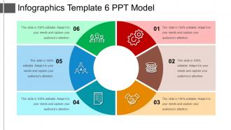
Build a thirst for knowledge with our infographics template 6 PPT model. Point out enlightening details and work for the target of organized decisions. Through this circular format, we have shown the concept of the systematic business process with multiple stages. This essential design comprises of six stages, reflecting terms like data management, data classification, information lifecycle management. Colorful patterns, circular exemplars, and relative icons could help your team or client to grasp the process better. What sets this PPT exhibition template apart is the perfect amalgamation of graphics and contextualized text-based notes. Elaborate your plans free of space constraints, add your data and help your hard work stand out. This is a simple, yet elegant looking presentation design will surely assist you to make your viewers understand the importance of taking the right approach for business development. We have included interesting visual combinations in each step to create a better idea of your motive. Create an appetite for information with our Infographics Template 6 Ppt Model. Dish out a host of enlightening details.
People who downloaded this PowerPoint presentation also viewed the following :
Infographics template 6 ppt model with all 5 slides:
Deal with any indication of insecurity with our Infographics Template 6 Ppt Model. It will calm the jitters.
FAQs for Infographics template
So focus on three main things: hierarchy, flow, and balance. Your biggest info needs to pop first - use size and color to make it obvious. Then guide people's eyes down the page with clear sections that make sense. Don't cram everything together! White space actually helps (I used to hate leaving empty space but it really works). Stick to maybe 3-4 colors max, keep fonts consistent, and make your charts readable at first glance. Quick test: show someone for 10 seconds. If they can't tell you the main point afterward, it's too cluttered and you gotta simplify.
Honestly, infographics work because we're just wired to process visuals better than walls of text. People remember like 65% more info after three days when you use charts and icons instead of boring paragraphs. The templates give you that logical flow too - your audience won't get lost trying to follow complex stuff. I mean, anything beats staring at a spreadsheet, right? Just pick one that actually fits your story. Are you comparing numbers? Showing a process? Breaking down survey results? Match the template to what you're trying to say and you're golden.
For infographics, go with bar charts, pie charts, and basic line graphs - people can digest those instantly. Icons paired with big numbers are money, especially when you're comparing stuff. Skip anything crazy like scatter plots since most people just skim these things anyway. Timelines work well if you're showing steps or chronological stuff. Honestly, flowcharts are underrated too. You want zero mental effort required. Here's what I do: show your draft to someone for literally 10 seconds, then ask what stuck. If they can't remember the main points, simplify more.
Just swap out the colors, fonts, and icons to match your industry - healthcare looks way better with clean blues and medical stuff than bright orange pizza graphics, you know? Bar charts work great for finance topics while timelines are perfect for historical stuff. Most tools let you drag and drop everything around, so you can totally restructure the whole layout. Honestly, the boring templates sometimes end up looking the most professional once you customize them. Match your visuals to what your audience expects and your brand colors. Start by figuring out what visual style your industry typically uses, then go from there.
Okay so the big three things are hierarchy, contrast, and white space. Don't make everything the same size - people need to know what's most important. Stick to maybe 3-4 colors max because more just looks messy. And seriously, give your content room to breathe! I can't tell you how many infographics I've seen that are just wall-to-wall text and graphics. Make your fonts big enough for mobile - 14pt minimum for body text. Group related stuff together and keep your spacing consistent. Oh, and there should be a clear flow so someone knows where to start reading. Quick test: show it to someone for 5 seconds and see what sticks.
Dude, colors and fonts can totally make or break your whole infographic. You want maybe 2-3 colors tops - warm ones grab attention, cool ones feel more trustworthy. For fonts, mix a bold header with something clean for the body text. Works every time. I've literally seen people ruin beautiful designs with terrible color choices (neon green is not your friend). Oh, and please avoid Comic Sans unless you're making something for kids. Two complementary fonts max, then test it on your phone and laptop before you call it done. Trust me on this one.
So think of storytelling as your roadmap - it's what moves people through your infographic smoothly. Map out your narrative first (problem to solution, chronological, whatever works). Then build everything around that flow. Headers become your chapter breaks, visuals back up key points, and white space gives readers a breather. Honestly, the story structure should come before you even think about design. It's like... you wouldn't write a book by randomly throwing chapters together, right? Same logic here. Guide viewers from start to finish with intention, not just pretty graphics scattered around.
Make different versions for each platform - square for Insta, horizontal for Facebook/Twitter, and those tall story formats. Print stuff needs way higher resolution (300 DPI) plus CMYK instead of RGB colors. The aspect ratio thing is honestly such a pain but your posts will perform way better. Also check that your text doesn't become impossible to read when it's tiny on phones. Oh and don't try forcing one design everywhere - just export separate versions. Trust me, it's less headache in the long run than dealing with cropped or stretched designs.
Don't cram a wall of text everywhere - people won't read it. Also make sure your images aren't pixelated garbage when you blow them up. Pick colors that actually match your brand instead of just using whatever the template came with. The layout needs to make sense for your info too. Like, don't force your content into some random design just because it looks cool. Make your main points pop visually - hierarchy matters. Oh and definitely check how it looks on phones since that's probably where most people will see it anyway. I always preview at full size first though, saves you from nasty surprises later.
Honestly, user feedback is like having a crystal ball for your templates. People will tell you straight up when something sucks - maybe your fonts are too tiny or the layout makes zero sense. I've seen "gorgeous" templates flop hard while basic ones crush it because they're actually usable. The trick is being systematic about it though. Send surveys, check your analytics, watch people struggle through your interface (it's painful but so helpful!). Focus on the complaints you hear over and over. Oh, and just ask your current users what pisses them off most - they'll definitely tell you.
Honestly, just go with Canva first - their free version has everything you need to start. Adobe Illustrator's amazing if you're into graphic design, but it'll take forever to learn. Piktochart's pretty decent too, especially for charts and data stuff. I spent way too much time last week playing around with Canva templates when I should've been working lol. PowerPoint actually works fine for basic stuff too, which surprised me. Venngage's another solid option. Don't overthink it though - try Canva's free version first, see what you're missing, then upgrade if you need more features.
Yeah, your audience totally changes everything. Corporate stuff needs to look buttoned-up - clean lines, lots of white space, boring but trustworthy colors. They want those data-heavy charts that scream "serious business happening here." Educational templates? Way more fun honestly. Bright colors, playful fonts, icons that don't look like they came from 2003. The whole layout should guide people through learning instead of just dumping info on them. Corporate clients obsess over ROI metrics while educators just want kids to actually get it. Match your design to how people's brains work in each setting.
Dude, the infographics that really blow up are usually those "evolution of" ones - like showing how the iPhone changed over time. People go crazy for comparison charts too, especially the "X vs Y" format because everyone loves taking sides. Those before/after transformations always do well, and honestly, anything that turns complicated data into something you can understand in like 5 seconds. Remember all those COVID timeline graphics from 2020? Pure gold. The trick is jumping on whatever topic's already trending and making it visual. Just pick one of these formats and run with whatever people are talking about right now.
Honestly, start with your brand basics - logo, colors, fonts - and use them on every single infographic. I've watched companies totally shoot themselves in the foot by grabbing random templates that look nothing alike. Your audience gets confused and doesn't recognize your stuff anymore. Keep your icon style consistent too. Same spacing, similar layouts, and stick to how your brand actually talks. Think of each infographic as part of the same family, you know? Oh, and create a quick brand guide with your template rules so if someone else on your team makes one, they won't accidentally mess up your whole vibe.
Oh totally, design trends basically control how infographic templates look. Like when minimalism was everywhere, templates got super stripped down with tons of white space. Now data storytelling is big, so you're seeing more story-like layouts with those panel sequences. The color thing follows whatever's trendy too - right now it's all about accessible, high-contrast stuff. Honestly the speed of these changes is kinda crazy. I'd probably update your template stash every 6-12 months and follow some design blogs. Keeps you from looking outdated, you know?
-
Much better than the original! Thanks for the quick turnaround.
-
Easy to edit slides with easy to understand instructions.