

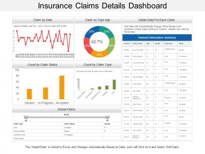
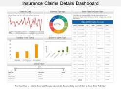
Insurance claims details dashboard




Try Before you Buy Download Free Sample Product
 Impress Your
 Audience
 100%
100% Editable
 Save Hours
 of Time


Heighten the belief in your commitment to deliver with our Insurance Claims Details Dashboard. It will generate intense faith.
People who downloaded this PowerPoint presentation also viewed the following :
Insurance claims details dashboard with all 6 slides:
Inject a dose of humor into the discussion with our Insurance Claims Details Dashboard. Be jovial about it.
FAQs for Insurance
Okay so definitely track claims volume, settlement times, and cost per claim first - that's your foundation right there. Approval/denial rates matter too, plus customer satisfaction if you can get it. I'd personally start with settlement time because you can spot your bottlenecks immediately. Loss ratios are clutch for the bigger picture. Oh and claims by category helps you see patterns forming. If your system tracks fraud indicators, throw those in too but honestly don't overwhelm yourself at first. You can always layer on more detailed stuff once you've got these basics dialed in.
Honestly, visualizing your claims data is a game changer. Those endless spreadsheets are soul-crushing - charts and graphs actually make sense of everything instantly. You'll spot fraud patterns, see which areas are high-risk, and catch seasonal spikes without squinting at numbers all day. Bar charts work great for comparisons, heat maps show geographic stuff clearly, and line charts track trends over time. Plus, when you need to present findings to your boss or whoever, visuals just hit different than dumping a spreadsheet on them. I learned that the hard way. Start with your most important metrics first.
Dude, real-time data totally changes the game with claims stuff. You can actually see bottlenecks happening instead of finding out about them three days later when everyone's already pissed. Track where claims are stuck, who's drowning in work, processing times - all that good stuff instantly. When someone gets swamped you can shuffle things around before it becomes a disaster. Honestly the best part is catching delays before customers start blowing up your phone. Just don't go crazy with alerts or you'll hate your life - only set them for claims that sit too long in one spot.
Honestly, these dashboards are game-changers. You get all your claim data in one spot - volumes, settlement patterns, fraud red flags, processing times. No more jumping between systems like a maniac. What I love is you can actually see what's happening instead of drowning in spreadsheets. Spot the claims that need urgent attention right away. Plus you'll catch problems early before they blow up your budget. Takes like 30 seconds to figure out where your team's getting bogged down. Way better than the old days of pulling reports for hours just to answer basic questions.
Honestly, these dashboards handle pretty much everything - auto, property, health, workers' comp, liability, the whole nine yards. Real-time data gets pulled straight from your claims system into charts and tables. Some places track hundreds of claim types simultaneously (total information overload if you ask me). Filtering is super flexible though - you can sort by claim type, status, adjuster, date ranges, whatever you need. My advice? Start with your busiest claim types first. Get comfortable with how it works, then branch out. Way less overwhelming that way.
So basically the AI handles all the boring stuff automatically. It spots sketchy claims right away, figures out what you'll probably pay out, and sorts everything into the right buckets. Honestly? The fraud detection is where you'll see the biggest difference - I'd turn that on first. Routine claims just zip through without you touching them, while the complicated ones get sent to your specialists with all the risk info already crunched. It's kinda like having someone really smart working 24/7. Oh, and processing gets way faster since most stuff doesn't need human eyes on it anymore.
Focus on what adjusters actually need every day - claim status, next steps, key dates right up top. Search has to be rock solid since they're always hunting down specific claims. Colors are your friend for flagging urgent stuff or overdue tasks. Most dashboards are hot garbage because they try to show everything at once. Simple navigation with clear categories works way better. Oh, and customizable views are clutch so different people can see what matters to them. Definitely test with real users first - they'll catch stuff you'd never think of.
So the dashboard's trend analysis is perfect for this - it spots patterns in how often claims happen, how bad they are, plus seasonal stuff. Run it on 2-3 years of old data and it'll actually predict future claim volumes pretty accurately (which honestly blew my mind the first time I saw it). Monthly trend reports are your best bet to start building up that forecasting accuracy. Oh and it's great at catching emerging risks early, budget planning, even weird fraud patterns before they get out of hand. Super helpful tool once you get the hang of it.
Start with role-based access controls - that's your biggest vulnerability right there. Only let people see the claim data they actually need. Two-factor auth is non-negotiable after what happened to that other company (still can't believe they didn't have it). Encrypt everything in transit and at rest. Set up audit logs so you know who's poking around where. Auto-timeout for inactive sessions is clutch too. Oh, and mask sensitive data in your test environments - saw a breach happen that way once. Regular security assessments help catch stuff you missed. Honestly, access controls should be priority one since most breaches start there.
Honestly, a claims dashboard is a game-changer for cutting down those annoying "where's my claim?" calls. Your customers get real-time updates on their claim status, can check progress at 2am if they want, and you can push automated notifications when things change. Think of it like tracking a package but for insurance stuff - people are obsessed with knowing what's happening. The transparency thing really builds trust too. Nobody likes being left in the dark wondering if you're actually doing anything. Start simple with basic status updates and timelines. Trust me, you'll see your call volume drop pretty fast.
Honestly, claims dashboards are lifesavers for catching fraud - they pick up weird patterns you'd never notice going through everything by hand. Set up alerts for the obvious stuff first: duplicate claims, crazy high amounts, multiple claims from the same IP address. That kind of thing jumps out immediately. The visual side is pretty cool too - you'll start seeing trends like one address generating tons of claims or the same person filing way too often. I'd focus on your biggest fraud red flags when setting it up initially, then use the pattern tools to investigate anything that feels sketchy. Way better than manually combing through spreadsheets all day.
Honestly, the worst part is trying to get all your data to talk to each other - claims systems are a nightmare that way. Plus good luck getting everyone to agree on which metrics actually matter. Adjusters will hate you at first because they think it's just more work piled on top of everything else. Oh, and if your dashboard sucks to use, people will straight up ignore it. I've seen that happen so many times. Start with just one metric that everyone already cares about. Get that right, then slowly add more stuff once they see it's actually useful.
Responsive design is a game-changer for accessibility. Picture someone filing a claim on their phone after a fender bender - tiny buttons and cramped text fields will just frustrate them more. Your dashboard needs to adapt smoothly across devices. Font sizes, button spacing, and navigation should automatically adjust so everyone can actually use it. Most responsive design practices align with WCAG guidelines anyway, which is nice. I'd start by testing your current setup on different devices - honestly, you'll probably spot issues immediately. Look for anywhere users might struggle with touch targets or reading the text.
Honestly, you need everyone at the table from day one - claims, underwriting, finance, ops, the whole crew. Different teams catch different problems with the data, plus they'll think of metrics you'd never consider. I've watched so many dashboards crash and burn because IT just built whatever they thought was needed. Nobody used them! Get stakeholders involved early, then set up regular check-ins once it's running. Trust me, a dashboard that works for everyone beats one that's perfect for nobody. It's really the difference between success and expensive digital paperweight.
So here's what I'd do - set up your dashboard to track the big stuff first: claim processing times, denial rates, settlement patterns. All that regulatory compliance data in one spot. Automated alerts are a lifesaver, trust me on this one. You won't be constantly checking everything manually anymore. Pull data from whatever systems you're using to get that real-time view of where you stand with state codes, federal requirements, all of it. Oh and definitely add trend analysis - regulators eat that historical stuff up. Start small though. Pick your top 3-5 compliance headaches and build views for those first.
No Reviews