


Investment banking presentations powerpoint presentation slides





Try Before you Buy Download Free Sample Product
 Impress Your
 Audience
 100%
100% Editable
 Save Hours
 of Time


Our Investment Banking Presentations Powerpoint Presentation Slides are topically designed to provide an attractive backdrop to any subject. Use them to look like a presentation pro.
People who downloaded this PowerPoint presentation also viewed the following :
Investment banking presentations powerpoint presentation slides with all 50 slides:
Use our Investment Banking Presentations Powerpoint Presentation Slides to effectively help you save your valuable time. They are readymade to fit into any presentation structure.




FAQs for Investment banking presentations
So for your IB deck, start with exec summary - that's what the MDs actually read anyway. Then do market overview, industry stuff, company analysis with your comps and precedent deals. After that, drop your recommendation with whatever valuation method makes sense. Oh and the appendix is gonna be huge - like way bigger than you think. I always underestimate that part. Risk factors and assumptions need to be super clear too, can't have them poking holes later. Keep slides clean and make sure the whole thing tells a coherent story from start to finish. Honestly the exec summary can make or break you since that's where everyone's attention span is.
Honestly, don't try to cram every single calculation on there - it'll look like a mess. Pick your best stuff: valuation ranges, sensitivity analysis, maybe a clean assumptions table. Screenshots from your model? They usually suck in presentations because nobody can read them. Better to rebuild the key tables in PowerPoint so they're actually legible. Charts work great for showing scenarios or comparables - way better than endless rows of numbers. Oh, and definitely walk through your methodology and assumptions so people get what's behind your numbers. Trust me, stakeholders appreciate knowing how you got there.
Honestly, just stick to your firm's template and don't get fancy with colors - two or three max. Each slide needs a real headline that tells people something, not generic crap like "Financial Analysis." Give your content room to breathe because cramming everything together makes people zone out immediately. High contrast is clutch for readability - blues and blacks on white backgrounds work great. Your charts should be dead simple too. Bar charts and line graphs beat those ridiculous 3D things every time. Oh, and make your font big enough that someone in the back row can actually read it without squinting.
Lead with your main point - don't bury it in backstory. For each case, hit deal rationale (1-2 bullets), key numbers with charts not text blocks, then what you actually learned. Max 2-3 slides per case or people's eyes will glaze over, trust me. Keep formatting consistent so they can scan and compare easily. Here's the thing though - only include stuff that's relevant to your current situation. I see people cramming in every detail just because it happened, but honestly? Your audience doesn't care about the full timeline. They want insights they can use. Focus on what supports your thesis, not just walking through events chronologically.
Dude, waterfall charts are amazing for deal breakdowns and transaction flows. For comps and multiples, just go with basic bar charts - they do the job perfectly. Line charts are your go-to for showing historical performance over time. Honestly, bubble charts are probably my favorite for peer analysis because you can cram tons of data points without it looking messy. Oh, and bridge charts work really well when you need to explain valuation changes. Just don't go crazy with colors - stick to 2-3 max. Make your labels super clear too, otherwise you'll have some MD squinting at your screen asking what everything means.
Line graphs are your best friend for showing trends - they make the direction super obvious. Always toss your data source at the bottom, and use callout boxes or arrows to highlight the big moments that matter. Green for good stuff, red for bad stuff works every time (honestly, people's brains just get it faster that way). When you're showing forecasts, make them dotted lines or shade them differently so nobody confuses them with real data. Oh, and put your main point right in the slide title - don't make people dig for it. Include confidence intervals if you've got them, but keep those time horizons realistic.
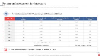
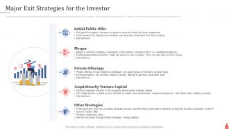
Honestly, investors only care about three things: how big the opportunity is, why you'll win, and realistic numbers with a clear exit. That first slide? Make or break - they're deciding in 30 seconds flat. Don't be the millionth person claiming "trillion dollar market" but actually show you get your slice and how you'll grab it. I'd keep it tight, maybe 12-15 slides tops. Oh and always end with specifics - exactly how much cash you need and what milestones you'll hit with it. Sounds obvious but you'd be surprised how many people mess this up.
Don't dump all the regulatory stuff at the end - nobody pays attention by then. Pick the regs that actually matter for your specific deal, not every random acronym you can think of. Weave compliance timelines and approval requirements right into your structure and timeline slides. Honestly, most people glaze over when you list twenty different regulatory bodies. Add a risk section about upcoming regulatory changes too. The whole point is helping clients understand how this stuff will actually hit their timeline and budget. Oh, and be specific about potential hurdles - vague warnings don't help anyone.
Think of your pitch like telling a story - problem first, then walk them through how you'd solve it. Every slide needs to pass the "so what?" test. If you can't explain why something matters in normal words, ditch it. Most pitches I've seen just throw data at people without connecting anything. Your slides should flow from one point to the next so the conclusion feels obvious by the end. Honestly? Practice it like you're explaining the whole thing to someone over drinks. That'll help you figure out what actually matters and what's just fluff.
Dude, figure out who you're talking to first - that's literally half the battle. Retail folks want simple numbers and stories they can actually follow. Institutions? They're digging into every financial detail and want those heavy comp analyses. I watched this guy completely tank a pitch once because he went full Wall Street mode with regular investors - painful to watch. VCs just care if you can scale massively. Your slide count should change too. Like, pension funds might sit through 40+ slides but family offices get bored after 15. Start with your exec summary and work backwards from there.
Dude, less is more with slides - cram too much text and people just check out. Let your charts and graphs tell the story instead. Those default PowerPoint templates? Hard pass, they look so basic. Your numbers better match up between slides because bankers are like hawks with that stuff and will totally call you out. Clean fonts, consistent colors throughout, skip the weird animations. Here's the thing though - your slide titles should basically tell the whole story on their own. Like if someone just read the headers while walking by, they'd get it. That's honestly saved me so many times when people zone out during presentations but still need to follow along.
Dude, don't bury your main point - put it right at the top. Three key supporting points max, then your charts underneath. Clean slides are everything: white backgrounds, barely any text, charts that actually make sense without explanation. Seriously, most decks I've seen are total disasters - way too much crap crammed on each slide. Your exec summary better be rock solid since half the clients won't read past that anyway. Oh, and don't forget slide numbers for when people jump around during Q&A. Each section needs clear next steps or you'll lose them.
Dude, branding is everything in IB presentations. Your slides need to look expensive before you even open your mouth. Clean fonts, consistent logos, proper color schemes - all that stuff matters way more than you'd think. I've literally watched teams lose credibility because their slides looked thrown together last minute. Meanwhile the competition rolls in with bulletproof templates that scream "we charge a fortune because we're worth it." Clients notice this stuff immediately. Don't underestimate how much your visual game affects their first impression of you.
Stick to waterfall charts for value creation and bridge charts for variances - they're clean and actually tell a story. Bar/line combos work great for trends too. Honestly, most decks are just unreadable chart chaos. Your visuals should back up what you're saying, not confuse everyone. Keep colors consistent with your branding and ditch heavy legends. Titles should literally state your main point. Here's the thing - if you can't explain the chart in one breath, it's way too complicated. I always start with my conclusion first, then figure out how to show it visually.
Honestly, nail those slide transitions first - that's where everyone falls apart. Tell a story instead of just rattling off bullet points. Look at different people around the room (not just one friendly face). Talk slower than you think you need to... we all speed up when we're nervous, it's brutal. Have backup slides ready because someone will definitely ask something random. And stop clicking that thing constantly! Use your hands purposefully instead of fidgeting. Run through it three times minimum, time yourself each round. If you really know your numbers, it'll show. Confidence beats perfection every time.
-
Use of different colors is good. It's simple and attractive.
-
Excellent Designs.
-
Attractive design and informative presentation.
-
Very unique, user-friendly presentation interface.
-
Presentation Design is very nice, good work with the content as well.
-
Great designs, really helpful.
-
Topic best represented with attractive design.