


Learning journey arrow steps ppt infographic template




Try Before you Buy Download Free Sample Product
 Impress Your
 Audience
 100%
100% Editable
 Save Hours
 of Time


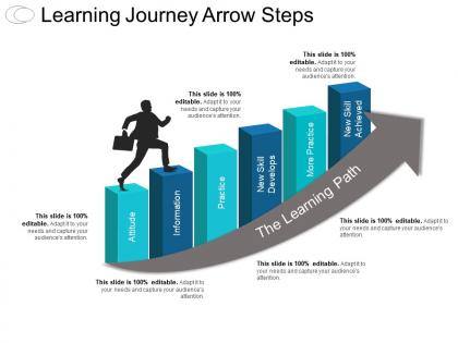
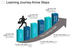
Presenting to you Learning Journey Arrow Steps PPT Infographic Template. Enhance your team’s knowledge related to the learning path using learning journey PPT. This PowerPoint slide for learning process is designed to help you spread the required motivation to your audience. The PPT slide includes a flow diagram illustrating a journey by following a specific path in order to achieve the desired targets. The bars in the infographic template depict the factors affecting the path of learning. The factors mentioned in the PowerPoint slide theme are attitude, information, practice, new skills development, etc. The user can alter the factors according to the audience and required field. The attractive template allows you to explain the context in an interesting and precise manner. This slide for learning process allows you understand the progressive changes in an individual or organization. This product can be very useful for an organisation looking forward to provide an ideal journey to its team.
People who downloaded this PowerPoint presentation also viewed the following :
Learning journey arrow steps ppt infographic template with all 5 slides:
Boost the chances of a comfortable future with our Learning Journey Arrow Steps Ppt Infographic Template. Increase the amount of hope existing.
FAQs for Learning journey arrow steps
Start with clear learning objectives - that's your foundation. Break everything down into bite-sized steps with arrows showing the flow. Each step needs a quick description of what people will actually do. Milestones are clutch because everyone wants to see they're making progress! I always throw in time estimates too since nobody wants to commit blindly. Oh, and list any prerequisites upfront - super annoying when you're halfway through and realize you needed something else first. The whole thing should make sense at a quick glance. Honestly, working backwards from your end goal makes mapping the sequence way easier.
Your brain processes visuals like 60,000 times faster than text, which is wild when you think about it. So when you map out learning with arrows and visual steps, people instantly get where they're going. It's basically GPS for education - way better than those boring bullet point lists everyone ignores anyway. The arrow flow thing creates momentum too, keeps learners hooked instead of feeling totally lost. Colors and icons for each step? Game changer. I've seen comprehension rates shoot up immediately when people can actually see their path instead of just reading about it.
Honestly, blue is your best bet for educational stuff - it just screams trustworthy and smart. Green's solid too since it feels like growth and learning. Don't go crazy with rainbow colors though, I see people do that all the time thinking it's more "fun" but it just looks messy. Orange or yellow work great for highlighting important bits, but keep it minimal. Stick to maybe 2-3 colors total with blue or green as your main one, then use gray for regular text. Oh and if you can test it with actual students first, do it - they'll tell you real quick what works and what doesn't.
So there's this 30-70 rule I always go by – roughly 30% text, 70% visuals. Though honestly, it depends on what you're explaining. Your text should back up the visuals, not fight them for attention. Short headlines work best. Bullet points beat paragraphs every time. I swear, half the infographics I see look like someone just dumped an essay onto a poster and called it a day. Sketch out your flow first – where do you want people's eyes to go? Then add just enough text so each section makes sense. Less is usually more here.
Canva's probably your best bet - seriously easy to use and they have a bunch of templates already made. You can just swap out colors and text. Adobe Illustrator gives you way more control but honestly, it's kind of a pain to learn if you're just doing this once. Oh, and Figma's cool if other people need to jump in and edit stuff since it works right in your browser. I mean... PowerPoint actually works too if you're desperate, but maybe don't lead with that lol. Just grab one of Canva's education templates and customize it.
Honestly, the worst thing you can do is cram way too much info into each step. Like, I've seen flowcharts that are basically paragraphs with arrows - total disaster. Keep your flow simple too, left-to-right makes sense since that's how we read. Don't get fancy with the direction unless there's actually a reason. Oh, and please don't use tiny fonts or those super light gray colors that look "modern" but nobody can actually read. Each step should focus on just one thing, give it breathing room with white space. Test it on someone fresh - they'll spot the confusing parts immediately.
Different icon styles work really well - lightbulbs for discovery moments, gears when they're building skills, targets for mastery. I always do color coding too, like starting with cool blues for beginners then warming up to oranges and greens as they progress. Arrow thickness is honestly my favorite trick for showing momentum! Visual metaphors are clutch here: seedlings turning into trees, puzzle pieces fitting together, mountain climbing paths. Oh, and definitely keep your icons consistent but distinct enough that someone can glance at it and instantly know where they are in the whole journey.
Honestly, start with engagement stuff - how long people actually look at it, clicks, shares. That's the easy data to grab. If you've got interactive parts, completion rates matter too. I'm weirdly obsessed with seeing where people click and bail out, gives you so much insight. Before/after quizzes work great for seeing if they retained anything. Get feedback too - sometimes people just tell you straight up what's confusing. Oh, and if it's supposed to drive signups or whatever, track those conversions. Don't go crazy tracking everything though. Pick 2-3 metrics that actually match what you're trying to accomplish.
So audience segmentation basically flips your whole design approach. Beginners need way more hand-holding - simpler words, clearer arrows between each step. Experts? They can handle dense info and don't mind jumping around. Think roadmap vs subway map, if that makes sense. Your colors and icons should actually match what clicks with each group too. I'd start by sketching out maybe 2-3 main audience types first. Then create different versions that hit their specific experience levels and what they're trying to accomplish. It's honestly more work upfront but makes such a difference.
For learning infographics, typography can totally make or break the whole thing. Clean, readable fonts are your best friend - nobody wants to squint through your content. Sans-serif works great since people scan these pretty quickly. Mix up your font weights and sizes so the important stuff really pops compared to smaller details. Oh, and spacing! Cramped text is honestly the worst - gives me a headache just thinking about it. Keep everything consistent as people follow your arrow steps. Test it on different screens too because what looks good on your laptop might be tiny on mobile.
Yeah, absolutely! Just match the complexity to who you're designing for. Little kids need bright colors and maybe 3-4 simple steps max - they get overwhelmed easily. High schoolers? They actually care about how things look (honestly more than adults sometimes), so make it visually interesting with some branching paths. Adults want to see clear milestones that connect to their actual goals. I'd sketch the basic journey first, then add detail based on your audience. Short attention spans get simpler arrows, longer ones can handle more complexity. It's really about not overloading people with info they can't process.
Check out Google's "Digital Marketing Courses" and HubSpot's "Inbound Certification" infographics - they're really well done. Both use clear arrows that show you exactly where you are in the process. Salesforce's Trailhead is amazing too, though I got a bit addicted to their point system last year! What these all do right is breaking everything into bite-sized steps with visual progress bars and time estimates. The trick is finding that balance between showing enough info without making it look cluttered. Study how they space things out - you'll see what I mean.
Don't wait until the end to get feedback - that's where people mess up. I usually show rough sketches first to make sure the flow makes sense, then get input as I polish things up. Do this maybe 2-3 times max or you'll drive yourself crazy. Ask specific questions like "does step 3 actually connect to step 4?" instead of just "what do you think?" Test your arrows on someone who doesn't know the topic - if they can't follow it, neither will your audience. Quick check-ins early on will save you from having to redo everything later.
Put those infographics where kids will actually see them - your LMS, projected in class, or printed on bulletin boards. Just make sure the text isn't tiny because squinting students don't learn anything (learned that one the hard way). Don't just throw it at them though. Walk through how each step connects to what they're doing in class. Break complex ones into smaller pieces for younger kids - they get overwhelmed easily. The best part? Make it interactive. Have students figure out where they are now and what's next. It's way more engaging than just staring at a pretty poster.
Honestly, interactive timelines are probably your best bet here. You can add clickable hotspots on each arrow that show extra details or even mini-quizzes when people hover over them. Progress bars are super satisfying too - they fill up as users complete steps. I've seen some cool ones with embedded videos at different milestones. Oh, and branching paths work well if you want people to choose their route based on skill level. The expandable text boxes thing is pretty slick for keeping things clean but detailed. Just start with basic hover effects and don't overcomplicate it right away!
-
Wonderful templates design to use in business meetings.
-
Great experience, I would definitely use your services further.