

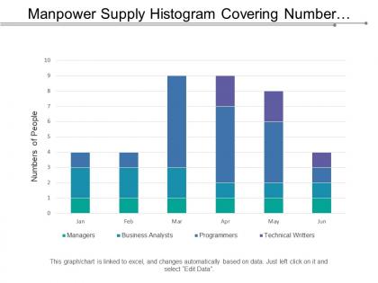
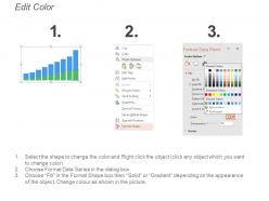
Manpower supply histogram covering number of recruitment at different positions in percent




Try Before you Buy Download Free Sample Product
 Impress Your
 Audience
 100%
100% Editable
 Save Hours
 of Time


Give birth to joie-de-vivre with our Manpower Supply Histogram Covering Number Of Recruitment At Different Positions In Percent. Generate a carefree atmosphere.
People who downloaded this PowerPoint presentation also viewed the following :
Manpower supply histogram covering number of recruitment at different positions in percent with all 5 slides:
From micro to macro you have it all down. Elaborate on the details with our Manpower Supply Histogram Covering Number Of Recruitment At Different Positions In Percent.

FAQs for Manpower supply histogram covering number of recruitment at different
Honestly, start simple with three things: time periods (months work fine), headcount by department, and hiring/departure plans. Getting the data is annoying - you'll be pulling from HR systems, recruiting spreadsheets, maybe some stuff you track manually. I'd categorize roles consistently and include both current people and pipeline hires. Leadership loves visuals, so make it easy to spot where you're over or understaffed. Don't overthink it at first - nail a basic version, then get fancy later once it's actually useful.
Think of manpower supply histograms as basically a visual breakdown of your workforce - age groups, skill levels, experience, that sort of thing. Pretty handy for catching problems early, like realizing half your engineering team is about to retire (been there, not fun). You'll spot recruiting gaps way ahead of time instead of scrambling when people actually leave. Honestly, the proactive approach saves so much headache later. Use them to figure out which departments need fresh blood and how to balance everything out. Way better than playing catch-up after someone's already walking out the door.
So basically these histograms show stuff like headcount by department, employee levels over time, and how your workforce breaks down by skill or job grade. Age groups, tenure, education backgrounds - all that demographic stuff too. Way better than staring at endless spreadsheet rows, trust me. Your HRIS or payroll system will have the actual employee numbers (not just budgeted positions). Pick whatever data tells your story best - maybe you're spotting staffing gaps, planning for a wave of retirements, or trying to convince leadership you need more people. It's pretty flexible honestly.
Honestly, histograms make it so much easier than scrolling through endless spreadsheet rows. Watch for weird gaps or random spikes that don't match what you'd expect for normal staffing. Multiple peaks usually mean your scheduling's all over the place. Clusters sitting way above or below target ranges? That's trouble. The asymmetrical shapes are dead giveaways too - like when one side looks totally different from the other. I'd suggest checking these regularly so you can fix issues before they snowball into bigger headaches. Way better to catch manpower problems early than deal with the chaos later.
Honestly, just start with Excel or Google Sheets - they're pretty decent for basic workforce histograms and you probably already know how to use them. Tableau and Power BI are where you'd want to go next if you need fancier dashboards that connect to your HR systems. Python with matplotlib is solid too (and free, which your finance team will love). There's also specialized stuff like Workday or SAP SuccessFactors if you're already using those platforms - they've got reporting built right in. I'd say go with whatever your team's comfortable with first, then level up later if you need real-time data or forecasting. Way easier than jumping into something completely new right away.
Honestly, looking at your workforce data over a few years makes the patterns super obvious. When you see those seasonal spikes hit every year, start recruiting like 2-3 months earlier than you normally would. Don't wait until you're already short-staffed and panicking. Skill gaps are the same deal - if you keep running into shortages for specific roles, either train people up internally or fix your hiring pipeline. I mean, the data doesn't lie, right? Build in that buffer time and focus your recruiting where you actually need it most. Way better than scrambling later.
Demographics basically control your whole manpower supply chart. Age structure's the big one - shows how many people are jumping into the workforce versus retiring out. You've also got population growth, education levels, migration patterns. Here's something wild: birth rates from like 20-30 years back? That's your current entry-level pool size right there. Geographic spread matters too since people are pretty stubborn about relocating for work. Growth rates and where people actually live vs where jobs are - it's all connected. When you're doing workforce projections, dig into your local demographic trends first instead of relying on those generic industry numbers.
Honestly, those histograms are pretty clutch for workforce planning. You'll spot talent gaps way faster than staring at spreadsheets all day. Map out your current headcount first, then overlay where you want to grow in the next 6-12 months - boom, gaps become obvious. Shows you exactly where you're overstaffed or missing key skills. Leadership loves the visual format too, makes getting budget approval for new hires way easier. I'd update them quarterly though, things change fast. The budget planning aspect alone makes it worth doing.
Don't fall into the trap of thinking your histogram shows what you *need* - it's just showing what you have right now. Small sample sizes are tricky too. Like if you've only got 20 people, those bars might look crazy dramatic but mean basically nothing. Seasonal stuff can mess with your head if you're only looking at one slice of time. Also watch out for lumping different job types together - that gets messy fast. Honestly, just double-check your timeframe and sample size before you start panicking about hiring gaps. Could save you a lot of stress.
Honestly, it depends a lot on what industry you're in. Tech companies usually stay pretty flat throughout the year since they don't really have seasonal swings. Retail? Total opposite - they go absolutely crazy during holidays. Manufacturing follows production cycles, so it's more predictable. Healthcare stays steady most of the time, maybe bumps up during flu season (though COVID completely screwed that up for everyone). Construction peaks in summer when the weather's decent. I'd check out what 3-4 companies similar to yours are doing. That'll give you a way better sense of what's actually normal for your space.
So you'll definitely want to add some key metrics alongside that histogram. Mean, median, and standard deviation are your basics for seeing workforce patterns. Percentiles are clutch though - like 25th, 75th, 95th - because they help with capacity planning and show what normal demand looks like versus those crazy peak times. Trend analysis over different time periods is solid too. Oh, and peak-to-trough ratios if you're into that. The histogram by itself is pretty useless without context, honestly. If you're doing any forecasting, throw in accuracy metrics to compare predicted vs actual. Start there and you'll catch bottlenecks way faster.
Color coding is your best friend here - use different colors for departments or skill levels so patterns pop right out. Definitely add data labels on top of bars (saves people from squinting at axes). Trend arrows work great to show if you're hitting target staffing or not. Icons help too, especially when you're presenting to people who aren't super data-savvy. Oh, and throw in a legend so everyone knows what they're looking at. My advice? Run it by someone else first - if they don't get the main point in like 10 seconds, you need to simplify.
Honestly, layering histograms across different time periods is a game-changer for workforce planning. You'll catch patterns like senior talent bleeding out while junior roles stack up. Seasonal trends become super obvious this way too. Supply concentrations show you where bottlenecks are forming before they explode into real problems. The cool part? You can actually see how market shifts or training programs moved the needle on your workforce composition. I always tell people to watch for early warning signs of talent gaps - way better than scrambling later. Use this stuff to tweak your recruiting strategy before things get expensive and messy.
So basically, seasonality makes your manpower histograms look super chunky instead of smooth. You'll get these obvious peaks when more people are available, then valleys during busy periods - holidays, summer breaks, that whole back-to-school chaos (ugh, September is always rough). The cool thing is these patterns repeat every year like clockwork. Don't just look at yearly totals though - break it down month by month so you can actually see the trends. Makes staffing way easier when you know August will always be light but October ramps back up.
Look at your histogram like a training GPS - it shows exactly where you're short on talent and where you've got too much. Those shortage spots? That's where your training dollars should go first. Areas where you're overstaffed need cross-training so people can move around (because honestly, nobody wants to be stuck doing nothing). Age distribution is huge too - tells you who's retiring soon and how fast you need to get replacements ready. Way better than throwing training at random stuff and hoping it sticks.
-
Perfect template with attractive color combination.
-
Excellent template with unique design.