


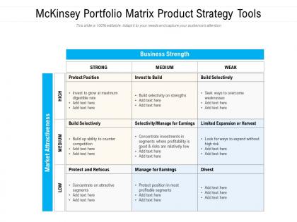
Mckinsey portfolio matrix product strategy tools




Try Before you Buy Download Free Sample Product
 Impress Your
 Audience
 100%
100% Editable
 Save Hours
 of Time


Our Mckinsey Portfolio Matrix Product Strategy Tools are topically designed to provide an attractive backdrop to any subject. Use them to look like a presentation pro.
People who downloaded this PowerPoint presentation also viewed the following :
Mckinsey portfolio matrix product strategy tools with all 2 slides:
Use our Mckinsey Portfolio Matrix Product Strategy Tools to effectively help you save your valuable time. They are readymade to fit into any presentation structure.
FAQs for Mckinsey portfolio matrix
So the McKinsey Matrix is basically about smart resource allocation across your different business units. Plot each one by market attractiveness vs your competitive strength - like "is this market even worth it?" and "do we actually have a shot at winning?" Way more sophisticated than BCG's simple growth/share thing. Honestly, most companies just throw money at whoever yells loudest, but this forces you to be strategic about your whole portfolio. Perfect for annual planning when you're deciding what gets funded, what needs work, and what you should probably just dump.
BCG is super straightforward - just growth vs market share. McKinsey gets way more complicated because you're juggling multiple factors like market size, competition, profitability, all that stuff. Honestly, McKinsey gives you a better picture when your business is complex, but man, the data collection is a pain. I'd probably start with BCG unless the simple growth/share thing doesn't really capture what's going on with your business units. Sometimes simple beats thorough, you know? But if you've got the time and resources, McKinsey's analysis is definitely more nuanced.
So the McKinsey Matrix plots your business units on two axes - market attractiveness (how good the market is) versus business unit strength (how well you're doing there). Market attractiveness covers stuff like growth rates, market size, competition levels. Business unit strength is your market share, brand power, costs, that kind of thing. It's basically GE's answer to the BCG matrix but with a 3x3 grid instead. Top-left quadrants get more investment, bottom-right ones might get sold off. Honestly, the hardest part isn't drawing the matrix - it's getting people to be brutally honest about where their units actually belong.
So basically you plot each product on the matrix - market attractiveness vs your competitive position. Stars (high on both) get your biggest investment. Cash cows should just generate profits for you since they're strong but in boring markets. Question marks are tricky - you gotta decide if they're worth doubling down on or just cutting loose. Dogs usually need to go, though I've seen companies keep crappy legacy products way too long because of sentimental reasons. Just be honest about where stuff actually lands, not where you hope it does. Great for quarterly reviews too.
So the McKinsey Matrix has two main things you're plotting: how attractive the industry is, and how strong you are competitively. Industry attractiveness covers stuff like growth rates, profit potential, how cutthroat the competition is. Then there's your competitive strength - market share, brand power, costs compared to everyone else. Honestly, scoring these gets pretty subjective sometimes, which is kind of annoying. The trick is not fooling yourself about where you actually sit versus where you want to be. Once you've got that figured out, use it to decide where to throw your money and resources.
Market attractiveness tells you whether to go all-in or cut your losses on a business unit. High attractiveness means invest and grow - even if you're not crushing it yet, the opportunity's there. Low attractiveness? Time to harvest profits or bail out, no matter how dominant you are. Pretty straightforward stuff. Here's the thing though - don't just look at market size. Growth rates matter way more than people think, plus you've got profitability potential and how cutthroat the competition is. Use this framework when you're fighting over budget allocation. It'll save you from throwing good money after bad.
So competitive strength in the McKinsey Matrix is basically how well your business unit can actually fight in its market. You plot it horizontally against market attractiveness. It measures stuff like market share, brand power, costs, tech capabilities - you know, your real "fighting power." The stronger you are, the more you should probably invest in growing that unit. Honestly, most companies think they're stronger than they actually are, which is... not great for planning. Use it to figure out where you truly stand versus competitors, not where you hope you stand.
Yeah totally, just tweak it for startup life. Use it for your product ideas or different customer segments instead of business units. The data thing is gonna be rough though - you'll be guessing on market attractiveness and competitive strength since you probably don't have solid numbers yet. But honestly? That's not terrible because it makes you really think about where to dump your time and money. I'd treat it more like a brainstorming framework than some rigid analysis. Oh and definitely update it once you start getting actual feedback from customers.
Honestly, I'd check every 6 months if your industry moves fast - annually at minimum. Things shift way quicker now than they used to. Your competitive position can change overnight with one big competitor move or regulatory shake-up. Don't wait around for your scheduled review if something major happens. Business units jump between those matrix quadrants faster than you'd expect. Time it with your planning cycles, but stay flexible. I learned this the hard way when we missed a huge market shift because we stuck to our annual schedule. Set those calendar reminders now and treat it seriously.
Honestly, the main issue is you're cramming messy business reality into just two neat categories. Old data will screw you over every time. Plus people always game the ratings for their favorite projects - seen it a million times. Don't treat those nine boxes like they're set in stone either. Real opportunities get missed because they won't fit the framework perfectly. Politics mess with how units get scored too. The whole thing works better as your starting point, not some final decree. Keep it loose and dig deeper once you've got the basic picture mapped out.
So the McKinsey Matrix is basically plotting your business units on two axes - market attractiveness vs how strong you are competitively. Makes it super visual to see where you should dump money (the stars), what to milk for cash, and honestly the brutal part - what to kill off. I've seen CEOs get weirdly attached to dying business units though. Anyway, the grid makes those awkward budget conversations way less painful. You can literally point and say "see, this quadrant gets nothing." Perfect for building your yearly investment plan and backing up tough calls with leadership.
Start with your hard numbers for industry attractiveness and business strength. Then add in the softer stuff - management quality, brand strength, regulatory headaches, whatever matters for your situation. I always build weighted scorecards mixing both types of data. Honestly? The qualitative factors usually end up being way more important than people think going in. Super helpful when you've got business units sitting right on the fence between matrix categories too. Just be upfront about which qualitative elements you're factoring in and how they're shifting your final call. That way everyone gets the full story.
Manufacturing and pharma companies get the most out of it since they're always juggling tons of different products. Tech firms use it all the time too - figuring out which apps to kill off or invest in more. Energy and telecom work really well with it because they're stuck managing old stuff while trying new things. Consumer brands do it for portfolio decisions constantly. Pretty much any company with multiple divisions can benefit, though some are better fits than others obviously. Start by just mapping where everything sits first - you'll see which quadrant each unit actually lands in, then go from there.
Tech changes can totally flip your industry's attractiveness - and honestly, it usually makes things way more cutthroat. New tech often lowers barriers, brings in fresh competitors, and shifts what customers want basically overnight. Look at streaming vs. Blockbuster - that industry went from decent to dead real quick. But if you're actually on the right side of emerging tech, your industry could become incredibly attractive with solid growth potential. You've got to keep reevaluating your position though. What seemed like a star business six months ago might be headed straight for dog territory if you don't adapt fast enough.
Honestly, just start with Excel or Google Sheets - they're perfect for bubble charts and you probably already know how to use them. PowerPoint works too if you need something presentation-ready. Tableau and Power BI are where things get fancy with interactive dashboards, but that might be overkill depending on what you're doing. I've seen people use specialized strategy software (Strategy& has one I think?) but it's usually not worth the hassle. Map your business units by market attractiveness and competitive strength first, then see if you actually need the bells and whistles later. Nine times out of ten, simple gets the job done.
No Reviews