


Monthly review powerpoint presentation slides






Try Before you Buy Download Free Sample Product
 Impress Your
 Audience
 100%
100% Editable
 Save Hours
 of Time


Introducing our content ready Monthly Review PowerPoint Presentation Slides. The topic-specific monthly plan review presentation deck comprises of self-explanatory PPT slides such as business overview, financial performance, client and project updates, competitor’s analysis, future roadmap, CSR, key developments /milestones achieved to name a few. Provide an overall picture of your monthly performance using the monthly business plan PPT visuals. Utilize these editable business performance assessment PowerPoint templates to facilitate your monthly business review meeting. Showcase your numbers according to country, geography, product, segment, etc. with the help of business review meeting format PowerPoint presentation. Utilize business performance review PowerPoint templates to track and monitor your progress against strategic and operational goals. Furthermore, this professional-looking corporate review PPT presentation template will provide you the appropriate format to conduct a monthly business meeting with your employees. Therefore, download the visually appealing business review report PPT graphics to drive internal performance and growth. Beat the heat with our Monthly Review Powerpoint Presentation Slides. Feel chilled out anywhere.
People who downloaded this PowerPoint presentation also viewed the following :
Content of this Powerpoint Presentation
Slide 1: This slide introduces Monthly Review. State Your Company Name and begin.
Slide 2: This is an Agenda slide. State your agendas here.
Slide 3: This slide shows Table of Content for the presentation.
Slide 4: This slide highlights Business Overview from Table of Content.
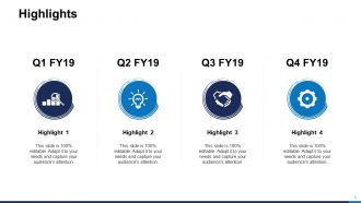
Slide 5: This slide displays Highlights with related icons and additional text boxes.
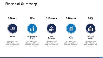
Slide 6: This slide presents Financial Summary describing- EBITDA, Net Profit, Q-O-Q Revenue Growth, Net Profit Margin, Net Revenue.
Slide 7: This slide showcases Revenue Split - by Geography showing data in percentage.
Slide 8: This slide represents Revenue Split - by Country including countries as- Asia, Australia, South America, North America, Africa.
Slide 9: This slide shows Revenue Split - by Product/ Segment in tabular form.
Slide 10: This slide presents Revenue Split - by Product/ Segment in graphical form.
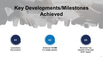
Slide 11: This slide displays Key Developments/ Milestones Achieved with related imagery.
Slide 12: This slide highlights Financial Performance from Table of Content.
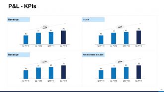
Slide 13: This slide represents P&L - KPIs describing- Revenue, COGS, Operating Profit, Net Increase in Cash.
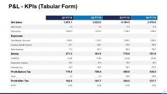
Slide 14: This slide showcases P&L - KPIs (Tabular Form).
Slide 15: This slide shows Balance Sheet - KPIs describing- Current Assets, Current Liabilities, Total Assets, Total Liabilities.
Slide 16: This slide presents Balance Sheet - KPIs (Tabular Form) showing liabilities.
Slide 17: This slide displays Balance Sheet - KPIs (Tabular Form) showing assests.
Slide 18: This slide represents Cash Flow Statement - KPIs describing- Operation, Financing Activities, Investing Activities, Net Increase In Cash.
Slide 19: This slide showcases Cash Flow Statement - KPIs (Tabular Form).
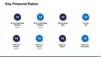
Slide 20: This slide shows Key Financial Ratios including- P/E Ratio, Debt to Equity Ratio, Current ratio, Return on Assets, Return on Equity, Return on Investment.
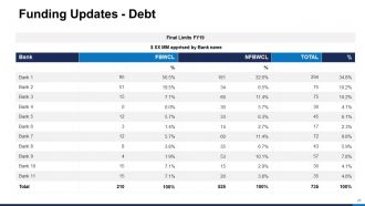
Slide 21: This slide presents Funding Updates showing Debts.
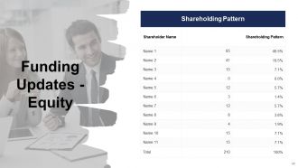
Slide 22: This slide presents Funding Updates showing Equity.
Slide 23: This slide highlights Client and Project Updates from Table of Content.
Slide 24: This slide displays Top Customers & Vendors in tabular form.
Slide 25: This slide represents Top Debtors & Creditors.
Slide 26: This slide showcases Client Updates with related images.
Slide 27: This slide shows Project Updates on major projects bagged, major orders in hand, major projects lost and pipeline orders.
Slide 28: This slide highlights Competitor's Analysis from Table of Content.
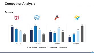
Slide 29: This slide shows Competitor Analysis (Revenue) with the help of bar graph.
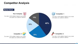
Slide 30: This slide presents Competitor Analysis (Market Share) with the help of Pie Chart.
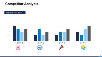
Slide 31: This slide displays Competitor Analysis (Cost of Goods Sold).
Slide 32: This slide represents Competitor Analysis (Net Profit Margin).
Slide 33: This slide showcases Benchmarking Competitive Intelligence in matrix form.
Slide 34: This slide highlights Future Roadmap from Table of Content.
Slide 35: This slide shows 30-60-90 Day Plan with text boxes.
Slide 36: This slide presents Light Bulb with Time Planning Ideas.
Slide 37: This slide displays Product Roadmap (Layout - 1) in timeline form.
Slide 38: This slide represents Product Roadmap (Layout - 2) in graphical form.
Slide 39: This slide showcases Product Roadmap (Layout - 3).
Slide 40: This slide shows Phases of Implementation with text boxes.
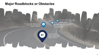
Slide 41: This slide presents Major Roadblocks or Obstacles.
Slide 42: This is an optional slide for Major Roadblocks or Obstacles.
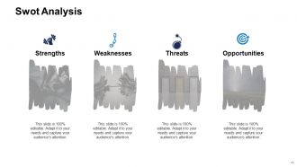
Slide 43: This slide displays Swot Analysis. Describe your firm's Strengths, weaknesses, opportunities and threats.
Slide 44: This slide highlights CSR / Miscellaneous Activities from Table of Content.
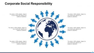
Slide 45: This slide represents Corporate Social Responsibility (CSR) with related diagram and text boxes.
Slide 46: This slide showcases Customer Service Benchmarking in graphical form.
Slide 47: This is an optional slide for Customer Service Benchmarking.
Slide 48: This slide shows Organization Chart with names and designation.
Slide 49: This slide presents Goals and Success Metrics. Add data as per needs.
Slide 50: This slide displays Health Scorecard with Overall Score, Qualitative Aspects, Quantitative Aspects.
Slide 51: This slide showcases Monthly Review Icons.
Slide 52: This slide reminds about 15 minutes coffee break.
Slide 53: This slide is titled as Additional Slides for moving forward.
Slide 54: This slide shows Clustered Bar chart with three products comparison.
Slide 55: This slide presents Clustered Column - Line chart with three products comparison.
Slide 56: This slide displays Pie Chart with data in percentage.
Slide 57: This slide shows Staked Area-Clustered Column chart.
Slide 58: This is Our Mission slide with related imagery and text.
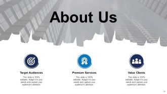
Slide 59: This is About Us slide to show company specifications etc.
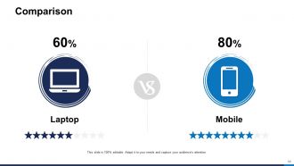
Slide 60: This is a Comparison slide to state comparison between commodities, entities etc.
Slide 61: This is a Financial slide. Show your finance related stuff here.
Slide 62: This slide is titled as Post it Notes. Post your important notes here.
Slide 63: This is a Puzzle slide with text boxes to show information.
Slide 64: This is a Target slide. State your targets here.
Slide 65: This is a Venn slide with text boxes.
Slide 66: This is a Thank You slide with address, contact numbers and email address.
Monthly review powerpoint presentation slides with all 66 slides:
Use our Monthly Review Powerpoint Presentation Slides to effectively help you save your valuable time. They are readymade to fit into any presentation structure.
-

Monthly Review
-

Agenda
-
Monthly Business Review
-
Monthly Business Review
-
Highlights
-
Financial Summary
-
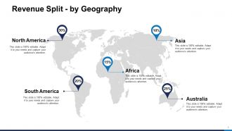
Revenue Split by Geography
-
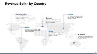
Revenue Split by Country
-
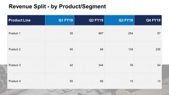
Revenue Split by Product Segment
-
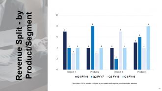
Revenue Split by Product Segment
-
Key Developments Milestones Achieved
-
Monthly Business Review
-
P L KPIs
-
P L KPIs Tabular Form
-
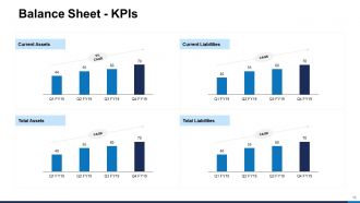
Balance Sheet KPIs
-
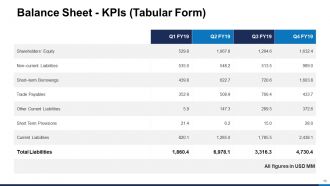
Balance Sheet KPIs Tabular Form
-
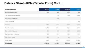
Balance Sheet KPIs Tabular Form Cont
-

Cash Flow Statement KPIs
-
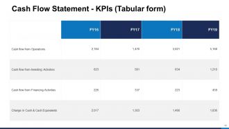
Cash Flow Statement KPIs Tabular form
-
Key Financial Ratios
-
Funding Updates Debt
-
Funding Updates Equity
-
Monthly Business Review
-
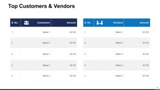
Top Customers Vendors
-
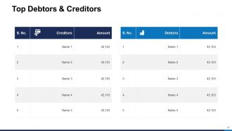
Top Debtors Creditors
-
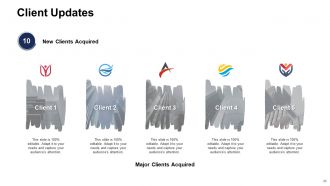
Client Updates
-
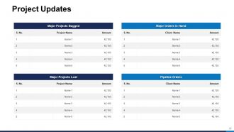
Project Updates
-
Monthly Business Review
-
Competitor Analysis
-
Competitor Analysis
-
Competitor Analysis
-
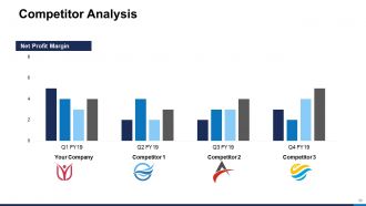
Competitor Analysis
-
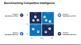
Benchmarking Competitive Intelligence
-

Monthly Business Review
-
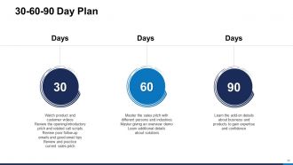
30 60 90 Day Plan
-
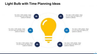
Light Bulb with Time Planning Ideas
-
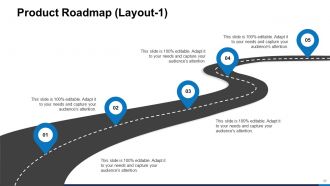
Product Roadmap Layout 1
-

Product Roadmap Layout 2
-
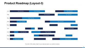
Product Roadmap Layout 3
-
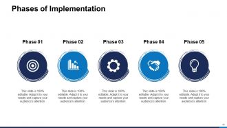
Phases of Implementation
-
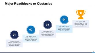
Major Roadblocks or Obstacles
-
Major Roadblocks or Obstacles
-
Swot Analysis
-
Monthly Business Review
-
Corporate Social Responsibility
-
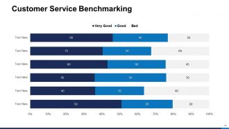
Customer Service Benchmarking
-
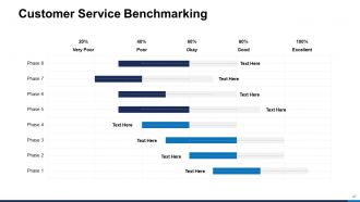
Customer Service Benchmarking
-
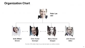
Organization Chart
-
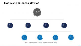
Goals and Success Metrics
-
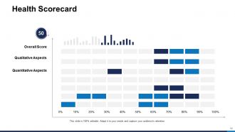
Health Scorecard
-
Monthly Review Icons Slide
-

Coffee Break
-

Additional Slides
-
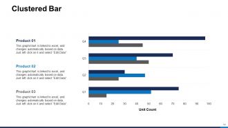
Clustered Bar
-
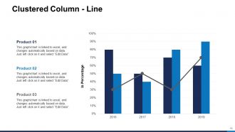
Clustered Column Line
-
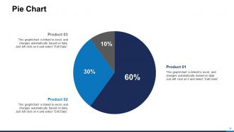
Pie Chart
-
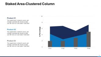
Staked Area Clustered Column
-

Our Mission
-
About Us
-
Comparison
-
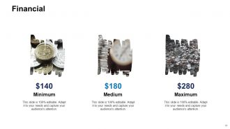
Financial
-
Post It Nots
-

Puzzle
-

Target
-
Venn
-

Thank You
FAQs for Monthly review
Pick your most important KPIs first - revenue, conversion rates, customer acquisition costs, whatever your team actually cares about. Throw in some operational stuff like project completion and budget tracking. Customer satisfaction scores are good too if you've got them. Keep it tight though - maybe 5-7 metrics max? Nobody wants to sit through endless charts (trust me on this one). Focus on numbers that actually tell the story of your month. The key is being able to explain why each metric matters and what you're gonna do if something's off track.
Honestly, charts and graphs are a game changer for monthly reviews. People actually pay attention instead of zoning out over spreadsheet data. Bar charts make trends super obvious, and progress bars or before/after screenshots make your wins feel real. I've sat through way too many meetings where someone just reads numbers off a screen - total snooze fest. Color coding different metrics helps too, but don't go crazy with it. The whole point is telling a story with your data instead of just throwing stats at people. Keep charts clean and simple so everything clicks immediately.
Think detective story when you're presenting data. Start with the problem, walk through what the numbers show, then boom - reveal what actually happened. Don't just throw charts at people. Make your user segments into actual characters and follow their journey. I swear it works so much better than boring spreadsheet dumps. Build some suspense too - reveal insights bit by bit instead of everything upfront. "Our conversion rate dropped like a rock" lands way harder than "decreased 23%." Oh, and try starting your next review with "Here's what happened to our power users..." Trust me, people actually pay attention when you frame it that way.
Don't wait until the end of the month to dump all your feedback into one presentation - trust me, I've been there and it's a nightmare. Instead, grab feedback as it happens throughout the month. Set up some kind of shared doc or folder (honestly whatever works for your team) to capture stuff from stakeholders, teammates, your own notes, everything. Then review it weekly so you can actually see what patterns are emerging. Way better than scrambling last minute. Your presentations will actually tell a story instead of just being random data thrown together. Start tracking this week if you can.
Honestly, executives hate data dumps more than anything. Keep it to like 3-5 metrics max - the ones that actually move the needle. I've seen so many presentations bomb because someone crammed 15 tiny charts on every slide. Nobody can even read that stuff from the back of the room. Here's the thing though - don't just show your wins. Call out the problems too and what you're doing to fix them. People respect that honesty way more than pretending everything's perfect. Make it visual, tell a story with your numbers, and always wrap up with concrete next steps they can actually do something about.
Honestly, I learned this the hard way after boring way too many executives with technical details they didn't care about. You've gotta know your audience first - like, what actually keeps them up at night? Execs want the big picture stuff. Budget impact, strategic wins, major roadblocks. Your team needs the nitty-gritty - process changes, who did what, operational details. Clients? They only care about their specific goals and what's happening next. I always write down my audience's top 3 priorities before touching PowerPoint now. Game changer. Also switch up your visuals - clean summary charts for leadership, detailed breakdowns for your team.
Honestly, just pick a template and stick with it. Your executives will love not having to decode a new layout every month. I made this mistake early on - kept switching colors and chart styles thinking it looked "fresh" but it just annoyed everyone. Same spots for your key metrics each time makes trends way easier to catch. Plus you'll save yourself hours not redesigning everything from scratch. The consistency thing sounds boring but it actually makes your data tell a much clearer story. Trust me on this one.
Numbers are your best friend here - "closed 15 deals" beats "productive month" every time. Be real about challenges but don't just dump problems on them without showing you're thinking through solutions (that's honestly my biggest pet peeve with these reviews). I'd go with 2-3 wins with actual metrics, then maybe 1-2 roadblocks where you explain what you learned. Keep everything to one sentence if you can. The trick is ending with specific next steps so they see you're already planning ahead, not just complaining about what went wrong.
Honestly, just stick with PowerPoint or Google Slides for your monthly reviews. Everyone already knows them, so you won't waste time explaining how to navigate weird interfaces. Canva's where it's at though if you want something that actually looks good - their templates are seriously impressive and make up for my complete lack of design sense. Oh, and if you're dealing with tons of data, maybe create your charts in Excel or Tableau first, then drop them in. Don't get sucked into fancy animations either. Pick one tool and master it. You'll thank me later when you're not scrambling to learn new software every month.
Before you even touch those slides, figure out which metrics actually tie back to your company's big strategic goals. I literally keep that strategy doc open the whole time I'm prepping - otherwise I get distracted by cool data that doesn't matter. Build your story around how this month moved the needle on revenue growth, customer retention, whatever they're obsessing over right now. Honestly, execs only care about progress on the stuff they're getting judged on. Everything else gets cut, even if your team crushed it.
Arrows and color coding are your best friends here - they make changes pop instantly. Those little sparkline charts? Game changer for showing trends without cluttering everything up. I'd do week-over-week breakdowns so people can pinpoint exactly when stuff shifted. Don't just dump numbers on them though. Add notes about what actually caused the changes if you know. Context beats raw data every time. Make it brain-dead obvious what went up, down, or stayed the same. Oh, and before/after shots work great too.
Honestly, just jump right in with a quick poll or show of hands - gets everyone awake from the start. Ask stuff like "what challenges hit your team this month?" throughout the presentation. The whole "raise your hand if you've experienced this" thing is kinda cheesy but it actually works, even on Zoom calls. When you hit those boring data sections, pause and ask different departments for their take on the numbers. Oh and don't save questions for the end - that's where engagement goes to die. Stop every few slides instead and let people jump in. Try one of these next time and you'll see the difference immediately.
Oh totally do an action items slide - that's like the most important part honestly. List who's doing what and when it's due before your next meeting. I've watched so many solid presentations just die because everyone walked away confused about next steps lol. Also throw in any budget stuff or resources people mentioned during the discussion. For bigger projects, set up those follow-up check-ins so things don't get forgotten. And definitely email those action items within a day while it's all still fresh in people's heads!
Okay so I always start with the numbers - that's your backbone. But here's the thing: you gotta throw in actual customer quotes and team feedback to explain what's really happening behind those charts. I do like 60/40 data to stories, though it totally depends who you're presenting to. Spreadsheet nerds? Go heavy on the graphs. People-person executives? Mix it up more. The stories make your data memorable instead of just... forgettable numbers on a slide. Oh and pair each big data point with a real example that backs it up. Makes everything way more convincing.
Okay so definitely run through it out loud at least twice - thinking about it silently is basically useless. Time yourself too because going over is awkward for everyone. Lead with your biggest wins or most urgent stuff right away to hook them. Don't rush through all the data, and honestly, make eye contact even if it feels weird. Pauses are good! Have backup slides ready because someone will 100% ask for regional breakdowns or whatever. Oh and know your key numbers cold so you're not constantly staring at notes. Trust me on this one.
-
Attractive design and informative presentation.
-
Commendable slides with attractive designs. Extremely pleased with the fact that they are easy to modify. Great work!
-
Enough space for editing and adding your own content.
-
Innovative and attractive designs.
-
Informative design.
-
a very compelling executive summary and business review presentation