

Management Summary Powerpoint Presentation Slides






Try Before you Buy Download Free Sample Product
 Impress Your
 Audience
 100%
100% Editable
 Save Hours
 of Time


A short document often known as executive summary can be compiled for use of business activities in the form of Management Summary PowerPoint Presentation Slides. It is a must to have a graphical PPT layout for defining the structuring of the business and making it clear as far as internal and external resources are concerned. Without putting out the fine details but still putting forward the essence of document is the task which is handled with ease in a presentation slide. This section of management summary PPT template can be made a part of bigger presentation right after table of contents or before the part dealing with introduction. Management PowerPoint presentation plays an important role as in analyzing and identifying the business goals and objectives but on the other hand the second section of presentation graphic deals with implementation and enforcement of the strategies so designed. Companies’ mission and division can be carefully addressed with dealing with management summary in slide template. Breakthrough the clutter for your audience. Clear the way with our Management Summary Powerpoint Presentation Slides.
People who downloaded this PowerPoint presentation also viewed the following :
Content of this Powerpoint Presentation
Slide 1: This is an introductory slide for Management Summary. State Your Company Name and begin.
Slide 2: This is the first template on Executive Summary with- Introduction, Vision, Mission, Key Offerings (Service, Detail), Clientele (Logo).
Slide 3: This is the second Executive Summary slide with- Company Overview: (Company XX introduction line, Key USP and competitive advantage, Key clients, Major accreditations and certifications for the company, Company infrastructure of location advantage, if any, Market leader/product leader/new product/idea, First to implement anything, Staff/workforce updates), Transaction: {(Promoters may consider a (XX%) secondary stake sale, Primary infusion + optional infusion (depending on inorganic opportunities), Secondary stake sale of PE investors). and Financials (Revenue, EBITDA etc.)}
Slide 4: This is the third slide showcasing Executive Summary with the following headings- a: What’s the service/product? b: What’s the core problem you are solving? c: What’s your big vision? Use these headings to answer your queries.
Slide 5: This is the fourth slide showcases Executive Summary with Company’s Vision & Mission. It also displays Financial highlights graph with- CAGR ( Revenue, EBITDA, Net income). Other subheadings include- Background (Add details on company’s history, Previous line of services, How it all started etc. Other key points). Accreditation (List of main accreditation, if any Capabilities : (Key services offered/Production capacity Milestones achieved in services offered/production Key projects handled): (Promoters and Shareholding One liner on CMD’s background One liner on CEO’s background One liner of company’s key shareholder; e.g. PE investor).
Slide 6: This slide showcases Our Vision And Mission. State your vision and mission here.
Slide 7: This slide presents Our Goals And Objectives. It can be displayed by the following headings- Systems & Solutions, Operation Of The Solution, Programmers For Strategic Objectives, Business Plan, Business Plan. State them by the help of these sub headings.
Slide 8: This slide presents Core Values of the company/organization. Some examples given are - Integrity, Pursuit of Excellence, Accountability & Collaboration, Passion, Mutual Respect.
Slide 9: This is another slide on Core Values with examples, such as Collaborative, Passionate, Excellence, Integrity, Progressive, Respect.
Slide 10: This is a Coffee Break slide to halt. You may alter/modify the content as per need.
Slide 11: This slide is titled Charts & Graphs to proceed forward.
Slide 12: This is a Line Chart slide to show product/entity comparison, specifications etc.
Slide 13: This slide presents a Column Chart to show two products in comparison.
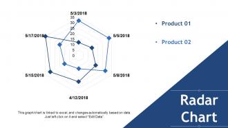
Slide 14: This slide presents a Radar Chart for two products/entities to be compared.
Slide 15: This slide is titled Additional Slides to move forward. You may alter/modify the content as per need.
Slide 16: This slide showcases Our Mission. State it here.
Slide 17: This slide presents Our Team with text boxes and imagery to go with. State about your team here.
Slide 18: This slide presents Our Goal with icon imagery. State your goals here.
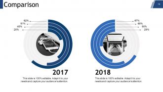
Slide 19: This slide displays Comparison to be shown.
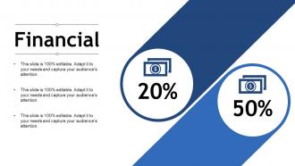
Slide 20: This slide shows Financial scores aspect with text boxes. State them here.
Slide 21: This is a Quotes slide. State highlights, specification, message, beliefs etc. by Quote here. You may alter/modify the content as per need.
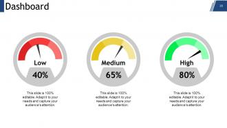
Slide 22: This slide shows Dashboard with dashboard image and text boxes to state kpis, metrics etc.
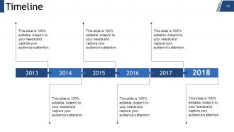
Slide 23: This is a Timeline slide to show evolution, growth, milestones etc.
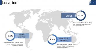
Slide 24: This is a Location slide of world map image to show global presence, growth etc.
Slide 25: This is a Puzzle image slide to show information, specifications etc.
Slide 26: This is a Circular image slide to show information, specifications, cyclic process etc.
Slide 27: This is a Venn diagram image slide to show information, specifications etc.
Slide 28: This is a Target image slide. State your goals, aspirations, targets here.
Slide 29: This is a Mind map image slide to show information, specifications etc.
Slide 30: This is a Bulb & Idea slide. Present any new information, data here.
Slide 31: This is a Thank You slide with Address # street number, city, state, Contact Numbers, Email Address to be put and displayed.
Management Summary Powerpoint Presentation Slides with all 31 slides:
Awaken dormant capability with our Management Summary Powerpoint Presentation Slides. No assignment is too daunting for them.
-

Management Summary
-
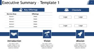
Executive Summary Template 1
-
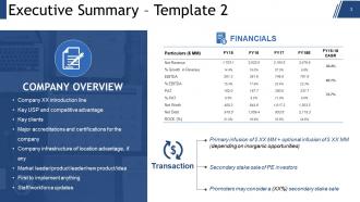
Executive Summary Template 2
-
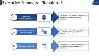
Executive Summary Template 3
-
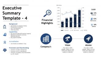
Executive Summary Template 4
-

Our Vision And Mission
-
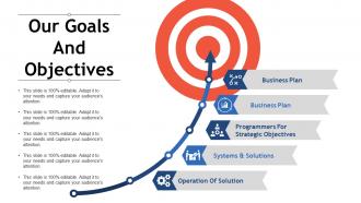
Our Goals And Objectives
-
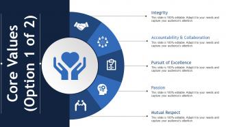
Core Values Option 1 of 2
-
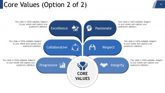
Core Values Option 2 of 2
-

Coffee Break
-

Graph Chart
-
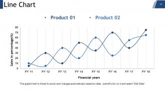
Line Chart
-

Column Chart
-
Radar Chart
-

Additional Slides
-

Our Mission
-

Our Team
-
Our Goal
-
Comparison
-
Financial
-
Management Summary
-
Dashboard
-
Timeline
-
Location
-
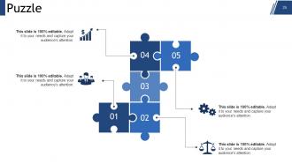
Puzzle
-
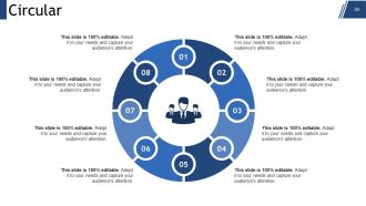
Circular
-
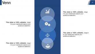
Venn
-

Target
-

Mind Map
-
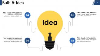
Bulb Idea
-

Thank You
FAQs for Management Summary
So the exec summary hits a few must-haves: lead with your main findings or what you're recommending, then the problem you're tackling and why execs should care. I always write mine backwards - draft the whole thing first, then do the summary. Way easier that way. Make sure they get the gist in 30 seconds or less. Toss in your solution, the data that backs you up, and if you need money or headcount, spell that out too. One page tops - honestly, half a page is even better if you can swing it. The whole thing goes first in your deck even though you'll write it last.
Put your main point right at the top - answer "so what?" immediately. Break everything down with bullet points so people can actually follow along. I made the mistake once of writing this massive 3-page summary that everyone ignored. Focus on what actually happened and why it matters, not all the boring process stuff. Skip the jargon - seriously, just talk like a normal person. Charts are great but don't go crazy with them. Here's the thing: your CEO should be able to skim it in 2 minutes and get everything. Always wrap up with what happens next.
Ugh, the worst thing you can do is write a massive executive summary that goes on forever. Keep it short! Put your main findings right at the top - don't make executives hunt for them. I've seen so many people write these like they're dissertations when really, busy leaders just want the key points fast. Skip the technical jargon too, especially if non-experts will read it. Oh, and never write the summary first - finish your analysis, then summarize what you actually found. Lead with your conclusion, then briefly walk through how you got there. Trust me, less is more here.
Yeah totally, your audience is everything when writing those summaries. Executives want the big picture stuff - ROI, strategic impact, that's it. Technical people? You can actually use their jargon and get specific. Board members are weird though - they only care about business risks and impact, nothing detailed. Middle managers need both angles since they're briefing up and down. Honestly, I just pick one specific person from that group and pretend I'm explaining it to them over coffee. Works way better than trying to write for some faceless crowd. Makes the whole thing feel more natural too.
Look, execs are slammed and won't read your 50-page masterpiece - I've watched brilliant ideas tank because of this. You need summaries for board meetings, budget asks, any big strategic stuff. Complex projects with moving parts? Summary first. High-stakes decisions where money's on the line? Definitely lead with the key points. Mixed audiences are tricky too since everyone's got different expertise levels. Honestly, if it affects company direction or the bottom line, just give them that crisp overview upfront. Save everyone time and actually get your point across.
Dude, visual design can totally save your management summary. Clean layouts with lots of white space - that's key. Use bullet points instead of chunky paragraphs because nobody has time for that. Bold text for important numbers and decisions. Charts are honestly a lifesaver since execs scan visuals way faster than reading. I learned this the hard way after watching someone squint through my dense report once. Keep fonts big enough to actually see and stay consistent with formatting. Think dashboard vibes, not textbook. You want the critical stuff to pop immediately when they glance at it.
Honestly, stick to just 2-3 metrics that actually back up your point. Charts work way better than those nightmare spreadsheets - I've literally watched C-suite people zone out when you dump too many numbers on them. Tell them what the data means for business, not just "we're up 12%." Short sentences hit different. Your story should flow with data supporting it, not the other way around. Oh, and throw all the detailed stuff in an appendix - they can geek out later if they want. Trust me on this one.
Start with your biggest findings right at the top - execs barely read past the first paragraph anyway. Three or four main points, max. I structure mine as problem-findings-recommendations because it flows better. One page only, and honestly? Bullet points are your friend here. Don't waste space on background stuff they already know. End each section by telling them exactly what to do and why it'll impact the business. The whole point is helping them decide fast, so be direct about your recommendations.
So stakeholder feedback is super helpful because they'll catch stuff you totally missed. Like, you might obsess over certain metrics while they actually care way more about budget or timeline issues. Getting their input early helps you focus on what executives really want to see - honestly saves so much time later. They're also great at calling out when you're using too much internal jargon (guilty as charged lol). Don't just ask "thoughts?" though. Be specific like "what's missing here?" You'll get way better feedback that actually makes your summary hit the mark.
Keep it to 1-2 pages tops – honestly, anything longer and executives will just skim anyway. Hit your main findings, key recommendations, and the money stuff. Skip all the background nonsense (save that for the full report). Use bullet points and headers so people can scan quickly. Lead with your conclusion, then back it up briefly. Oh, and here's how you'll know if it works: could someone read just your summary and still understand what's wrong and what they need to do? If they can, you're golden. Should take about 3-5 minutes to read through.
Honestly, a management summary is like your cheat sheet for making actual decisions. It cuts through all the data noise and shows you what really matters. You'll spot trends faster, see where things are getting stuck, and can update your team without boring them to death. Plus it forces you to figure out what's actually important vs just feels urgent (which is harder than it sounds). Use it to get everyone on the same page about priorities. Track your progress. Justify why you need more budget or resources. Saves everyone time too.
Dude, just tell it like a story! Start with the problem you're tackling, then walk through what you found out, and finish with your big recommendations. Honestly, I think most management summaries are boring because they sound like textbooks. Instead, write like you're explaining it to someone over coffee. Open with a specific example that shows your main point - it grabs people right away. Skip the abstract stuff and use real scenarios. Show them the current mess, then paint a picture of where you want to end up. Way more engaging than the usual corporate speak everyone's used to.
They're basically the same thing, just different labels. Corporate folks usually say "executive summary" while consultants tend to go with "management summary." Both need your main findings, recommendations, and next steps - that's it. Honestly, I think people waste too much time debating the name instead of just writing the damn thing. What matters is keeping it short and hitting the stuff busy executives actually care about. Just pick whatever sounds right for your workplace and run with it. Don't stress about the terminology!
Templates are a total game-changer, honestly. Everyone gets the same structure so you're not dealing with random formats and missing info all over the place. People have to cover the big stuff - finances, risks, decisions that matter to the bosses. Saves tons of time too since nobody's reinventing the wheel every single time. You can nail down what goes where, how to show metrics, detail levels, all that. Oh, and execs love knowing exactly where to look for what they need. I'd grab your best team's format first, then slowly push it out to everyone else.
Honestly, just steal templates from whoever writes good summaries at your company - that's where the magic happens. PowerBI and Tableau are solid for grabbing metrics fast. I actually use ChatGPT sometimes to get a rough draft going if I'm feeling lazy. Monday.com shows project statuses pretty clearly, though sometimes I just stick with Excel because why overcomplicate things? Word's outline feature is underrated too. Oh, and don't be shy about literally asking your best writer colleague for their template - most people are cool about sharing that stuff.
-
Professional and unique presentations.
-
Perfect template with attractive color combination.