


Multiple choice questions showing question and four choice




Try Before you Buy Download Free Sample Product
 Impress Your
 Audience
 100%
100% Editable
 Save Hours
 of Time


Ensure innocent folks don't get fooled with our Multiple Choice Questions Showing Question And Four Choice. Combat attempts at brainwashing.
People who downloaded this PowerPoint presentation also viewed the following :
Content of this Powerpoint Presentation
Description:
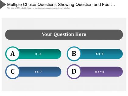
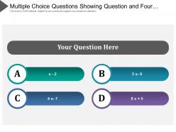
This image presents a PowerPoint slide designed for displaying multiple choice questions with four options. The slide's title states, "Multiple Choice Questions Showing Question and Four¦" suggesting that the full title may include additional text not fully visible. The main header, "Your Question Here," is a placeholder text where the question is to be inserted for participants to answer. There are four answer choices labeled A, B, C, and D, each accompanied by a colored bar. These colored bars contain placeholder algebraic expressions ("x - 2," "5x - 6," "4x - 7," and "8x + 5" respectively) which suggest they are examples for mathematical problems but can be replaced with any text relevant to the actual question.
Use Cases:
The slide is versatile and can be utilized in multiple sectors for educational purposes, assessments, training modules, or engaging presentations where audience interaction is desired. The seven industries that could use these slides include:
1. Education:
Use: Engage students in quizzes and assess learning
Presenter: Teacher or instructor
Audience: Students
2. Corporate Training:
Use: Evaluate employee understanding during training sessions
Presenter: Corporate trainer or HR professional
Audience: Employees or trainees
3. Market Research:
Use: Gather opinions during focus groups or surveys
Presenter: Market researcher
Audience: Focus group participants or survey respondents
4. Healthcare:
Use: Test knowledge of procedures or patient care guidelines
Presenter: Medical educator or healthcare professional
Audience: Medical students or healthcare staff
5. Publishing and Media:
Use: Interactive quizzes for readers or viewers
Presenter: Media host or content creator
Audience: General audience or subscribers
6. Tech and Software:
Use: Assess user knowledge or preferences for software features
Presenter: Product manager or technical trainer
Audience: Software users or trainees
7. Conferences and Workshops:
Use: Engage attendees in topic-related questions for interaction
Presenter: Speaker or workshop leader
Audience: Conference or workshop participants
Multiple choice questions showing question and four choice with all 5 slides:
Display integrity with our Multiple Choice Questions Showing Question And Four Choice. Insist on honest dealings.
FAQs for Multiple choice questions showing question
Okay so basically you need three things: a solid main question, one right answer, and some believable wrong ones. Write your correct answer first - trust me, this makes everything easier. Then create distractors that are wrong but not completely ridiculous, you know? Keep your question straightforward and try avoiding negatives since they just mess with people's heads. All the answer choices should be similar length and match grammatically. Oh, and don't fall into that trap where the right answer is always B or whatever - mix up the placement. Honestly the hardest part is making the wrong answers sound tempting enough that students actually have to think about it.
Here's the thing - messy MCQ layout literally makes students' brains work harder just to figure out what they're looking at. I've watched people abandon decent questions because they looked like a hot mess. Your question stem needs to pop visually, and options should be numbered with plenty of white space. Otherwise students burn mental energy decoding the format instead of actually thinking about the content. Consistent spacing and clear hierarchy aren't just nice touches - they let learners focus on showing what they know rather than playing "where does this question end?"
Honestly, good typography makes a huge difference for MCQs. Students need to process questions fast, so consistent fonts and spacing really matter. Sans-serif works better on screens - though some platforms still use Times New Roman for some reason. Make your question text bigger or bolder than the answer choices. White space is your friend here; cramped text just slows people down. Also, keep spacing between options consistent. I'd start by just cleaning up whatever fonts you're currently using. It's wild how much that simple fix can improve things. The whole point is removing anything that'll trip up test-takers visually.
Honestly, color choices can totally make or break your MCQs. You want high contrast between text and background - makes everything way easier to read. Complementary colors work great for highlighting important stuff or guiding people toward answers. But don't go crazy with bright colors everywhere because it's just distracting and people perform worse. I learned this the hard way on a project last year. White or light gray backgrounds are your safest bet, then pick one accent color for emphasis. Your text needs at least 4.5:1 contrast ratio for accessibility. Also test on different screens - colors look totally different than you'd think.
Here's what I've learned from making way too many quizzes: definitely list your options vertically - way less eye strain when comparing answers. Try ordering them logically if you can (alphabetically or whatever makes sense). Keep the lengths similar too, otherwise the super long one screams "pick me!" Oh, and skip those "all/none of the above" options - honestly they're just lazy. Your wrong answers should sound believable but still be clearly incorrect. Don't make them ridiculous. I usually put my best fake answer first since it sets the right difficulty level from the start.
Honestly, less is more with visuals. Don't overcrowd things - give your images breathing room with white space so they're not fighting with the text. I learned this the hard way when I saw students completely miss obvious details because the layout was too busy. Muted colors work way better than flashy stuff. Pick one spot for visuals and stick with it - like always above the question. Students shouldn't have to hunt around. Oh, and make sure whatever image you use actually connects to what you're testing. The last thing you want is students getting confused by a visual that needs its own interpretation.
Make sure your MCQ design has high contrast colors and bigger fonts - 12pt minimum. White space between answer choices is huge for readability. I'd structure questions with proper headings since screen readers hate when everything's mashed together (learned that one the hard way). Your answer options need to work with keyboard navigation too. Audio versions are clutch if you can swing it. Honestly, the biggest mistake people make? Not actually testing with a screen reader first. Download one and run through your quiz yourself before going live.
Honestly, spacing makes such a huge difference for MCQs. I've seen students bomb questions just because everything was crammed together - like, they literally couldn't figure out where one answer choice ended and the next began. Super frustrating to watch. What works is being way more generous with whitespace than you'd think. Put solid spacing between your question and the options, then give each choice room to breathe. I usually double whatever looks "okay" to me. Sounds excessive but it's not - your brain actually needs that visual break to process everything cleanly. Otherwise you're just creating this wall of text that nobody wants to read through.
Oh totally, question order makes a huge difference! Starting easy builds confidence - students hit their stride. But throw hard ones up front? They'll panic and waste forever on stuff they can't do yet. I learned this the hard way watching kids completely freeze up. Grouping similar questions helps them find a rhythm. Random order actually works pretty well too since nobody can predict what's coming next. Honestly, the whole "easy to hard" thing is overrated anyway. Try switching it up and see what clicks with your students.
Watch out for inconsistent formatting and crappy distractors - those'll trip you up every time. Answer choices should be similar lengths because students totally pick the longest one (and honestly, they're usually right). Skip "all of the above" options unless you really need them. They just seem lazy. Avoid negatives in your questions since they confuse everyone, including me sometimes. Mix up where you put the right answers too - students figure out patterns crazy fast. Oh, and read everything out loud before you're done. You'd be surprised how weird some questions sound when you actually hear them. Trust me on that one.
Oh yeah, this stuff matters way more than people think! Different cultures read in opposite directions, so where you put answer choices actually affects how people process them. Some audiences want lots of context while others just want you to get to the point. Colors are weirdly tricky too - red means "stop" to us but might not elsewhere. Your question style needs to match what people expect culturally. Some cultures prefer super direct questions, others think that's rude. Honestly, I'd test layouts with actual users from each region before launching anything major. Trust me, it'll save you from awkward fixes later when nobody's clicking what you thought they would.
For MCQ layouts, I'd probably start with what you already have - even Word can look pretty decent if you mess around with templates and spacing. Canva's super user-friendly for anything visual, and Adobe InDesign if you want to get fancy (though honestly that might be overkill). Google Forms is clutch for quick online quizzes. Takes like 5 minutes to set up. For presentations, Kahoot's always a hit - people actually pay attention instead of zoning out. Really depends what you're going for though. Interactive? Print? Just start simple and see what works.
So for MCQs, desktop gives you room to spread choices horizontally or do multi-column stuff. Mobile's different though - stack everything vertically because tiny horizontal buttons are honestly the worst to tap. Make your touch targets bigger on mobile, like 44px minimum, and give more spacing between options. CSS media queries will handle the screen size detection for you. Oh and actually test on real devices, not just shrinking your browser - there's always some weird difference you didn't expect.
Bad layout totally screws with students' heads during tests. They waste mental energy just figuring out what they're reading instead of focusing on the actual questions. Cramped spacing and inconsistent formatting? That's just adding unnecessary stress on top of test anxiety. I've seen some truly awful test designs that make me wonder if anyone even looked at them before printing. Clean formatting with good spacing lets students actually think about the content. Short answer: messy layouts give you garbage data about what kids actually know. Keep it simple and you'll get way better results.
Honestly, feedback integration is a game changer for MCQs. You're giving students instant explanations for right AND wrong answers, which beats just slapping an X on something and calling it a day. Each question becomes like a mini teaching moment. Students get why they messed up while it's still fresh in their minds - way better than waiting forever for graded results. I'd add quick explanations to every answer choice, not just the correct one. The real-time learning adjustment is what makes it work so well, plus it actually helps stuff stick.
-
good
-
Easy to edit slides with easy to understand instructions.
-
The content is very helpful from business point of view.